My new home page, refreshed [Updated collection of great Silverlight/WPF Data Visualization resources!]
Some great content has been published since I posted my previous collection of Silverlight/WPF Charting links. What's more, the November 2009 release of the Silverlight Toolkit and the February 2010 release of the WPF Toolkit have both been released, so please have a look at them if you haven't already!
Now, without further ado, here are all links that are fit to print (FYI: previously published links are gray):
Overviews (100 level)
- Silverlight Toolkit Released – More controls! - Tim Heuer's during the PDC keynote overview set the stage for good Charting content.
- Silverlight Toolkit (Silverlight 2 Control Pack) - Charting - Pete Brown followed up minutes later with another good overview. (Party trivia: The styles seen in his blog offer a rare glimpse of the pre-release Charting styles.)
- Silverlight - Introducing the Chart Control - Chad Campbell was also ready with a good "zero-day" overview and code samples.
- The Weekly Source Code 36 - PDC, BabySmash and Silverlight Charting - Scott Hanselman's post includes a BabySmash tie-in and a smidge of flattery. :)
- Graphing – Silverlight Toolkit - Jesse Liberty introduces Charting and covers some of the basics.
- Bubble chart - Jesse Liberty introduces the BubbleSeries class and describes some interesting use-cases.
- The Bubble Chart in the Silverlight Toolkit - Sparkling Client interviews Jesse Liberty in this podcast discussing the BubbleSeries.
- Day #15: Silverlight Charting - Jeff Blankenburg gives a nice overview of Charting and demonstrates how easy it is to switch series types along the way.
- Getting started with the charting controls - The Silverlight SDK team has a nice overview that walks readers through creating their first chart from start to finish.
Scenarios (200 level)
- Zooming into a chart - Ruurd Boeke did the "zooming" scenario sample for the live Charting samples page - here's how he did it.
- Silverlight - Getting Started with the Chart Control - Chad Campbell again - a thorough walkthrough of creating your first chart.
- Silverlight 2 Custom Stock Charts With Silverlight Toolkit - Peter Bromberg with his own walkthrough - creating a stock chart with plenty of code.
- Styling the Charts in the Silverlight Toolkit - Pete Brown again - this time with a good styling overview for designers.
- Designer’s Guide to Styling Silverlight Toolkit Charting Controls - Mehdi Slaoui Andaloussi goes over the top with a "soup to nuts" designer-oriented guide to styling everything. It probably helps that Mehdi works on my team and authored the shipping styles for Charting as well. :)
- Pie Chart Styling in the Silverlight Toolkit - Cross-Slice Gradients - Pete Brown takes a proof-of-concept for holistic pie chart styling and uses it to great effect.
- Bubbles – 1 Chart – three Axes - Jesse Liberty takes advantage of BubbleSeries to visualize historical data in an interesting way.
- Customizing the Labels on an Axis of the Silverlight Toolkit Chart - Kevin Dockx calls out the AxisLabelStyle property which allows designers to easily customize the labels of an axis.
- Dazzling Silverlight Toolkit Pie Charts with Overlays - Pete Brown continues working with pie charts and creates a further level of polish by adding some shiny overlays that make the visuals "pop".
- Silverlight Charting: Creating rich data point tooltips - Jeff Wilcox shows how he customized the ToolTips of a LineSeries to show a wealth of information relevant information in a very user-friendly manner.
- Pie Chart and Column Chart videos post - Jesse Liberty demonstrates the use of PieSeries and ColumnSeries in a set of "How Do I" videos.
- Styling Charts with the Silverlight Toolkit - Pete Brown's comprehensive Expression Newsletter article provides some of the best information available anywhere about Charting styling!
- Styling a Silverlight Chart - Rudi Grobler shows how to re-style a LineSeries to look just like the Google Analytics charts.
- LineChart with Markers - Lee demonstrates one way of adding markers (also known as annotations or cursors) to a Chart.
- Showing and Hiding Series in chart - Lee neatly solves the problem of hiding (and showing) individual Series by clicking on their entries in the Legend.
- Creating, Binding and Styling a Bubble Chart - Timmy Kokke shows off how some of the new Blend 3 features can be used to completely customize the appearance of a BubbleSeries without writing any code at all.
- Custom Bar Charts with the Silverlight Toolkit - Pete Brown discusses how he went about dramatically customizing the appearance of two Chart types to create a very modern, polished look for a demo app.
- Silverlight 3: Displaying and Charting with TwitterCounter - Peter Bromberg shows off an application to display Twitter statistics along with a chart of followers over time.
- Silverlight - Drill Down Charts Walkthrough - Chad Campbell gives a great overview of creating "drill-down" charts - in video form!
- Binding to a Silverlight Chart Series gives a null reference exception - Jim Lynn shows how to detect and correct a common mistake (I make myself from time to time).
- An Excel file Viewer in Silverlight 4 - Walter Ferrari shows how to write a simple viewer for Excel spreadsheets - with flexible graphing and zoom support!
- Squeezing out performance from Charting - Lee Campbell describes how using a custom CollectionViewSource can improve performance by making it easy to reduce the amount of data being visualized.
- Silverlight Toolkit Charting Controls - Hans Hugli outlines a few ways to make the process of customizing chart visuals in Blend a little easier.
Internals (300 level)
- Adding a Location Crosshair to Silverlight Charts - Colin Eberhardt shows how to add crosshairs on top of a Chart to display the coordinates of the mouse pointer.
- Adding a Location Crosshair to Silverlight charts (again!) - Colin Eberhardt updates his crosshairs post to accommodate changes in the March 09 release.
- How to create stock charts using the Silverlight Toolkit - Rudi Grobler shows how to create a custom Series type that's perfect for stock charts (open/high/low/close).
- Silverlight Charts: Binding multiple Series - Jeremiah Morrill shows off an attached behavior that enables binding a Chart to a "collection of collections" to create an arbitrary number of series automatically.
- Interacting with Charts - Lee implements a nice interactive range selection behavior to create a friendly "zoom" feature for controlling the Axis range.
- Interacting with charts-2 - Lee shows off a proof-of-concept implementation to add an overlay for the plot area with grippers that enable interactive zooming on an axis.
- How can I add labels to a WPF pie chart? - Bea Stollnitz begins her three-part series about adding annotations to a pie chart with an overview.
- How can I add labels to a WPF pie chart? - Implementation details - Bea Stollnitz's second post explains how she implemented her pie chart annotations on WPF.
- How can I port the WPF labeled pie chart to Silverlight? - Bea Stollnitz's final post of the trilogy details how she ported the WPF implementation to Silverlight.
- Freeing the axes of the Microsoft toolkit charting control - Robert provides an in-depth description of how he created a custom axis behavior and used it to produce a nice stacked chart display.
- WPF & Silverlight Charting: A Logarithmic Axis - Cory Plotts took it upon himself to write - and share - a LogarithmicAxis implementation that should make some of you very happy!
- Databinding Multi-Series Charts - Beat Kiener shows how he added support for the "collection of collections" scenario - very useful when the number of series isn't known in advance and you don't want to have to write code to hook things up.
Team Member posts (Partner level)
- Building an Observable Model in Silverlight - Jafar Husain gives some deep, technical detail about the observable model that Charting uses to enable its rich dynamic data support.
- Writing Your Own Silverlight Chart Series (Part 1): Making Designers Happy - Jafar Husain provides an overview of what it takes to create a new Series type and some scaffolding for an OHLC Series.
- Writing Your Own Silverlight Chart Series (Part 2): Implementing the Series - Jafar Husain explains all that it takes to completely implement a custom chart type using only the public interfaces!
- TreeMap control is coming to Silverlight Toolkit - Marek Latuskiewicz introduces the new TreeMap control, explains what Interpolators are, and shows how they work.
- Treemap released in Silverlight Toolkit - Gareth Bradshaw gives a great TreeMap overview that touches on all the common scenarios.
- TreeMap in Silverlight Toolkit: How to write your own interpolator - Marek Latuskiewicz explains more about what Interpolators are, how they're actually used by the TreeMap control, and how to write one yourself!
My posts (Ego level)
- Announcing a free, open source Charting solution for Silverlight [Silverlight Toolkit released today at PDC!]
- Click your way to great Silverlight charts [Live ChartBuilder sample and source code!]
- Improving ChartBuilder's cultural sensitivity [ChartBuilder app/source updated!]
- Silverlight Charting gets a host of improvements [Silverlight Toolkit December 08 release now available!]
- Great Silverlight charts are still just a click away [ChartBuilder sample and source code updated for Charting's December 08 release]
- Yummier pies! [A technique for more flexible gradient styling of Silverlight Toolkit pie charts]
- Columns of a different color [Customizing the appearance of Silverlight charts with re-templating and MVVM]
- Silverlight Charting is faster and better than ever [Silverlight Toolkit March 09 release now available!]
- Silverlight Charting remains just a click away - and runs on WPF, too!! [ChartBuilder sample and source code updated for Charting's March 09 release]
- Supporting the unsupported [Two fixes for the unofficial WPF Charting assembly!]
- If they can build it, they will come... [Enabling anyone to compile WPF Charting from the Silverlight Charting sources!]
- Another round of (un)support [Quick fix for the unofficial WPF Charting assembly!]
- Pineapple upside-down chart [How to: Invert the axis of a chart for "smaller is better" scenarios]
- Chart tweaking made easy [How to: Make four simple color/ToolTip changes with Silverlight/WPF Charting]
- Peanut butter jelly time [How to: Create a pleasing visual effect with Silverlight/WPF Charting]
- WPF Charting: It's official! [June 2009 release of the WPF Toolkit is now available!]
- Silverlight Charting gets an update - and a TreeMap! [Silverlight Toolkit July 2009 release now available!]
- Bringing the Silverlight Toolkit's TreeMap to WPF [Silverlight/WPF Data Visualization Development Release 0]
- Simple column labels you can create at home! [Re-Templating the Silverlight/WPF Data Visualization ColumnDataPoint to add annotations]
- A preview of upcoming Charting changes [Silverlight/WPF Data Visualization Development Release 1]
- Silverlight (and WPF) Data Visualization classes unsealed [Silverlight Toolkit October 2009 release now available!]
- Two birds, one stone [Silverlight/WPF Data Visualization Development Release 2 and DataVisualizationDemos update]
- Silverlight 4 Beta is out - and the Toolkit has it covered! [Silverlight Toolkit November 2009 release now available for Silverlight 3 and 4!]
- Two birds, squared! [Silverlight/WPF Data Visualization Development Release 3 and a DataVisualizationDemos update]
- "I feel the need... the need for SPEED!" [Seven simple, performance-boosting tweaks for common Silverlight/WPF Charting scenarios]
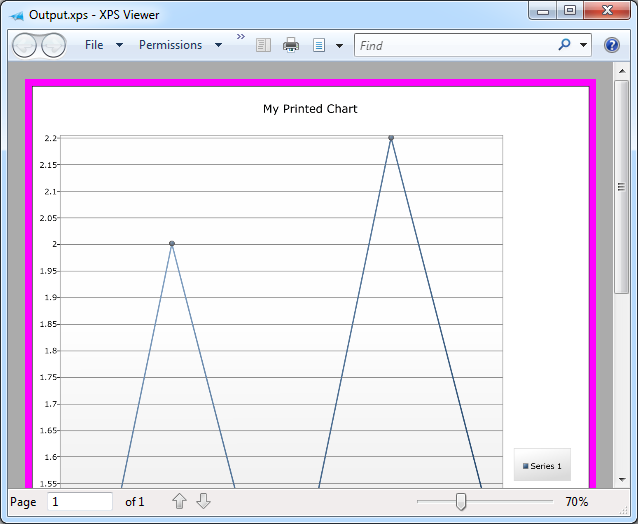
- No trees were harmed in the making of this blog post [How to: Successfully print a Chart with the Silverlight 4 Beta]
- This is what happens when two Toolkits fall in love... [The February 2010 release of the WPF Toolkit is now available!]
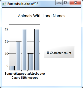
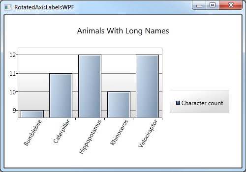
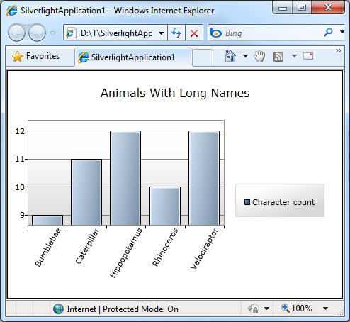
- Turn your head and check out this post [How to: Easily rotate the axis labels of a Silverlight/WPF Toolkit chart]
My many thanks go out to everyone who has spent time helping people learn how to use Silverlight/WPF Data Visualization!
PS - If I've missed any good resources, please leave a comment with a link - I'm always happy to find more great content!
PPS - The most recent version of this collection will always be pointed to by http://cesso.org/r/DVLinks. If you're going to create a favorite or link to this post, please use that URL so you'll always be up to date.