Silverlight Charting is faster and better than ever [Silverlight Toolkit March 09 release now available!]
We've just published the March 09 release of the Silverlight Toolkit and I bet there's something in there to make just about everyone happy! There are bug fixes for some of your favorite controls, a variety of cool new features sprinkled all around, and some completely new controls that will add a little more excitement to your next Silverlight application. The Toolkit continues to support everyone's ongoing Silverlight 2 development efforts and now also supports the newly released Silverlight 3 Beta. What's more, you get all of this goodness for the same low, low price of: free! :)
I encourage everyone to have a look at the live samples for Silverlight 2 or Silverlight 3, download the Toolkit installer(s), and enjoy the new stuff!
Aside: As a public service, I'll also direct your attention to the new LayoutTransformer control which didn't get its own sample page this time around, but remains near and dear to my heart. And if you look closely enough, you just might be able to spot LayoutTransformer being used by Accordion and Charting...
But enough about the rest of the Toolkit; you're probably here because you want to learn more about Silverlight Charting. Well, you've come to the right place! If you haven't already done so, this might be a good time to read or review my previous two introductory posts for Charting: this one for the initial November release and this one for the follow-up release in December. The March 09 release of Charting builds on the foundation Jafar and I previously established to add some new features, improve some usability scenarios, fix some bugs, and address what was easily our most common request: better performance!
Let's start with the full version of the Charting release notes (a simplified version of these notes is available on the "What's New" page for the Toolkit - but it omits all the juicy details):
Notable Changes
Significant performance improvements have been made to many parts of the Charting framework which yield noticeable speed-ups for scenarios dealing with large data sets. Because performance is one of those areas where it's easy to make improvements against benchmarks and yet achieve very little benefit that's relevant to the user, I won't cite the benchmark-based improvements our testing shows for this release. Instead, I'll share the anecdotal story of a Charting customer who got a chance to try an early version of the code and found that a scenario which was starting to bog down with around 500 points under the previous release could now manage over 5000 points with no difficulty! Your mileage may vary, of course, but we definitely think the new Charting core feels snappier!
Added new Series type AreaSeries which works just like
LineSeriesexcept that it fills in the area underneath the line. With the addition ofAreaSeriesin this release, Silverlight Charting now supports all of the major chart types offered by the top level of Excel's ribbon! We've still got some work to do before we can think about trying to replace Excel (like supporting stacked series!), but it's nice to be moving in the right direction and to have achieved this "mini milestone". :)Any Series can use a CategoryAxis as its independent value axis. Specifically, it is now possible to create a
LineSerieswith values on the vertical axis and categories (ex: Dogs, Cats, Fish) on the horizontal axis. The purists among you might argue that it's inappropriate to use aLineSeriesin this manner because the presence of a line connecting each value suggests a cross-value correlation that's typically not present with categorized data. So the purists are welcome to ignore this feature entirely - but those of you who have requested this feature should please go ahead and make use of it however you feel best fits your particular scenario. :)Added DependentValuePath and IndependentValuePath string-typed properties to the Series classes (and a corresponding
SizeValuePathproperty toBubbleSeries) to significantly simplify the experience of binding to properties of the underlying data objects being visualized. Instead of having to type something likeDependentValueBinding="{Binding Value}", it's now also possible to use the simpler, easier to readDependentValuePath="Value". In fact, we like the simplicity of the new form so much that we've made the new*Pathproperties the default user-visible properties at design time! The*Bindingproperties are still present, of course, and can be used for more advanced scenarios such as those where it's necessary to use theConverterparameter of theBinding. The continued support of the*Bindingproperties also means that any existing code using the Charting core will continue to work just fine as-is and won't need to be changed.Numerous design-time enhancements for Silverlight 3 and Blend 3. The most obvious improvement here is that dragging a new
Chartonto the design surface automatically creates some simple sample data as well as aColumnSeriesthat's properly hooked up to that data. This means that not only does the new chart look like a chart (instead of being mostly blank), but it also demonstrates how to correctly hook aSeriesup to a data source. It's like getting a mini Charting tutorial for free! :) Another big improvement in this area is better exception handling during design-time so the code is less likely to throw exceptions during the intermediate configuration steps that are common to interactive design. This makes it easier to build a chart interactively without having it complain about missing values along the way. Other design-time improvements include improved metadata and a slightly improved workflow.Added support for Silverlight 3's new easing feature for better control over how data change animations behave. Available only with Silverlight 3 Charting, the new
TransitionEasingFunctionproperty ofSeriesmakes it easy to select any of Silverlight 3's easing functions to be used when animating the value change of the data points in a Chart. The default value,QuadraticEase, provides a smoother, more pleasing animation that helps keep the viewer focused on the data itself. And while we haven't explicitly changed theDataPointdefault fade in/fade out show/hide transition behavior to use an easing function, it's easy for anyone else to do so by providing a customDataPointTemplate in the usual manner.Added ExtendRangeToOrigin and Origin properties to LinearAxis to enable more scenarios when this axis is used for dependent values. The
ExtendRangeToOriginproperty is handy when you know you want to display the origin (0) on the dependent axis, but you don't want to have to setMinimumorMaximumbecause your data could have positive or negative values - or both! SettingExtendRangeToOriginis an easy way to ensure that aColumnSeriesorBarSeriesalways displays the full extent of its columns/bars which makes it easy for the viewer to draw conclusions based on the relative sizes of the elements. Similarly, theOriginproperty allows you to override the default origin for scenarios where 0 just isn't good enough.Changed the underlying types of the Chart's Series and Axis properties to improve the code- and design-time experience when using them. As a result, Blend now automatically filters its class list and offers only valid types when adding a new item to either of these collections.
Fixed a memory leak that could occur when a Chart was removed from the visual tree and had one or more
Serieswith theirItemsSourceproperties set to anObservableCollection(T)owned by the application. The specifics of the leak scenario are a bit technical, so I'll refer interested readers to this post of mine which contains a fairly detailed description of the problem and its solution.Changed the default Template of ScatterDataPoint to improve performance and provide more consistent behavior. The previous
ScatterDataPointTemplate employed aRotateTransformto create its diamond shape - in this release we've switched to aPathwhich enables us to simplify the Template reduce theScatterDataPoint's overhead just a bit.Various architectural changes to improve the current and future programmability story for Charting. Most of these changes aren't the kinds of things that you'll notice as a user, but they're part of our ongoing effort to open up the Charting platform and provide a solid foundation for others to build upon.
Breaking Changes
Assembly name changed to System.Windows.Controls.DataVisualization.Toolkit.dll as part of a Toolkit-wide assembly renaming task. Because this change wasn't specific to Charting, I won't discuss it here. Please refer to the Toolkit release notes for more information about the renaming and how to easily migrate your applications.
Root namespace changed to System.Windows.Controls.DataVisualization as part of a Toolkit-wide namespace renaming task. As above, this change had wasn't specific to Charting and will not be discussed here.
Switched AxisOrientation enumeration values from Horizontal/Vertical to X/Y for clarity, succinctness, and future-proofing. As part of the architectural work that went on, we realized that we'd eventually be switching to
X/Yas we introduced certain other features and decided to make the change now to help ease the transition later.Some of the *Axis properties on the Series classes have been renamed to be more general as a consequence of adding more flexible axis support to the
Seriesclasses. For example, what used to be namedIndependentRangeAxisis now simplyIndependentAxis.Data values represented by strings are no longer automatically converted to numbers or dates. This is another consequence of the more flexible axis support: when a chart is taking advantage of automatic axis creation, we can't be sure what the desired behavior is if the values "2007", "2008", "2009" are provided as the independent values. Specifically, it's unclear whether the intent is to create a
CategoryAxiswith three string categories or to create aLinearAxisspanning those numeric values. So we've resolved the ambiguity by requiring stronger typing of dependent and independent values: numeric values must be a numeric type (int,double, etc.) and chronological values must be aDateTime. Otherwise, category values will be used where possible. It's unfortunate that this change may break some existing scenarios, but we believe the ambiguity it removes is worthwhile and the overall behavior is now more consistent and predictable. Charting has always encouraged you to be in charge of your data and this change simply reinforces that - if you want to visualize numbers, then you need to provide numbers. :)The default Template of Chart has been reworked slightly to make things a bit easier for designers to customize. The most obvious change is the introduction of a new
EdgePanelprimitive for sizing/positioning the plot area and axes. UsingEdgePanelmakes this axis placement process more transparent to the designer and should be a little more resilient than the previousGrid-based approach.Legend is now a TemplatePart of Chart; its LegendItems property has been removed. Certain architectural changes made it necessary for the
Chartto be able to identify itsLegendand that meant that we needed to formalize things a bit and makeLegendaTemplatePart. There's a slight loss of generality here because it is no longer possible to put two or moreLegends in the same Template, but as far as we know, nobody was doing this anyway. Note that it is still perfectly acceptable to omit the Legend entirely;TemplateParts are always optional in a Template.Removed the MarkerWidth/MarkerHeight properties for LineSeries and ScatterSeries. We use the term "convenience properties" for properties that exist to make things easier for the user but that aren't actually necessary because there are other ways of doing the same thing. During development we're always trying to balance the benefits of convenience properties against the API bloat and possible confusion they can cause. In this case, we decided the
MarkerWidthandMarkerHeightproperties added very little value over re-TemplatingLineDataPointorScatterDataPoint(which is the default approach for changing the appearance of something in WPF and Silverlight). So the default width and height for theseDataPoints are now set by their default Templates - and can be customized by re-Templating in the usual manner.The DataPointSeries and DataPoint classes have been changed to internal visibility to indicate that we are not yet ready for people to be deriving from them when writing their own Series. That's not to say we don't love to see people opening up the hierarchy and writing their own
DataPointSeriessubclasses - just that we want to be sure people realize that doing so isn't supported quite yet. (But if you do this anyway, please share your feedback with us - we'd like to ensure that when we do open things up they'll work as smoothly as possible!)Other Changes
Various UI improvements and bug fixes for issues reported by customers or found internally.
There's lots of good stuff here - we hope you'll enjoy using it as much as we enjoyed developing it!
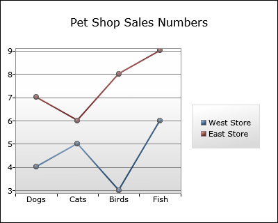
Let's begin by looking at an example of the new support for using a CategoryAxis somewhere that it previously wouldn't have been allowed. For this example, we'll look at a fictitious pet shop chain's sales numbers for four types of animals across two different stores. We could go the traditional route and use ColumnSeries for this, but in this case we're looking to visually draw attention to the fact that one store is outselling the other in every category. With the latest Charting bits, it's easy to do this with LineSeries:
Here's the XAML for this chart:
<!-- Chart with shared DataContext -->
<chartingToolkit:Chart
    Title="Pet Shop Sales Numbers"
    DataContext="{StaticResource SalesDataCollection}">
    <!-- West Store data -->
    <chartingToolkit:LineSeries
        Title="West Store"
        ItemsSource="{Binding}"
        IndependentValuePath="Animal"
        DependentValuePath="WestStoreQuantity"/>
    <!-- East Store data -->
    <chartingToolkit:LineSeries
        Title="East Store"
        ItemsSource="{Binding}"
        IndependentValuePath="Animal"
        DependentValuePath="EastStoreQuantity"/>
</chartingToolkit:Chart>
Because the "Animal" property of our data objects is of type string, the LineSeries automatically does what we want and uses a CategoryAxis for the horizontal axis! Note that we're also using the new *Path properties to specify the independent/dependent values instead of the *Binding properties. The new syntax is short, sweet, and to the point - and allows us to focus on visualizing our data instead of creating Bindings.
One other thing worth calling attention to here is the way the data source is associated with both Series. In this case (as in many real-world scenarios), a single data source provides data objects for multiple series. While we could certainly recreate the same Binding to that data source in the ItemsSource property of each Series, there's a slightly easier way! What we do instead is specify the data source as the DataContext of the Chart object and then simply point both ItemsSource properties to it via a simple "{Binding}". The savings in this particular example are relatively minor, but for scenarios with more series, the convenience of being able to perform the actual binding to the data source in just one place becomes quite nice.
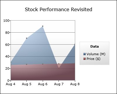
For the next example, let's revisit one of the charts from last time that used BubbleSeries to visualize the performance of a made-up stock ticker by displaying its price and volume by date. But this time around we'll use two instances of the new AreaSeries class to display the same data. Here's how it looks:
The XAML is very similar to last time:
<chartingToolkit:Chart
    Title="Stock Performance Revisited"
    LegendTitle="Data">
    <!-- Volume -->
    <chartingToolkit:AreaSeries
        Title="Volume (M)"
        ItemsSource="{StaticResource StockDataCollection}"
        IndependentValuePath="Date"
        DependentValuePath="Volume"/>
    <!-- Price -->
    <chartingToolkit:AreaSeries
        Title="Price ($)"
        ItemsSource="{StaticResource StockDataCollection}"
        IndependentValuePath="Date"
        DependentValuePath="Price"/>
    <chartingToolkit:Chart.Axes>
        <!-- Axis for custom range -->
        <chartingToolkit:LinearAxis
            Orientation="Y"
            Minimum="0"
            Maximum="100"
            ShowGridLines="True"/>
        <!-- Axis for custom labels -->
        <chartingToolkit:DateTimeAxis
            Orientation="X">
            <chartingToolkit:DateTimeAxis.AxisLabelStyle>
                <Style TargetType="chartingToolkit:DateTimeAxisLabel">
                    <Setter Property="StringFormat" Value="{}{0:MMM d}"/>
                </Style>
            </chartingToolkit:DateTimeAxis.AxisLabelStyle>
        </chartingToolkit:DateTimeAxis>
    </chartingToolkit:Chart.Axes>
</chartingToolkit:Chart>
Notice how the semi-transparency of the fill used by AreaSeries makes it easy to plot both sets of data on the same chart. We've also gone ahead and added a title for the Legend via the LegendTitle property on Chart and customized the names of each series via the Title property on Series. We're using the simplified *Path syntax again to keep things easy to understand and we've preserve the previous sample's axis customization to provide a nicely readable representation of the dates being displayed (instead of the longer MM/DD/YYYY form that's used by default).
For the last example, we'll need to use the Silverlight 3 version of Charting because we're going to take advantage of the new support for easing functions that's available there. The effort needed to customize the easing function used by a Series is practically nothing - all you need to do is add the highlighted portion below to an existing chart and you're done! It really is this easy:
<chartingToolkit:Chart
    x:Name="EasingDemonstration"
    Title="Easing Demonstration">
    <chartingToolkit:ColumnSeries
        Title="Gelatin Sales">
        <!-- Custom easing function -->
        <chartingToolkit:ColumnSeries.TransitionEasingFunction>
            <ElasticEase EasingMode="EaseOut"/>
        </chartingToolkit:ColumnSeries.TransitionEasingFunction>
        <!-- Specify an appropriate color -->
        <chartingToolkit:ColumnSeries.DataPointStyle>
            <Style TargetType="Control">
                <Setter Property="Background" Value="#ff33ff33"/>
            </Style>
        </chartingToolkit:ColumnSeries.DataPointStyle>
    </chartingToolkit:ColumnSeries>
    <!-- Custom Y axis for range -->
    <chartingToolkit:Chart.Axes>
        <chartingToolkit:LinearAxis
            Orientation="Y"
            Minimum="0"
            Maximum="10"
            ShowGridLines="True"/>
    </chartingToolkit:Chart.Axes>
</chartingToolkit:Chart>
Here's what the corresponding chart looks like:
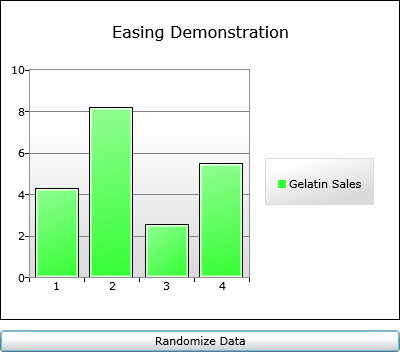
Okay, I admit: this is just a static picture and the effect of the easing function can't be appreciated here... However, if you download and build the Silverlight 3 version of the sample code linked to above, you'll find that clicking the "Randomize Data" button changes the data values every time it's pressed. And every time it does, the ElasticEase function specified above causes each of the bars to zoom quickly to their new values and then bounce around for a bit - just as if the bars were made out of gelatin! I'll grant that ElasticEase is probably not the most practical easing function for data visualization purposes, but we found that the default QuadraticEase behavior makes a very noticeable - yet subtle - impact on the viewer. It obviously won't turn a bad chart into a good chart, but it adds just a bit of extra polish that can help a good chart really shine! :)
Finally, let's have a look at one of the many Blend improvements we've made in this release. One of the things we wanted to do was help newcomers to Charting get up and running as quickly as possible without having to learn a lot of obscure concepts. To that end, when you drop a new Silverlight 3 Chart onto the design surface with the new Blend 3 Preview, you'll automatically get not just XAML for the chart, but also a bit of sample data and a properly configured ColumnSeries that uses it to display a very simple chart!
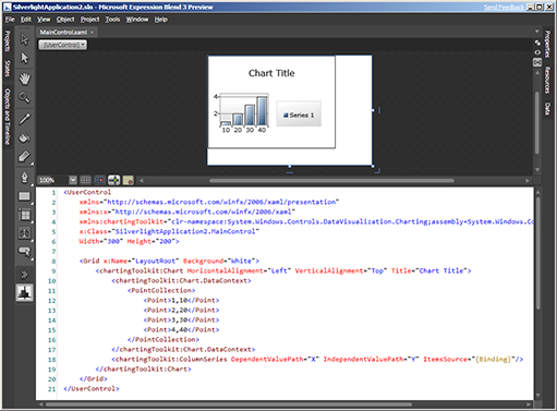
Of course, we don't expect this to be the same data you intended to visualize, but the automatic creation and configuration of the complete end-to-end scenario should help people understand just what it takes to create a chart. Furthermore, it's easy to begin experimenting with the objects and data that are automatically created in order to learn more and develop an understanding about how the different properties work together. To make that experimentation even more rewarding (translation: less frustrating) we've done some work internally to suppress many of the exceptions that result from the invalid configurations that are so easy to accidentally trigger when interactively manipulating a chart in the designer. There's still a lot more that can be done to improve the design-time experience for Charting - but I hope you'll agree that changes like this move us strongly in the right direction!
We've had a great time working on the March 09 release of Charting and hope you're as excited by the new functionality as we are! You can always browse the live Charting sample page for Silverlight 2 or Silverlight 3 to find out more - then please download the March 09 Toolkit release - for Silverlight 2 or Silverlight 3 - and start playing around with the new stuff! And as always, if you have questions about Charting, please ask them in the Silverlight Controls forum where there are plenty of folks who are happy to help out (including us!). If you run into problems and think you've found a bug, please report it with the Issue Tracker on the Toolkit's CodePlex site so that we'll know about it and others can tell us if they're seeing the same behavior.
Thank you very much for taking an interest in Charting - I hope you have fun with the new bits!! :)
PS - I'll be posting an update to my ChartBuilder application/tutorial (Background reading: Introduction, Update, New Release) in the next day or so. ChartBuilder itself hasn't changed much since last time, but there's going to be something special about it this time that think you'll agree is pretty exciting! :)