I'm happy to report that we've just published the Silverlight for Windows Phone Toolkit November 2010 release! This is the second iteration of the Windows Phone Toolkit and effectively doubles the number of controls we've created to help developers and designers build more compelling, more platform-consistent user experiences with ease. The first Windows Phone Toolkit release has been a big hit and we've seen a lot of developers using it (in both binary and source forms) to build their Windows Phone 7 applications. But while we tried to address the most pressing needs with that release, there were still a couple of prominent controls missing...
With today's update, we've tried to provide more of the fundamental controls customers have been asking for - as well as API documentation and fixes for some of the bugs people reported with the first release. Recall that the Windows Phone Toolkit is published on CodePlex under the Ms-PL open-source license so anyone who wants can look at the source code to learn how we've done things - or customize any control to suit their specific scenario. As always, if you have suggestions for things we should add or change, please search the CodePlex issue tracker and vote for the issue (or create a new one if the idea is unique). We use your input to help prioritize our efforts and ensure we're delivering the right things for the community!
What's New?
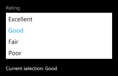
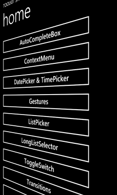
ListPicker
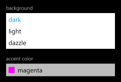
<toolkit:ListPicker Header="background">
    <sys:String>dark</sys:String>
    <sys:String>light</sys:String>
    <sys:String>dazzle</sys:String>
</toolkit:ListPicker>
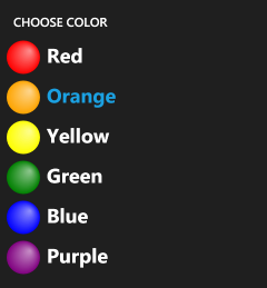
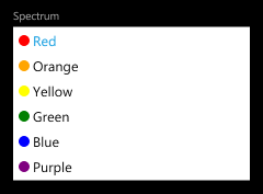
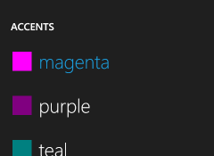
ListPicker is the Windows Phone 7 equivalent of the ComboBox control: give it a list of items and it will show the selected one and also allow the user to pick from a list if they want to change it. The core applications on Windows Phone 7 implement two kinds of list selection: an in-place expander for picking among five or fewer items, and a full-screen popup for picking among more. The Toolkit's ListPicker control combines both experiences into one handy package by automatically selecting the right UX based on the number of items in its list! It is a standard ItemsControl subclass with all the common elements of a Selector, so the API will be familiar to just about everyone. In fact, you can take most existing ListBoxes and convert them to ListPickers just by changing the control name in XAML!
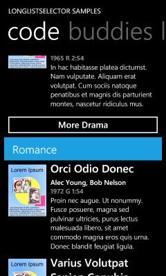
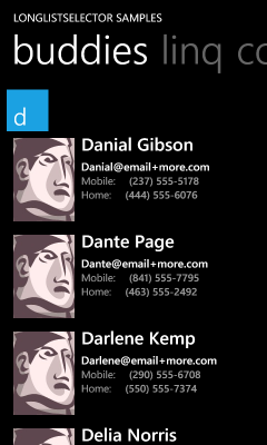
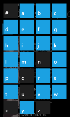
LongListSelector
<toolkit:LongListSelector
    ItemsSource="{StaticResource movies}"
    ListHeaderTemplate="{StaticResource movieListHeader}"
    GroupHeaderTemplate="{StaticResource movieGroupHeader}"
    GroupFooterTemplate="{StaticResource movieGroupFooter}"
    GroupItemTemplate="{StaticResource groupItemHeader}"
    ItemTemplate="{StaticResource movieItemTemplate}">
</toolkit:LongListSelector>
While ListPicker is about simple selection scenarios, LongListSelector is about advanced ones! Think of it as ListBox++--, it has everything you expect from ListBox plus a bunch of advanced capabilities and great on-device performance minus the levels of abstraction and generality that tend to slow ListBox down. LongListSelector supports full data and UI virtualization, flat lists, grouped lists (with headers!), and also implements the "jump list" header navigation UI that makes the "People" app so efficient! The theory behind LongListSelector is that it should be easy to fix a poorly-performing ListBox scenario by swapping in a LongListSelector instead: it handles all the tricky parts for you, so there's less to worry about and it "just works". Unless you've spent a lot of time fine-tuning your application's list behavior, you should see improved performance by switching to LongListSelector!
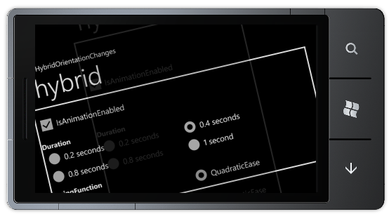
TransitionFrame (and Transitions)
RootFrame = new TransitionFrame();
<toolkit:TransitionService.NavigationInTransition>
    <toolkit:NavigationInTransition>
        <toolkit:NavigationInTransition.Backward>
            <toolkit:TurnstileTransition Mode="BackwardIn"/>
        </toolkit:NavigationInTransition.Backward>
        <toolkit:NavigationInTransition.Forward>
            <toolkit:TurnstileTransition Mode="ForwardIn"/>
        </toolkit:NavigationInTransition.Forward>
    </toolkit:NavigationInTransition>
</toolkit:TransitionService.NavigationInTransition>
<toolkit:TransitionService.NavigationOutTransition>
    <toolkit:NavigationOutTransition>
        <toolkit:NavigationOutTransition.Backward>
            <toolkit:TurnstileTransition Mode="BackwardOut"/>
        </toolkit:NavigationOutTransition.Backward>
        <toolkit:NavigationOutTransition.Forward>
            <toolkit:TurnstileTransition Mode="ForwardOut"/>
        </toolkit:NavigationOutTransition.Forward>
    </toolkit:NavigationOutTransition>
</toolkit:TransitionService.NavigationOutTransition>
The Windows Phone UI Guidelines encourage smooth, attractive page-to-page animations like the core applications show, but there has been little platform support for creating similar experiences in your own applications - until now! :) The new transition classes in the Windows Phone Toolkit aims to make it easy for application developers to add attractive, platform-consistent transitions to their applications. All that's necessary to enable transitions for an application's pages is tweak App.xaml.cs (shown above) and add a bit of XAML to each page to specify its transitions (also shown above). Everything else is done for you!
Aside: This release includes support for multiple flavors of the following transitions: turnstile, slide, rotate, swivel, and roll. It's also possible to implement custom transitions using the same framework!
AutoCompleteBox
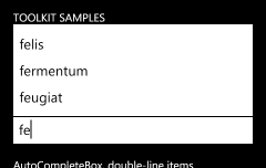
<toolkit:AutoCompleteBox
    ItemsSource="{StaticResource words}"/>
AutoCompleteBox first appeared in the Silverlight 2 Toolkit, then later graduated to the Silverlight 3 SDK. Now it's back in the Toolkit - this time for Windows Phone 7! Because phones are about being small and quick to use, simplifying tedious tasks like text input is an important goal. Toward that end, a number of the core applications (like Bing search) make use of auto-completion to predict what the user is typing and save time by allowing them to click on the completed word instead. AutoCompleteBox makes it easy to bring the same convenience to your own applications by taking advantage of a phone-friendly implementation of this popular Silverlight control. By providing a suitable completion list (in any of a variety of ways), users are automatically prompted with the relevant matches as they start typing!
API Documentation
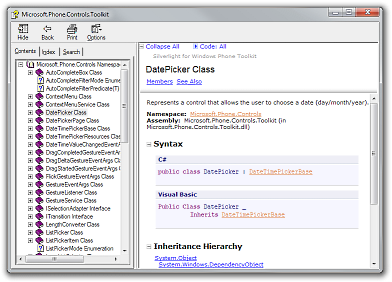
The source code for the Windows Phone Toolkit has included full XML Documentation Comments from the beginning, but now we've begun generating a separate CHM file with all the property/method/event comments in a single, easy-to-browse location. The documentation file is automatically installed by the Windows Phone Toolkit installer and a handy link is added to the "Silverlight for Windows Phone Toolkit" folder in the Start Menu. Because we don't have dedicated documentation writers on the Toolkit team, our documentation is a bit on the terse side - but the CHM file is still a great way to survey the Toolkit classes and get a feel for what's available. And because the sample syntax is available in both C# and VB, everyone should be comfortable with the examples!
Bug fixes for existing controls
The previous Toolkit release wasn't all that long ago and we've been quite busy since then, but we've still managed to squeeze in fixes for some of the more annoying bugs customers reported. That's not to say that we fixed them all or that we had a chance to squash your favorite bug, but we were fortunate to be able to fix a good number of customer-impacting issues and I hope everyone finds the new controls even more pleasant to use! :)
[Click here to download the Silverlight for Windows Phone Toolkit November 2010 release.]
The screen shots and XAML shown above are all from the sample application you can download along with the Toolkit. I encourage people to play around with the sample if they want to experiment with any of these controls (in the emulator or on the device) or if they want to learn more about how these controls work. I anticipate more in-depth coverage will show up in the coming weeks (I will be posting a detailed ListPicker overview tomorrow!), but for now the sample application is a great springboard to get folks started!
In closing, I'm really glad we've been able to get this second round of controls out to the community in such a short time! While there are probably still some "nice to have" controls that could be added to further round-out the Windows Phone 7 control offering, I think that what we've included in the Windows Phone Toolkit represents nearly all the critical ones needed to unblock important scenarios. I hope people continue to enjoy their Windows Phone development experience and that the new Windows Phone Toolkit makes application development even easier! :)