The December 08 release of the Silverlight Toolkit was published a short while ago. Just about every control in the Toolkit got some love and attention for this release and I encourage you to have a look, download it, and enjoy!
That said, readers of my blog know that I'm all about the Charting. :) So just like my original Charting announcement and overview post, here's an announcement of the December 08 Charting release and an overview of some of the high points. By now, I assume folks have had time to play around with Charting and are starting to get into some more advanced scenarios, so the samples are going to be a little more technical than before. If you want a refresher on basic Charting concepts, please have a look at my original overview - all of those concepts still apply.
Though the Charting team was down to just two of us for this release, Jafar and I have done our best to deliver some pretty compelling new features. It's important to note that there are a few breaking changes from the November 08 release, but I hope you'll agree that the new functionality is worth the minor inconvenience of updating existing Charting code. As it happens, if you don't explicitly use the Axis class, you probably won't need to change anything at all!
I wrote the following summary for the release notes, and it seems like a good way to begin:
Notable Changes
Support has been added for arbitrary numbers of Axes for a Chart. A key and significant consequence of this change is that it is now possible to mix previously incompatible Series in the same chart (example: Column and Bar). The former "automatically share axes when possible" behavior remains present and can be used to render two series with a shared independent axis and different dependent axes in order to display related-but-differently-scaled values (example: an engine's torque and RPM).
The Column/Bar/Line/Scatter Series classes expose two new (optional) properties which specify a particular Axis instance to be used by the Series (rather than letting the Series choose from the Chart's Axes collection as it does by default). These properties allow very specific customization of each Series' axes in situations where maximum control is desired.
A design-time assembly for Charting has been created which is automatically used by Blend and Visual Studio to enhance the design-time experience. Most class properties are now categorized into custom "Data Visualization" and "Data Visualization Styles" categories to make them easier to find - while particularly common properties are now found in the "Common" category. ToolTips identify the purpose of each control and property, and Toolbox icons are automatically associated with each class. (Note: Some of these features are only supported by one of the design tools.)
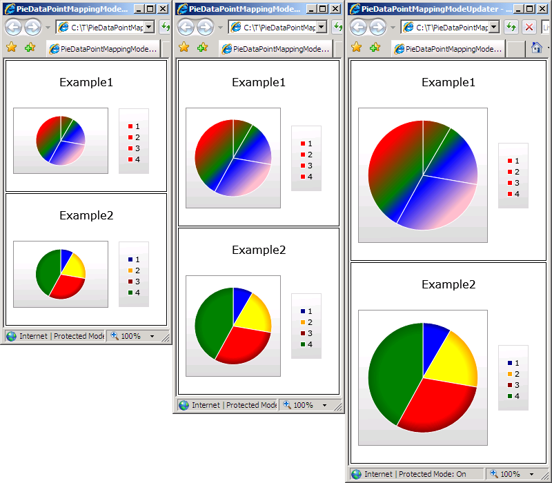
The design-time behavior of DataPoints has been enhanced: DataPoints are now visible by default when dropped onto the design surface in Blend, so styling them is easier. PieDataPoint now creates a default Geometry (that can be customized interactively with the ActualRatio and ActualOffsetRatio properties) which makes it possible to see and understand relevant styling changes. DataPoints in a Chart show up in Visual Studio without a refresh of the design surface.
The Chart class is now decorated with ContentPropertyAttribute("Series") which means that it is no longer necessary to explicitly wrap Series with <charting:Chart.Series> ... </charting:Chart.Series> in XAML. Additionally, this enables Blend to display a Chart's Series in the "Objects and Timeline" pane and makes accessing the properties of a Series considerably easier. Example of simplified XAML syntax:
    <charting:Chart>
        <charting:PieSeries ... />
    </charting:Chart>
The behavior of the Axis classes during animations that expand or shrink the range of displayed data has been changed so that the animation of the size change is smooth (vs. jumping between axis intervals). This significantly increases the ease with which dynamic data changes can be observed and understood by the viewer.
The DataPointSeries class (a subclass of Series) has been unsealed to make the task of writing a custom Series considerably easier. While this change doesn't expose the entire hierarchy on which the "in-box" Series are built, it is a significant benefit to developers because DataPointSeries implements many of the key Series notions: the ItemsSource property, DataPoint creation, dynamic data detection, change animation, show/hide transitions, DataPoint selection, and more.
A new Series type, BubbleSeries, has been added (along with its associated BubbleDataPoint class). BubbleSeries is similar in nature to ScatterSeries, but conveys additional information by using the size of the data points to display an additional dependent value for each of the data points.
In scenarios where multiple columns/bars (of ColumnSeries/BarSeries) share the same category, all such data points will now be automatically displayed overlapping so that smaller values will no longer be obscured from view by larger values.
Breaking Changes
The Axis.AxisType property has been replaced by a corresponding hierarchy of Axis classes. The concrete classes map directly to the AxisType values that were removed: LinearAxis, DateTimeAxis, CategoryAxis. In addition to improving overall API consistency, a consequence of this refactoring is that the LinearAxis.Minimum/Maximum properties are now strongly typed as double and the corresponding properties on DateTimeAxis are strongly typed as DateTime - both of which improve development-time and design-time usability.
The Axis.ShouldIncludeZero property has been removed; this property is has no meaning for some axis types and is typically not needed because the same thing can be accomplished by setting Minimum or Maximum accordingly. A consequence of this is that Column/Bar charts will usually not include the 0 value by default (and therefore the "beginnings" of the columns/bars can be truncated). This behavior is consistent with Excel (demonstrated by creating a column chart of the values 10, 11, and 12 in Excel), though truncation is more likely because Charting's heuristics are more aggressive with regard to excluding 0.
Other Changes
Various UI improvements and bug fixes.
Whew - there's a lot of good stuff in there! :)
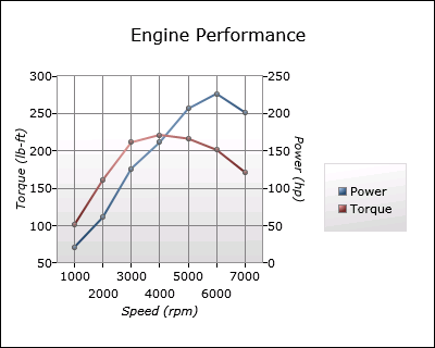
So now that we have an idea what's new, let's start by looking at the support for multiple axes with a common scenario: charting two quantities that are related, but measured in different units and/or on different scales. For the purposes of this demonstration, let's chart the performance characteristics of an imaginary engine:
[Note: Complete source code for all of the sample charts here can be found in the ChartingIntroduction.zip file attached to this post.]
The XAML for this Chart is straightforward (and discussed below):
<charting:Chart Title="Engine Performance">
    <!-- Power curve -->
    <charting:LineSeries
        Title="Power"
        ItemsSource="{StaticResource EngineMeasurementCollection}"
        IndependentValueBinding="{Binding Speed}"
        DependentValueBinding="{Binding Power}"
        MarkerWidth="5"
        MarkerHeight="5">
        <!-- Vertical axis for power curve -->
        <charting:LineSeries.DependentRangeAxis>
            <charting:LinearAxis
                Orientation="Vertical"
                Title="Power (hp)"
                Minimum="0"
                Maximum="250"
                Interval="50"
                ShowGridLines="True"/>
        </charting:LineSeries.DependentRangeAxis>
    </charting:LineSeries>
    <!-- Torque curve -->
    <charting:LineSeries
        Title="Torque"
        ItemsSource="{StaticResource EngineMeasurementCollection}"
        IndependentValueBinding="{Binding Speed}"
        DependentValueBinding="{Binding Torque}"
        MarkerWidth="5"
        MarkerHeight="5">
        <!-- Vertical axis for torque curve -->
        <charting:LineSeries.DependentRangeAxis>
            <charting:LinearAxis
                Orientation="Vertical"
                Title="Torque (lb-ft)"
                Minimum="50"
                Maximum="300"
                Interval="50"/>
        </charting:LineSeries.DependentRangeAxis>
    </charting:LineSeries>
    <charting:Chart.Axes>
        <!-- Shared horizontal axis -->
        <charting:LinearAxis
            Orientation="Horizontal"
            Title="Speed (rpm)"
            Interval="1000"
            ShowGridLines="True"/>
    </charting:Chart.Axes>
</charting:Chart>
We start with the usual Chart object to contain the series - but now we can put the series directly inside the Chart tags instead of inside nested Chart.Series tags (though that syntax still works and is fully supported). There are two LineSeries here (one for torque and one for power) and each starts out as you'd expect by hooking up to the data and doing a bit of customization. But then there's something new: the LineSeries.DependentRangeAxis property is used to identify a specific LinearAxis. Every series type (other than PieSeries which doesn't have axes) now exposes a Dependent???Axis property and an Independent???Axis property (where "???" is "Range" or "Category" depending on which series it is).
Normally, a series will search the Chart.Axis collection to find an axis that it can use - but when these new properties are set, it always uses the specified axis. So in this example we're providing a specific LinearAxis for each LineSeries to use and we're customizing it slightly to get the chart looking just how we want. Having specified both LineSeries in this manner, a third LinearAxis is added to the Chart.Axis collection where it will be found - and used - by both LineSeries when they acquire an independent value axis.
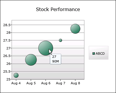
Moving on, here's a chart using the new BubbleSeries in a financial scenario (for a fictional stock ticker symbol). It's the usual "stock price by date" chart we've all seen before - but this chart is also showing the trading volume each day by varying the size the data points:
The XAML for that Chart is what you'd expect:
<charting:Chart Title="Stock Performance">
    <!-- Stock price and volume -->
    <charting:BubbleSeries
        Title="ABCD"
        ItemsSource="{StaticResource StockDataCollection}"
        IndependentValueBinding="{Binding Date}"
        DependentValueBinding="{Binding Price}"
        SizeValueBinding="{Binding Volume}"
        DataPointStyle="{StaticResource CustomBubbleDataPointStyle}"/>
    <charting:Chart.Axes>
        <!-- Axis for custom labels -->
        <charting:DateTimeAxis
            Orientation="Horizontal">
            <charting:DateTimeAxis.AxisLabelStyle>
                <Style TargetType="charting:DateTimeAxisLabel">
                    <Setter Property="StringFormat" Value="{}{0:MMM d}"/>
                </Style>
            </charting:DateTimeAxis.AxisLabelStyle>
        </charting:DateTimeAxis>
    </charting:Chart.Axes>
</charting:Chart>
BubbleSeries is used just like a ScatterSeries, but it exposes an additional property SizeValueBinding that works just like Independent/DependentValueBinding to identify the source of the size values. The DataPointStyle property specifies a custom style for BubbleDataPoint (not shown here) where we've added the day's volume to the ToolTip of each bubble. This custom style was created in the usual manner - by starting from the default style for BubbleDataPoint and making the desired changes. (I did so in Visual Studio's XAML editor, but it could just as easily be done in Blend.)
Tweaking things just a little more, the independent value axis is customized by setting its AxisLabelStyle property and providing a style for the new DateTimeAxisLabel class. DateTime/NumericAxis/AxisLabel are the classes used to display an axis's labels. In this case we've provided a custom StringFormat so that the dates are all displayed in the friendly Month+Day pattern seen above. DateTimeAxisLabel offers specific StringFormat properties for each supported IntervalType - but in this case we've simply used the StringFormat property which conveniently overrides the other, more specific types.
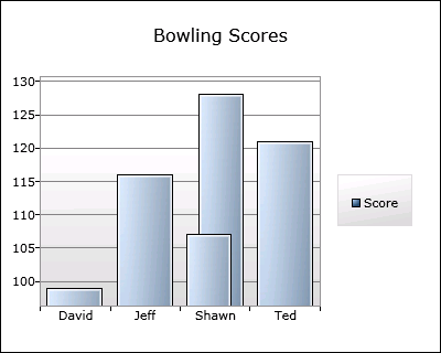
Next up is a fairly typical column chart showing made-up bowling scores for some of the people on the Toolkit team. But there's twist because there are two "Shawn"s on the team:
By now, the XAML is probably kind of boring in its predictability:
<charting:Chart Title="Bowling Scores">
    <!-- Scores -->
    <charting:ColumnSeries
        Title="Score"
        ItemsSource="{StaticResource ScoreDataCollection}"
        IndependentValueBinding="{Binding Player}"
        DependentValueBinding="{Binding Score}">
        <charting:ColumnSeries.IndependentCategoryAxis>
            <!-- Axis for automatic sorting -->
            <charting:CategoryAxis
                Orientation="Horizontal"
                SortOrder="Ascending"/>
        </charting:ColumnSeries.IndependentCategoryAxis>
    </charting:ColumnSeries>
</charting:Chart>
This is a standard ColumnSeries, which is specifying a IndependentCategoryAxis so the new SortOrder property of CategoryAxis can be used to automatically sort the category names. This data set contains two items with the independent value "Shawn". Previously, both would have been displayed in the same category slot with the same width which means the column in front could have obscured the one in back and led viewers to believe that only four scores were being displayed. But now ColumnSeries and BarSeries automatically detect this situation and overlap columns/bars in the same category slot (after sorting them by size). This behavior makes it clear that five values are being shown and makes it easy to hover over either of the "Shawn"s to get a ToolTip with the associated score.
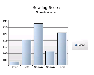
The previous chart is interesting for another reason, too: it's using the natural, simple way to display the data, but a purist might argue that it's also the "wrong" way to do so... [Jafar and I actually had this "argument" - I won't say who took which position. :) ] Categorizing by player name works well enough, but what if we also had an image for each player and we wanted to display that image instead of their name? Changing the ColumnSeries.IndependentValueBinding property might work, but it's become obvious that we're mixing display concerns and data concerns.
When maintaining developer/designer separation is critical, what's probably more appropriate is to categorize by the actual data object - and then display it however we want. Here's a chart that does just that:
And here's the XAML - which is a bit more complicated than before, but still quite manageable:
<charting:Chart>
    <!-- Customized Title -->
    <charting:Chart.Title>
        <StackPanel>
            <TextBlock
                Text="Bowling Scores"
                HorizontalAlignment="Center"/>
            <TextBlock
                Text="(Alternate Approach)"
                FontSize="10"
                HorizontalAlignment="Center"/>
        </StackPanel>
    </charting:Chart.Title>
    <!-- Scores -->
    <charting:ColumnSeries
        Title="Score"
        ItemsSource="{StaticResource ScoreDataCollection}"
        IndependentValueBinding="{Binding}"
        DependentValueBinding="{Binding Score}">
        <charting:ColumnSeries.IndependentCategoryAxis>
            <!-- Axis for automatic sorting and custom labels -->
            <charting:CategoryAxis
                Orientation="Horizontal"
                SortOrder="Ascending">
                <charting:CategoryAxis.AxisLabelStyle>
                    <Style TargetType="charting:AxisLabel">
                        <Setter Property="Template">
                            <Setter.Value>
                                <ControlTemplate TargetType="charting:AxisLabel">
                                    <TextBlock Text="{Binding Player}"/>
                                </ControlTemplate>
                            </Setter.Value>
                        </Setter>
                    </Style>
                </charting:CategoryAxis.AxisLabelStyle>
            </charting:CategoryAxis>
        </charting:ColumnSeries.IndependentCategoryAxis>
    </charting:ColumnSeries>
</charting:Chart>
Now that we've set IndependentValueBinding to the data objects themselves, there are automatically five categories (one for each of the five objects in the data set). (Aside: CategoryAxis will still sort them for us because the data objects implement the IComparable interface.) Once the data is set up "properly", all that's left to do is customize how the objects are displayed - and this is done by providing a custom template for the AxisLabel class (something that's already been discussed).
One other thing to note above is how the Chart.Title property is set to a tree of UI elements instead of the usual string. Chart.Title (and other such properties in Charting) follows the ContentControl model because it makes simple things simple while also allowing more advanced scenarios. In this case, all we've done is provide a "subtitle" - but we could also have gone much further and created something very customized.
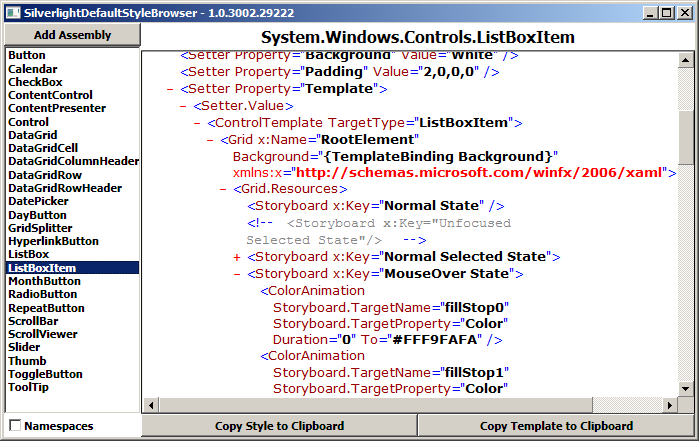
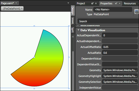
The last thing I wanted to highlight was some of the design-time enhancements for Charting in this release. Data points were previously a little tricky to customize because their default state is not visible (which allows the reveal/show animation to fade them in without flicker). Data points now check if they're being used in design-time and will automatically play their reveal/show animation so that they're visible on the design surface by default. PieDataPoint used to be extra tricky because its Geometry property is only set when it's actually being used by PieSeries. But now it knows about design-time and its ActualRatio/ActualOffsetRatio properties can be changed to interactively evaluate different styling approaches. Here's a stand-alone PieDataPoint in Blend showing off both of these improvements (along with the new "Data Visualization" property category):
I hope you're excited by some of the new functionality we've just looked at from the December 08 release of Charting! And naturally, we've made a some other improvements, too! :) You can browse the live Charting sample page to find out more - then download the December 08 Toolkit release and start playing around with the new stuff! As always, if you have questions about Charting, you can ask them in the Silverlight Controls forum. If you think you've found a bug, please report it with the Issue Tracker in the Toolkit's CodePlex site.
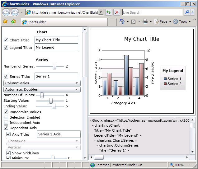
PS - If you're looking for an update to my ChartBuilder application (Background reading: Introduction, Update) to show off the new Charting functionality, please stay tuned because it will be available very soon! :)
PPS - I'm on vacation in December, so responses to blog comments and emails may be delayed. But please don't let that stop you from contacting me: I'll follow up on everything I get - I just might be a little slower than usual. :)