The blog of dlaa.me

Posts from February 2010

Highlighting a "weak" contribution [Enhancements make preventing memory leaks with WeakEventListener even easier!]

It was back in March of last year that I explained the motivation for the WeakEventListener class I'd started using in the Silverlight Toolkit's Data Visualization assembly. Since then, a few other Toolkit controls have added WeakEventListener where necessary - but otherwise not much has changed...

Then, a few days ago, I saw that Beat Kiener had written a post detailing the specifics of how WeakEventListener really works. Where I focused more on saying why WeakEventListener is necessary, Beat does a great job of showing why - with lots of pretty diagrams and a detailed explanation. He even identifies a mistake users of WeakEventListener might make and outlines a simple tweak to the original implementation to prevent it! Beat's post is a good read, and I recommend it for anyone who's interested in this stuff.

But wait, there's more! Beat followed with a post about a wrapper to simplify the common usage pattern shared by every WeakEventListener consumer. Whereas WeakEventListener is a little tricky to use correctly, Beat's wrapper is easy to get right - and still gets the job done! So if you've wanted to make use of WeakEventListener, but were intimidated by the technical details, please have a look at these two posts because I think you'll find it's really quite approachable. :)


PS - If you think you have a memory leak, but aren't sure, this post I wrote about using WinDbg, SOS, and GCRoot to diagnose .NET memory leaks may be helpful.

This is what happens when two Toolkits fall in love... [The February 2010 release of the WPF Toolkit is now available!]

The WPF Toolkit team has just published the February 2010 release of the WPF Toolkit! In addition to a variety of bug fixes for DataGrid, DatePicker, Calendar, and Visual State Manager, this release also includes the latest changes to the Data Visualization assembly for Silverlight and WPF, bringing the official WPF implementation up to date with the November 2009 release of the Silverlight Toolkit. And because sharing the Silverlight Toolkit's Data Visualization assembly with WPF Toolkit customers has worked out so well, this release of the WPF Toolkit introduces three other controls from the Silverlight Toolkit: AutoCompleteBox (SDK documentation), Accordion, and Rating!


WPF Toolkit February 2010 installer


Just as with the Data Visualization assembly, the WPF Toolkit implementation of AutoCompleteBox, Accordion, and Rating are almost identical copies of the latest Silverlight Toolkit implementations - we've even kept the same assembly names and structure. Therefore, everything you already know and love about these controls on Silverlight (including your code and XAML) should translate seamlessly to WPF! Even the Visual Studio 2008 design-time experience for these controls should be the same; we've brought the Visual Studio design-time assemblies over, too!

These controls have been part of the Silverlight Toolkit long enough that there are plenty of great resources on the web for information, examples, and more. I expect WPF developers will come up to speed quickly and be able to start taking advantage of them in WPF applications in no time! :)


Aside: This release of the WPF Toolkit targets the version of WPF that is part of .NET 3.5 (just as previous releases did). There isn't a version of the WPF Toolkit specifically for .NET 4 - largely because many of the controls in the WPF Toolkit were folded into WPF 4 itself!


Those of you who follow the progress of the Data Visualization project already know that I maintain a collection of helpful links from all over the web here: http://cesso.org/r/DVLinks. Another handy resource for new users is my DataVisualizationDemos sample project which runs on Silverlight 3, Silverlight 4, WPF 3.5, and WPF 4 and provides examples of a bunch of different things made possible by the Data Visualization project. Finally, there are some WPF Toolkit-specific notes that are part of my WPF Toolkit June 2009 announcement and which may be worth reviewing. (In particular, the "Build Notes" section covers an issue that occasionally trips people up when trying to compile the design-time assemblies themselves.)


Release notes: For a summary of the changes to the WPF version of Data Visualization since the June 2009 WPF Toolkit and numerous code/XAML examples, please have a look at my announcements for the July 2009, October 2009, and November 2009 releases of the Silverlight Toolkit.


It's always exciting when there's a new Toolkit release - and a bit of a relief because there's a lot of work that goes on behind the scenes to make these possible. I'd like to thank the WPF Toolkit team for their continued support of Data Visualization and for their willingness to include additional controls from the Silverlight Toolkit. In particular, I'd like to thank Patrick Danino who did nearly all the work to port the three new controls over to WPF, test them, and resolve a few platform incompatibilities that came up! His efforts went well beyond what I expected when he and I first talked about the idea and it has been a pleasure working with him on this. If any bugs happened to sneak through, it's not for lack of effort on Patrick's part. :) Please don't blame him - blame me instead!

No trees were harmed in the making of this blog post [How to: Successfully print a Chart with the Silverlight 4 Beta]

One of the big requests people have had for Silverlight was the ability to print, so one thing that's new in the Silverlight 4 Beta is the PrintDocument class which enables applications to print anything they want! There isn't an excess of fancy bells and whistles quite yet, but the support Silverlight provides is enough to do just about everything - it's just that sometimes you might need to do a little more than you expect. :) It's the classic "crawl, walk, run" approach to feature delivery, and this is a great first step that will be a welcome addition for everyone who's been wanting to print with Silverlight.

Okay, so that's all well and good and people can print any content they want and it all looks beautiful and works perfectly, right? Pretty much, yes! Well, except for certain scenarios involving charts from the Silverlight/WPF Data Visualization assembly. :( To be clear, if you try to print a Chart that's already in the visual tree, it works just fine and what you see really is what you get. But if you've tried to create custom content specifically for printing (for example: a different layout, maybe some page headers and footers, etc.) and that content included a Chart instance, you probably noticed a minor issue: none of the data points showed up on the page. Darn, it sure is hard to tell what's going on without those data points...


Fortunately, a bit of mental debugging reveals what's going on here. Charting's data points fade in by default - from Opacity 0 to 1 over the course of 0.5 seconds via a Visual State Manager transition. That's cool and it works great in the visual tree - however, when you're creating print-specific visuals and immediately printing them, those data points don't have a chance to do much fading in... So they're actually all there on the printed page, but they're at Opacity 0, so you can't see them!

What to do? Well, the most convenient thing would be for the Chart code to somehow know it was going to be printed and SkipToFill those pesky animations. But there's no official way for a control to know it's being created for printing. There are a few tricks the Chart could use to make an educated guess, but it doesn't do so yet - and I'm not sure that's the right answer anyway. So the next most obvious thing would be to re-Template the DataPoints to replace the default fading Template with one that doesn't fade, but instead starts fully visible. And as you'd expect, this works just fine - the data points show up and look great!

However, that's a lot of work that you probably don't want to have to do. It would be nice if there were a middle ground - some technique that was maybe a little bit of a hack, but that was really easy to implement and worked just about all the time...


And the good news is that there is such a hack! The idea builds upon the observation that printing a Chart from the visual tree works correctly - so let's start by popping our new, print-ready chart into the visual tree to give it a chance to get all pretty, then print it once that's done. That seems easy enough, let's try it:

// Create customized content for printing
var chart = new Chart { Title = "My Printed Chart" };
var series = new LineSeries
{
    ItemsSource = (PointCollection)Resources["Items"],
    DependentValuePath = "Y",
    IndependentValuePath = "X",
};
chart.Series.Add(series);
var content = new Border
{
    BorderBrush = new SolidColorBrush(Colors.Magenta),
    BorderThickness = new Thickness(10),
    Child = chart,
};

// Create container for putting content in the visual tree invisibly
var visualTreeContainer = new Grid
{
    Width = 1000,
    Height = 1000,
    Opacity = 0,
};

// Put content in the visual tree to initialize
visualTreeContainer.Children.Add(content);
LayoutRoot.Children.Add(visualTreeContainer);

// Prepare to print
var printDocument = new PrintDocument();
printDocument.PrintPage += delegate(object obj, PrintPageEventArgs args)
{
    // Unparent the content for adding to PageVisual
    visualTreeContainer.Children.Remove(content);
    args.PageVisual = content;
};

// Print the content
printDocument.Print();

// Remove container from the visual tree
LayoutRoot.Children.Remove(visualTreeContainer);

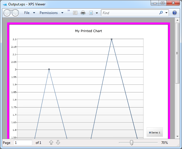
Note that the sample application is creating a completely new Chart instance here (with a print-specific title and custom magenta frame) - and that the printed output looks just like it should:

ChartPrinting sample output


[Click here to download the source code for the ChartPrinting sample for the Silverlight 4 Beta as a Visual Studio 2010 solution]


The Chart is added to the visual tree before the print dialog is shown - so it has plenty of time for those 0.5 second animations to play to completion while the user interacts with the dialog. The only sketchy bit is that an exceedingly fast user could possibly manage to print a Chart before the animations had run all the way to completion. Yes, well, I said it was a hack up front, didn't I? :) If you want rock-solid printing behavior, you probably ought to be re-templating the data points in order to ensure the initial visuals are exactly as you want them. But if you're just interested in printing something attractive with a minimum of fuss or inconvenience - and your users aren't hopped up on performance enhancing drugs - you'll probably be quite successful with this technique instead.


PS - The XPS Printer driver is a fantastic tool for testing printing scenarios like this one. By printing to a file and opening that file in the XPS Viewer application that comes with Windows, I was able to avoid wasting a single sheet of paper during the course of this investigation. Highly recommended!

This one time, at band camp... [A banded StackPanel implementation for Silverlight and WPF!]

Recently, I came across this article in the Expression Newsletter showing how to create a three-column ListBox. In it, Victor Gaudioso shows a Blend-only technique for creating a Silverlight/WPF ListBox with three columns. [And I award him extra credit for using the Silverlight Toolkit to do so! :) ] The technique described in that article is a great way to custom the interface layout without writing any code.

But it can get a little harder when the elements in the ListBox aren't all the same size: a row with larger elements may only be able to fit two items across before wrapping, while a row with smaller elements may fit four items or more! Such things can typically be avoided by specifying the exact size of all the items and the container itself (otherwise the user might resize the window and ruin the layout). But while hard-coding an application's UI size can be convenient at times, it's not always an option.


For those times when it's possible to write some code, specialized layout requirements can usually be implemented more reliably and more accurately with a custom Panel subclass. Victor started by looking for a property he could use to set the number of columns for the ListBox, and there's nothing like that by default. So I've written some a custom layout container to provide it - and because I've created a new Panel, this banded layout can be applied anywhere in an application - not just inside a ListBox!

The class I created is called BandedStackPanel and it behaves like a normal StackPanel, except that it includes a Bands property to specify how many vertical/horizontal bands to create. When Bands is set to its default value of 1, BandedStackPanel looks the same as StackPanel - when the value is greater than 1, additional bands show up automatically! And because BandedStackPanel is an integral part of the layout process, it's able to ensure that there are always exactly as many bands as there should be - regardless of how big or small the elements are and regardless of how the container is resized.


Vertical BandedStackPanel on Silverlight


[Click here to download the source code for BandedStackPanel and the Silverlight/WPF sample application in a Visual Studio 2010 solution]


The sample application shown here has a test panel on the left to play around with and a ListBox at the right to demonstrate how BandedStackPanel can be used to satisfy the original requirements of the article. The ComboBoxes at the top of the window allow you to customize the behavior of both BandedStackPanel instances. And, of course, BandedStackPanel works great on WPF as well as on Silverlight. :)


Horizontal BandedStackPanel on WPF


The way to use BandedStackPanel with a ListBox is the same as any other ItemsControl layout customization: via the ItemsControl.ItemsPanel property:

<ListBox>
    <ListBox.ItemsPanel>
        <ItemsPanelTemplate>
            <delay:BandedStackPanel Bands="3"/>
        </ItemsPanelTemplate>
    </ListBox.ItemsPanel>
    <ListBoxItem Content="ListBoxItem 0"/>
    <ListBoxItem Content="ListBoxItem 1"/>
    <ListBoxItem Content="ListBoxItem 2"/>
    ...
</ListBox>


That's pretty much all there is to it! The Silverlight/WPF layout system is very powerful and can be made to do all kinds of weird and wonderful things without writing a single line of code. But for those times when your needs are very specific, nothing beats a custom Panel for really nailing the scenario!


PS - The implementation of BandedStackPanel is fairly straightforward. The only real complexity is abstracting out the handling of both the horizontal and vertical orientations so the same code can be used for both. I followed much the same approach the Silverlight Toolkit's WrapPanel uses and introduced a dedicated OrientedLength class that allows the code to deal in terms of primary/secondary growth directions instead of specifically manipulating width and height. Once the abstraction of OrientedLength is in place, the implementations of MeasureOverride and ArrangeOverride are pretty much what you'd expect. Here they are for those who might be interested:

/// <summary>
/// Implements custom measure logic.
/// </summary>
/// <param name="constraint">Constraint to measure within.</param>
/// <returns>Desired size.</returns>
protected override Size MeasureOverride(Size constraint)
{
    var bands = Bands;
    var orientation = Orientation;
    // Calculate the Size to Measure children with
    var constrainedLength = new OrientedLength(orientation, constraint);
    constrainedLength.PrimaryLength = double.PositiveInfinity;
    constrainedLength.SecondaryLength /= bands;
    var availableLength = constrainedLength.Size;
    // Measure each child
    var band = 0;
    var levelLength = new OrientedLength(orientation);
    var usedLength = new OrientedLength(orientation);
    foreach (UIElement child in Children)
    {
        child.Measure(availableLength);
        // Update for the band/level of this child
        var desiredLength = new OrientedLength(orientation, child.DesiredSize);
        levelLength.PrimaryLength = Math.Max(levelLength.PrimaryLength, desiredLength.PrimaryLength);
        levelLength.SecondaryLength += desiredLength.SecondaryLength;
        // Move to the next band
        band = (band + 1) % bands;
        if (0 == band)
        {
            // Update for the complete level; reset for the next one
            usedLength.PrimaryLength += levelLength.PrimaryLength;
            usedLength.SecondaryLength = Math.Max(usedLength.SecondaryLength, levelLength.SecondaryLength);
            levelLength.PrimaryLength = 0;
            levelLength.SecondaryLength = 0;
        }
    }
    // Update for the partial level at the end
    usedLength.PrimaryLength += levelLength.PrimaryLength;
    usedLength.SecondaryLength = Math.Max(usedLength.SecondaryLength, levelLength.SecondaryLength);
    // Return the used size
    return usedLength.Size;
}

/// <summary>
/// Implements custom arrange logic.
/// </summary>
/// <param name="arrangeSize">Size to arrange to.</param>
/// <returns>Used size.</returns>
protected override Size ArrangeOverride(Size arrangeSize)
{
    var bands = Bands;
    var orientation = Orientation;
    var count = Children.Count;
    // Prepare the Rect to arrange children with
    var arrangeLength = new OrientedLength(orientation, arrangeSize);
    arrangeLength.SecondaryLength /= bands;
    // Arrange each child
    for (var i = 0; i < count; i += bands)
    {
        // Determine the length of the current level
        arrangeLength.PrimaryLength = 0;
        arrangeLength.SecondaryOffset = 0;
        for (var band = 0; (band < bands) && (i + band < count); band++)
        {
            var desiredLength = new OrientedLength(orientation, Children[i + band].DesiredSize);
            arrangeLength.PrimaryLength = Math.Max(arrangeLength.PrimaryLength, desiredLength.PrimaryLength);
        }
        // Arrange each band within the level
        for (var band = 0; (band < bands) && (i + band < count); band++)
        {
            Children[i + band].Arrange(arrangeLength.Rect);
            arrangeLength.SecondaryOffset += arrangeLength.SecondaryLength;
        }
        // Update for the next level
        arrangeLength.PrimaryOffset += arrangeLength.PrimaryLength;
    }
    // Return the arranged size
    return arrangeSize;
}

The customer is always right [Updated free tool and source code to prevent a machine from going to sleep!]

It was a few months back that I released Insomnia, a simple utility to prevent a computer from entering sleep mode. (For more on why that can be desirable (or other details about what Insomnia is and how it works), please refer to the original post.) Insomnia is a very simple program (it boils down to a single Win32 API call), but it fills a need many of us have - and the feedback I've gotten has been much appreciated!


Insomnia application

[Click here to download the Insomnia application along with its complete source code.]


My original post explains why Insomnia makes its window Topmost: "so it's always visible and people will be less likely to accidentally leave their computers sleep-less". My reasoning made plenty of sense to me (obviously!), but I received some public and private requests (like these) to add the ability to minimize Insomnia to the tray. I'm not one to argue with customers, so I decided to spend a commute adding the requested feature. Fortunately, I've already written and shared a WPF-based "minimize to tray" implementation, so I added that file to the Insomnia project and pasted the single line of code it took to enable "minimize to tray". And though I was done, I still had most of the bus ride left... :)


Insomnia minimized to the tray


So I figured I'd address the other popular request while I was at it: the ability to start Insomnia already minimized. To do that, I added the following code to the constructor which looks for a "-minimize" argument on the command-line and starts Insomnia minimized when it's present:

// Start minimized if requested via the command-line
foreach (var arg in Environment.GetCommandLineArgs())
{
    if (0 == string.Compare(arg, "-minimize", true))
    {
        Loaded += delegate { WindowState = WindowState.Minimized; };
    }
}
Aside: Because I'm using the Loaded event, there can be a brief instant where Insomnia shows up on the screen before minimizing itself. While my initial implementation actually set the Minimized state directly from the constructor, there's enough going on at that point (and enough non-standard window settings in Insomnia) that WPF got confused and showed a small, empty window even though the application was minimized. I probably could have added more code to suppress that, but this implementation is so clean and obvious about what it's doing that I didn't want to trade it in for an alternate one that would be more complex and hacky.


You know, when everything is said and done, I find that I really like Insomnia's new ability to get out of the way by minimizing to the tray. :) So thanks for everyone's feedback here - and please keep the great suggestions coming!


PS - If you want a simple way to start Insomnia minimized, create a customized shortcut:

  1. Right-click on the Insomnia program
  2. Choose "Create shortcut"
  3. Right-click on "Insomnia - Shortcut"
  4. Choose "Properties"
  5. Add  -minimize to the end of the command line
  6. Press OK
  7. Optionally: Move that shortcut to the "Startup" folder in the Start Menu to have Insomnia start minimized every time you log in to Windows
Editing Insomnia shortcut