Today marks the official release of the Windows Phone Developer Tools. This free download enables anyone to create .NET applications for the Windows Phone 7 platform using the Silverlight framework (for traditional applications) or the XNA framework (for games). The Windows Phone 7 application development experience is fully integrated with Visual Studio 2010 and Blend 4 and also includes an emulator for running and testing applications without having a phone. It's really cool stuff, and I encourage everyone to learn more about Windows Phone 7 development!
Congratulations to the Windows Phone 7 team on their accomplishment!
To celebrate, there's a new download for the Silverlight Toolkit CodePlex project: the Silverlight for Windows Phone Toolkit September 2010 release! Yes, that's right - in addition to providing controls for Silverlight developers targeting the desktop, we're also providing controls for Silverlight developers targeting Windows Phone 7! As you might guess, the Windows Phone Toolkit is a lot like the Silverlight Toolkit: the goal is still to provide a set of controls that complement the platform's core offering and help developers/designers create more compelling, more platform-consistent user experiences simply and easily. Because we focus on writing solid, reusable controls that address common scenarios, you are free to focus on delivering an engaging, compelling application to your customers!
As with the Silverlight Toolkit, the Windows Phone Toolkit comes with full source code (under the permissive OSI-approved Ms-PL license) to help people learn the techniques behind developing rich, platform-consistent controls, to see how we solved a particular problem, or to make tweaks and improvements to the controls themselves! The idea is to publish the Windows Phone Toolkit every few months or so; each release will include new controls, improvements to existing controls, and fixes for any bugs people run into. If you have a suggestion for something we should add or change, please search for that issue in the CodePlex issue tracker and vote for it (or create a new issue if your idea is unique). We pay attention to the number of votes an issue has when prioritizing our efforts - it helps ensure we're delivering what the community wants!
Okay, after all that intro and background, you're probably wondering what's actually in the Phone Toolkit... :)
What's in the Phone Toolkit?
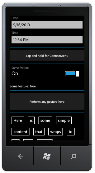
ContextMenu and ContextMenuService
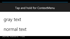
In desktop applications, ContextMenu is handy because it lets the second mouse button perform additional, contextually-relevant tasks; but on the phone, it's practically a requirement! Phone-sized UIs need to use every pixel to its fullest advantage, so being able to hide secondary commands behind a tap+hold gesture is a great way to keep the interface clean and easy to read.
The Windows Phone Toolkit's ContextMenu control is a direct port of the Silverlight 4 Toolkit's ContextMenu (read more about what it does and how it works here) with additional Windows Phone-specific functionality added on top. So the Phone ContextMenu uses the same, great 100% Silverlight- and WPF-compatible ItemsControl-based API you know and love - plus it looks good on the phone and behaves just like the system's ContextMenu does! Which means ContextMenu (along with its helper ContextMenuService) is simple to use and makes it easy for Windows Phone applications to maintain platform-consistent appearance and behavior. (And for advanced scenarios, ContextMenu supports the ICommand interface, data-binding (of and to) items, Separator, and more!)
Here's the XAML for the example above:
<Border
    Background="{StaticResource PhoneChromeBrush}"
    Padding="20">
    <toolkit:ContextMenuService.ContextMenu>
        <toolkit:ContextMenu>
            <toolkit:MenuItem
                Header="gray text"
                Click="MenuGrayTextClick"/>
            <toolkit:MenuItem
                Header="normal text"
                Click="MenuNormalTextClick"/>
        </toolkit:ContextMenu>
    </toolkit:ContextMenuService.ContextMenu>
    <TextBlock
        x:Name="MenuTextBlock"
        Text="Tap and hold for ContextMenu"
        HorizontalAlignment="Center"/>
</Border>
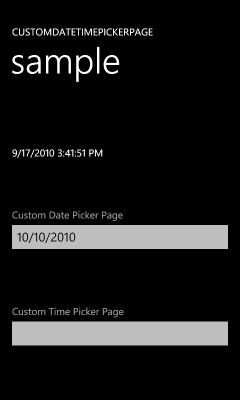
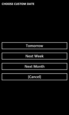
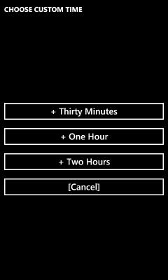
DatePicker and TimePicker
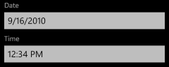
Windows Phone 7 includes a cool, distinctive UI for choosing dates and times: three vertical spinners create a fun "endless looping" experience that people really enjoy using. The Phone Toolkit's DatePicker and TimePicker controls implement the exact same experience as the core controls, so it's easy to add date and time selection to your own application!
What's more, these controls are both culture-aware and automatically configure themselves according to the settings on the user's phone (ex: d/m/y vs. m/d/y date formats and 12- vs. 24-hour time format). The API for DatePicker and TimePicker will be familiar to anyone who's used similar "picker" controls in the past. The Header convenience property simplifies the task of labeling either control - in a platform-consistent font and style!
Here's the XAML for the example above and to the right:
<toolkit:DatePicker
    Header="Date"
    Value="9/16/2010"
    ValueChanged="DatePickerValueChanged"/>
<toolkit:TimePicker
    Header="Time"
    Value="12:34 pm"
    ValueChanged="TimePickerValueChanged"/>
ToggleSwitch

The Windows Phone UI for toggling settings on and off will be immediately familiar to anyone who's used a light switch (or an iDevice). Because there are subtleties to the core controls that are tricky to get right, the Toolkit includes the ToggleSwitch control! Continuing the theme of "make it easy to match the core behavior", ToggleSwitch looks, feels, and acts just like Windows Phone users will expect - including supporting flicks and swipes. In addition to subclassing ToggleButton for consistency and usability, ToggleSwitch supports the Header convenience property to make it easy to create properly-spaced settings pages. And if the need arises, you can also provide custom Content or pull the ToggleSwitchButton primitive control out and use it directly!
Here's the XAML for the example above:
<toolkit:ToggleSwitch
    Header="Some feature"
    IsChecked="true"
    Checked="ToggleSwitchChanged"
    Unchecked="ToggleSwitchChanged"/>
GestureListener and GestureService

Touch interfaces are a lot more interactive and engaging than the conventional mouse+keyboard UI most people are used to. One of the neatest things about touch UIs are their ability to translate natural human gestures into meaningful commands. Taking good advantage of touch and gestures can significantly improve the user experience and really help an application stand out from the crowd.
To make gestures easy to work with, the Phone Toolkit includes the GestureService and GestureListener classes which provide events for the following gestures: tap, double-tap, hold, flick, drag (started/delta/completed), and pinch (started/delta/completed). All these gestures respect the relevant system parameters (ex: movement threshold, input timing, etc.), so applications that use GestureListener feel familiar and natural. All the developer needs to do is associate a GestureListener with the element(s) of interest and handle the corresponding gesture event(s) as they show up!
For more background on gestures, here's a nice, easy to visualize overview for Windows 7 (not identical, but close) and here's a detailed document specific to windows Phone 7.
Here's the XAML for the example above (note that typical applications will only hook up to the event(s) they care about):
<Border
    Background="{StaticResource PhoneChromeBrush}"
    Padding="40">
    <toolkit:GestureService.GestureListener>
        <toolkit:GestureListener
            Tap="GestureListenerTap"
            DoubleTap="GestureListenerDoubleTap"
            Hold="GestureListenerHold"
            Flick="GestureListenerFlick"
            DragStarted="GestureListenerDragStarted"
            DragDelta="GestureListenerDragDelta"
            DragCompleted="GestureListenerDragCompleted"
            PinchStarted="GestureListenerPinchStarted"
            PinchDelta="GestureListenerPinchDelta"
            PinchCompleted="GestureListenerPinchCompleted"/>
    </toolkit:GestureService.GestureListener>
    <TextBlock
        x:Name="GestureTextBlock"
        Text="Perform any gesture here"
        HorizontalAlignment="Center"/>
</Border>
WrapPanel
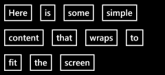
It may not be the sexiest of the Panel classes, but WrapPanel is a tremendously useful layout container! Lots of Windows Phone developers have been using this control from the Silverlight 3 Toolkit (either by referencing that assembly or by copying the code into their projects), but that can be a little tricky - so we thought we'd make it super easy by including WrapPanel in the Phone Toolkit! WrapPanel's "put as much stuff on a line as fits, then wrap to the next line" approach works particularly well on the phone - especially for scenarios where the sizes of things can vary (ex: during the transition from portrait orientation to landscape).
Here's the XAML for the example above:
<toolkit:WrapPanel>
    <Button Content="Here"/>
    <Button Content="is"/>
    <Button Content="some"/>
    <Button Content="simple"/>
    <Button Content="content"/>
    <Button Content="that"/>
    <Button Content="wraps"/>
    <Button Content="to"/>
    <Button Content="fit"/>
    <Button Content="the"/>
    <Button Content="screen"/>
</toolkit:WrapPanel>
[Click here to download the sample application used to create all the examples shown here.]
Helpful Hints for Hopeful Heroes
Here are a few tips and tidbits to help fledgling Windows Phone 7 developers make the most of the Phone Toolkit:
-
The examples I show here are from my own (deliberately simple) sample application, but there's also a more comprehensive sample application that shows off more sophisticated scenarios. The complete source code for the entire Phone Toolkit (including the sample application) can be downloaded from the CodePlex release page or the CodePlex source code page or by using any of the supported version control system clients (ex: TFS, SVN, etc.).
-
Some (but not all) of the ContextMenus used by the core phone applications get a little fancy when they show the menu: they shrink the UI of the rest of the application in the background. Because we strive to help developers create consistent applications, the Toolkit's ContextMenu does this by default as well.
But because it's not part of the application itself, our ContextMenu's behavior needs to be as self-contained as possible - which means it can not modify the existing visuals in order to create this effect. (Otherwise it might make an unexpected change that crashes the developer's application!) Therefore, the "shrink" effect is implemented by capturing a "background" screen shot of the entire application, layering it over an opaque PhoneBackgroundBrush layer to avoid transparent areas leaking through, creating a "active element" screen shot capture of just the element that was tap+held, layering this over a correspondingly-sized opaque PhoneBackgroundBrush layer (to avoid transparency issues again), creating a "menu" layer for the actual menu items, layering everything over the running application by putting it in a Popup, and finally animating the scale of the "background" layers. Whew - if that sounds like a lot of effort, it is... :)
The good news is this works pretty well in practice and duplicates the core effect fairly authentically - the less good news is that certain page designs poke little holes in the sleight-of-hand ContextMenu is doing. In many cases, such issues can be resolved by modifying the target element (the one to which the ContextMenu is attached) to have a non-transparent background. (ContextMenu's PhoneBackgroundBrush guess is the best it can do, but the application developer can sometimes do better.)
But if you still can't get the effect you're looking for - or if you just don't like the default "shrink and grow" behavior (the core applications don't use it everywhere, either!) - then you can set the (Phone-specific) ContextMenu.IsZoomEnabled property to false in order to disable the custom animation and get rid of all this goofy complexity. In every case I know of so far, developers who resorted to IsZoomEnabled were quite happy with the results! :)
-
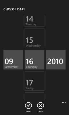
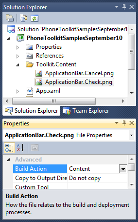 When you first add
 DatePicker or TimePicker to your application, you'll find that the "done" and "cancel" ApplicationBar icons shown when the pickers are opened are wrong. That's because the icons aren't actually being loaded - and that's because of a platform restriction. Specifically, the ApplicationBarButton.IconUri property will only load images that are part of the project and marked with Build Action=Content in the property editor. This means there's no good way for an assembly like the Phone Toolkit assembly to bundle such icons within itself (like there would be if the IconUri property supported the assembly-relative syntax "/assemblyShortName;component/resourceLocation").
As a result, it's necessary for application developers to add these two icons to a well-known path in their project where DatePicker and TimePicker will automatically use them. For your convenience, we've bundled these two icons along with the Toolkit installer and they're already on your machine! :) To find them, open the Start Menu, expand the "Microsoft Silverlight for Windows Phone Toolkit" folder, and click on the "Binaries" item. This will open a Windows Explorer view of the install location of the Phone Toolkit (something like C:\Program Files\Microsoft SDKs\Windows Phone\v7.0\Toolkit\Sep10\Bin). The icons can be found in the "Icons" sub-folder within.
To use these two icons in an application, right click the application's project node in the Visual Studio Solution Explorer, choose "Add", choose "New Folder", and rename it "Toolkit.Content". Then right-click on the new folder, choose "Add", choose "Existing Item...", navigate to the Phone Toolkit's install directory, select both icons, and hit "OK". Right-click each icon and change its "Build Action" to "Content"; re-run the application, and they'll show up just like you expect! (And if any of that seemed confusing, just look at how the sample application is configured - match that and you'll be fine.)
-
If you already know Windows Phone 7 supports different themes ("Light" and "Dark", AKA "white background" and "black background"), you might wonder why it's not necessary to provide "Light" and "Dark" versions of each icon... Well, the platform's a little clever here - it will automatically "Light"-ify "Dark" icons when the "Light" theme is active. Therefore, all we need to do is provide is "Dark" versions of the icons - the system converts them for us!
Note: The reverse is not true; "Light" icons will not be "Dark"-ified for you. (So it seems like maybe the "Dark" side is more powerful?)
-
We've already discussed the reasons why it's good for controls to use the Popup control (because it keeps things isolated from the rest of the application), so DatePicker and TimePicker obviously use Popup too, right? Wrong! :)
To be fair, DatePicker and TimePicker originally used a Popup for exactly those reasons. And life was good. Except when you tried to scroll the time/date spinners in the picker view... It worked okay, but the frame-rate was pretty low - almost as if the animations weren't happening on the composition (render) thread like they were supposed to... And, indeed, they weren't! It turns out the phone platform doesn't apply hardware acceleration to content in a Popup. :(
Enough people were unhappy with the performance that DatePicker and TimePicker were modified to use a PhoneApplicationPage-based model instead. What this means is that instead of opening a Popup to hold the picker's spinner UI, these controls instead call NavigationService.Navigate("...") and point it to a Page subclass that's hosted in the same control assembly. The platform doesn't care where it loads pages from, so it happily navigates to the new Page, which then loads the spinners, which benefit from hardware acceleration, and therefore scroll smoothly!
If this sounds like a wonderful solution, that's because it is - mostly. The big drawback to the Page-based approach is that it subtly breaks one of the guidelines of control development we discussed above: don't make changes that affect the application. In this case, if the application is already listening to the NavigationService's Navigating or Navigated events, then it will also see the "hidden" navigations that DatePicker and TimePicker are performing.
Whether this is a problem or not depends on what the application is doing and how it's doing it. The good news is that most applications don't track navigations and won't need to worry about this at all; for applications that do track navigations, the good news is that this scenario is easy to detect. Specifically, if the object exposed by NavigationEventArgs.Content during a navigation implements IDateTimePickerPage, then the current navigation is part of DatePicker or TimePicker's behavior and should be ignored by the application. Applications that follow that simple guideline should be safe; applications that ignore it and play tricks like cancelling DatePicker and TimePicker navigations will most likely break stuff. :(
-
Now that I've thoroughly scared everyone away from ever using Page-based navigations, let me back-pedal a bit and say that there are some cool things you can do with them! In particular, DatePicker and TimePicker allow you to customize their destination Page which lets you completely change the picker experience for both of them. But I've already gone on long enough here; that'll be the topic of a subsequent blog post... :)
We've had a lot of fun building the Silverlight for Windows Phone Toolkit - and we hope you have a lot of fun using it! Everything in the Phone Toolkit is there because there was strong customer demand. The Silverlight Toolkit team has heard you loud and clear, and we're doing our best to make your Windows Phone 7 development experience as pleasant and productive as possible!
Okay, enough chatter for now - go download the developer tools and get busy building great applications! :)