Alive and kickin' [New Silverlight 4 Toolkit released with today's Silverlight 4 RTW!]
The Silverlight team released Silverlight 4 today and it includes a variety of compelling new features and great improvements for all kinds of scenarios. You can learn more about the new platform hotness in the Silverlight 4 Technical Feature Overview.
Congratulations to the team on another great release!
To help celebrate the event, we have just published the April '10 release of the Silverlight Toolkit! If you're new to Silverlight 4 or the Silverlight Toolkit, you might start by reviewing my November 09 Toolkit announcement to see what was in the Silverlight 4 Beta Toolkit. Once you've done that, you're ready for my take on the...
Silverlight 4 Toolkit April '10 Release Notes
ContextMenu (New!)
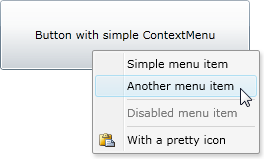
Silverlight 4 allows applications to handle the right mouse button (via the UIElement.MouseRightButtonDown event), and the showcase control for that is ContextMenu! (If you're not familiar with ContextMenu, here's an overview of the WPF version.). While I considered starting from an existing implementation, the handful I saw didn't match the WPF class hierarchy. Because compatibility is a big priority for us, I wrote the Toolkit's ContextMenu from scratch - and this is a 100% WPF-compatible subset implementation. Which means that existing properties/methods/events should behave the same on Silverlight as they do on WPF - something that makes porting existing code from WPF to Silverlight very straightforward.
That said, please pay attention to the word "subset"; the Toolkit's ContextMenu doesn't have all the features of WPF's quite yet. Notably, it doesn't support multi-level menu item nesting. However, none of the customers I asked felt that nesting was necessary right now, so I don't expect its absence to be a big limitation.
Okay, enough about what's not there; here's what is there:
- WPF-subset
ContextMenuimplementation based on the ItemsControl model - ContextMenuService, ContextMenu, MenuItem, Separator, MenuBase classes
- Mouse and keyboard support
- Click and ICommand (Command/CommandParameter) support
- Header and Icon support
- IsOpen property, Opened/Closed events, OnOpened/OnClosed virtuals
- HorizontalOffset/VerticalOffset properties for custom positioning
- Familiar, attractive default UI
XAML for the example above:
<Button
    x:Name="MyButton"
    Content="Button with simple ContextMenu">
    <toolkit:ContextMenuService.ContextMenu>
        <toolkit:ContextMenu>
            <toolkit:MenuItem
                Header="Simple menu item"
                Click="MenuItem_Click"/>
            <toolkit:MenuItem
                Header="Another menu item"
                Click="MenuItem_Click"/>
            <toolkit:Separator/>
            <toolkit:MenuItem
                Header="Disabled menu item"
                IsEnabled="False"/>
            <toolkit:Separator/>
            <toolkit:MenuItem
                Header="With a pretty icon"
                Click="MenuItem_Click">
                <toolkit:MenuItem.Icon>
                    <Image Source="Paste.png"/>
                </toolkit:MenuItem.Icon>
            </toolkit:MenuItem>
        </toolkit:ContextMenu>
    </toolkit:ContextMenuService.ContextMenu>
</Button>
If you're looking for more examples of how to use ContextMenu, just about any WPF sample you find should be useful. The one thing to keep in mind is that Silverlight 4 doesn't have the FrameworkElement.ContextMenu property that's often used to attach a ContextMenu to an element. Instead, it is always necessary to use the (functionally equivalent and more flexible) ContextMenuService.ContextMenu attached property like I show above.
ContextMenu is useful in a variety of scenarios - some of them are obvious (like the example above) and some a little less so. For an example, please...
[Click here for my follow-up post about ContextMenu.]
[Or click here to download the sample application for this post containing all the examples.]
Stacked series support (New!)
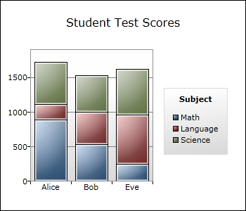
One common feature request for the Data Visualization assembly in the Silverlight Toolkit (and WPF Toolkit) has been support for stacked series (like you see in the example above). This release of the Silverlight Toolkit includes full stacking support, which means all of Excel's top-level series types are supported in both normal and stacked modes! The following eight series classes are now available in the Data Visualization assembly:
StackedBarSeriesStackedColumnSeriesStackedLineSeriesStackedAreaSeriesStacked100BarSeriesStacked100ColumnSeriesStacked100LineSeriesStacked100AreaSeries
Another common request has been better performance - and that's something else this release includes. While existing applications aren't likely to see a big difference by default, there's a trivial change that can be made to many scenarios to enable significant performance gains for BarSeries, ColumnSeries, LineSeries, AreaSeries, and ScatterSeries.
And because customer scenarios involving selection (including "drill down") come up a lot more often than you'd think, the new stacked series types also offer full ListBox-style selection support, including multi-select and all the associated events/properties.
Based on the fact that a stacked series showing a single set of data is morally equivalent to the corresponding non-stacked series, it's clear that you can get these benefits for existing scenarios, too. In fact, I've added five additional wrapper classes to make it even easier to do so!
XAML for the example above:
<toolkit:Chart
    Title="Student Test Scores"
    LegendTitle="Subject">
    <toolkit:Chart.Resources>
        <Style TargetType="toolkit:LinearAxis">
            <Setter Property="Minimum" Value="0"/>
        </Style>
    </toolkit:Chart.Resources>
    <toolkit:StackedColumnSeries>
        <toolkit:SeriesDefinition
            Title="Math"
            ItemsSource="{Binding}"
            DependentValuePath="MathScore"
            IndependentValuePath="StudentName"/>
        <toolkit:SeriesDefinition
            Title="Language"
            ItemsSource="{Binding}"
            DependentValuePath="LanguageScore"
            IndependentValuePath="StudentName"/>
        <toolkit:SeriesDefinition
            Title="Science"
            ItemsSource="{Binding}"
            DependentValuePath="ScienceScore"
            IndependentValuePath="StudentName"/>
    </toolkit:StackedColumnSeries>
</toolkit:Chart>
There's a lot that went on under the hood to add this new support, and some of the details are pretty interesting - but it's necessary to understand a bit about how stacked series came about in the first place. Because I want to keep these release notes brief, please...
[Click here for my follow-up post about stacked series support.]
[Or click here to download the sample application for this post containing all the examples.]
SystemColors theme (New!)
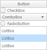
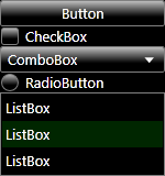
Some customers have asked for an easy way to get a Silverlight application to honor the color settings of the host operating system. This typically comes up in the context of high contrast mode (shown above on the right) and improved accessibility support, but it's also generally applicable. So the UX team created a custom theme for this, and I've incorporated their work into this release of the Silverlight Toolkit as the new SystemColors theme. Just like the 11 themes already in the Toolkit, using it is as easy as wrapping some content in an instance of the SystemColors theme container - everything inside automatically gets the new styles!
XAML for the example above:
<toolkit:SystemColorsTheme>
    <StackPanel>
        <Button Content="Button"/>
        <CheckBox Content="CheckBox"/>
        ...
    </StackPanel>
</toolkit:SystemColorsTheme>
Actually, it can be even easier than that!
Theme base class improvements
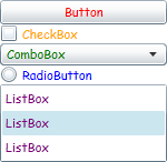
Because Silverlight 4's support for implicit styling makes theming so much easier, the Theme base class has been enhanced and is now more useful than ever. For starters, there's a ThemeUri property which can point to an external file to use as the theme. This reference can be a URL for a web resource like /MySiteWideTheme.xaml which gives sites the freedom to change a theme after an application has been deployed. Or it can point to an assembly resource via the /AssemblyShortName;component/ResourceLocation syntax discussed here. In this second case, the theme is loaded immediately; otherwise it is downloaded asynchronously and applied as soon as the download completes. Even better, ThemeUri can be changed dynamically by applications that allow users to change their themes "on the fly".
The format of a theme file is exactly what you'd expect: a generic.xaml-like ResourceDictionary containing one or more implicit styles. This is how the Toolkit classes store their theme resources, so those themes are accessible in the same manner. This makes it easy to dynamically switch among any of the Toolkit themes, too!
Okay, that's pretty cool and all, but sometimes you want to theme an entire application and you don't want to have to wrap every page in its own theme container. No sweat, that's what the new ApplicationThemeUri attached property is all about! Just open your project's App.xaml and set the ApplicationThemeUri property on the Application object (just as you would for ThemeUri on the Theme class). When ApplicationThemeUri is used, the corresponding implicit styles are added at the application level and automatically apply to every page.
Can it get any easier? Yes! IsApplicationTheme attached property. Much like ApplicationThemeUri, you set this property in App.xaml on the Application object. But because IsApplicationTheme is a simple bool value, you don't have to mess with ugly, confusing URI formats or even know what a URI is! Just set it (to True), and forget it!
XAML for the example above:
<toolkit:Theme ThemeUri="/ToolkitSamplesApril10;component/CustomTheme.xaml">
    <StackPanel>
        <Button Content="Button"/>
        <CheckBox Content="CheckBox"/>
        ...
    </StackPanel>
</toolkit:Theme>
<ResourceDictionary
    xmlns="http://schemas.microsoft.com/winfx/2006/xaml/presentation">

    <Style TargetType="Button">
        <Setter Property="FontFamily" Value="Comic Sans MS"/>
        <Setter Property="Foreground" Value="Red"/>
    </Style>

    <Style TargetType="CheckBox">
        <Setter Property="FontFamily" Value="Comic Sans MS"/>
        <Setter Property="Foreground" Value="Orange"/>
    </Style>

    ...

</ResourceDictionary>
Alternatively:
<Application xmlns="http://schemas.microsoft.com/winfx/2006/xaml/presentation"
             xmlns:x="http://schemas.microsoft.com/winfx/2006/xaml"
             x:Class="ToolkitSamplesApril10.App"
             xmlns:toolkit="http://schemas.microsoft.com/winfx/2006/xaml/presentation/toolkit"
             toolkit:Theme.ApplicationThemeUri="/ToolkitSamplesApril10;component/CustomTheme.xaml">
    <Application.Resources>
    </Application.Resources>
</Application>
Or:
<Application xmlns="http://schemas.microsoft.com/winfx/2006/xaml/presentation"
             xmlns:x="http://schemas.microsoft.com/winfx/2006/xaml"
             x:Class="ToolkitSamplesApril10.App"
             xmlns:toolkit="http://schemas.microsoft.com/winfx/2006/xaml/presentation/toolkit"
             toolkit:SystemColorsTheme.IsApplicationTheme="True">
    <Application.Resources>
    </Application.Resources>
</Application>
[Click here to download the sample application for this post containing all the examples.]
Test Framework improvements and new UI
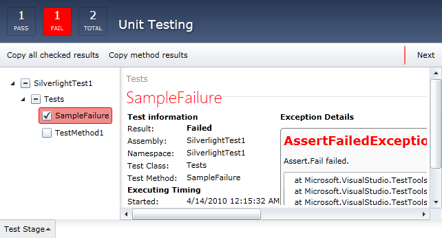
The Silverlight Unit Test Framework that comes with the Toolkit has been updated to include:
- Out-of-browser support for Silverlight applications
- Support for testing Windows Phone 7 applications
- A new, more functional user interface
Note: The two Unit Test Framework assemblies (Microsoft.Silverlight.TestingandMicrosoft.VisualStudio.QualityTools.UnitTesting.Silverlight) are no longer located in theBindirectory of the Toolkit install - they have been moved to a newTestingdirectory instead. This was done to prevent many of the classes used by the new UI from showing up in the Visual Studio and Blend designers and confusing people. However, this location change could cause existing applications that reference the test assemblies to fail to compile due to the "missing" references. If that happens, please delete the two broken references and create references to these assemblies in their new location. Everything else should continue to work as expected.
For more information about changes to the Silverlight Unit Test Framework, please have a look at Jeff Wilcox's blog.
PanelDragDropTarget (New!)
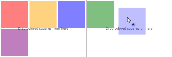
A new DragDropTarget has been added to make it easy to support drag/drop scenarios with Panel subclasses like Grid and WrapPanel. Simply wrap the relevant Panel in an instance of PanelDragDropTarget (like you see below), and the Toolkit's drag/drop framework automatically allows users to drag items out of that container with full visual feedback about what's being dragged and what the drop action will be. To allow dropping items into the container, just set its AllowDrop property to True and the details are handled seamlessly.
XAML for the example above:
<Border Grid.Column="0">
    <Grid>
        <TextBlock Text="Drag colored squares from here"/>
        <toolkit:PanelDragDropTarget>
            <toolkit:WrapPanel>
                <Rectangle Fill="Red"/>
                <Rectangle Fill="Orange"/>
                <Rectangle Fill="Green"/>
                <Rectangle Fill="Blue"/>
                <Rectangle Fill="Purple"/>
            </toolkit:WrapPanel>
        </toolkit:PanelDragDropTarget>
    </Grid>
</Border>

<Border Grid.Column="1">
    <Grid>
        <TextBlock Text="Drop colored squares on here"/>
        <toolkit:PanelDragDropTarget>
            <toolkit:WrapPanel
                AllowDrop="True"
                Background="Transparent"/>
        </toolkit:PanelDragDropTarget>
    </Grid>
</Border>
For more about other DragDropTargets and how they work, please have a look at Jafar Husain's series of posts on the topic.
[Click here to download the sample application for this post containing all the examples.]
TreeView Scenario Examples (New!)
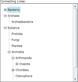
There are some fairly common TreeView scenarios that tend to stymie people who try to implement them in WPF or Silverlight. So this release of the Toolkit includes complete, run-able examples of some of these scenarios in the Toolkit sample application. None of the scenarios requires changing TreeView code - but there are a couple of fancy XAML tricks in there.
For a look at the new samples, please visit the live Toolkit samples application, navigate to the TreeView node, and switch to the "Templating" tab.
Improved XmlnsDefinition support
Now that Silverlight 4 honors the URI form of XmlnsDefinitionAttribute, we use that to simplify the list of namespace mappings needed by typical applications. Specifically, the primary namespaces of all Toolkit assemblies share the URI http://schemas.microsoft.com/winfx/2006/xaml/presentation/toolkit which maps to the prefix "toolkit" by default.
So instead of wrestling with this big glob of XAML goo:
xmlns:controls="clr-namespace:System.Windows.Controls;assembly=System.Windows.Controls.Toolkit"
xmlns:layout="clr-namespace:System.Windows.Controls;assembly=System.Windows.Controls.Layout.Toolkit"
xmlns:input="clr-namespace:System.Windows.Controls;assembly=System.Windows.Controls.Input.Toolkit"
xmlns:datavis="clr-namespace:System.Windows.Controls.DataVisualization;assembly=System.Windows.Controls.DataVisualization.Toolkit"
xmlns:charting="clr-namespace:System.Windows.Controls.DataVisualization.Charting;assembly=System.Windows.Controls.DataVisualization.Toolkit"
xmlns:theming="clr-namespace:System.Windows.Controls.Theming;assembly=System.Windows.Controls.Theming.Toolkit"
The following is now all you need (and will be automatically used by both Visual Studio and Blend):
xmlns:toolkit="http://schemas.microsoft.com/winfx/2006/xaml/presentation/toolkit"
Aside: If you're someone like me who writes your XAML by hand, there's no need to memorize the URI above - just copy the default xmlns from the top of any XAML file and add "/toolkit" to the end!
You can read more about this feature in the Silverlight SDK article about a similar change for the SDK assemblies.
Changed AssemblyFileVersion for all assemblies

Based on feedback from the Visual Studio and Blend teams regarding design-time issues when the Silverlight 3 and Silverlight 4 Toolkits were both installed, we've changed the AssemblyFileVersion of all Silverlight 4 Toolkit assemblies. Where it used to be 2.0.5.0 (which is what's used by versions of Silverlight so far), Toolkit assemblies now specify 4.0.5.0. This change resolves the confusion for both design tools by uniquely distinguishing the Silverlight 3 and Silverlight 4 Toolkit assemblies.
Removed the Reactive Extensions dependency
In previous releases, limited parts of the Silverlight Toolkit made use of the Reactive Extensions for .NET (Rx) library internally. Those Toolkit assemblies therefore had a direct dependency on the version of the Rx assemblies we referenced when we compiled the Toolkit. However, Rx binaries released by the Rx team in the time since we published the last Toolkit have included some breaking changes. This has caused frustration for customers wanting to use more recent Rx bits in their own applications because of the fact that a XAP can contain only one instance of a particular assembly. Those customers were often unable to upgrade successfully as a result of mismatched Rx assembly versions. Because of the feedback we've received here, Toolkit assemblies no longer have a dependency on the Rx assemblies and applications are again free to reference whatever version of Rx they wish!
Note: Most applications should be completely unaffected by this change. However, if your project has specific references to any of the Rx assemblies that were previously located in theBindirectory of the Toolkit install (System.CoreEx.dll,System.Interactive.dll, orSystem.Reactive.dll), those references are no longer valid and should be removed. In rare cases, it may be necessary to add an explicit reference to their replacement assembly,System.Windows.Controls.Toolkit.Internals.dll, which is now present in theBindirectory instead.
Removed System.ComponentModel.Composition.Packaging.Toolkit
MEF's PackageCatalog class was renamed to DeploymentCatalog and moved to the System.ComponentModel.Composition.Initialization assembly that is part of the Silverlight 4 SDK. The System.ComponentModel.Composition.Packaging.Toolkit assembly was left with nothing in it and therefore removed from the Silverlight Toolkit.
Various bug fixes
This release also includes bug fixes for a variety of problems customers have reported or that were identified internally.
As you can see, the Toolkit has a lot of new stuff for Silverlight 4! Of course, the first thing to do is install Silverlight 4! Once you've done that, please check out the live Toolkit samples application, download the Toolkit installer, and start writing great applications!
We hope you enjoy the new release!!