ListPicker? I hardly even know 'er! [A detailed overview of the Windows Phone Toolkit's ListPicker control]
In yesterday's post, I announced the second release of the Silverlight for Windows Phone Toolkit and gave an overview of the four new controls it includes. (For a discussion of the controls in the original Windows Phone Toolkit, please see my announcement for that release.) In today's post, I want to focus on one of the new controls, ListPicker, and discuss it in detail.
The sample application associated with the official Windows Phone Toolkit download offers a great overview of the Windows Phone Toolkit controls, but (deliberately) doesn't get into specific detail on any of them. This post is all about details, so I've written a dedicated sample application which is the source of all the XAML snippets and screenshots below:
[Click here to download the complete source code for the ListPickerSamples application.]
Background
From my previous post:
ListPickeris the Windows Phone 7 equivalent of the ComboBox control: give it a list of items and it will show the selected one and also allowing the user to pick from a list if they want to change it. The core applications on Windows Phone 7 implement two kinds of list selection: an in-place expander for picking among five or fewer items, and a full-screen popup for picking among more. The Toolkit'sListPickercontrol combines both experiences into one handy package by automatically selecting the right UX based on the number of items in its list! It is a standard ItemsControl subclass with all the common elements of a Selector, so the API will be familiar to just about everyone. In fact, you can take most existing ListBoxes and convert them toListPickers just by changing the control name in XAML!
That's the gist: ListPicker is the control of choice for selecting values in Windows Phone 7 applications. To be more explicit, it is most appropriate in "Settings"-like scenarios where the user is offered a variety of different options and it makes sense to display only the current value (with an option to show everything once the user decides to make a change). Conversely, ListPicker is not appropriate for displaying long lists of data that the user is going to scan and scroll; scenarios like the "People" or "Marketplace" applications are better served by a ListBox or the Windows Phone Toolkit's new LongListSelector.
Typical Use
The most common scenario for ListPicker looks something like this:
<StackPanel>
    <toolkit:ListPicker
        Header="Rating"
        ItemsSource="{Binding Ratings}"
        SelectedIndex="1"
        SelectionChanged="RatingSelectionChanged"/>
    <TextBlock
        x:Name="RatingSelection"
        CacheMode="BitmapCache"/>
    ...
</StackPanel>
Which gets displayed like this (in normal and expanded forms):


As you'd expect for an ItemsControl subclass, the ItemsSource property is used to provide the list of items (see also: the Items property). And as you'd expect for a Selector-like control, the SelectionChanged event is used to signal changes and the SelectedIndex property is used to get or set the selection (see also: SelectedItem). Everything so far looks just like ListBox - the only difference is the Header property which can optionally be used to provide a simple, platform-consistent label for the ListPicker that offers additional context about the control's purpose (see also: HeaderTemplate).
Aside: The built-inListBoxcontrol will throw an exception if you setSelectedIndexas in the example above because it tries to apply the selection before the Binding has provided the list of items.ListPickerspecifically handles this common scenario so you don't have to jump through hoops to make it work. :)
Custom Templates
Displaying strings is all well and good, but sometimes it's nice to display richer content:

The first thing to do is set the ItemTemplate property as you would for ItemsControl or ListBox - that applies the specified DataTemplate to each item and formats it attractively in the usual manner. That works great, but what about ListPicker's Full mode that's used when the list has too many items? By default, the same ItemTemplate automatically applies there, too, so you may not need to do anything more! However, the Full mode UI uses the entire screen, so it's pretty common to want to specifically customize the appearance of the items for that mode. Therefore, the FullModeItemTemplate property lets you provide a different DataTemplate to be used in the Full mode scenario. Another relevant property for such cases is FullModeHeader which sets the content that's shown at the top of the full-screen "popup".
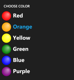
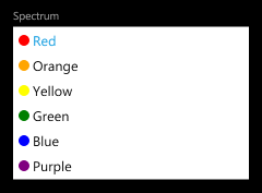
<toolkit:ListPicker
    Header="Spectrum"
    FullModeHeader="CHOOSE COLOR"
    ItemsSource="{Binding Rainbow}"
    ItemTemplate="{StaticResource RainbowTemplate}"
    FullModeItemTemplate="{StaticResource LargeRainbowTemplate}"/>
Threshold Overrides
By default, lists with five or fewer items expand in-place while lists with more items switch to a full-screen selection interface. This behavior matches the platform guidelines, but sometimes it might make sense to nudge the threshold one way or another (for very large or very small items, perhaps). You might even want to force a ListPicker to always use Expanded or Full mode...

For these scenarios, there's the ItemCountThreshold property: it specifies the maximum number of items that will be displayed in Expanded mode. In addition to nudging it up or down a bit for custom scenarios, it can also be set to 0 to "always use Full mode" or a very large number to "always use Expanded mode". Granted, an application that forces Expanded mode for a list of 1000 items probably won't be easy to use - but the freedom is there to allow developers and designers to dial-in exactly the kind of experience they want.
<toolkit:ListPicker
    Header="Rating"
    FullModeHeader="CHOOSE RATING"
    ItemsSource="{Binding Ratings}"
    ItemCountThreshold="0"/>
<toolkit:ListPicker
    Header="Spectrum"
    ItemsSource="{Binding Rainbow}"
    ItemTemplate="{StaticResource RainbowTemplate}"
    ItemCountThreshold="100"/>
Two-Way Binding

As you'd expect, ListPicker can be used with TwoWay Bindings as well. This is particularly convenient for the SelectedIndex/SelectedItem properties where it's common to want to set the initial value based on a data model (see also: MVVM) and/or when you want the model to update directly when selection changes. The corresponding XAML looks just how you'd expect:
<toolkit:ListPicker
    Header="Network"
    ItemsSource="{Binding Networks}"
    SelectedItem="{Binding CurrentNetwork, Mode=TwoWay}"/>
<StackPanel
    Orientation="Horizontal"
    Margin="{StaticResource PhoneMargin}"
    CacheMode="BitmapCache">
    <TextBlock Text="Current Network: "/>
    <TextBlock Text="{Binding CurrentNetwork}"/>
</StackPanel>
Tips and Tricks
At this point, I hope everyone knows how ListPicker works and has a good feel for when/where/why/how to use it. That being the case, there are a few additional things I'd like to draw attention to:
-
The
ListPickerphilosophy is that "there is always an active selection", so it makes sure to select an item when it initializes or when the list changes. This automatic selection (of the first item in most cases) causes theSelectionChangedevent to fire - and that causes the application's associated event handler to run (assuming one has been registered). In practice, this "initialization-time" event catches some people by surprise - but it's the intended behavior (and folks tend to agree it's correct once they understand why it happens). Now that you know about it, maybe your development experience will be a bit easier. :)Aside: If you want to ignore this event in code, it should be easy to detect because its SelectionChangedEventArgs.RemovedItems collection will be empty (have 0 items). And the only time that happens is when
ListPickeris transitioning from an empty list to a non-empty one (e.g., on startup). -
ListPicker's transitions betweenNormalandExpandedmode are effectively animations of the control's Height. BecauseHeightchanges cause a layout pass, they don't take place on the composition thread and therefore are more susceptible to performance issues. An easy way to mitigate this in the typical "list of items in a StackPanel" scenario is to add CacheMode=BitmapCache to the elements that appear below theListPicker(i.e., those that are pushed down by the animation). Please refer back to the first XAML snippet for an example - this tweak allows the Silverlight layout system to animate such controls as bitmaps and that helps the animation run a bit more smoothly.Aside: If you don't want to apply
BitmapCacheto every control individually, an alternate approach is to wrap the affected controls in anotherStackPaneland set theCacheModeproperty on the StackPanel instead. Please see the last XAML snippet above for an example of this. -
If you have a long list of controls in a
StackPanelinside a ScrollViewer and there's aListPickernear the bottom usingExpandedmode, that expansion does not automatically scroll the screen to keep theListPickercompletely in view. On WPF, the fix would be a simple matter of calling FrameworkElement.BringIntoView. However, Silverlight doesn't have that API and there doesn't seem to be a good general purpose way forListPickerto find the right parent to scroll. (Although walking up the visual tree to find the firstScrollVieweris probably right in most cases, it's not a sure thing;ListPickererrs on the side of caution and doesn't try to make guesses.) In practice, the underlying issue doesn't come up very often - when it has, my suggestion has been to use theItemCountThresholdproperty to force the relevantListPickerto useFullmode (which doesn't expand, so it doesn't alter the parent's layout, so it doesn't have this problem).
Summary
ListPicker is a relatively straightforward control that should be familiar to anyone who's used the standard ListBox. But while its API may be unremarkable, its user experience is all Windows Phone 7 goodness! :)
I hope you enjoy it!