The blog of dlaa.me

Posts tagged "Silverlight"

You've got to know where you've been to know where you're going [Some background on Charting's ordered multiple dictionary implementation]

As I've said before, one of our key goals for the March 09 release of Silverlight/WPF Charting was to improve the performance of key customer scenarios. I didn't go into a lot of details with the release notes, but one of the ways we accomplished this was to change some code that had been doing a linear search to use a binary search instead. (Example: Finding the high/low data point values as part of the process of setting the range of an axis.) If this optimization seems obvious and makes you think "golly, they should have done it that way in the first place", you're absolutely right. :) It's not that we didn't want to do this earlier; it was just that we didn't have the resources to do so...

What we hoped to take advantage of was some already-written-and-tested class implementing an ordered multi-dictionary (a kind of associative array) that could be dropped right into the Silverlight Toolkit source code and used without concern. After we found a suitable implementation, we established that it did, indeed, improve performance on non-trivial data sets in the way that we hoped. Unfortunately, something came up at the last minute and we decided not to proceed with the code we'd been using for the previous few weeks. That left us in kind of a funk because we didn't want to give up the performance improvements we'd already seen...

So I set aside some other tasks and dashed off a quick binary tree implementation to do what we needed and preserve the performance gains from faster searching. The resulting code for BinaryTree is part of the Charting source code and can be viewed here or as part of the Silverlight Toolkit download. It's fairly simple and straightforward, though there are a few things worth calling out:

  • A binary tree (indexed by key, duplicates replace, values don't matter) doesn't follow quite the same semantics as an ordered multi-dictionary (indexed by key, duplicates do not replace, values matter). I needed to come up with an easy way to merge the two notions and the trick I came up with was to change the search function (named KeyAndValueComparison) from being key-based to being key-and-value-based. Simply by incorporating the value into the comparison, I pretty easily created a multi-dictionary (i.e., something that can store multiple values for the same key). What's more, it automatically clusters by key and orders the values under every key! The only remaining problem is what to do with key+value duplicates - and the answer is simple: store them all together in the tree. By relaxing the binary tree definition slightly to allow for same-valued nodes, it's easy enough to store identical nodes "beside" each other. The same search/remove logic still applies under the new rules - all that changes is a slight tweak to the add logic!
  • This implementation is just a simple binary tree, so there's no guarantee of balance like there is with more sophisticated algorithms. In fact, because the rules about where new nodes go are strict, there's no freedom when it comes time to place a new node. The only time there's any choice is when a key+value duplicate is added (or removed) - once the matching node in the tree is found, the new node could be added to its left or its right. In a feeble attempt to create balance, this BinaryTree implementation alternates left/right in these cases. Unfortunately, it's not likely to help much because key+value duplicates are typically not the primary scenario...
  • Because it was an easy performance win, this implementation uses an iterative add implementation (vs. the traditional recursive one). The delete operation is somewhat more complex and follows the usual recursive approach - which can be problematic for certain inputs. 
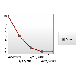
:( Imagine the scenario of adding 1000 elements to a BinaryTree where the keys are already in numerical order. (By the way, this isn't as unlikely as it sounds; people frequently chart data that is already sorted!) In this case, the tree will "go linear" and all the nodes will lie in a line off to the right side. Conveniently, removing the same nodes in the same order (the common scenario for Charting!) is wicked fast - the node that gets removed is always the root node which is both fast to find and fast to update. However, if one were to remove the nodes in reverse order, there's a good chance the stack would overflow instead. :( This is because the node that should be removed is at the end of a long chain of 1000 nodes and the recursive remove calls build up quickly and soon overwhelm the system. So please don't do that with this implementation!
  • One of the handy helper methods I ended up writing is Traverse which does an iterative inorder walk of the entire tree and returns a sequence of items selected by the selection function from nodes that match the comparison function. Traverse makes it easy to build more sophisticated methods - GetKeys, GetValuesForKey, and GetValuesForAllKeys are all simple 1-liners thanks to the power of Traverse. Similarly, the GetExtreme method does a binary search according to the successor function and returns some aspect of the most extreme node according to the selector function. MinimumKey, MaximumKey, MinimumValue, and MaximumValue are all simple 1-liners thanks to the flexibility of GetExtreme.
  • BinaryTree is a generic class and supports completely arbitrary key and value types. In order to avoid imposing unnecessary restrictions on the generic types (ex: that they implement the IComparable interface), BinaryTree's constructor takes a Comparison(T) delegate for comparing keys and another for comparing values. As long as you can write code to compare two keys/values of the type you've chosen according to the necessary contract, BinaryTree is happy to work with them!

So that's a bit of background on the BinaryTree class that's used by Silverlight/WPF Charting today. An unbalanced binary tree doesn't give the best performance in the world, but it was quick and easy to implement (under time pressure!) and gives a noticeable boost to many of the common scenarios we set out to improve.

And as it happens, this is all very relevant to the topic of my next post! Here's a hint; see if you can guess what it is... :)

Chart tweaking made easy [How to: Make four simple color/ToolTip changes with Silverlight/WPF Charting]

While answering a support forum question I'd seen a couple of times before, I figured it would be helpful to write a post showing how to make simple styling changes to charts created by the Charting controls that come with the Silverlight Toolkit. Note that I said simple changes - if you want to make more dramatic changes, you should go read some of the excellent tutorials Pete Brown has written on the topic. Links to Pete's posts (and other interesting posts) can be found on my latest Charting links post.


The sample application we'll be working with here shows off four scenarios and looks like this:

Styling Sample


Simple Color Change

In this scenario we have a basic Chart with a ColumnSeries and want to change the color to purple. As you'd expect, this is quite easy to do: we provide a custom Style that sets the Background color to purple and we're done!

It's worth pointing out that we could add more Setters to this Style to customize things further - but I promised I'd keep this simple, so we won't do that right now. :)

<charting:Chart
    Title="Simple Color Change">
    <charting:ColumnSeries
        ItemsSource="{Binding}"
        DependentValueBinding="{Binding Length}"
        IndependentValueBinding="{Binding}">
        <charting:ColumnSeries.DataPointStyle>
            <Style TargetType="charting:ColumnDataPoint">
                <Setter Property="Background" Value="Purple"/>
            </Style>
        </charting:ColumnSeries.DataPointStyle>
    </charting:ColumnSeries>
</charting:Chart>


Custom ToolTip (Column)

For this example, the setup is the same as last time except that now we want to change the default ToolTip that appears when the user hovers over any of the columns. As with just about every other visual default, the standard ToolTip is part of the ColumnDataPoint's default Template. So in order to customize it we start with a copy of that Template and modify it to suit our needs. Blend makes this easy, but I'm most comfortable in Visual Studio, so what we'll do here is go to the source code for ColumnDataPoint.xaml and copy the Style there to the Application.Resources section of our App.xaml.

Aside: You can also use my handy-dandy SilverlightDefaultStyleBrowser for this. What's more, SilverlightDefaultStyleBrowser works even when you don't have access to source code for the control you're styling, so it's something to keep in mind for those occasions when Blend isn't readily available. :)

Copying done, we can tweak the ToolTip to include a custom message as follows:

<ToolTipService.ToolTip>
    <StackPanel>
        <ContentControl
            Content="Custom ToolTip"
            FontWeight="Bold"/>
        <ContentControl
            Content="{TemplateBinding FormattedDependentValue}"/>
    </StackPanel>
</ToolTipService.ToolTip>

After that, and it's simply a matter of assigning our customized Style/Template to the DataPointStyle property of the ColumnSeries:

<charting:Chart
    Title="Custom ToolTip">
    <charting:ColumnSeries
        ItemsSource="{Binding}"
        DependentValueBinding="{Binding Length}"
        IndependentValueBinding="{Binding}"
        DataPointStyle="{StaticResource MyColumnDataPointStyle}"/>
</charting:Chart>


Simple Palette Change

What we've done so far will work for all of the current series except for PieSeries which is special because each of its PieDataPoints gets a unique Style. In other words, there's no DataPointStyle property on PieSeries because one value just isn't enough! Therefore, PieSeries exposes a StylePalette property just like Chart does and we can use that to provide a collection of Styles for the pie slices. (Note that we can provide as many or as few as we want; PieSeries will start at the beginning and automatically loop through the collection as necessary.)

In this case, we know our data has exactly four items, so we'll provide exactly four custom Styles to set the colors we want. Other than using a list this time around, it's just like the first example we saw:

<charting:Chart
    Title="Simple Palette Change">
    <charting:PieSeries
        ItemsSource="{Binding}"
        DependentValueBinding="{Binding Length}"
        IndependentValueBinding="{Binding}">
        <charting:PieSeries.StylePalette>
            <datavis:StylePalette>
                <Style TargetType="charting:PieDataPoint">
                    <Setter Property="Background" Value="Red"/>
                </Style>
                <Style TargetType="charting:PieDataPoint">
                    <Setter Property="Background" Value="Orange"/>
                </Style>
                <Style TargetType="charting:PieDataPoint">
                    <Setter Property="Background" Value="Green"/>
                </Style>
                <Style TargetType="charting:PieDataPoint">
                    <Setter Property="Background" Value="Blue"/>
                </Style>
            </datavis:StylePalette>
        </charting:PieSeries.StylePalette>
    </charting:PieSeries>
</charting:Chart>


Custom ToolTip (Pie)

Finally, let's customize the ToolTip for the slices of a PieSeries. Like before, we'll start by copying the default Style/Template from the source code for PieDataPoint.xaml and then customize the ToolTip found within:

<ToolTipService.ToolTip>
    <StackPanel>
        <ContentControl
            Content="Custom ToolTip"
            FontWeight="Bold"/>
        <ContentControl
            Content="{TemplateBinding FormattedDependentValue}"/>
        <ContentControl
            Content="{TemplateBinding FormattedRatio}"/>
    </StackPanel>
</ToolTipService.ToolTip>

Because we want our PieSeries to use all the same colors as the default, the next step is to copy the default StylePalette from the code for Chart.xaml and add a single Setter for the Template property of each of the Styles within. All of which point to the one Template we just customized, so if we make any changes in the future there's exactly one place we need to touch and our changes automatically shows up everywhere they should:

<datavis:StylePalette
    x:Key="MyStylePalette">
    <!--Blue-->
    <Style TargetType="Control">
        <Setter Property="Template"
                Value="{StaticResource MyPieDataPointTemplate}"/>
        <Setter Property="Background">
            <Setter.Value>
                ...
            </Setter.Value>
        </Setter>
    </Style>
    <!--Red-->
    <Style TargetType="Control">
        <Setter Property="Template"
                Value="{StaticResource MyPieDataPointTemplate}"/>
        <Setter Property="Background">
            <Setter.Value>
                ...
            </Setter.Value>
        </Setter>
    </Style>
    ...

With that out of the way, all that remains is to use our customized StylePalette by assigning it to the StylePalette property of PieSeries:

<charting:Chart
    Title="Custom ToolTip">
    <charting:PieSeries
        ItemsSource="{Binding}"
        DependentValueBinding="{Binding Length}"
        IndependentValueBinding="{Binding}"
        StylePalette="{StaticResource MyStylePalette}">
    </charting:PieSeries>
</charting:Chart>


Done!

If you've gotten this far, I hope that you've gained at least a somewhat better understanding of how to perform some basic style changes to the Toolkit's Charting controls. We've really only scratched the surface, though, so I encourage interested readers to have a look at some of the other charting links for more details, ideas, and inspiration!


[Please click here to download the source code for the sample application.]

Pineapple upside-down chart [How to: Invert the axis of a chart for "smaller is better" scenarios]

Let's imagine that we want to use Silverlight (or WPF!) to chart the performance of a book on one of those "bestsellers" lists... The book we care about has been doing very well lately; here's the corresponding data we want to display:

var items = new List<DataItem>
{
    new DataItem(new DateTime(2009, 4, 1), 10),
    new DataItem(new DateTime(2009, 4, 8),  5),
    new DataItem(new DateTime(2009, 4, 15), 2),
    new DataItem(new DateTime(2009, 4, 22), 1),
    new DataItem(new DateTime(2009, 4, 29), 1),
};

Naturally, we'll use the Charting controls that are part of the Silverlight Toolkit (and also available for WPF). :) Charting is easy to use and we quickly bang out the following XAML to create something suitable:

<charting:Chart
    FontSize="9">
    <charting:LineSeries
        ItemsSource="{Binding}"
        DependentValuePath="Place"
        IndependentValuePath="Date"
        Title="Book">
        <charting:LineSeries.DataPointStyle>
            <Style TargetType="charting:LineDataPoint">
                <Setter Property="Background" Value="Maroon"/>
            </Style>
        </charting:LineSeries.DataPointStyle>
        <charting:LineSeries.DependentRangeAxis>
            <charting:LinearAxis
                Orientation="Y"
                Minimum="0.5"
                Maximum="10.5"
                Interval="1"
                ShowGridLines="True"/>
        </charting:LineSeries.DependentRangeAxis>
    </charting:LineSeries>
</charting:Chart>

It looks like this:

Initial attempt

Hurm...

The chart is 100% correct, but there's a problem: it looks like the book is becoming less popular, not more popular. Most of us are used to assuming that "bigger/taller is better", but that's not the case for the data in this scenario and so the chart's meaning is not intuitively obvious. In the ideal world, there would be a bool Invert property on LinearAxis that you could toggle to "flip" the vertical axis and save the day. Unfortunately, we haven't yet implemented such a property (though it's on our list of things to do)...

Therefore, it looks like a clever solution is called for - and in this case the simple trick is to invert the values before charting them. After inversion, the "best" values (low numbers like 1) will be numerically greater than the "worst" values (high numbers like 10) and will therefore appear towards the top of the chart. This seems almost too easy, so let's see how it works out in practice by writing a simple IValueConverter to invert the values and then making the highlighted changes to the XAML:

public class InverterConverter : IValueConverter
{
    public object Convert(object value, Type targetType, object parameter, CultureInfo culture)
    {
        if (value is int)
        {
            return -(int)value;
        }
        throw new NotImplementedException();
    }

    public object ConvertBack(object value, Type targetType, object parameter, CultureInfo culture)
    {
        throw new NotImplementedException();
    }
}
<charting:Chart
    FontSize="9">
    <charting:LineSeries
        ItemsSource="{Binding}"
        DependentValueBinding="{Binding Place, Converter={StaticResource InverterConverter}}"
        IndependentValuePath="Date"
        Title="Book">
        <charting:LineSeries.DataPointStyle>
            <Style TargetType="charting:LineDataPoint">
                <Setter Property="Background" Value="Maroon"/>
            </Style>
        </charting:LineSeries.DataPointStyle>
        <charting:LineSeries.DependentRangeAxis>
            <charting:LinearAxis
                Orientation="Y"
                Minimum="-10.5"
                Maximum="-0.5"
                Interval="1"
                ShowGridLines="True"/>
        </charting:LineSeries.DependentRangeAxis>
    </charting:LineSeries>
</charting:Chart>

The resulting chart:

Inverted axis

Woot - the chart now clearly communicates the book's recent popularity! But the trick we played with negative numbers is plainly visible for everyone to see and they will probably mock us mercilessly. :( If only there were some way to customize the chart's visuals to hide what we've done and complete the illusion...

Wait - there is a way! All we need to do is take advantage of Charting's DataPoint.DependentValueStringFormat and LinearAxis.AxisLabelStyle properties and mix in a little of .NET's support for "Section Separators and Conditional Formatting".

[Type, type, type...]

<charting:Chart
    FontSize="9">
    <charting:LineSeries
        ItemsSource="{Binding}"
        DependentValueBinding="{Binding Place, Converter={StaticResource InverterConverter}}"
        IndependentValuePath="Date"
        Title="Book">
        <charting:LineSeries.DataPointStyle>
            <Style TargetType="charting:LineDataPoint">
                <Setter Property="Background" Value="Maroon"/>
                <Setter Property="DependentValueStringFormat" Value="{}{0:0.#;0.#}"/>
            </Style>
        </charting:LineSeries.DataPointStyle>
        <charting:LineSeries.DependentRangeAxis>
            <charting:LinearAxis
                Orientation="Y"
                Minimum="-10.5"
                Maximum="-0.5"
                Interval="1"
                ShowGridLines="True">
                <charting:LinearAxis.AxisLabelStyle>
                    <Style TargetType="charting:AxisLabel">
                        <Setter Property="StringFormat" Value="{}{0:0.#;0.#}"/>
                    </Style>
                </charting:LinearAxis.AxisLabelStyle>
            </charting:LinearAxis>
        </charting:LineSeries.DependentRangeAxis>
    </charting:LineSeries>
</charting:Chart>

Presto:

Complete success

Success - our chart looks exactly how we want it to and we barely even broke a sweat! You can go ahead and pat yourself on the back a few times - then stop spending time imagining Charting scenarios and get back to work! :)

[Click here to download the complete source code for the sample application used to create the charts shown above.]

One more platform difference more-or-less tamed [SetterValueBindingHelper makes Silverlight Setters better!]

Earlier this week I wrote about the "app building" exercise my team conducted and posted my sample application, a simple organizational hierarchy viewer using many of the controls in the Silverlight Toolkit. One of the surprises I had during the process of building this application was that Silverlight (version 2 as well as the Beta for version 3) doesn't support the scenario of providing a Binding in the Value of a Setter. I bumped into this when I was trying to follow one of the "best practices" for TreeView manipulation - but I soon realized the problem has much broader reach.

First, a bit about why this is interesting at all. :) Because of the way TreeView works on WPF and Silverlight, it turns out that the most elegant way of manipulating the nodes (for example, to expand all the nodes in a tree) is to do so by manipulating your own classes to which the TreeViewItem's IsExpanded property is bound. Josh Smith does a great job explaining why in this article, so I won't spend more time on that here. However, as Bea Stollnitz explains near the bottom of this post (and as I mention above), the XAML-based Setter/Value/Binding approach doesn't work on Silverlight.

In her post, Beatriz outlines a very reasonable workaround for this problem which is to subclass TreeView and TreeViewItem in order to override GetContainerForItemOverride and hook up the desired Bindings there. However, there are two drawbacks with this approach that I hoped to be able to improve upon: 1. It's limited to ItemsControl subclasses (because other controls don't have GetContainerForItemOverride) and 2. it moves design concerns into code (where designers can't see or change them).

As part of my app building work, I came up with a one-off way of avoiding the ItemsControl coupling, but it wasn't broadly useful in its original form. Fortunately, in the process of extracting that code out in generalizing it for this post, I realized how I could avoid the second drawback as well and accomplish the goal without needing any code at all - it's all XAML, all the time! [Yes, designers, I [heart] you. :) ]

The trick is to use a Setter to set a special attached DependencyProperty with a Value that specifies a special object which identifies the DependencyProperty and Binding to set. It's that easy! Well, okay, I have to do a bit of work behind the scenes to make this all hang together, but it does work - and what's more it even works for attached properties!


Here's an example of SetterValueBindingHelper in action:

SetterValueBindingHelperDemo sample

First, the relevant XAML for the TreeViewItem:

<Style TargetType="controls:TreeViewItem">
    <!-- WPF syntax:
    <Setter Property="IsExpanded" Value="{Binding IsExpanded}"/> -->
    <Setter Property="local:SetterValueBindingHelper.PropertyBinding">
        <Setter.Value>
            <local:SetterValueBindingHelper
                Property="IsExpanded"
                Binding="{Binding IsExpanded}"/>
        </Setter.Value>
    </Setter>
</Style>

Yes, things end up being a little bit more verbose than they are on WPF, but if you squint hard enough the syntax is quite similar. Even better, it's something that someone who hasn't read this post should be able to figure out on their own fairly easily.

Here's the XAML for the top Button:

<Style TargetType="Button">
    <!-- WPF syntax:
    <Setter Property="Content" Value="{Binding}"/> -->
    <Setter Property="local:SetterValueBindingHelper.PropertyBinding">
        <Setter.Value>
            <local:SetterValueBindingHelper
                Property="Content"
                Binding="{Binding}"/>
        </Setter.Value>
    </Setter>
</Style>

There's really nothing new here, but I did want to show off that SetterValueBindingHelper works for non-ItemsControls as well.

Finally, here's the XAML for the right Button where two properties are being set by SetterValueBindingHelper:

<Style TargetType="Button">
    <!-- WPF syntax:
    <Setter Property="Grid.Column" Value="{Binding}"/>
    <Setter Property="Grid.Row" Value="{Binding}"/> -->
    <Setter Property="local:SetterValueBindingHelper.PropertyBinding">
        <Setter.Value>
            <local:SetterValueBindingHelper
                Type="System.Windows.Controls.Grid, System.Windows, Version=2.0.5.0, Culture=neutral, PublicKeyToken=7cec85d7bea7798e"
                Property="Column"
                Binding="{Binding}"/>
        </Setter.Value>
    </Setter>
    <Setter Property="local:SetterValueBindingHelper.PropertyBinding">
        <Setter.Value>
            <local:SetterValueBindingHelper
                Type="Grid"
                Property="Row"
                Binding="{Binding}"/>
        </Setter.Value>
    </Setter>
</Style>

As you can see, SetterValueBindingHelper also supports setting attached DependencyPropertys, so if you find yourself in a situation where you need to style such a creature, SetterValueBindingHelper's got your back. It's also worth pointing out that the Setter for "Column" is using the official assembly-qualified naming for the Type parameter of the SetterValueBindingHelper object. This form is completely unambiguous - and it's also big, ugly, and pretty much impossible to type from memory... :) So I added code to SetterValueBindingHelper that allows users to also specify the full name of a type (ex: System.Windows.Controls.Grid) or just its short name (ex: Grid, used by the Setter for "Row"). I expect pretty much everyone will use the short name - but sleep soundly knowing you can fall back on the other forms "just in case".


[Click here to download the complete source code for SetterValueBindingHelper and the sample application.]


Lastly, here's the code for SetterValueBindingHelper in case that's all you care about:

Update (2010-10-31): At the suggestion of a reader, I've removed the implementation of SetterValueBindingHelper from this post because a newer version of the code (that works well on Silverlight 4, too) can be found in this more recent post. (FYI: The download link is the same for both posts and therefore always up-to-date.)

/// <summary>
/// Class that implements a workaround for a Silverlight XAML parser
/// limitation that prevents the following syntax from working:
///    &lt;Setter Property="IsSelected" Value="{Binding IsSelected}"/&gt;
/// </summary>
public class SetterValueBindingHelper
{
    /// <summary>
    /// Optional type parameter used to specify the type of an attached
    /// DependencyProperty as an assembly-qualified name, full name, or
    /// short name.
    /// </summary>
    [SuppressMessage("Microsoft.Naming", "CA1721:PropertyNamesShouldNotMatchGetMethods",
        Justification = "Unambiguous in XAML.")]
    public string Type { get; set; }

    /// <summary>
    /// Property name for the normal/attached DependencyProperty on which
    /// to set the Binding.
    /// </summary>
    public string Property { get; set; }

    /// <summary>
    /// Binding to set on the specified property.
    /// </summary>
    public Binding Binding { get; set; }

    /// <summary>
    /// Gets the value of the PropertyBinding attached DependencyProperty.
    /// </summary>
    /// <param name="element">Element for which to get the property.</param>
    /// <returns>Value of PropertyBinding attached DependencyProperty.</returns>
    [SuppressMessage("Microsoft.Design", "CA1011:ConsiderPassingBaseTypesAsParameters",
        Justification = "SetBinding is only available on FrameworkElement.")]
    public static SetterValueBindingHelper GetPropertyBinding(FrameworkElement element)
    {
        if (null == element)
        {
            throw new ArgumentNullException("element");
        }
        return (SetterValueBindingHelper)element.GetValue(PropertyBindingProperty);
    }

    /// <summary>
    /// Sets the value of the PropertyBinding attached DependencyProperty.
    /// </summary>
    /// <param name="element">Element on which to set the property.</param>
    /// <param name="value">Value forPropertyBinding attached DependencyProperty.</param>
    [SuppressMessage("Microsoft.Design", "CA1011:ConsiderPassingBaseTypesAsParameters",
        Justification = "SetBinding is only available on FrameworkElement.")]
    public static void SetPropertyBinding(FrameworkElement element, SetterValueBindingHelper value)
    {
        if (null == element)
        {
            throw new ArgumentNullException("element");
        }
        element.SetValue(PropertyBindingProperty, value);
    }

    /// <summary>
    /// PropertyBinding attached DependencyProperty.
    /// </summary>
    public static readonly DependencyProperty PropertyBindingProperty =
        DependencyProperty.RegisterAttached(
            "PropertyBinding",
            typeof(SetterValueBindingHelper),
            typeof(SetterValueBindingHelper),
            new PropertyMetadata(null, OnPropertyBindingPropertyChanged));

    /// <summary>
    /// Change handler for the PropertyBinding attached DependencyProperty.
    /// </summary>
    /// <param name="d">Object on which the property was changed.</param>
    /// <param name="e">Property change arguments.</param>
    private static void OnPropertyBindingPropertyChanged(DependencyObject d, DependencyPropertyChangedEventArgs e)
    {
        // Get/validate parameters
        var element = (FrameworkElement)d;
        var item = (SetterValueBindingHelper)(e.NewValue);
        if ((null == item.Property) || (null == item.Binding))
        {
            throw new ArgumentException(
                "SetterValueBindingHelper's Property and Binding must both be set to non-null values.");
        }

        // Get the type on which to set the Binding
        Type type = null;
        if (null == item.Type)
        {
            // No type specified; setting for the specified element
            type = element.GetType();
        }
        else
        {
            // Try to get the type from the type system
            type = System.Type.GetType(item.Type);
            if (null == type)
            {
                // Search for the type in the list of assemblies
                foreach (var assembly in AssembliesToSearch)
                {
                    // Match on short or full name
                    type = assembly.GetTypes()
                        .Where(t => (t.FullName == item.Type) || (t.Name == item.Type))
                        .FirstOrDefault();
                    if (null != type)
                    {
                        // Found; done searching
                        break;
                    }
                }
                if (null == type)
                {
                    // Unable to find the requested type anywhere
                    throw new ArgumentException(string.Format(CultureInfo.CurrentCulture,
                        "Unable to access type \"{0}\". Try using an assembly qualified type name.",
                        item.Type));
                }
            }
        }

        // Get the DependencyProperty for which to set the Binding
        DependencyProperty property = null;
        var field = type.GetField(item.Property + "Property",
            BindingFlags.FlattenHierarchy | BindingFlags.Public | BindingFlags.Static);
        if (null != field)
        {
            property = field.GetValue(null) as DependencyProperty;
        }
        if (null == property)
        {
            // Unable to find the requested property
            throw new ArgumentException(string.Format(CultureInfo.CurrentCulture,
                "Unable to access DependencyProperty \"{0}\" on type \"{1}\".",
                item.Property, type.Name));
        }

        // Set the specified Binding on the specified property
        element.SetBinding(property, item.Binding);
    }

    /// <summary>
    /// Returns a stream of assemblies to search for the provided type name.
    /// </summary>
    private static IEnumerable<Assembly> AssembliesToSearch
    {
        get
        {
            // Start with the System.Windows assembly (home of all core controls)
            yield return typeof(Control).Assembly;

            // Fall back by trying each of the assemblies in the Deployment's Parts list
            foreach (var part in Deployment.Current.Parts)
            {
                var streamResourceInfo = Application.GetResourceStream(
                    new Uri(part.Source, UriKind.Relative));
                using (var stream = streamResourceInfo.Stream)
                {
                    yield return part.Load(stream);
                }
            }
        }
    }
}

Going "extreme" with Silverlight 3 [Sharing the source code for a real-world sample application]

My teammates and I spent some time last week on an exercise known as "app building" to help identify issues with the latest build of Silverlight, the SDK, and the Silverlight Toolkit. The way app building works is that everyone comes up with an idea for a medium-sized application they think could be built with the bits at hand - then goes off and tries to build as much of that application as they can before time runs out!

The emphasis is on testing new scenarios, coming up with creative ways of integrating components, and basically just getting the same kind of experience with the framework that customers have every day. Coming up with a beautifully architected solution is nice if it happens, but not specifically a goal here. Rather, the point is to help people take a holistic look at how everything works together - because sometimes you'll find that two things which both look good in isolation are quite difficult to use together. App building is a great technique to use as part of the quality assurance process and the time we spent was definitely worthwhile. :)

For my application, I decided to write an organizational hierarchy viewer based loosely on an internal tool managers use at Microsoft. The application offers three main ways to visualize the data: a hierarchical tree of all employees at the left, a flattened summary pane of all employees at the bottom, and a detailed view of the selected employee at the right. I also added a search feature and a simple chart for visualizing the size of someone's "empire". (Because I love me some Charting...) I called my app "HeadTraxExtreme" (partly an inside joke) and here's what it looked like after the two days I spent banging it out:

HeadTraxExtreme sample application

[If you have the Silverlight 3 Beta installed, click here (or on the image above) to run HeadTraxExtreme in your browser.]

[If you want to have a look at the complete source code or build HeadTraxExtreme yourself, click here to download it.]


Notes:

  • HeadTraxExtreme incorporates the following controls/concepts:
    • DataGrid
    • DataForm
    • TreeView/TreeViewItem
    • AutoCompleteBox
    • ComboBox
    • Chart/PieSeries/PieDataPoint
    • Image
    • Data Binding
    • Model-View-ViewModel (MVVM)
    • Custom Style/Template
    • Asynchronous data access
    • Out-of-browser
    • IValueConverter
    • INotifyPropertyChanged
    • XLinq
    • Layout
  • The employee images are downloaded from the web site of origin, so if you download and build it yourself please be sure to run HeadTraxExtreme using the included web project (HeadTraxExtreme.Web) if you want to see the images.
  • Because we were testing the latest (private) builds of everything, I needed to back-port my code to the official Silverlight 3 Beta bits in order to post it here. That didn't take long, but it did draw my attention to a couple of very notable improvements that have been made since the Beta bits went out. I won't say more because I don't want to ruin any surprises, but I can say that a couple of the controls will be much more pleasant to use by RTM. :)
  • My original version displayed a 300+ person org, but I didn't want to publish everyone's personal data without permission. :) So I made up the completely fictional 14 person mini-org you see above. Any resemblance to an actual org is unintentional...
  • There are two aspects of HeadTraxExtreme that I plan to write more about in the next few days. In both cases, I approached something in a specific way and I'd like to highlight what I did and talk about why I thought that was a good way.

Building HeadTraxExtreme was a fun little diversion that turned up some good issues for everyone. It exposed me to a couple of controls I hadn't used yet and I'm glad to have broadened my knowledge. I think there's probably a little something for everyone here; I hope HeadTraxExtreme can be a good learning experience for others, too!

Trying to get the story straight [A brief summary of Storyboard differences between WPF and Silverlight]

I was investigating a Silverlight Toolkit bug this morning and got into a spirited discussion about Storyboard behavior with Jafar. We disagreed on a couple of points, so I [grudgingly :) ] coded up a quick test application to help sort things out. Unfortunately, it turns out that the situation is a little weirder than either of us realized... I knew I'd never be able to remember the specifics, so I'm documenting my findings here for everyone's benefit.

StoryboardBehavior on WPF

At the heart of the matter is the way Storyboards fit into the Silverlight/WPF property system. What's generally expected is that when a Storyboard is actively animating a property, the animation value takes precedence over the local value. It should still be possible to change the local value, but such changes shouldn't be visible until the Storyboard gives up control of the property. That said, there are a few ways in which WPF and Silverlight seem to disagree - as the following table illustrates. To help keep things clear, I've colored things green or red according to whether I believe the behavior to be correct or incorrect (respectively) based on my current understanding. (Note: All tests were performed with the default HoldEnd FillBehavior.)

Scenario WPF Silverlight 2 /
Silverlight 3 Beta
[DoubleAnimation.From specified]
  1. Start animation from value A to value B
  2. Set value C during animation
  3. Stop animation when complete
Property has value C Property has value A
[DoubleAnimation.From specified]
  1. Start animation from value A to value B
  2. Set value C after animation completes
Property has value B Property has value C
[DoubleAnimation.From not specified]
  1. Start animation from value A to value B
  2. Set value C during animation
Animation "jitters" when value C is set No "jitter"

You can experiment with these behaviors using the sample application I built for this purpose. It works quite simply: the width of the orange rectangle starts at 200 pixels and is changed by either animating it wider to 300 pixels or by directly setting it narrower to 50 pixels. The animation is performed by a 2 second Storyboard, so there's plenty of time to change things during the animation. (The relevant code is included below.)

StoryboardBehavior on Silverlight

As far as I can tell, the WPF behavior is the most correct. Granted, the animation "jitter" is visually jarring (and doesn't fit with my understanding of the property system hierarchy), but things quickly work themselves out and the final results on that platform make the most sense to me. Of course, I'll be passing all this information on to the folks who actually own this functionality and will help get bugs get opened for any behavior that turns out to be wrong. And with luck, these inconsistencies will be gone in a future release of Silverlight and/or WPF! :)


[Click here to download the StoryboardBehavior test application source code for WPF and Silverlight.]


public partial class DemoControl : UserControl
{
    public DemoControl()
    {
        InitializeComponent();
    }

    public bool SetFrom { get; set; }

    private Storyboard Storyboard
    {
        get
        {
            if (null == _storyboard)
            {
                _storyboard = new Storyboard();
                Storyboard.SetTarget(_storyboard, Indicator);
                Storyboard.SetTargetProperty(_storyboard, new PropertyPath("Width"));
                DoubleAnimation doubleAnimation = new DoubleAnimation();
                doubleAnimation.Duration = new Duration(TimeSpan.FromSeconds(2));
                if (SetFrom)
                {
                    doubleAnimation.From = 200;
                }
                doubleAnimation.To = 300;
                _storyboard.Children.Add(doubleAnimation);
            }
            return _storyboard;
        }
    }
    private Storyboard _storyboard;

    private void StartGrowingAnimation(object sender, RoutedEventArgs e)
    {
        Storyboard.Begin();
    }

    private void StopGrowingAnimation(object sender, RoutedEventArgs e)
    {
        Storyboard.Stop();
    }

    private void SetSmallerSize(object sender, RoutedEventArgs e)
    {
        Indicator.Width = 50;
    }
}

My new home page, extended [Updated collection of great Silverlight and WPF Charting resources!]

It's been a while since the March 09 release of the Silverlight Toolkit - and even longer since I last posted a collection of Charting links. It's clearly time for an update, so I've added a bunch of new links to the collection below (FYI: previously published links are gray):

Overviews (100 level)

Scenarios (200 level)

Internals (300 level)

Jafar Husain's posts (Partner level)

My posts (Ego level)

Many, many thanks to everyone who has spent time helping others learn how to use Silverlight/WPF Charting!

PS - If I've missed any good resources, please leave a comment with a link - I'm always happy to find more quality Charting content! :)

A bit more(er) than meets the eye [Easily animate and update LayoutTransformer with AnimationMediator!]

Yesterday I posted the code for AnimationMediator, a simple Mediator class to make it easy to animate the Transitions of a LayoutTransformer. Today, Silverlight Toolkit teammate Ted Glaza asked why the LayoutTransformerName property was present and I said that while I'd really wanted to use Binding+ElementName with the LayoutTransformer property, it didn't work for me when I tried. Ted kindly pointed out that in order for that to succeed, the LayoutTransformer property needed to be a DependencyProperty - and I'd used a simple CLR property instead. :(

Aside: What happened is that I originally used a DependencyProperty, convinced myself it wasn't working, then simplified to a plain CLR property. But I obviously did something wrong along the way, because the scenario I wanted to enable works great once LayoutTransformer is a DependencyProperty.


So I've updated the implementation of AnimationMediator accordingly; you can get the new version by downloading the source code again - or from below. And with this update there's no need to use the LayoutTransformerName property on Silverlight 3 (in fact, I've removed it from the code!) - so the scenario from last time simplifies to the following:

<local:AnimationMediator
    x:Name="RotationMediator"
    LayoutTransformer="{Binding ElementName=ButtonTransformer}"
    AnimationValue="{Binding Angle, ElementName=Rotation, Mode=TwoWay}"/>
Aside: Binding's ElementName property isn't present on Silverlight 2, so the LayoutTransformerName property is still relevant on that platform. Therefore, I have not changed the AnimationMediator implementation I originally included in the text of yesterday's post.


AnimatingLayoutTransformer Demo


[Click here to download the complete source code for the AnimationMediator sample application.]


As long as I was updating the sample application, I wanted to take the opportunity to show off two other things as well. The first is that AnimationMediator is good for more than just Storyboards - you can also use it with XAML-only bindings to other UI elements! In this case, I've added a TextBlock and two Sliders and hooked those Sliders up to the ScaleTransform of a LayoutTransformer for the text. As you'll see if you run the demo, it works just like you'd expect and it's 100% XAML, no code. :) The second thing I wanted to show is a proof of my claim that you can use two AnimationMediators with the same LayoutTransformer - which I do here.

This is what the XAML for the new scaling scenario looks like:

<!-- Applies the LayoutTransform for TextBlock -->
<layoutToolkit:LayoutTransformer
    x:Name="TextTransformer">

    <!-- A scale transformation-->
    <layoutToolkit:LayoutTransformer.LayoutTransform>
        <ScaleTransform
            x:Name="Scale"/>
    </layoutToolkit:LayoutTransformer.LayoutTransform>

    <!-- Text being scaled -->
    <TextBlock
        Text="Scale Me!"
        FontSize="50"
        FontWeight="Bold"
        HorizontalAlignment="Center"
        VerticalAlignment="Center"/>

</layoutToolkit:LayoutTransformer>

<!-- An AnimationMediator for each Slider Binding -->
<local:AnimationMediator
    x:Name="ScaleXMediator"
    LayoutTransformer="{Binding ElementName=TextTransformer}"
    AnimationValue="{Binding ScaleX, ElementName=Scale, Mode=TwoWay}"/>
<local:AnimationMediator
    x:Name="ScaleYMediator"
    LayoutTransformer="{Binding ElementName=TextTransformer}"
    AnimationValue="{Binding ScaleY, ElementName=Scale, Mode=TwoWay}"/>

<!-- A Slider for X and Y -->
<Slider
    Maximum="5"
    Value="{Binding AnimationValue, ElementName=ScaleXMediator, Mode=TwoWay}"
    Grid.Row="1"/>
<Slider
    Maximum="5"
    Value="{Binding AnimationValue, ElementName=ScaleYMediator, Mode=TwoWay}"
    Grid.Row="2"/>


So thanks for pointing this out, Ted - AnimationMediator is now just about as simple as can be!


PS - Here's the updated implementation of AnimationMediator:

/// <summary>
/// Class that acts as a Mediator between a Storyboard animation and a
/// Transform used by the Silverlight Toolkit's LayoutTransformer.
/// </summary>
/// <remarks>
/// Works around an issue with the Silverlight platform where changes to
/// properties of child Transforms assigned to a Transform property do not
/// trigger the top-level property changed handler (as on WPF).
/// </remarks>
public class AnimationMediator : FrameworkElement
{
    /// <summary>
    /// Gets or sets a reference to the LayoutTransformer to update.
    /// </summary>
    public LayoutTransformer LayoutTransformer
    {
        get { return (LayoutTransformer)GetValue(LayoutTransformerProperty); }
        set { SetValue(LayoutTransformerProperty, value); }
    }
    public static readonly DependencyProperty LayoutTransformerProperty =
        DependencyProperty.Register(
            "LayoutTransformer",
            typeof(LayoutTransformer),
            typeof(AnimationMediator),
            new PropertyMetadata(LayoutTransformerPropertyChanged));
    private static void LayoutTransformerPropertyChanged(
        DependencyObject o,
        DependencyPropertyChangedEventArgs e)
    {
        var layoutTransformer = (LayoutTransformer)(e.NewValue);
        if (null != layoutTransformer)
        {
            // Update now to be safe
            layoutTransformer.ApplyLayoutTransform();
        }
    }

    /// <summary>
    /// Gets or sets the value being animated.
    /// </summary>
    public double AnimationValue
    {
        get { return (double)GetValue(AnimationValueProperty); }
        set { SetValue(AnimationValueProperty, value); }
    }
    public static readonly DependencyProperty AnimationValueProperty =
        DependencyProperty.Register(
            "AnimationValue",
            typeof(double),
            typeof(AnimationMediator),
            new PropertyMetadata(AnimationValuePropertyChanged));
    private static void AnimationValuePropertyChanged(
        DependencyObject o,
        DependencyPropertyChangedEventArgs e)
    {
        ((AnimationMediator)o).AnimationValuePropertyChanged();
    }
    private void AnimationValuePropertyChanged()
    {
        if (null == LayoutTransformer)
        {
            throw new InvalidOperationException(
                "AnimationMediator's LayoutTransformer property must not be null.");
        }
        // The Transform hasn't been updated yet; schedule an update to run after it has
        Dispatcher.BeginInvoke(() => LayoutTransformer.ApplyLayoutTransform());
    }
}

A bit more than meets the eye [Easily animate LayoutTransformer with AnimationMediator!]

I came across a question on the Silverlight Toolkit support forum yesterday asking how to animate the values of a Transform used by the Silverlight Toolkit's LayoutTransformer. (Background on LayoutTransformer: Motivation and introduction for Beta 1, Significant enhancements and update for Beta 2, Update for RTW, Fixes for two edge case bugs, Usefulness on WPF, Rename for Silverlight Toolkit.) As the questioner discovered, this task isn't quite as easy as it should be due to a difference between Silverlight and WPF.

Aside: I describe the Silverlight limitation in more detail under the third bullet point of the "Notes" in this post (though that workaround has since been invalidated per the first bullet point of the "Notes" of this post).
AnimatingLayoutTransformer Demo

I wanted something that was simple and easy to use - and managed to come up with a pretty reasonable XAML-only solution on my second try. [The first attempt would have been a bit simpler, but didn't work out. :( ] The basic idea is to insert a Mediator between the animation and the LayoutTransformer and let the Mediator make sure the LayoutTransformer is updated when necessary. This task is complicated slightly by the fact that Silverlight won't let you create a Binding on one of its Transforms - but the equivalent effect can be had by putting a TwoWay Binding on the Mediator instead (as discussed in more detail by Jeff Prosise here).

This is what the XAML for the above sample looks like:

<Grid.Resources>
    <!-- Storyboard to animate the Button; targets AnimationMediator -->
    <Storyboard x:Key="Animation">
        <DoubleAnimation
            Storyboard.TargetName="RotationMediator"
            Storyboard.TargetProperty="AnimationValue"
            To="180"
            AutoReverse="True"
            Duration="0:0:0.3"/>
    </Storyboard>
</Grid.Resources>

<!-- Target of animation; forwards changes to the RotateTransform -->
<local:AnimationMediator
    x:Name="RotationMediator"
    LayoutTransformerName="ButtonTransformer"
    AnimationValue="{Binding Angle, ElementName=Rotation, Mode=TwoWay}"/>

<!-- Applies the LayoutTransform for Button -->
<layoutToolkit:LayoutTransformer
    x:Name="ButtonTransformer"
    Grid.Column="1"
    Grid.Row="1">

    <!-- A simple transformation -->
    <layoutToolkit:LayoutTransformer.LayoutTransform>
        <RotateTransform
            x:Name="Rotation"/>
    </layoutToolkit:LayoutTransformer.LayoutTransform>

    <!-- Button being animated -->
    <Button
        Content="Click to Animate!"
        Click="Button_Click"
        FontSize="30"/>

</layoutToolkit:LayoutTransformer>

The sample application is written for Silverlight 3 because I wanted to make use of the new ElementName feature to keep things simple - but the basic idea applies to Silverlight 2 just the same. (However, please note that it may be necessary to hook up the Binding with code on that platform.) And if you find that you need to support multiple Transforms, just add a few more AnimationMediators to the mix! :)

There you have it - with just a little bit of extra typing to add an AnimationMediator, the original scenario works quite nicely!


[Click here to download the complete source code for the AnimationMediator sample application.]


PS - Here's the implementation of AnimationMediator:

Updated 2009-04-10: Please see this post for an update that makes AnimationMediator a little easier to use on Silverlight 3.

/// <summary>
/// Class that acts as a Mediator between a Storyboard animation and a
/// Transform used by the Silverlight Toolkit's LayoutTransformer.
/// </summary>
/// <remarks>
/// Works around an issue with the Silverlight platform where changes to
/// properties of child Transforms assigned to a Transform property do not
/// trigger the top-level property changed handler (as on WPF).
/// </remarks>
public class AnimationMediator : FrameworkElement
{
    /// <summary>
    /// Gets or sets a reference to the LayoutTransformer to update.
    /// </summary>
    public LayoutTransformer LayoutTransformer { get; set; }

    /// <summary>
    /// Gets or sets the name of the LayoutTransformer to update.
    /// </summary>
    /// <remarks>
    /// This property is used iff the LayoutTransformer property is null.
    /// </remarks>
    public string LayoutTransformerName
    {
        get
        {
            return _layoutTransformerName;
        }
        set
        {
            _layoutTransformerName = value;
            // Force a new name lookup
            LayoutTransformer = null;
        }
    }
    private string _layoutTransformerName;

    /// <summary>
    /// Gets or sets the value being animated.
    /// </summary>
    public double AnimationValue
    {
        get { return (double)GetValue(AnimationValueProperty); }
        set { SetValue(AnimationValueProperty, value); }
    }
    public static readonly DependencyProperty AnimationValueProperty =
        DependencyProperty.Register(
            "AnimationValue",
            typeof(double),
            typeof(AnimationMediator),
            new PropertyMetadata(AnimationValuePropertyChanged));
    private static void AnimationValuePropertyChanged(
        DependencyObject o,
        DependencyPropertyChangedEventArgs e)
    {
        ((AnimationMediator)o).AnimationValuePropertyChanged();
    }
    private void AnimationValuePropertyChanged()
    {
        if (null == LayoutTransformer)
        {
            // No LayoutTransformer set; try to find it by LayoutTransformerName
            LayoutTransformer = FindName(LayoutTransformerName) as LayoutTransformer;
            if (null == LayoutTransformer)
            {
                throw new InvalidOperationException(string.Format(CultureInfo.CurrentCulture,
                    "AnimationMediator was unable to find a LayoutTransformer named \"{0}\".",
                    LayoutTransformerName));
            }
        }
        // The Transform hasn't been updated yet; schedule an update to run after it has
        Dispatcher.BeginInvoke(() => LayoutTransformer.ApplyLayoutTransform());
    }
}

Nobody likes seeing the hourglass... [Keep your application responsive with BackgroundTaskManager on WPF and Silverlight]

In my last post I talked about the source control repository browser project I've been playing around with and mentioned that one of my primary goals was for the application to be "Completely asynchronous so that one or more long-running network tasks wouldn't hang the user interface". Some of you asked me to go into more detail about how this application works, and I thought I'd begin by discussing the asynchronous aspect.

The challenge here is that sometimes an application needs to perform a long-running task and it doesn't want to do so on the user interface thread because that causes noticeable delays and those make users grumpy. (Any time you see an application become completely unresponsive and stop updating its window, that's probably because the UI thread is busy doing something other than updating the UI...)

Fortunately, there's usually an API available for potentially long-running tasks that is written according to one of the common asynchronous programming design patterns. When that's the case, making use of the provided construct is almost always the preferred option because the API's authors are in the best position to provide the right abstractions and interfaces. However, sometimes you'll find that the only API or technique for accomplishing what you need is synchronous. In these cases, the best choice is usually to move as much of the operation as possible to a separate thread in order to avoid bogging down the UI thread.

BackgroundTaskManagerDemo on WPF

.NET provides a number of ways to accomplish this, one of which is the BackgroundWorker class. BackgroundWorker tries to make asynchronous operations easy and - while it's not something I find myself using often - is well suited to the problem at hand! Specifically, all that's needed to avoid hanging the UI is to push the brunt of the work to the DoWork event and then add a bit of code to the RunWorkerCompleted event to take the result of that work and update the user interface accordingly.

Aside: There are at least two high level approaches to updating the user interface after a long-running task: by updating the (bound) data and/or view model with the new values or by manipulating the UI directly to show those values. Both approaches work, but one of the things I find very elegant about the WPF and Silverlight architecture is how well suited it is to supporting rich data binding across an entire application. In particular, one of the great things that comes from an application which makes strong use of data binding is that there's typically very little need to directly manipulate the UI. Which means there's also a great deal less code that needs to be written to keep track of the exact state of the UI and make sure that overlapping updates don't conflict with each other.

Because when you're managing all the UI yourself, you need to be sure that the results of a background task are still relevant by the time they're available (for example, that the user hasn't changed tasks, reconfigured the window, etc.). But when you're using data binding and updating the model the UI is bound to, the right thing "just happens" without any special effort on your part. If the new data is still relevant, it shows up exactly where it's supposed to - and if it's no longer applicable, it just doesn't show up. And if the user switches back to what they were doing, the new data is automatically used.

Synchronization can be tricky to get right, so being able to avoid it entirely by taking advantage of WPF and Silverlight's rich data binding support is a big win!


For the purposes of my source control repository viewer application, every call to the local source control client (ex: TF.exe or SVN.exe) is a synchronous call and is assumed to take a long time to complete. Granted, in the best case, a particular call might not need to contact the server and will complete quickly - but in the worst case, the call to the server ends up getting queued behind a backlog of other long-running commands and takes tens of seconds (or more!) to complete. I obviously don't want the interface of my application to block during this time - and furthermore I don't want to prevent the user from performing other operations just because a particular one is taking a long time to complete. For example, the user may have just requested a recursive history of the entire repository and is fully expecting for the command to take a while to complete. But there's no reason that should prevent him or her from simultaneously initiating a much simpler request to do something like view the list of pending changes. Therefore, every call to the source control client is run on a background thread and when the results come back they are used to update the model - at which point pervasive data binding automatically propagates those changes to the user interface!

BackgroundTaskManagerDemo on Silverlight

It's a fairly simple programming model, but a powerful one, and it leaves the application's UI snappy and responsive no matter what the user does, how fast the network is, or how overloaded the server may be. :)


All long-running tasks are initiated via the BackgroundTaskManager class which is a thin wrapper around BackgroundWorker. The additional functionality this wrapper provides is tracking of the number of active background tasks (which is automatically reflected in the UI to help the user understand what's going on) and a slightly more convenient interface for specifying the code that runs in the background and upon completion. Here's what a typical call to BackgroundTaskManager from the UI thread looks like (from the sample application):

BackgroundTaskManager.RunBackgroundTask(
    () =>
    {
        // Task function runs in the background
        return ComputeValue(TimeSpan.FromSeconds(durationInSeconds));
    },
    (result) =>
    {
        // Completion function runs on the UI thread
        UseValue(result);
        Log(string.Format(CultureInfo.CurrentCulture,
            "Finished asynchronous task taking {0} seconds", durationInSeconds));
    });

The two methods that get passed to RunBackgroundTask can do anything you want - with one important restriction: the background task function must not do anything that directly manipulates the user interface. This is a platform limitation that anyone who's done much threading with WPF or Silverlight is probably familiar with: only the UI thread is allowed to manipulate the UI. So the pattern I follow is that the background task's only responsibility is to perform the time-consuming operation (ex: the call to the source control server). The result of this computation is handed directly to the completion function which has the responsibility of updating the UI either directly or through the model. It's an easy model to develop against and has proven pretty valuable so far.

Here's the complete implementation of BackgroundTaskManager:

/// <summary>
/// Class that manages the execution of background tasks.
/// </summary>
public static class BackgroundTaskManager
{
    /// <summary>
    /// Event invoked when a background task is started.
    /// </summary>
    [SuppressMessage("Microsoft.Usage", "CA2211:NonConstantFieldsShouldNotBeVisible",
        Justification = "Add/remove is thread-safe for events in .NET.")]
    public static EventHandler<EventArgs> BackgroundTaskStarted;

    /// <summary>
    /// Event invoked when a background task completes.
    /// </summary>
    [SuppressMessage("Microsoft.Usage", "CA2211:NonConstantFieldsShouldNotBeVisible",
        Justification = "Add/remove is thread-safe for events in .NET.")]
    public static EventHandler<EventArgs> BackgroundTaskCompleted;

    /// <summary>
    /// Runs a task function on a background thread; invokes a completion action on the main thread.
    /// </summary>
    /// <typeparam name="T">Type of task function result.</typeparam>
    /// <param name="taskFunc">Task function to be run on a background thread.</param>
    /// <param name="completionAction">Completion action to run on the primary thread.</param>
    public static void RunBackgroundTask<T>(Func<T> taskFunc, Action<T> completionAction)
    {
        // Create a BackgroundWorker instance
        var backgroundWorker = new BackgroundWorker();

        // Attach to its DoWork event to run the task function and capture the result
        backgroundWorker.DoWork += delegate(object sender, DoWorkEventArgs e)
        {
            e.Result = taskFunc();
        };

        // Attach to its RunWorkerCompleted event to run the completion action
        backgroundWorker.RunWorkerCompleted += delegate(object sender, RunWorkerCompletedEventArgs e)
        {
            // Invoke the BackgroundTaskCompleted event
            var backgroundTaskFinishedHandler = BackgroundTaskCompleted;
            if (null != backgroundTaskFinishedHandler)
            {
                backgroundTaskFinishedHandler.Invoke(null, EventArgs.Empty);
            }

            // Call the completion action
            completionAction((T)e.Result);
        };

        // Invoke the BackgroundTaskStarted event
        var backgroundTaskStartedHandler = BackgroundTaskStarted;
        if (null != backgroundTaskStartedHandler)
        {
            backgroundTaskStartedHandler.Invoke(null, EventArgs.Empty);
        }

        // Run the BackgroundWorker asynchronously
        backgroundWorker.RunWorkerAsync();
    }
}


The sample application associated with this post lets you play around with synchronous and asynchronous operations of different durations. The red buttons on the left make synchronous calls that hang the entire application UI for the duration of the call (0, 2, or 10 seconds). (For fun, start a 10 second synchronous operation and then start clicking around the window - before long Windows will tag it as "Not responding" and gray the entire window out to reinforce the fact!) The green buttons on the right make asynchronous calls and leave the rest of the application completely responsive. You can queue up as many or as few simultaneous asynchronous calls as you'd like - they all run in parallel and without conflict. The status display shows the current number of pending asynchronous operations and helps to communicate what's going on in the background.

[Click here to download the source code for BackgroundTaskManager and the WPF/Silverlight sample applications shown above.]

One other thing that's worth pointing out is that while I originally wrote this code exclusively for use with WPF, it runs fine without changes on Silverlight as well (which you can see in the second screenshot above). In fact, the entire sample application is built from the exact same source code and XAML for both WPF and Silverlight (thanks to file linking)!


Whatever platform you're on, if your application has things to do and those things take time, please do what you can to keep your application responsive by doing that work off the UI thread. BackgroundTaskManager makes this easy, but your users will appreciate your efforts no matter how you solve the problem! :)