The blog of dlaa.me

Posts tagged "Silverlight"

Using one platform to build another [HTML 5's canvas tag implemented using Silverlight!]

Background

There's been some buzz about the upcoming HTML 5 standard over the past few months. In particular, there are a couple of new features that people are looking forward to. One of them is the new <canvas> element which introduces a 2D drawing API offering a pretty rich set of functionality. If you've worked with HTML much, you can probably imagine some of the things that become possible with this. In fact, those are probably some of the same things that Flash and Silverlight are being used for today! So some people have gone as far as to suggest HTML 5 could eliminate the need for Flash and Silverlight...

I didn't know much about the <canvas> element and I wanted to understand the situation better, so I did some research. The specification for <canvas> is available from two sources: the W3C and the WHATWG. (The two groups are working together, so the spec is the same on both sites.) The API is comprised of something close to 100 interfaces, properties, and methods and offers an immediate mode programming model that's superficially similar to the Windows GDI API. At a very high level, the following concepts are defined (though Philip Taylor did some investigation a while back which suggested that no browser offered complete support):

  • Paths and shapes (move/line/curve/arc/clipping/etc.)
  • Strokes and fills (using solid colors/gradients/images/etc.)
  • Images
  • Context save/restore
  • Transformations (scale/rotate/translate/etc.)
  • Compositing (alpha/blending/etc.)
  • Text (font/alignment/measure/etc.)
  • Pixel-level manipulation
  • Shadows

There's a variety of stuff there - and as I read through the list, I was struck by how much of it is natively supported by Silverlight. Pretty much all of it, in fact! :) So I thought it might be a fun and interesting learning experience to try implementing the HTML 5 <canvas> specification in Silverlight! What better way to understand the capabilities of <canvas> than to implement them, right?

So I went off and started coding... I didn't set out to support everything and I didn't set out to write the most efficient code (in fact, some of what's there is decidedly inefficient!) - I just set out to implement enough of the specification to run some sample apps and see how hard it was.

And it turns out to have been pretty easy! Thanks to Silverlight's HTML Bridge, I had no trouble creating a Silverlight object that looks just like a <canvas> to JavaScript code running on a web page. So similar, in fact, that I'm able to run some pretty cool sample applications on my own <canvas> simply by tweaking the HTML to instantiate a Silverlight <canvas> instead of the browser's <canvas>. And as a nice side effect, Internet Explorer "magically" gains support for the <canvas> tag!

Aside: Yes, I know I'm not the first person to add <canvas> support to IE. :)


Samples

I started off easy by working my way through the Mozilla Developer Center's Canvas tutorial and implementing missing features until each of the samples loaded and rendered successfully. Here are three of my favorite samples as rendered by Html5Canvas, my custom <canvas> implementation:

Mozilla samples


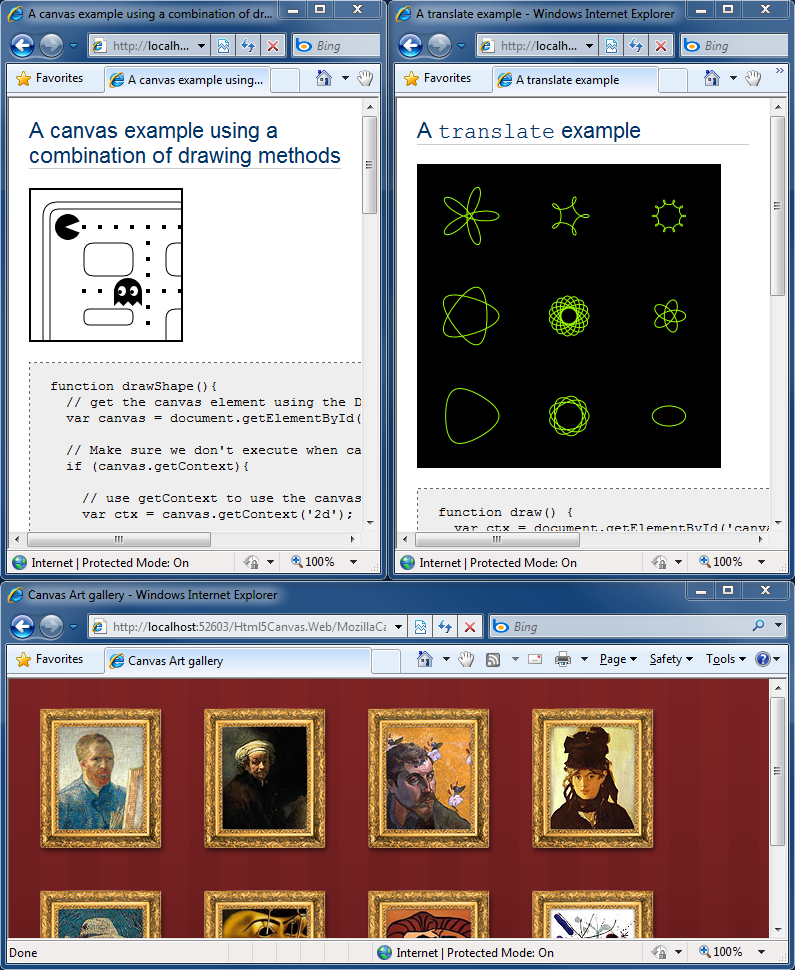
Aside: It's important to note that I did NOT change the JavaScript of these (or any other) samples - I just tweaked the HTML host page to load my <canvas> implementation. My goal was API- and feature-level parity; a Silverlight implementation of <canvas> that was "plug-compatible" with the existing offerings.


After that, I knew I just had to run Ben Joffe's Canvascape "3D Walker" because it bears a striking resemblance to one of the games I played when I was younger:

Canvascape


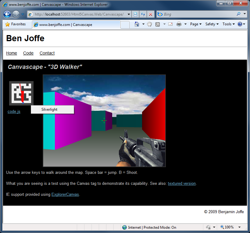
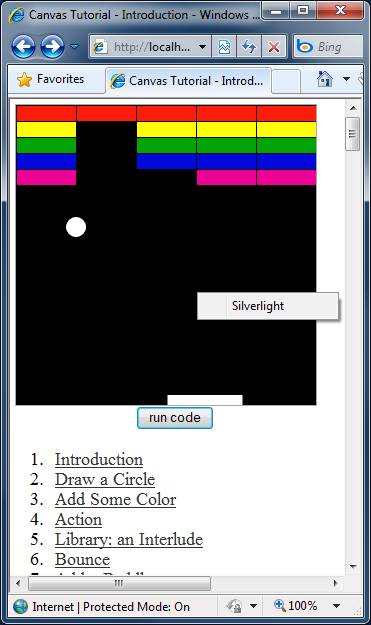
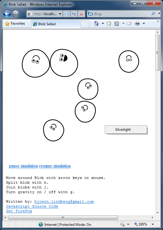
Aside: Be sure to look for the "Silverlight" context menu item I've included in the image above and in the next few screen shots to prove there's no trickery going on. :)


Next up was Bill Mill's Canvas Tutorial - and another shout-out to hours of misspent youth:

Canvas Tutorial


For something completely different, I got Bjoern Lindberg's Blob Sallad running:

Blob Sallad


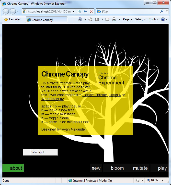
Then it was on to Ryan Alexander's Chrome Canopy fractal zoomer (despite the note, it runs okay-ish in IE8 with my Silverlight <canvas>):

Chrome Canopy


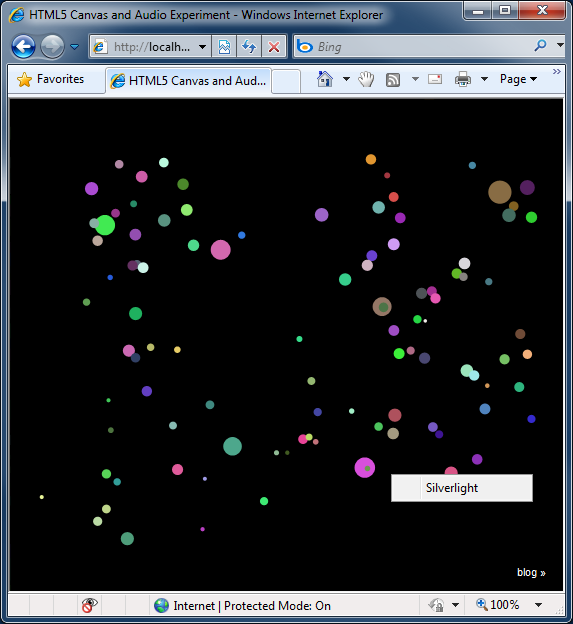
Finally, I wanted to see how the 9elements HTML5 Canvas Experiment ran:

Canvas Experiment


Whew, What a rush - those apps are really cool! :)


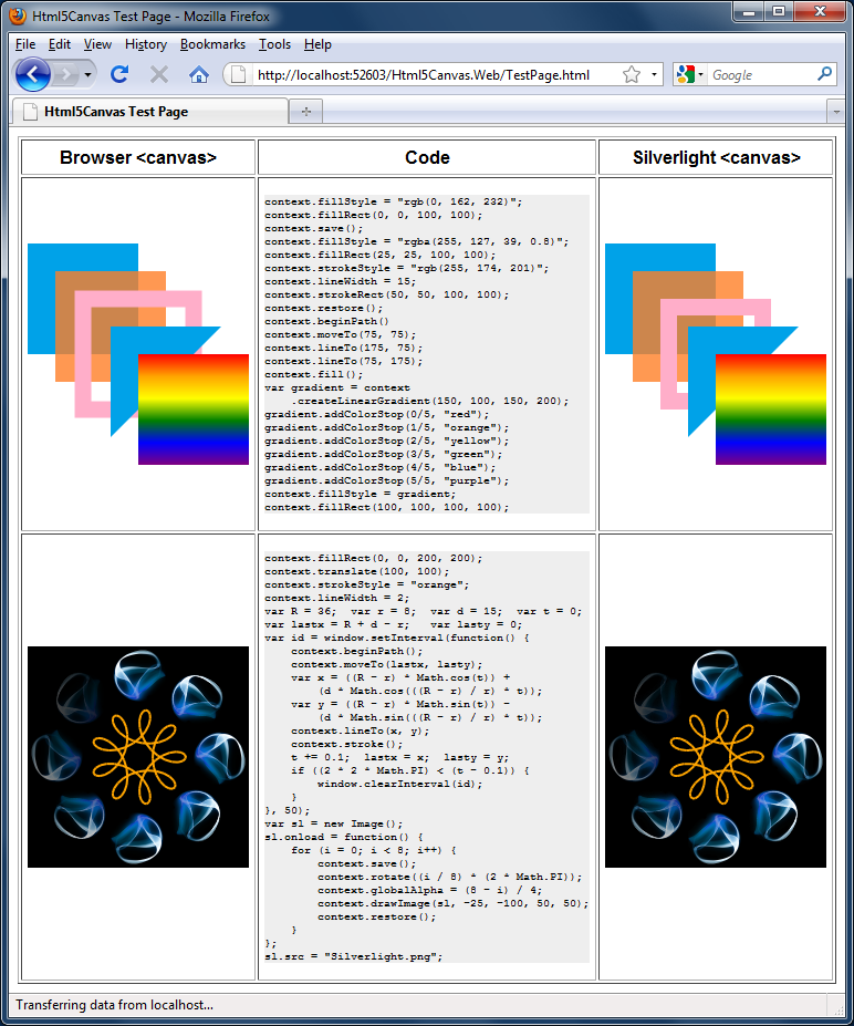
But I still wanted a sample I could include with the source code download, so I also wrote a little app to exercise most of the APIs supported by Html5Canvas (thanks to Mozilla for the Hypotrochoid animation inspiration and Wikipedia for the equation). Here it is on IE:

Sample application in IE


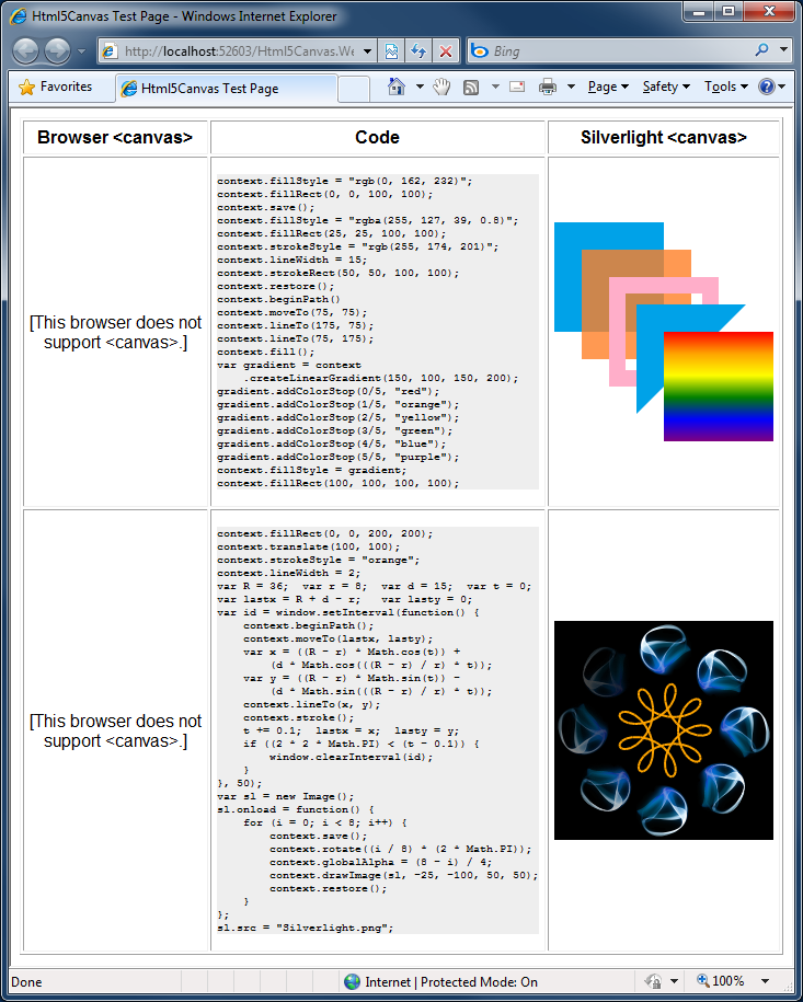
And wouldn't it be nice to see how Html5Canvas compares to a "real" <canvas> implementation? Sure, here's my sample running on Firefox:

Sample application in Firefox


Details

So how does it actually work? Well, I'm obviously not modifying the browser itself, so redefining the actual <canvas> tag isn't an option. Instead, I've written a simple Html5Canvas.js file which gets referenced at the top of the HTML page:

<script type="text/javascript" src="Html5Canvas.js"></script>

Among other things, it defines the handy function InsertCanvasObject(id, width, height, action) function which can be used to insert a Silverlight <canvas> thusly:

<script type="text/javascript">
    InsertCanvasObject("mycanvas", 200, 200, onCanvasLoad);
</script>

That code inserts a Silverlight object running Html5Canvas.xap that looks just like the <canvas> tag would have. Yep, it's that easy!

And it brings up an important difference between Html5Canvas and a real <canvas>: Html5Canvas can be used only after the Silverlight object has loaded - whereas <canvas> is usable as soon as the body/window has loaded (which happens sooner). This distinction is important to keep in mind if you're converting an existing page, because it requires moving the initialization call from onload to the action parameter of InsertCanvasObject. Believe it or not, that's really the only big "gotcha"!

Aside: While I could think of a few ways to avoid exposing this difference to the developer, none of them were general enough to apply universally.

Other minor differences between Html5Canvas and <canvas> are that Silverlight doesn't natively support the relevant repeat modes used by createPattern to tile images (though I could implement them without much difficulty), Silverlight doesn't support the GIF image format for use with drawImage (also easily worked around), and the conventional technique of JavaScript feature-detection by writing if (canvas.toDataURL) { ... } doesn't work because Silverlight's HTML Bridge doesn't allow a method to be treated like a property (I could work around this, too, but the extra level of indirection was unnecessarily confusing for a sample app).

Finally, let me reiterate that I did not attempt to implement the complete <canvas> specification. Instead, I implemented just enough to support the first 5 (of 6 total) Mozilla sample pages as well as the handful of applications shown above. Specifically, I've implemented everything that's not in italics in the feature list at the beginning of this post. Thinking about what it would take to add the stuff that's not implemented: text and pixel-level manipulation are both directly supported by Silverlight and should be pretty easy. Shadows seem like a natural fit for Silverlight's pixel shader support (though I haven't played around with it yet). All that's left is layer compositing, which does worry me just a little... I haven't thought about it much, but this seems like another job for WriteableBitmap, perhaps.


[Please click here to download the complete source code to Html5Canvas and the sample application shown above.]

Be sure to set the Html5Canvas.Web project as the active project and run the TestPage.html within it to see the sample application.


Summary

Html5Canvas was a fun project that definitely accomplished its goal of bringing me up to speed on HTML 5's <canvas> element! The implementation proved to be fairly straightforward, though there were a couple of challenging bits that ended up being good learning opportunities. :) The code I'm sharing here is intended to be a proof-of-concept and is not optimized for performance. However, if there's interest in making broader use of Html5Canvas, I have some ideas that should really improve things...

I hope folks find this all as interesting as I did - and maybe next time you want to add browser features, you'll use Silverlight, too! ;)

Scrolling so smooth like the butter on a muffin [How to: Animate the Horizontal/VerticalOffset properties of a ScrollViewer]

Recently, I got email from two different people with the same question: How do I animate the HorizontalOffset/VerticalOffset properties of a Silverlight/WPF ScrollViewer control? Just in case you've never tried this yourself, I'll tell you that it's not quite as easy as you'd think; those two properties are both read-only and therefore can't be animated by a DoubleAnimation. The official way to accomplish this task is to call the ScrollToHorizontalOffset or ScrollToVerticalOffset method - but of course that can't be done by a DoubleAnimation either...

Aside: Why are HorizontalOffset and VerticalOffset read-only in the first place? Good question; I don't know! I don't see why they couldn't be writable in today's world, but I bet there was a good reason - once upon a time. :)

While I didn't have the time to implement a solution myself, I did have an idea for what to do. It was inspired by a rather quirky business plan and went like this:

  1. Create an attached DP for ScrollViewer of type double called SettableHorizontalOffset
  2. In its change handler, call scrollViewerInstance.ScrollToHorizontalOffset(newValue)
  3. Animate the attached DP on the ScrollViewer of your choice
  4. ???
  5. Profit

I cautioned at the time that my idea might not work - and sure enough, when I tried it myself, it didn't! It turns out that neither Silverlight nor WPF much like the idea of pointing Storyboard.TargetProperty at an attached DependencyProperty. So much for my clever idea; I needed a different way to solve the problem... And before long I realized that I could use a Mediator just like I did for a similar situation with LayoutTransformer (see previous posts).


So I created a simple class, ScrollViewerOffsetMediator, which exposes a ScrollViewer property that you point at a ScrollViewer instance (hint: use a Binding with ElementName to make this easy) and a VerticalOffset property which is conveniently writable. :) Any changes to the VerticalOffset property are automatically applied to the relevant ScrollViewer via a call to its ScrollToVerticalOffset method - so you can animate the mediator and it'll be just like you were animating the ScrollViewer itself!

That solves the original problem and it's all well and good - but it doesn't quite address a pretty common scenario: wanting to animate a ScrollViewer from top to bottom. You see, VerticalOffset is expressed in pixels and it's not easy to pass the (unknown) height of an arbitrary ScrollViewer to an animation in static XAML. So I added another property called ScrollableHeightMultiplier which takes a value between 0.0 and 1.0, multiplies it by the ScrollViewer's current ScrollableHeight and sets the VerticalOffset to that value. In this manner, animations can be written in general, pixel-independent terms, and it's easy to get the animated scrolling effect everybody wants!

Aside: I've implemented support for only the vertical direction - doing the same thing for the horizontal direction is left as an exercise to the reader.


The sample application uses ScrollableHeightMultiplier and an EasingFunction (just to show off!) and looks like this:

AnimatingScrollViewerOffsets sample


[Click here to download the complete AnimatingScrollViewerOffsets sample.]


The XAML for the sample is quite straightforward:

<Grid Height="200" Width="150">

    <!-- Trigger to start the animation when loaded -->
    <Grid.Triggers>
        <EventTrigger RoutedEvent="Grid.Loaded">
            <BeginStoryboard>
                <BeginStoryboard.Storyboard>
                    <!-- Animate back and forth forever -->
                    <Storyboard
                        AutoReverse="True"
                        RepeatBehavior="Forever">
                        <!-- Animate from top to bottom -->
                        <DoubleAnimation
                            Storyboard.TargetName="Mediator"
                            Storyboard.TargetProperty="ScrollableHeightMultiplier"
                            From="0"
                            To="1"
                            Duration="0:0:1">
                            <DoubleAnimation.EasingFunction>
                                <!-- Ease in and out -->
                                <ExponentialEase EasingMode="EaseInOut"/>
                            </DoubleAnimation.EasingFunction>
                        </DoubleAnimation>
                    </Storyboard>
                </BeginStoryboard.Storyboard>
            </BeginStoryboard>
        </EventTrigger>
    </Grid.Triggers>

    <!-- ScrollViewer that will be animated -->
    <ScrollViewer
        x:Name="Scroller">
        <!-- Arbitrary content... -->
        <StackPanel>
            <ItemsControl
                ItemsSource="{Binding}"
                FontSize="32"/>
        </StackPanel>
    </ScrollViewer>

    <!-- Mediator that forwards the property changes -->
    <local:ScrollViewerOffsetMediator
        x:Name="Mediator"
        ScrollViewer="{Binding ElementName=Scroller}"/>

</Grid>


Here's the complete implementation of ScrollViewerOffsetMediator which naturally works perfectly well on WPF:

/// <summary>
/// Mediator that forwards Offset property changes on to a ScrollViewer
/// instance to enable the animation of Horizontal/VerticalOffset.
/// </summary>
public class ScrollViewerOffsetMediator : FrameworkElement
{
    /// <summary>
    /// ScrollViewer instance to forward Offset changes on to.
    /// </summary>
    public ScrollViewer ScrollViewer
    {
        get { return (ScrollViewer)GetValue(ScrollViewerProperty); }
        set { SetValue(ScrollViewerProperty, value); }
    }
    public static readonly DependencyProperty ScrollViewerProperty =
        DependencyProperty.Register(
            "ScrollViewer",
            typeof(ScrollViewer),
            typeof(ScrollViewerOffsetMediator),
            new PropertyMetadata(OnScrollViewerChanged));
    private static void OnScrollViewerChanged(DependencyObject o, DependencyPropertyChangedEventArgs e)
    {
        var mediator = (ScrollViewerOffsetMediator)o;
        var scrollViewer = (ScrollViewer)(e.NewValue);
        if (null != scrollViewer)
        {
            scrollViewer.ScrollToVerticalOffset(mediator.VerticalOffset);
        }
    }

    /// <summary>
    /// VerticalOffset property to forward to the ScrollViewer.
    /// </summary>
    public double VerticalOffset
    {
        get { return (double)GetValue(VerticalOffsetProperty); }
        set { SetValue(VerticalOffsetProperty, value); }
    }
    public static readonly DependencyProperty VerticalOffsetProperty =
        DependencyProperty.Register(
            "VerticalOffset",
            typeof(double),
            typeof(ScrollViewerOffsetMediator),
            new PropertyMetadata(OnVerticalOffsetChanged));
    public static void OnVerticalOffsetChanged(DependencyObject o, DependencyPropertyChangedEventArgs e)
    {
        var mediator = (ScrollViewerOffsetMediator)o;
        if (null != mediator.ScrollViewer)
        {
            mediator.ScrollViewer.ScrollToVerticalOffset((double)(e.NewValue));
        }
    }

    /// <summary>
    /// Multiplier for ScrollableHeight property to forward to the ScrollViewer.
    /// </summary>
    /// <remarks>
    /// 0.0 means "scrolled to top"; 1.0 means "scrolled to bottom".
    /// </remarks>
    public double ScrollableHeightMultiplier
    {
        get { return (double)GetValue(ScrollableHeightMultiplierProperty); }
        set { SetValue(ScrollableHeightMultiplierProperty, value); }
    }
    public static readonly DependencyProperty ScrollableHeightMultiplierProperty =
        DependencyProperty.Register(
            "ScrollableHeightMultiplier",
            typeof(double),
            typeof(ScrollViewerOffsetMediator),
            new PropertyMetadata(OnScrollableHeightMultiplierChanged));
    public static void OnScrollableHeightMultiplierChanged(DependencyObject o, DependencyPropertyChangedEventArgs e)
    {
        var mediator = (ScrollViewerOffsetMediator)o;
        var scrollViewer = mediator.ScrollViewer;
        if (null != scrollViewer)
        {
            scrollViewer.ScrollToVerticalOffset((double)(e.NewValue) * scrollViewer.ScrollableHeight);
        }
    }
}


PS - Thanks to Homestar Runner's Strong Bad for inspiring the title of this post.

Simple column labels you can create at home! [Re-Templating the Silverlight/WPF Data Visualization ColumnDataPoint to add annotations]

A customer contacted me over the weekend asking how to add labels (also known as annotations) to a ColumnSeries. My reply was that we don't support annotations in Silverlight/WPF Charting yet, but it's possible to create some pretty simple ones for limited scenarios just by editing the default ColumnDataPoint Template. And because it's so quick, I thought I'd write up a brief example on the bus!

Aside: For some more examples of basic DataPoint Template changes, please have a look at my earlier post on customizing ToolTips.


In this case, the customer wanted to add a label showing the column's value at the bottom of the column, just above its axis label. (This is a nice place to put labels because it makes it easy for viewers to associate the category with its value no matter how high each column is.) The obvious approach is to add a TextBlock to the body of the default Template, but the problem with that is that the text can get clipped or even disappear for small columns... So the trick is to add a negative Margin to pull the text "outside" the normal clipping region. Fortune must have been smiling upon me, because when I tried this on Silverlight, it worked just like I wanted! :)

Aside: My other idea was to use a Canvas because it doesn't clip by default; maybe someone else will need to use that approach for their scenario.


Here's how the resulting chart looks:

Simple column annotations (on bottom)

The XAML's nothing special - aside from the negative Margin, it's all standard stuff:

<charting:Chart
    Title="Simple Column Annotations - Bottom">
    <charting:ColumnSeries
        DependentValuePath="Value"
        IndependentValuePath="Key"
        ItemsSource="{Binding}">
        <charting:ColumnSeries.DataPointStyle>
            <Style TargetType="charting:ColumnDataPoint">
                <Setter Property="Background" Value="Yellow"/>
                <Setter Property="Template">
                    <Setter.Value>
                        <ControlTemplate TargetType="charting:ColumnDataPoint">
                            <Grid>
                                <Rectangle
                                    Fill="{TemplateBinding Background}"
                                    Stroke="Black"/>
                                <Grid
                                    Background="#aaffffff"
                                    Margin="0 -20 0 0"
                                    HorizontalAlignment="Center"
                                    VerticalAlignment="Bottom">
                                    <TextBlock
                                        Text="{TemplateBinding FormattedDependentValue}"
                                        FontWeight="Bold"
                                        Margin="2"/>
                                </Grid>
                            </Grid>
                        </ControlTemplate>
                    </Setter.Value>
                </Setter>
            </Style>
        </charting:ColumnSeries.DataPointStyle>
    </charting:ColumnSeries>
</charting:Chart>


Just for fun, I thought I'd try the same trick to put the annotations on top of the columns, too. This is the more traditional location - and that also works pretty nicely:

Simple column annotations (on top)

The only change from the previous XAML is switching the VerticalAlignment to Top:

<Grid
    Background="#aaffffff"
    Margin="0 -20 0 0"
    HorizontalAlignment="Center"
    VerticalAlignment="Top">
    <TextBlock
        Text="{TemplateBinding FormattedDependentValue}"
        FontWeight="Bold"
        Margin="2"/>
</Grid>


And there you have it - a simple technique for simple column annotations!

Aside: Of course, these aren't "real" annotations - they'll eventually break in more complicated scenarios. But hey, if you've got simple needs, here's a simple solution for you. :)


PS - For people playing along at home, here's how I created the data for the samples:

public MainPage()
{
    InitializeComponent();
    var items = new List<KeyValuePair<string, double>>();
    items.Add(new KeyValuePair<string,double>("Apples", 0));
    items.Add(new KeyValuePair<string,double>("Oranges", 0.1));
    items.Add(new KeyValuePair<string,double>("Pears", 1));
    DataContext = items;
}

My new home page, enhanced [Updated collection of great Silverlight/WPF Data Visualization resources!]

In the time since posting my last collection of Silverlight/WPF Charting links, there's been some great activity! Of particular significance, the June 2009 WPF Toolkit includes the same Data Visualization goodness that was introduced for Silverlight and the July 2009 release of the Silverlight Toolkit added a TreeMap control. Without further ado, here are the latest links (FYI: previously published links are gray):

Overviews (100 level)

Scenarios (200 level)

Internals (300 level)

Team Member posts (Partner level)

My posts (Ego level)

Many, many thanks to everyone who's spent time helping others learn how to use Silverlight/WPF Data Visualization!

PS - If I've missed any good resources, please leave a comment with a link - I'm always happy to find more good stuff! :)

Bringing the Silverlight Toolkit's TreeMap to WPF [Silverlight/WPF Data Visualization Development Release 0]

Now that Data Visualization is part of the Silverlight Toolkit and the WPF Toolkit, it has an official release vehicle for both platforms of interest. This is great because it means that any customers who need to be running signed bits from an official release have a place to get what they need. Of course, because the two Toolkits are not on the same ship schedule, there will probably always be a delta between them: some features or fixes that are present for one platform but not the other. Fortunately, the release cadence for the Toolkits is pretty short (on the order of months), so it won't take long for features to make their way into both releases.

But for folks who always want to be running the latest-and-greatest stuff, that wait can feel like an eternity... :) The good news is that both Toolkits are Ms-Pl open source, so anyone can migrate code between the two. (And, in fact, I made some small tweaks recently to make that even easier!) But why should everyone have to reinvent the wheel? Wouldn't it be better if one person simplified the process and shared the results with everybody? Yeah, I thought so too...


Announcing Silverlight/WPF Data Visualization Development Release 0!

The Silverlight/WPF Data Visualization Development Release is a side project of mine to make it easier for Silverlight and WPF customers to get their hands on the latest Data Visualization code for both platforms. From time to time, I plan to release a single, comprehensive ZIP file with the complete Data Visualization source code, projects for all supported platforms, a unifying solution, and pre-compiled release-mode binaries for all supported platforms (unsigned). These development releases will contain the latest internal source code changes with all the fixes and features that are in progress. Interested parties can evaluate the newest stuff and provide early feedback on what works and what's broken - feedback that can help ensure the things you care about get some love and attention.

The catch - and there's always a catch - is that I'm not committing to any kind of schedule for these releases - and they won't be as thoroughly tested as what's in the official Toolkit releases. But if that doesn't bother you, I'd love to have your feedback!


[Please click here to download the complete SilverlightWpfDataVisualization solution.]


Release Notes

  • The source code for Development Release 0 is identical to what's included with the recent Silverlight Toolkit July 09 release, so there are no new features for the Silverlight assembly. However, the WPF assembly includes the new TreeMap control and a better performing BubbleSeries! (Please see my release announcement and notes for more information about what TreeMap is and how to use it.)
  • Please remember that whenever you add a project reference to the Data Visualization assembly on WPF, you also need to add a reference to WPFToolkit.dll or you'll get weird runtime errors because the Visual State Manager (VSM) isn't available.
  • The file structure of the archive looks like this (highlighted items are files; everything else is directories):
    SilverlightWpfDataVisualization
    |   SilverlightWpfDataVisualization.sln
    +---Binaries
    |   +---Silverlight3
    |   |       System.Windows.Controls.DataVisualization.Toolkit.dll
    |   |       
    |   \---WPF35
    |           System.Windows.Controls.DataVisualization.Toolkit.dll
    |           WPFToolkit.dll
    +---Platforms
    |   +---Silverlight3
    |   |   |   Core.Silverlight3.csproj
    |   |   +---Properties
    |   |   \---Themes
    |   \---WPF35
    |       |   Core.WPF35.csproj
    |       +---Properties
    |       \---Themes
    \---SourceCode
        \---Core
            +---Charting
            |   +---Axis
            |   +---Chart
            |   +---DataPoint
            |   +---Primitives
            |   \---Series
            +---Collections
            +---Legend
            +---Properties
            +---Title
            \---TreeMap
                +---Interpolators
                \---Layout
    The pre-compiled release-mode binaries are located under the Binaries directory. All the common source code is under the SourceCode directory. Platform-specific project and source files are under the Platforms directory. The unified Visual Studio solution is in the root.
  • Design-time assemblies are not part of this release because I don't expect the target audience to make changes to them and also because they add a lot of complexity. However, if there's strong interest in having the design-time assemblies included with future development releases, I'm open to doing so.
  • I haven't updated my DataVisualizationDemos application for this unofficial release, but it's fairly easy to file-link the included TreeMap sample page into the WPF project to get those TreeMap samples running on WPF. (And that's exactly what I did to make sure TreeMap still works well on WPF!)


This whole idea of doing development releases is a bit of an experiment for me and I'm interested to see how it works out... If folks really love the idea, I'll try to do development releases more frequently. Or if it's simply too much churn for everyone to keep up with, people can always just wait for the next official Silverlight/WPF Toolkit release to come around. But however people get at it, I hope the Silverlight/WPF Data Visualization project helps customers continue to do great things with Silverlight and WPF!!

An "extreme" update for the Silverlight 3 release [HeadTraxExtreme sample application updated]

A few weeks ago I wrote about an "app building" exercise we did on the Silverlight Toolkit team to help test our controls and identify potential issues with Silverlight 3 before it was released. My contribution to that effort was HeadTraxExtreme, an organizational hierarchy viewer loosely based on an internal tool. That blog post has been fairly popular, and I wanted to update the sample code for the recent release of Silverlight 3 so people can continue to learn from the sample and so I can walk through a fairly typical application upgrade scenario to show what's involved.


HeadTraxExtreme sample application

[Click here (or on the image above) to run HeadTraxExtreme in your browser.]

[If you want to look at the complete source code or build HeadTraxExtreme yourself, click here to download it.]


Notes:

  • I've made no functional changes here; just done the upgrade from Silverlight 3 Beta to Silverlight 3 RTW bits.
  • The employee images are loaded from the web site of origin, so if you download and build the sample yourself, please be sure to run HeadTraxExtreme from the included web project (HeadTraxExtreme.Web) in order to see them.

Changes:

  • Updated Default.html to include the minRuntimeVersion value 3.0.40624.0 (Silverlight 3 RTW's version number), the new links for installing Silverlight 3, the new IFRAME declaration, and some other minor changes to the default web page body.
  • Updated all project references to point to the official, signed versions of the SDK and Silverlight Toolkit assemblies.
  • Converted the out-of-browser configuration entries in AppManifest.xml to use the RTW names (for example, ApplicationIdentity is now called OutOfBrowserSettings).
  • Updated XAML references to DockPanel and DataForm to reflect their move from the Beta SDK to the Silverlight Toolkit.
  • Switched AutoCompleteBox declaration from SearchMode/ValueMemberBinding to the new FilterMode/ValueMemberPath properties. The former represents a rename post-Beta and the latter is a new, simplified Binding syntax based on what we did for Charting's *Binding properties in the last release.
  • Updated DataForm XAML to reflect some notable improvements made after the Beta. Specifically, DisplayTemplate was renamed to ReadOnlyTemplate and there is new support for DisplayAttribute that enables the use of the DataField element within that template. (The Employee class was already fully decorated with DisplayAttribute, so it didn't need to change.) The new XAML syntax is just as expressive as the old one (more expressive, actually!), it's less fragile, and it's more concise. Yay! :)
  • DataGrid's DataGridTextColumns now also honor DisplayAttribute, so it's no longer necessary to manually specify a header for each column.
  • Significantly simplified the code for downloading employee images. (This has nothing to do with Silverlight 3: for some reason I thought I needed a separate thread the first time around - but I don't.)
  • Deleted Silverlight.js which is not used by the default Silverlight 3 web page.


HeadTraxExtreme was a fun project and I'm glad people have found it useful! I hope this quick update keeps it relevant and exciting and helps to outline the typical upgrade process for an application that targets the Silverlight 3 Beta.


Please enjoy!

Silverlight Charting gets an update - and a TreeMap! [Silverlight Toolkit July 2009 release now available!]

We've just published the July 2009 release of the Silverlight Toolkit to help celebrate today's release of Silverlight 3! Silverlight 3 includes a wide variety of new features that significantly enhance the platform and make developing powerful applications easier than ever! The Silverlight Toolkit helps extends the Silverlight platform by offering a compelling set of additional controls to enable even more advanced scenarios. I encourage everyone to have a look at the live samples for Silverlight 2 or Silverlight 3, download the Toolkit installer, and enjoy!

Note: The Silverlight Toolkit includes support for both Silverlight 2 and Silverlight 3, so please have a look even if you're not upgrading to 3 today. :)


That said, you're probably here because what you really care about is Silverlight/WPF Charting! You may remember my last post announcing the June 2009 release of the WPF Toolkit with the first official release of WPF Charting. I'm pleased to announce that this release of Silverlight Charting is almost exactly in sync with its WPF Charting sibling! There were just two notable change that happened too late to be included with WPF Charting - they're in italics below (along with a third, very minor tweak):

Notable Changes

Included new TreeMap control! Please refer to the second half of this post for lots more about what a TreeMap is, what it's good for, and how to use it!

Improved performance of internal data structures for many common scenarios. Charting now makes use of left-leaning red-black trees to maintain properly balanced data structures. For more detail on this change, please refer to my post about the LeftLeaningRedBlackTree implementation.

Numerous bug fixes for animation inconsistencies between Silverlight and WPF. Storyboards and Animations sometimes behave a little differently on Silverlight/WPF, and a good bit of effort was spent trying to ensure that Charting will behave the same way on both platforms. In most cases, this was a matter of finding an implementation both platforms agreed on - in some it meant resorting to small, localized #if blocks.

Fixed handling of data objects with non-unique hash codes. When each data object had a unique hash code, things already worked fine. But data sets containing items sharing the same hash code could exhibit incorrect behavior in previous releases. Most typical data sets would not have encountered this problem because hash codes are nearly always unique - but there are certain classes that report quite UNunique hash codes and could trigger the problem fairly easily. This is no longer an issue.

Corrected behavior of charts at very small sizes and during animations. Some third party controls offer so-called "fluid" layout in which size changes are all animated and elements can easily shrink to a size of 0x0. This kind of environment could previously trigger layout bugs that would result in an unhandled exception from the Chart control. These issues have been fixed and dynamic layout changes are now handled seamlessly.

Improved the performance of BubbleSeries. Scenarios with many bubbles animating simultaneously could have previously exhibited some sluggishness. In this release for Silverlight we've implemented an optimization that saves a significant amount of time in such cases. Animations of BubbleSeries data changes are now considerably smoother.

Breaking Changes

IRequireGlobalSeriesIndex's GlobalSeriesIndexChanged method takes a nullable int parameter. This should affect only people who have written custom Series implementations - and the code change is a trivial.

Other Changes

Many other fixes and improvements.

  • Better handling of non-double data by shared Series
  • Addition of StrokeMiterLimit to the Polyline used by LineSeries
  • Fixes for edge case scenarios when removing a Series
  • Ability to set Series.Title with a Binding (on Silverlight 3 and WPF)
  • Automatic inheritance of the Foreground property by the Title control
  • Visual improvements to the LegendItem DataPoint marker
  • Improvement to AreaSeries default Style StrokeThickness behavior


In my earlier post about WPF Charting, I announced a new DataVisualizationDemos sample that consolidates all the Charting samples I've posted to my blog into one handy place and compiles/runs on both Silverlight and WPF. I've just updated DataVisualizationDemos for this release so it includes everything through the "Letter Frequency" sample I introduced last time, the original easing functions sample from the March 2009 release notes, my recent "Jelly Charting" demonstration, and a completely new sample:

TreeMap Introduction

Click here to download the complete source code for the DataVisualizationDemos sample application.


The new sample shows off the TreeMap control that's now part of the System.Windows.Controls.DataVisualization namespace. The Wikipedia entry explains TreeMaps in detail; the executive summary is that TreeMaps are used to visualize the values of a single property (ex: team scores) across an entire data set. They do this by adjusting the size (i.e., area) of each element so items with larger values are bigger, items with smaller values are littler, and the relative proportions are correct. There are some different algorithms to do this layout; our TreeMap implements the common "squarified" algorithm.

But enough background - let's use a TreeMap to visualize some data!


To begin, imagine that we have a data set listing all the blog posts I've made and the following details for each: post date, length, tags, and relative popularity. (Aside: The popularity measure is not accurate because it's based on an incomplete set of statistics - but it's sufficient for our purposes.) Let's begin by displaying all the posts ranked by popularity - that looks like this:

Simple TreeMap

The XAML is a tad verbose, but it's quite easy to understand:

<datavis:TreeMap
    x:Name="AllPosts"
    ItemsSource="{Binding}">
    <datavis:TreeMap.ItemDefinition>
        <datavis:TreeMapItemDefinition
            ValueBinding="{Binding Popularity}">
            <DataTemplate>
                <Grid>
                    <Border
                        BorderBrush="Black"
                        BorderThickness="1"
                        Background="#ff7fc3ff"
                        Margin="0 0 1 1">
                        <Grid Background="{StaticResource GradientOverlay}">
                            <controls:Viewbox Margin="3 0 3 0">
                                <TextBlock Text="{Binding FormattedDate}"/>
                            </controls:Viewbox>
                        </Grid>
                        <ToolTipService.ToolTip>
                            <StackPanel>
                                <TextBlock Text="{Binding Title}"/>
                                <TextBlock Text="{Binding FormattedTags}" FontStyle="Italic"/>
                                <TextBlock Text="{Binding FormattedDate}"/>
                            </StackPanel>
                        </ToolTipService.ToolTip>
                    </Border>
                </Grid>
            </DataTemplate>
        </datavis:TreeMapItemDefinition>
    </datavis:TreeMap.ItemDefinition>
</datavis:TreeMap>

We start out by creating a TreeMap and pointing it at our data set using the standard ItemsControl pattern of setting the ItemsSource property. Then we specify a TreeMapItemDefinition to describe what the items should look like and provide a Binding to identify the value we're visualizing.

At this point, you may be wondering whether there's a corresponding TreeMapItem control for each element (think ListBoxItem). Well, there is not. The reason being that TreeMaps are often used to display very large data sets with hundreds of elements - and it turns out that the overhead of having a wrapper control for each of those elements adds up quickly. So TreeMap takes the slightly different approach of allowing you to define a DataTemplate for its item (as with ItemsControl.ItemTemplate). This DataTemplate can be as simple or as complex as you'd like - and can even use a custom TreeMapItem-like control - so there's no loss of flexibility. However, there's a big win in performance: this approach is roughly four times faster!

The contents of the DataTemplate used here are pretty typical: a border around some text that's bound to the underlying data object and a helpful ToolTip to display more detail when the user mouses over the element. It's as easy as that!


Okay, let's get a little more advanced and display two values at the same time! The conventional way of showing a second value in a TreeMap is by varying the color of the items, so we'll do that. Size corresponds to popularity as before, but now we're using color saturation to visualize post length (where darker=longer):

TreeMap with Interpolator

The basic TreeMap definition is basically the same as last time - the interesting part is the contents of the Interpolators collection:

...
<datavis:TreeMap.Interpolators>
    <datavis:SolidColorBrushInterpolator
        TargetName="Border"
        TargetProperty="Background"
        DataRangeBinding="{Binding Length}"
        From="#ffeeeeff"
        To="#ff8080ff"/>
</datavis:TreeMap.Interpolators>
...

What's an Interpolator? It's a new concept we've introduced for TreeMap to automatically map a particular value ("Length" in this case) to a range of something. In this case, the something is colors, so we're using SolidColorBrushInterpolator which works great for backgrounds and foregrounds. There's also DoubleInterpolator which is handy for changing opacity, font size, and things like that. And if you want to do something different, it's simple to create your own mapping by deriving from Interpolator (or RangeInterpolator<T>)!

We've purposely made SolidColorBrushInterpolator easy to use - note how it cleanly incorporates the familiar notions of Storyboard's TargetName and TargetProperty properties with ColorAnimation's From and To. The remaining property, DataRangeBinding, provides a Binding that's used to identify the relevant variable on the data objects. Once everything's in place, the Interpolator automatically interpolates each value according to where it falls in the overall range of values!

It's a simple, yet powerful concept that makes it easy to build powerful visualizations without writing any code at all. And please note that the TreeMap.Interpolators property is a collection, so you can add as many of these as you'd like in order to visualize multiple values or control multiple properties!


This time, instead of visualizing posts, let's visualize tags. Specifically, let's see how many posts have been tagged with each tag name (remembering that some posts have multiple tags):

TreeMap via Linq

The aggregation of per-post data into per-tag data is made easy by a simple bit of Linq that first creates a unique tag/post object for each tag/post pairing, then groups these all by tag, and finally selects them into a new collection of objects:

var blogPostsByTag = blogPosts
    .SelectMany(p => p.Tags.Select(t => new { Tag = t, Post = p }))
    .GroupBy(p => p.Tag)
    .Select(g => new BlogTag { Tag = g.Key, Posts = g.Select(p => p.Post).ToArray() });

After that, creating the TreeMap is easy - it's just a minor variation of what we've already seen.


For our final trick, let's enhance the previous sample so we can see posts sorted by popularity within each tag grouping:

Nested TreeMaps

This is pretty easy to do as well - it's the previous TreeMap with copies of the first TreeMap nested inside each tag node! Nested TreeMaps? Sure! Like I said, the DataTemplate model is totally flexible. The outer TreeMap creates the bounding boxes, and the inner TreeMaps sub-divide them according to post popularity. No sweat... :)


As I hope you'll agree, the new TreeMap is a pretty cool addition to the Data Visualization assembly! And we wouldn't have it if not for the tireless efforts of the folks on the GPD-E (Global Product Development Europe) team who we partnered with to deliver this new control. In particular, all the real work was done by Cristian Costache, Marek Latuskiewicz, and Gareth Bradshaw - I mainly helped coordinate things and do a bit of testing. I'd like to extend my sincere thanks to these guys for their passion and dedication these past few weeks! Please check out their blogs for more information about TreeMap in the coming weeks! :)


PS - If you have any questions or feedback, the right places to start are the Silverlight Discussion Forum or the WPF Discussion List. Bugs and feature requests can be logged with the Silverlight Issue Tracker or the WPF Issue Tracker. Please raise issues that are clearly unique to one platform or the other in the obvious place. But for general questions and things that are common to both platforms, the Silverlight forum/list is probably a better place because there's more context and history there.

PPS - TreeMap is currently available only as part of the Silverlight Toolkit. However, it should run perfectly well on WPF; in fact, I did that as part of the testing process! Interested parties can recompile the Silverlight source code for WPF in order to start playing with TreeMaps on WPF today; the process should be pretty easy because both the Silverlight and WPF Toolkits are open source and share the same source code files/layout/etc.. However, I'll be posting more about this in the next few days and hope to have explicit directions and a script to make the entire process easy for everyone! :)

WPF Charting: It's official! [June 2009 release of the WPF Toolkit is now available!]

The WPF Toolkit team just published the June 2009 release of the WPF Toolkit. Those of you who know I'm on the Silverlight Toolkit team are probably wondering why this is relevant - so let's get right to the release notes for the next version of Silverlight/WPF Charting because they'll clear things up:


Notable Changes

WPF is now an official platform for Charting! Today's release of the June 2009 WPF Toolkit includes the binaries for WPF Charting, the associated design-time assemblies for both Visual Studio 2008 and Blend 3, and the complete source code for everything (under the usual Ms-PL license). Prior to today, WPF Charting only existed informally because of a blog post I'd written and some bits I'd shared. As of today, that "do it yourself" approach is a thing of the past - customers can get signed binaries and ready-to-build source code for Charting as part of the WPF Toolkit. And, as always, Charting exposes the same API and supports the same XAML on both platforms - making application portability trivial!

WPF Toolkit installer

Improved performance of internal data structures for many common scenarios. Charting now makes use of left-leaning red-black trees to maintain properly balanced data structures. For more detail on this change, please refer to my post about the LeftLeaningRedBlackTree implementation.

Numerous bug fixes for animation inconsistencies between Silverlight and WPF. Storyboards and Animations sometimes behave a little differently on Silverlight/WPF, and a good bit of effort was spent trying to ensure that Charting will behave the same way on both platforms. In most cases, this was a matter of finding an implementation both platforms agreed on - in some it meant resorting to small, localized #if blocks.

Fixed handling of data objects with non-unique hash codes. When each data object had a unique hash code, things already worked fine. But data sets containing items sharing the same hash code could exhibit incorrect behavior in previous releases. Most typical data sets would not have encountered this problem because hash codes are nearly always unique - but there are certain classes that report quite UNunique hash codes and could trigger the problem fairly easily. This is no longer an issue.

Corrected behavior of charts at very small sizes and during animations. Some third party controls offer so-called "fluid" layout in which size changes are all animated and elements can easily shrink to a size of 0x0. This kind of environment could previously trigger layout bugs that would result in an unhandled exception from the Chart control. These issues have been fixed and dynamic layout changes are now handled seamlessly.

Breaking Changes

IRequireGlobalSeriesIndex's GlobalSeriesIndexChanged method takes a nullable int parameter. This should affect only people who have written custom Series implementations - and the code change is a trivial.

Other Changes

Many other fixes and improvements.

  • Proper RoutedEvent support for DataPointSeries.SelectionChangedEvent
  • Better handling of non-double data by shared Series
  • Addition of StrokeMiterLimit to the Polyline used by LineSeries
  • Fixes for edge case scenarios when removing a Series
  • Ability to set Series.Title with a Binding (on Silverlight 3 and WPF)
  • Automatic inheritance of the Foreground property by the Title control
  • Visual improvements to the LegendItem DataPoint marker
  • Addition of SnapsToDevicePixels to the default Chart Template (WPF-only; unnecessary on Silverlight)

Build Notes

If you plan to recompile the WPF Toolkit from source, please be aware that two of the three Charting design-time assemblies reference Blend 3 DLLs Microsoft.Windows.Design.Extensibility.dll and Microsoft.Windows.Design.Interaction.dll. Unlike their Visual Studio counterparts, these design-time assemblies are not automatically found by the build and their absence causes 84 build errors in the Controls.DataVisualization.Toolkit.Design and Controls.DataVisualization.Toolkit.Expression.Design projects. :(

Most people won't care about building the Blend-specific design-time assemblies and can simply right-click the two failing projects in Visual Studio and choose "Unload Project". After that, everything builds successfully.

Alternatively, users with Blend installed can update these projects' references to both assemblies and then everything (including the Blend design-time assemblies!) builds successfully. The default location of the Blend assemblies is something like C:\Program Files (x86)\Microsoft Expression\Blend 3 Beta. (If you're on a 32-bit OS, remove the " x86"; once Blend releases, remove the " Beta".

Sorry for the inconvenience - we didn't want to ship pre-release Blend components with the WPF Toolkit.


Long-time readers know that I always include some new Charting samples with my release notes to showcase new features. The big feature here is WPF Charting, so I've put together a solution that contains almost all of the public Charting samples I've ever posted to my blog - now in one handy place! Naturally, the DataVisualizationDemos sample runs on both Silverlight (2 or 3!) and WPF with the exact same code and XAML. And it includes a brand new scenario called "Letter Frequency" that I wrote to help test some of the recent changes.

Here it is on WPF:

DataVisualizationDemos Letter Frequency sample

Click here to download the complete source code for the DataVisualizationDemos sample application.

(Note: To find the blog post associated with each sample, please refer to the "My posts" section of my Charting Links collection.)


Jafar and I spent most of the previous release cycle helping other teams with their deliverables, so we didn't get as nearly much time to spend on Charting as we would have liked. [Otherwise the release notes would be much longer! :) ] Fortunately, we did make the time to deliver some good fixes for this release and that should help make customers' lives a little easier. Of course, while we've done our best to make Charting as useful and problem-free as possible, there's always room for improvement...

So if you have any questions or feedback, the right places to start are the Silverlight Discussion Forum or the WPF Discussion List. Bugs and feature requests can be logged with the Silverlight Issue Tracker or the WPF Issue Tracker. Please raise issues that are clearly unique to one platform or the other in the obvious place. But for general questions and things that are common to both platforms, the Silverlight forum/list is probably a better place - just because there's more context and history there.

A big "thank you" goes out to everyone who's worked with Charting and helped to make it what it is today! Today's release and announcement are specifically directed at the WPF early-adopters who've truly gone the extra mile to use Charting. We thank you for your dedication! Also, my personal thanks go out to the WPF Toolkit team for making this possible - in particular to Samantha Durante, Vamsee Potharaju, and Alexis Roosa for their assistance and support!


PS - If you're a loyal Silverlight Charting user who's feeling a little left out right about now, I have some good news for you, too. :) The Silverlight Toolkit will also be releasing an update fairly soon. And when it does, Silverlight Charting will contain all the fixes described here, one or two others that came in too late to make this release, AND a nice little surprise that will make the wait worthwhile...

Peanut butter jelly time [How to: Create a pleasing visual effect with Silverlight/WPF Charting]

I was recently part of an e-mail thread with Pete Brown discussing the prospects of reproducing Richard Zadorozny's cool "jelly chart" behavior with the official Silverlight/WPF Charting controls from the Silverlight Toolkit. Richard's sample is really fun to play around with - but at the core it's really just a slick user experience demo masquerading as a charting solution. The question was: how hard it would be to take a real-world charting solution and get it to masquerade as a slick user experience demo... :)

I had some particular opinions on how to go about this, and said I'd put together a quick sample to show off my approach. I was aware of this sample when we started work on Silverlight/WPF Charting and made sure that Charting supported two specific things to make this kind of behavior easy: the DataPointSeries.AnimationSequence property and the Reveal/Show VSM state. In fact, I wrote a similar sample that's been part of the public charting samples since our first release. To find it, load the samples, pick the "Column Series" page from the left-hand column, then switch to the "Animation" tab at the top. The "Custom: Grow" samples show off the basic concept - all that's missing is the easing and that's easy (no pun intended) to add via Silverlight 3's built-in support.

However, as I thought about duplicating the jelly scenario for a few moments, I realized line series would be more challenging - because the line's shape tracks the actual data values and isn't covered by a VSM animation the way its points are. Fortunately, I had another trick up my sleeve - and thus the following Silverlight 3 sample was born:


JellyCharting sample

Click here or on the image above to run the sample in your browser.

Click here to download the complete source code for the sample.

While I didn't go out of my way to duplicate every aspect of the original demo, I did try to pay homage to it. :)


My solution is a straightforward IValueConverter implementation (more background) that can be easily dropped into an existing chart to add the cool jelly behavior. For simplicity, my implementation assumes the original data is Points and uses fixed values for delays and stuff - but that's just to keep things easy to read and understand. It would be quite easy to modify or extend what I've done to flexibly support more general scenarios.

Here's the relevant code:

// IValueConverter implementation that creates a "jelly" effect for showing chart data
public class JellyConverter : IValueConverter
{
    // Converts an ICollection of Points to an ICollection of animated JellyPoints
    public object Convert(object value, Type targetType, object parameter, CultureInfo culture)
    {
        // Type-check input
        var originalPoints = value as ICollection<Point>;
        if (null == originalPoints)
        {
            throw new NotImplementedException("JellyConverter only supports value type ICollection<T>.");
        }

        // Fixed paramaters (could be set via properties or parameter)
        var duration = TimeSpan.FromSeconds(0.5);
        var delay = TimeSpan.FromSeconds(0.5);
        var ease = new ElasticEase { Oscillations = 1 };

        // Prepare Storyboard
        var count = originalPoints.Count;
        var jellyPoints = new List<JellyPoint>(count);
        var storyboard = new Storyboard();
        var propertyPath = new PropertyPath("Y");
        var i = 0;

        // For each Point...
        foreach (var originalItem in originalPoints)
        {
            // Add a corresponding JellyPoint
            var jellyPoint = new JellyPoint { X = originalItem.X, Y = 0 };
            jellyPoints.Add(jellyPoint);

            // Create an animation
            var animation = new DoubleAnimationUsingKeyFrames();
            Storyboard.SetTarget(animation, jellyPoint);
            Storyboard.SetTargetProperty(animation, propertyPath);

            // Configure the initial delay and "jelly" behavior
            var thisDelay = TimeSpan.FromSeconds(delay.TotalSeconds * ((i + 1.0) / count));
            animation.KeyFrames.Add(new LinearDoubleKeyFrame
            {
                KeyTime = thisDelay,
                Value = 0
            });
            animation.KeyFrames.Add(new EasingDoubleKeyFrame
            {
                KeyTime = thisDelay + duration,
                Value = originalItem.Y,
                EasingFunction = ease
            });

            // Add animation to Storyboard
            animation.Duration = thisDelay + duration;
            storyboard.Children.Add(animation);
            i++;
        }

        // Play the Storyboard
        storyboard.Begin();

        return jellyPoints;
    }

    // Custom Point-like class allows easy animation of Y property
    public class JellyPoint : DependencyObject, INotifyPropertyChanged
    {
        // Static X value
        public double X { get; set; }

        // Dynamic Y value
        public static readonly DependencyProperty YProperty = DependencyProperty.Register(
            "Y", typeof(double), typeof(JellyPoint), new PropertyMetadata(YPropertyChanged));
        public double Y
        {
            get { return (double)GetValue(YProperty); }
            set { SetValue(YProperty, value); }
        }
        private static void YPropertyChanged(DependencyObject o, DependencyPropertyChangedEventArgs e)
        {
            var jellyPoint = (JellyPoint)o;
            var handler = jellyPoint.PropertyChanged;
            if (null != handler)
            {
                handler.Invoke(jellyPoint, _yPropertyChangedEventArgs);
            }
        }
        private static PropertyChangedEventArgs _yPropertyChangedEventArgs =
            new PropertyChangedEventArgs("Y");

        // INotifyPropertyChanged event
        public event PropertyChangedEventHandler PropertyChanged;
    }

    // Unimplemented/unnecessary method
    public object ConvertBack(object value, Type targetType, object parameter, CultureInfo culture)
    {
        throw new NotImplementedException();
    }
}


Notes:

  • The IValueConverter works by looking at the input Point collection and replacing it with a corresponding collection of JellyPoint objects. These JellyPoint objects are special in that their Y property is a DependencyProperty and can therefore be animated by a Storyboard. Furthermore, they implement the INotifyPropertyChanged interface, so Charting automatically registers to get notifications every time the value changes. That done, a Storyboard is created to animate each of the Y values of the JellyPoints from zero to their target values in left-to-right sequence. An easing function is applied to each animation to give the desired "jelly" effect. And Charting's built-in support for dynamic data automatically does all the rest of the work!
  • Note that DataPointSeries.TransitionDuration is set to 0 so Charting knows not to try to animate each value change itself - that's what the custom Storyboard is doing, after all!
  • You can click the little thumbnail in the upper right of the chart to switch from line to column. The switch is done smoothly with a standard Storyboard - though I do register a Completed event handler so I can bring the new thumbnail to the top after the animation is done. (Recall that when two elements overlap, one of them is always on top - and that role swaps every time the thumbnail is clicked.)
  • I mentioned above that the IValueConverter shouldn't be necessary for the column sample because Charting natively supports everything that's needed - but I used the IValueConverter anyway... What gives? Well, this is one of those things where it's harder to do a sample than it would be to do the real thing... When I run the sample, I always end up clicking the "More jelly!" button like a hyperactive monkey - and Charting wasn't designed for that kind of behavior. Specifically, when the AnimationSequence property is set, the corresponding in- and out-animations are always run to completion. They each have a duration of one second, so when someone goes nuts clicking, the animations start falling behind and the visuals start to lag. Things eventually settle correctly, but I'm not very patient and I used the IValueConverter just in case there are any other click-happy folks out there.


I've always thought the original "jelly charts" sample was really well done - it was fun to reproduce it using a "real" charting package. :)

Maintaining balance [A versatile red-black tree implementation for .NET (via Silverlight/WPF Charting)]

Problem

I spent some time in my last post explaining how Silverlight/WPF Charting takes advantage of an ordered multi-dictionary to improve the performance of various scenarios. I wrote about Charting's use of a custom binary tree implementation and outlined some limitations of that algorithm and our particular implementation of it. In this post, I'm going to explain how we're addressing those limitations for the next release of Charting and share the general purpose code we're using to do it!

The fundamental problem with our current BinaryTree implementation is that offers no guarantee of balance, and can devolve into linear performance even when dealing with fairly typical data. And this isn't an implementation problem - it's an algorithmic one: if you want balancing behavior, you should really use a data structure that balances. (Duh...) One of the most popular data structures for implementing a balanced binary tree is the red-black tree. Red-black trees get their name from the colors they assign to their nodes - which they use to perform various "rotations" on the tree in order to maintain a set of invariants that guarantee the tree remains more-or-less balanced. (I'm not going to go into more detail here; the Wikipedia article is a great resource for learning more.) The "problem" with red-black trees is that they're notoriously tricky to implement correctly - especially the remove scenarios. There are a lot of special cases to deal with, and things can get messy pretty quickly...

Solution

Which is why I was so excited to read about Robert Sedgewick's research paper on "left-leaning red-black trees". (If you want something a little more colorful than a research paper, here's a presentation on the same topic.) Basically, Dr. Sedgewick took advantage of a correspondence between red-black trees and 2-3-4 trees to introduce a constraint (that red nodes must be "left-leaning") which significantly simplifies the overall implementation. This new algorithm sounded perfect for our purposes, and I spent a few bus rides developing a C# implementation of left-leaning red-black trees based on the published research.

Performance comparison of up to 2000 elements

But wait! Charting needs an ordered multi-dictionary whereas red-black trees implement a standard dictionary - what gives? Well, do you remember the trick I wrote about in my binary tree post where I figured out that I could turn a standard dictionary into an ordered multi-dictionary by adding a value comparison into the mix? Good, because I've done exactly the same thing here. :)

But this time it's even a little bit better! Instead of storing "identical" nodes next "beside" each other (which is not as easy in a red-black tree), I realized that I could collapse all duplicate nodes into the same node by adding a Sibling count to the Node structure. This makes duplicate nodes really easy to deal with because the standard add and remove code stays exactly the same until the very end when it checks for siblings.

But wait - there's more. :) Because it was so easy to implement the ordered multi-dictionary Charting needed, I decided to make my LeftLeaningRedBlackTree implementation both an ordered multi-dictionary and a normal dictionary! You can choose which one you want by passing in either key+value comparison functions to the constructor (to create an ordered multi-dictionary) or just a key comparison function (to create a standard dictionary). All the class's properties and methods work exactly the same in both modes, so switching between them is easy! (To make it even easier, I've added two trivial helper methods to simplify the standard dictionary scenarios: Remove(key) and GetValueForKey(key).)

Performance

Okay, so this is all well and good, but the real question is whether LeftLeaningRedBlackTree runs faster than BinaryTree or not. Well, if you looked at the graph above comparing the elapsed time (vertical axis) of the two solutions for different node counts (horizontal axis), then you already know the answer. LeftLeaningRedBlackTree is a clear win for the tested scenario (which was sequential adds, a bunch of min/max search operations, then sequential removes - typical Charting behavior). Okay, so once you've decided that LeftLeaningRedBlackTree is a win when node counts start getting large, the next question is how the two implementations compare for low node counts. Because the scale of the previous graph is large and could be obscuring some detail in the low range, let's specifically measure the performance for small numbers of nodes:

Performance comparison focus on less than 100 elements

And there you have it: BinaryTree beats LeftLeaningRedBlackTree when the node count is close to 20. Which isn't very surprising when you think about it - for small numbers of nodes, the unbalance of BinaryTree is not yet significant enough to outweigh the overhead that LeftLeaningRedBlackTree incurs from its balancing process. But does this particular region of performance inversion really matter? Not so much - the range where BinaryTree wins is very small, the difference in timings is small, and the impact of sorting on performance at those node counts is basically insignificant. So the next version of Charting doesn't bother trying to pick the best sorting algorithm for different scenarios - it uses LeftLeaningRedBlackTree for everything. And you'll be glad it does when your node count starts growing! :)

Aside: There is a scenario where BinaryTree beats LeftLeaningRedBlackTree even at large node counts. Specifically, if the original data is already completely random, then BinaryTree naturally ends up nicely balanced as a direct consequence of that randomness - and it didn't need to spend any cycles making itself that way! LeftLeaningRedBlackTree doesn't know the data is random and spends cycles balancing itself unnecessarily. However, this performance delta between the algorithms doesn't diverge like in the charts above - LeftLeaningRedBlackTree has a consistent ~35% overhead across the board. It's been said that you never get something for nothing - and this overhead is just part of the cost of having guaranteed balancing behavior across all inputs.

Testing

Okay, so it's faster - but is it correct? Yes, I'm prepared to suggest that it is - and I happen to have a set of automated test cases to back my claim up! :) The tests I've written pick a random number of elements across randomly sized key and value spaces, add all these random pairs to the tree, make sure everything's behaving correctly, and then remove them all in random order. After each add or remove, the complete state of the entire tree is checked against a separate algorithm. And all the while LeftLeaningRedBlackTree is running its own internal code to ensure the invariants of a left-leaning red-black tree are maintained at all times.

I call this whole thing a "scenario". I've found that 100% code coverage is achieved after running just 1 or 2 scenarios; 40 scenarios is all it takes to exercise the set of problematic corner cases I've seen. Well, the automated tests run 1000 scenarios - 250 known scenarios against a normal dictionary, 250 known scenarios against an ordered multi-dictionary, 250 random ones on a normal dictionary, and 250 random ones on an ordered multi-dictionary. Whew!

Of course, no code is ever perfect - but I'm pretty happy with the level of coverage here and optimistic that it's helped squash the bugs that matter.

API

You might expect LeftLeaningRedBlackTree to implement IDictionary<TKey, TValue> - but it doesn't. However, it does have an API that strongly resembles that interface, so it should look pretty familiar. For example, Add looks exactly the same and the single-parameter form of Remove (for normal dictionary mode) is exactly the same as well. Ordered multi-dictionary mode necessitates a two-parameter form of Remove, but it's just what you'd expect. Clear and Count (via IDictionary's base class ICollection<T>) are identical as well.

However, things start to diverge a bit after that. Instead of ICollection<T> properties for Keys and Values (which may be unnecessarily costly to compute if the caller only needed a few of the elements), there are IEnumerable<T> methods GetKeys and GetValuesForAllKeys. It's the same idea, but more efficient thanks to being sequence-based! The array accessor (this[T]) is deliberately absent because it doesn't make much sense for the ordered multi-dictionary mode - I'd rather things be more explicit via Add or GetValueForKey/GetValuesForKey. The latter of those last two methods works in both modes; the first is available as a simplification for normal dictionary mode (and throws KeyNotFoundException for consistency with IDictionary implementations). ContainsKey and TryGetValue are both absent - and trivial to add if you want them. As for the rest of the IDictionary<T>/ICollection<T>/IEnumerable<T>/IEnumerable properties and methods, they either don't make sense on an ordered multi-dictionary or are easy enough to add. And finally, the API is rounded out by the MinimumKey and MaximumKey properties - specifically implemented for efficiency because Charting makes such heavy use of them.

In case that was all just a confusing jumble of class names and interfaces, here's what it looks like in code:

/// <summary>
/// Implements a left-leaning red-black tree.
/// </summary>
/// <remarks>
/// Based on the research paper "Left-leaning Red-Black Trees"
/// by Robert Sedgewick. More information available at:
/// http://www.cs.princeton.edu/~rs/talks/LLRB/RedBlack.pdf
/// http://www.cs.princeton.edu/~rs/talks/LLRB/08Penn.pdf
/// </remarks>
/// <typeparam name="TKey">Type of keys.</typeparam>
/// <typeparam name="TValue">Type of values.</typeparam>
public class LeftLeaningRedBlackTree<TKey, TValue>
{
    /// <summary>
    /// Initializes a new instance of the LeftLeaningRedBlackTree class implementing a normal dictionary.
    /// </summary>
    /// <param name="keyComparison">The key comparison function.</param>
    public LeftLeaningRedBlackTree(Comparison<TKey> keyComparison)

    /// <summary>
    /// Initializes a new instance of the LeftLeaningRedBlackTree class implementing an ordered multi-dictionary.
    /// </summary>
    /// <param name="keyComparison">The key comparison function.</param>
    /// <param name="valueComparison">The value comparison function.</param>
    public LeftLeaningRedBlackTree(Comparison<TKey> keyComparison, Comparison<TValue> valueComparison)

    /// <summary>
    /// Adds a key/value pair to the tree.
    /// </summary>
    /// <param name="key">Key to add.</param>
    /// <param name="value">Value to add.</param>
    public void Add(TKey key, TValue value)

    /// <summary>
    /// Removes a key (and its associated value) from a normal (non-multi) dictionary.
    /// </summary>
    /// <param name="key">Key to remove.</param>
    /// <returns>True if key present and removed.</returns>
    public bool Remove(TKey key)

    /// <summary>
    /// Removes a key/value pair from the tree.
    /// </summary>
    /// <param name="key">Key to remove.</param>
    /// <param name="value">Value to remove.</param>
    /// <returns>True if key/value present and removed.</returns>
    public bool Remove(TKey key, TValue value)

    /// <summary>
    /// Removes all nodes in the tree.
    /// </summary>
    public void Clear()

    /// <summary>
    /// Gets a sorted list of keys in the tree.
    /// </summary>
    /// <returns>Sorted list of keys.</returns>
    public IEnumerable<TKey> GetKeys()

    /// <summary>
    /// Gets the value associated with the specified key in a normal (non-multi) dictionary.
    /// </summary>
    /// <param name="key">Specified key.</param>
    /// <returns>Value associated with the specified key.</returns>
    public TValue GetValueForKey(TKey key)

    /// <summary>
    /// Gets a sequence of the values associated with the specified key.
    /// </summary>
    /// <param name="key">Specified key.</param>
    /// <returns>Sequence of values.</returns>
    public IEnumerable<TValue> GetValuesForKey(TKey key)

    /// <summary>
    /// Gets a sequence of all the values in the tree.
    /// </summary>
    /// <returns>Sequence of all values.</returns>
    public IEnumerable<TValue> GetValuesForAllKeys()

    /// <summary>
    /// Gets the count of key/value pairs in the tree.
    /// </summary>
    public int Count

    /// <summary>
    /// Gets the minimum key in the tree.
    /// </summary>
    public TKey MinimumKey

    /// <summary>
    /// Gets the maximum key in the tree.
    /// </summary>
    public TKey MaximumKey
}

Debugging

At this point, I'm reasonably confident that LeftLeaningRedBlackTree behaves correctly - but that wasn't always the case! :) Three particular debugging aids served me well and I'd like to call them out (Note: to enable the bottom two debugging aids, you need to uncomment the line #define DEBUGGING at the top of LeftLeaningRedBlackTree.cs):

  • The first is a standard .NET technique, but one many people don't seem to be familiar with: DebuggerDisplayAttribute. Specifically, this attribute improves the debugging experience by turning the visual representation of a node from {LeftLeaningRedBlackTree<int,int>.Node} into Key=4, Value=15, Siblings=0. Granted, it's the same information you'd get by expanding to display the node's properties, but it's automatically used in the Autos and Watch windows as well as by tooltips! What's more, this is easy to enable for any class - just provide a customized format string like this: "Key={Key}, Value={Value}, Siblings={Siblings}".
  • Both LeftLeaningRedBlackTree and its private Node class expose a string property that returns an HTML representation of the tree/node and its children. Here's what it looks like when viewed with Visual Studio's built-in "HTML Visualizer" for strings:

    HTML debugging display

    More than just a cool trick, the HtmlDocument and HtmlFragment properties are an invaluable resource for visualizing the many rotations/manipulations of the tree as it balances itself. After you've stared at this kind of stuff for a while, you start to develop a sense of what looks wrong - and this visualization makes finding algorithmic problems quite a bit easier than if the in-memory representation of the tree was all you had!

  • When enabled for debugging, the AssertInvariants method gets called at the end of every method that manipulates the tree. The purpose of this method is to ensure the basic requirements of a left-leaning red-black tree are maintained - specifically, it Asserts that the following conditions are true every time it's called:
    • Root node is black
    • Every path from the root to leaf nodes contains the same number of black nodes
    • Left node is less
    • Right node is greater
    • Both children of a red node are black
    • Nodes are always left-leaning
    • No consecutive red nodes

Summary

LeftLeaningRedBlackTree has been a fun project and I'm glad to be able to leverage it to help make significant improvements to Charting's performance for some very real customer scenarios. I'd like to extend my thanks to Dr. Sedgewick for his research in this area and express my hope that others will be able to take advantage of LeftLeaningRedBlackTree to improve the performance of their own applications. As always, if you run into any problems, please let me know - any errors here are my fault, not anyone else's! :)


[Please click here to download the source code for LeftLeaningRedBlackTree, its test application, unit tests, and the comparison project.]