The blog of dlaa.me

Posts tagged "Silverlight"

Sharing isn't easy for anyone [Tricks for sharing the same XAML files across Silverlight and WPF]

I casually mentioned two tricks for sharing the same XAML across Silverlight and WPF in the notes of a post a couple weeks ago. I used both techniques in my DataVisualizationDemos project (which compiles for Silverlight and WPF from the same source code) and wanted to call them out for others in similar situations. The feedback I got was quite positive - until Brian Elgaard Bennett tried the subclassing trick with HierarchicalDataTemplate. While there's no reason that shouldn't work, it doesn't.

What's going on is that WPF doesn't support subclassing DataTemplate or any of its children. What's worse, nobody expects this when they bump into it! [I know a few of us have independently reported the same issue to the WPF team - it's kind of like a rite of passage. :) ] So the right people are aware of the problem, and maybe - just maybe - the new XAML parser in .NET 4 will help fix things. But that doesn't matter for WPF 3.5 development today - and because my XAML sharing trick relies on subclassing, the situation seems pretty dire.


But I'm stubborn, so I thought about the situation a little and foolishly said I had an idea that should work. Unfortunately - like most of my ideas - it didn't work the first time. Or the second time. Or the third. Or...

I think it was something like the ninety-ninth idea that finally worked.

"Genius is one percent inspiration, ninety-nine percent perspiration." - Thomas Edison

Well, I won't claim this is genius or anything, but the ratio sure seems right. :)


[Click here to download the complete source code for the SharingXamlSilverlightWpf sample.]


The way I've solved the HierarchicalDataTemplate problem is a lot like the way I went about things before. However, I've implemented it a little differently this time around, so if you want a quick-and-dirty solution and don't care about HierarchicalDataTemplate, then do it the way I did in my previous post. But if you want a more complete, more comprehensive solution, please keep reading...


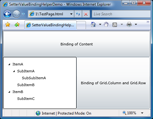
First, here's the XAML we'll be sharing. There's nothing fancy, just some standard controls that are part of the core framework for WPF, and part of the SDK/Toolkit for Silverlight.

<UserControl x:Class="SharingXamlSilverlightWpf_SL.MainPage"
    xmlns="http://schemas.microsoft.com/winfx/2006/xaml/presentation"
    xmlns:x="http://schemas.microsoft.com/winfx/2006/xaml"
    xmlns:systemWindows="clr-namespace:System.Windows;assembly=PresentationFramework"
    xmlns:systemWindowsControls="clr-namespace:System.Windows.Controls;assembly=PresentationFramework">
    <StackPanel>
        <systemWindowsControls:DockPanel>
            <TextBlock Text="Inside a DockPanel"/>
        </systemWindowsControls:DockPanel>

        <systemWindowsControls:Viewbox Height="40">
            <TextBlock Text="Inside a ViewBox"/>
        </systemWindowsControls:Viewbox>

        <systemWindowsControls:TreeView>
            <systemWindowsControls:TreeViewItem
                Header="Inside a TreeView(Item)"
                ItemsSource="{Binding}"
                IsExpanded="True">
                <systemWindowsControls:TreeViewItem.ItemTemplate>
                    <systemWindows:HierarchicalDataTemplate>
                        <TextBlock Text="{Binding}"/>
                    </systemWindows:HierarchicalDataTemplate>
                </systemWindowsControls:TreeViewItem.ItemTemplate>
            </systemWindowsControls:TreeViewItem>
        </systemWindowsControls:TreeView>
    </StackPanel>
</UserControl>
Aside: In the ideal world, we wouldn't need to use an XML namespace prefix under Silverlight and therefore this problem would never come up in the first place. Unfortunately, Silverlight 3 and the Silverlight 4 Beta don't support XmlnsDefinitionAttribute, so the fact that the SDK/Toolkit assemblies already properly implement it doesn't help us.

The interesting thing to note above is that all the relevant controls (DockPanel, Viewbox, TreeView, TreeViewItem, and HierarchicalDataTemplate) have a prefix and that things look just like you'd expect them to under WPF if you went to the trouble of specifying the namespace explicitly. And, in fact, that's all there is for WPF - just be explicit with the XAML and you're done!

So what's the magic that makes this work on Silverlight? Well, it's nothing in the application project there, either - just like with WPF there are no special changes required! However, there is an extra assembly on the Silverlight side...

Before I totally spoil the surprise, here's the code for that assembly:

extern alias SWC;
extern alias SWCT;
using System.Windows.Markup;
using SystemWindows = SWC::System.Windows;
using SystemWindowsControls = SWC::System.Windows.Controls;
using SystemWindowsControlsToolkit = SWCT::System.Windows.Controls;

namespace System.Windows
{
    // Stub class for HierarchicalDataTemplate
    public class HierarchicalDataTemplate : SystemWindows.HierarchicalDataTemplate
    {
    }
}

namespace System.Windows.Controls
{
    // Stub class for DockPanel
    public class DockPanel : SystemWindowsControlsToolkit.DockPanel
    {
    }

    // Stub class for TreeView
    public class TreeView : SystemWindowsControls.TreeView
    {
    }

    // Stub class for TreeViewItem
    public class TreeViewItem : SystemWindowsControls.TreeViewItem
    {
    }

    // Stub class for Viewbox
    // Silverlight's Viewbox is sealed, so simulate it with a ContentControl wrapper
    public class Viewbox : ContentControl
    {
        public Viewbox()
        {
            Template = (ControlTemplate)XamlReader.Load(@"
                <ControlTemplate
                    xmlns=""http://schemas.microsoft.com/winfx/2006/xaml/presentation""
                    xmlns:controls=""clr-namespace:System.Windows.Controls;assembly=System.Windows.Controls.Toolkit"">
                    <controls:Viewbox>
                        <ContentPresenter/>
                    </controls:Viewbox>
                </ControlTemplate>");
        }
    }
}

Aside from some extern alias/using stuff at the top to disambiguate references, there's nothing here we didn't see last time around - in fact, the subclassing trick for HierarchicalDataTemplate looks just like it does for the other classes.

But I thought that trick didn't work for HierarchicalDataTemplate?

Right, it doesn't work on WPF - but this assembly is Silverlight-only.

Then you need a matching assembly for WPF or else the project won't compile because of the XMLNS reference.

Unless the corresponding assembly already exists on WPF.

Oh, no you didn't...

Oh, yes I did! :)


The Silverlight-only assembly is named PresentationFramework.dll, the same name as the platform assembly that contains the actual implementations of the controls for WPF. The Silverlight platform doesn't have a PresentationFramework.dll, and this latest trick takes advantage of that fact to sneak one in. Because Silverlight doesn't suffer from the same DataTemplate subclassing bug, it's perfectly okay to subclass HierarchicalDataTemplate there.

So the original subclassing trick does 95% of what we want, the control wrapping trick adds Viewbox, and the PresentationFramework trick adds HierarchicalDataTemplate - which means we're 100% covered!


Well, at least until someone contacts me to report another problem. Which would no doubt be interesting to debug and I'd certainly want to have a look.

But not right now. Adding that same-named assembly has left me feeling a little slimy and I think I need a shower before I spend more time on this. :)

Silverlight 4 Beta is out - and the Toolkit has it covered! [Silverlight Toolkit November 2009 release now available for Silverlight 3 and 4!]

We've just published the November 09 release of the Silverlight Toolkit in conjunction with today's unveiling of the Silverlight 4 Beta! The Silverlight 4 Beta offers a bunch of neat new features which enable even more compelling online (and offline!) applications. Stuff like bi-directional text, web cam and microphone support, a RichTextArea control, clipboard access, ICommand, an elevated-trust model, printing, notifications, right-click, and more!

Of course, the big news for this post is a new version of the Silverlight Toolkit that's perfectly suited for developing great applications on Silverlight 4. And though it seems like just yesterday that we finished off the October 09 release, there are some neat, new things in today's release for Silverlight 3, as well. You can be confident that the Silverlight Toolkit has your back whichever platform you choose! :)


My announcements are usually all about the Toolkit's Data Visualization assembly - and there are some improvements in that area - but it wasn't my primary focus this time around. If you have a look at the official release notes, you'll see there are all kinds of new things across the board. I'm not going to repeat everything here, but I do want to highlight a few things:

Partial Release Notes

  • SL3/SL4: We've added a new control, BusyIndicator, based on the ActivityControl found in the RIA Services project template and samples. BusyIndicator makes it easy to add a "Please wait..." progress indicator to applications and does so in a way that's easy to customize. It's a simple control, but a handy one. I have a few examples below; please see David Poll's blog for more.
  • SL3/SL4: Minor tweaks to Data Visualization: Support more flexible subclassing scenarios of core classes, provide more helpful exception messages in some scenarios, tweak default Chart template to respect Padding, change type of Chart.LegendItems collection items to object for flexibility, convert Legend to a HeaderedItemsControl for consistency.
  • SL3/SL4: It's now possible to collect code coverage statistics when running unit tests with the Silverlight Unit Test Framework! Jeff spent some time this release productizing some clever hackery Ted Glaza originally did about a year ago, and this new capability fills a pretty big hole in the unit testing story for Silverlight. We're also including a couple of the custom build actions that we use internally - now you'll be able to use them in your projects! And we're including the XML files to make it easy for customers to enable Application Library Caching for their projects. For more information on these topics, please have a look at Jeff Wilcox's blog.
  • SL4: We've modified all the Toolkit/SDK control visuals and input handlers to behave correctly for right-to-left cultures and added mouse wheel support in some of the obvious places.
  • SL4: We've removed ImplicitStyleManager because Silverlight 4 supports implicit styles natively. Correspondingly, we've modified the Theme-based wrapper classes (TwilightBlue, ShinyRed, etc.) to use implicit styles.
  • SL4: Viewbox has moved into the Silverlight 4 core (i.e., it's available in the System.Windows.dll assembly that every Silverlight 4 install includes), so it has been removed from the Silverlight 4 Toolkit.
  • SL4: Along with the new MEF (Managed Extensibility Framework) features in the Silverlight 4 SDK, there's an experimental System.ComponentModel.Composition.Packaging.Toolkit assembly in the Toolkit that adds support for downloading secondary XAP’s and loading them into a MEF catalog. For more information, please have a look at Wes Haggard's blog.


BusyIndicator is in the house...

At its core, BusyIndicator is a simple wrapper control into which you put whatever makes up the UI of your application. (You can think of it as a special kind of Border with special abilities.) BusyIndicator exposes an IsBusy property which should be set to true (possibly via data binding) whenever the relevant portion of the application is busy and won't respond to user input. When this happens, BusyIndicator automatically disables its content and shows a simple UI to let the user know what's going on. It's really quite simple! :)

Here's the most basic scenario:

<controlsToolkit:BusyIndicator
    IsBusy="{Binding MyBusyProperty}">

    <!-- Content goes here... -->

</controlsToolkit:BusyIndicator>

And this is how it looks when IsBusy is set:

Default BusyIndicator

The most common change is to customize the message, and of course that's simple to do:

<controlsToolkit:BusyIndicator
    IsBusy="{Binding MyBusyProperty}"
    BusyContent="My custom message...">

    <!-- Content goes here... -->

</controlsToolkit:BusyIndicator>

Yielding:

BusyIndicator with custom message

Note that the BusyContent property is of type object, so we could have used other UI elements (like Grid, Image, and Button) for a message with more than just text. Of course, sometimes you want things to be totally custom - so there are some straightforward ways to do that which don't require you to completely re-Template:

<controlsToolkit:BusyIndicator
    IsBusy="{Binding MyBusyProperty}"
    BusyContent="{Binding}">

    <!-- Provide custom UI for busy display -->
    <controlsToolkit:BusyIndicator.BusyContentTemplate>
        <DataTemplate>
            <StackPanel>
                <TextBlock Text="Downloading Email" FontWeight="Bold" HorizontalAlignment="Center"/>
                <StackPanel Margin="6">
                    <TextBlock Text="{Binding MyStatus}"/>
                    <ProgressBar Value="{Binding MyProgress}" Height="15"/>
                </StackPanel>
                <Button Content="Cancel" HorizontalAlignment="Center"/>
            </StackPanel>
        </DataTemplate>
    </controlsToolkit:BusyIndicator.BusyContentTemplate>

    <!-- Remove unnecessary default ProgressBar -->
    <controlsToolkit:BusyIndicator.ProgressBarStyle>
        <Style TargetType="ProgressBar">
            <Setter Property="Visibility" Value="Collapsed"/>
        </Style>
    </controlsToolkit:BusyIndicator.ProgressBarStyle>

    <!-- Content goes here... -->

</controlsToolkit:BusyIndicator>

Which looks like:

BusyIndicator with custom UI

Another property to be aware of is the DisplayAfter property which lets you configure the initial delay before the busy indicator is shown - to avoid the annoying "on/off" flicker that would otherwise result from a lot of quick operations in succession. The BusyIndicator page of the public sample project has an interactive section where you can experiment with various delays and durations to see how this looks in action.


ImplicitStyleManager has left the building...

I wanted to show how to convert an existing application using ImplicitStyleManager over to using Silverlight 4's new implicit styling support. Because I made this change for the 11 Toolkit themes, I can tell you it is quite easy. :) Basically, it's just a matter of removing the ImplicitStyleManager attached property/properties and - where relevant - moving the ResourceDictionary of Styles into the Resources section of the parent element (or all the way up to App.xaml). Also, be sure to go through and remove any explicit assignments to the Style property or it's friends (e.g., ItemContanerStyle). (This probably isn't common in most applications, but the Toolkit Themes did it all over the place.)

To make that a little more concrete, here's a simplified "before" example that makes Buttons have blue text and ListBoxItems purple:

<StackPanel controlsThemingToolkit:ImplicitStyleManager.ApplyMode="OneTime">

    <!-- Styles for controls -->
    <StackPanel.Resources>
        <Style TargetType="Button">
            <Setter Property="Foreground" Value="Blue"/>
        </Style>
        <Style TargetType="ListBoxItem">
            <Setter Property="Foreground" Value="Purple"/>
        </Style>
    </StackPanel.Resources>

    <!-- Styled controls -->
    <Button Content="Button"/>
    <ListBox>
        <ListBoxItem Content="Item 1"/>
        <ListBoxItem Content="Item 2"/>
    </ListBox>

</StackPanel>

To convert this XAML over to Silverlight 4's implicit style support, just remove the highlighted portion above. The visuals will look exactly the same, but everything is more efficient because the platform is handling it internally. And what's more, various scenarios that were tricky to get working with ImplicitStyleManager (like styling the contents of a TabControl) now "just work" thanks to the new framework support for implicit styles!


Silverlight 4 has a lot of great improvements that really raise the bar for rich, interactive web applications. I encourage everyone to check it out today and start thinking about how to take advantage of all the new stuff! :) And when you're done with that, please check out the live Toolkit samples for Silverlight 3 or Silverlight 4, download the Toolkit installer(s) for the platform/platforms of your choice, and enjoy!

As the platform evolves, so do the workarounds [Better SetterValueBindingHelper makes Silverlight Setters better-er!]

Back in May, I mentioned that Silverlight 2 and 3 don't support putting a Binding in the Value of a Setter. I explained why this is useful (ex: MVVM, TreeView expansion, developer/designer separation, etc.) and shared a helper class I wrote to implement the intended functionality on Silverlight. My workaround supported setters for normal DependencyPropertys as well as attached ones, so it covered all the bases. It worked well on both flavors of Silverlight and a bunch of you went off and used SetterValueBindingHelper successfully in your own projects.

The sun was shining, birds were chirping, and all was right with (that part of) the world...

SetterValueBindingHelperDemo sample


Now flash forward to a few days ago when I was contacted by fellow Silverlight team members RJ Boeke and Vinoo Cherian with a report that certain uses of SetterValueBindingHelper which worked fine on Silverlight 2 and 3 were likely to break if used in a possible future version of Silverlight that was more consistent with WPF's handling of such things. You can imagine my astonishment and dismay...

Important aside: The Silverlight team takes backward compatibility very seriously, so running any Silverlight 2 or 3 application with SetterValueBindingHelper on such a future version of Silverlight would continue to work in the expected manner. The Silverlight team makes a concerted effort to ensure that each version of Silverlight is "bug compatible" with previous versions to prevent existing applications from suddenly breaking when a new version of Silverlight comes out. However, were someone to recompile such an application to target a newer release of Silverlight, that application would no longer be subject to the backwards compatibility quirks and would begin seeing the new (more correct/consistent) platform behavior.

RJ and Vinoo pointed out that a more WPF-consistent handling of Styles would break one of the samples that was part of my original blog post. Specifically, the following example would not have the first Binding applied (note: per convention, code in italics is wrong):

<Style TargetType="Button">
    <!-- WPF syntax:
    <Setter Property="Grid.Column" Value="{Binding}"/>
    <Setter Property="Grid.Row" Value="{Binding}"/> -->
    <Setter Property="local:SetterValueBindingHelper.PropertyBinding">
        <Setter.Value>
            <local:SetterValueBindingHelper
                Type="System.Windows.Controls.Grid, System.Windows, Version=2.0.5.0, Culture=neutral, PublicKeyToken=7cec85d7bea7798e"
                Property="Column"
                Binding="{Binding}"/>
        </Setter.Value>
    </Setter>
    <Setter Property="local:SetterValueBindingHelper.PropertyBinding">
        <Setter.Value>
            <local:SetterValueBindingHelper
                Type="Grid"
                Property="Row"
                Binding="{Binding}"/>
        </Setter.Value>
    </Setter>
</Style>

What's important to note is that two Setters are both setting the same Property (local:SetterValueBindingHelper.PropertyBinding) and WPF optimizes this scenario to only apply the last Value it sees. Clearly, it was time to think about how tweak SetterValueBindingHelper so it would work with this theoretical future release of Silverlight...

Tangential aside: This kind of platform change wouldn't affect just SetterValueBindingHelper - any place where multiple Setters targeted the same Property would behave differently. But that difference won't matter 99% of the time - SetterValueBindingHelper is fairly unique in its need that every Value be applied.


One idea for a fix is to expose something like PropertyBinding2 from SetterValueBindingHelper and treat it just like another PropertyBinding. While that would definitely work, how do we know that two properties is enough? What if you need three or four? No, despite its simplicity, this is not the flexible solution we're looking for.

Taking a step back, what we really want is to somehow provide an arbitrary number of Property/Binding pairs instead of being limited to just one. And if you read that last sentence and thought "Collection!", I like the way you think. :) Specifically, what if the same SetterValueBindingHelper class we're already using to provide the attached DependencyProperty and the data for it were also capable of storing a collection of other SetterValueBindingHelper objects? Yeah, sure, that would work!


So let's lay a few ground rules to help guide us:

  • Every current use of SetterValueBindingHelper should continue to be valid after we make our changes. In other words, upgrading should be a simple matter of dropping in the new SetterValueBindingHelper.cs file and that's all.
  • The new SetterValueBindingHelper syntax should work correctly for the current Silverlight 3 release as well as this mythical future version of Silverlight with the WPF-consistent Style changes.
  • The new collection syntax should be easy to use and easy to understand.
  • Arbitrary nesting is unnecessary; either someone's using a SetterValueBindingHelper on its own, or else they're using it as a container for a single, nested layer of SetterValueBindingHelper children.
  • We could try to be fancy and let children inherit things from their parent, but it's not actually as useful as it seems. Let's not go there and instead keep everything simple and consistent.

Keeping these guidelines in mind, the resulting changes to SetterValueBindingHelper give us the following alternate representation of the above XAML which works fine on Silverlight 3 today and will also give the desired effect on a possible future version of Silverlight with the WPF optimization:

<Style TargetType="Button">
    <!-- WPF syntax:
    <Setter Property="Grid.Column" Value="{Binding}"/>
    <Setter Property="Grid.Row" Value="{Binding}"/> -->
    <Setter Property="delay:SetterValueBindingHelper.PropertyBinding">
        <Setter.Value>
            <delay:SetterValueBindingHelper>
                <delay:SetterValueBindingHelper
                    Type="System.Windows.Controls.Grid, System.Windows, Version=2.0.5.0, Culture=neutral, PublicKeyToken=7cec85d7bea7798e"
                    Property="Column"
                    Binding="{Binding}"/>
                <delay:SetterValueBindingHelper
                    Type="Grid"
                    Property="Row"
                    Binding="{Binding}"/>
            </delay:SetterValueBindingHelper>
        </Setter.Value>
    </Setter>
</Style>
Aside: The two different ways of identifying Grid above are part of the original sample showing that both ways work - in practice, both instances would use the simple "Grid" form.


Other than the namespace change to "delay" (for consistency with my other samples), the only change here is the extra SetterValueBindingHelper wrapper you see highlighted. Everything else is pretty much the same and now it works on imaginary versions of Silverlight, too! :) So if you're working on an app and you find yourself needing SetterValueBindingHelper, please use this latest version; you can rest assured that you're future-proof.


[Click here to download the complete source code for SetterValueBindingHelper and its sample application.]


Here's the updated code in its entirety. Please note that I have used a normal (i.e., non-observable) collection, so dynamic updates to the Values property are not supported. This was a deliberate decision to minimize complexity. (And besides, I've never heard of anyone modifying the contents of a Style dynamically.)

/// <summary>
/// Class that implements a workaround for a Silverlight XAML parser
/// limitation that prevents the following syntax from working:
///    &lt;Setter Property="IsSelected" Value="{Binding IsSelected}"/&gt;
/// </summary>
[ContentProperty("Values")]
public class SetterValueBindingHelper
{
    /// <summary>
    /// Optional type parameter used to specify the type of an attached
    /// DependencyProperty as an assembly-qualified name, full name, or
    /// short name.
    /// </summary>
    [SuppressMessage("Microsoft.Naming", "CA1721:PropertyNamesShouldNotMatchGetMethods",
        Justification = "Unambiguous in XAML.")]
    public string Type { get; set; }

    /// <summary>
    /// Property name for the normal/attached DependencyProperty on which
    /// to set the Binding.
    /// </summary>
    public string Property { get; set; }

    /// <summary>
    /// Binding to set on the specified property.
    /// </summary>
    public Binding Binding { get; set; }

    /// <summary>
    /// Collection of SetterValueBindingHelper instances to apply to the
    /// target element.
    /// </summary>
    /// <remarks>
    /// Used when multiple Bindings need to be applied to the same element.
    /// </remarks>
    public Collection<SetterValueBindingHelper> Values
    {
        get
        {
            // Defer creating collection until needed
            if (null == _values)
            {
                _values = new Collection<SetterValueBindingHelper>();
            }
            return _values;
        }
    }
    private Collection<SetterValueBindingHelper> _values;

    /// <summary>
    /// Gets the value of the PropertyBinding attached DependencyProperty.
    /// </summary>
    /// <param name="element">Element for which to get the property.</param>
    /// <returns>Value of PropertyBinding attached DependencyProperty.</returns>
    [SuppressMessage("Microsoft.Design", "CA1011:ConsiderPassingBaseTypesAsParameters",
        Justification = "SetBinding is only available on FrameworkElement.")]
    public static SetterValueBindingHelper GetPropertyBinding(FrameworkElement element)
    {
        if (null == element)
        {
            throw new ArgumentNullException("element");
        }
        return (SetterValueBindingHelper)element.GetValue(PropertyBindingProperty);
    }

    /// <summary>
    /// Sets the value of the PropertyBinding attached DependencyProperty.
    /// </summary>
    /// <param name="element">Element on which to set the property.</param>
    /// <param name="value">Value forPropertyBinding attached DependencyProperty.</param>
    [SuppressMessage("Microsoft.Design", "CA1011:ConsiderPassingBaseTypesAsParameters",
        Justification = "SetBinding is only available on FrameworkElement.")]
    public static void SetPropertyBinding(FrameworkElement element, SetterValueBindingHelper value)
    {
        if (null == element)
        {
            throw new ArgumentNullException("element");
        }
        element.SetValue(PropertyBindingProperty, value);
    }

    /// <summary>
    /// PropertyBinding attached DependencyProperty.
    /// </summary>
    public static readonly DependencyProperty PropertyBindingProperty =
        DependencyProperty.RegisterAttached(
            "PropertyBinding",
            typeof(SetterValueBindingHelper),
            typeof(SetterValueBindingHelper),
            new PropertyMetadata(null, OnPropertyBindingPropertyChanged));

    /// <summary>
    /// Change handler for the PropertyBinding attached DependencyProperty.
    /// </summary>
    /// <param name="d">Object on which the property was changed.</param>
    /// <param name="e">Property change arguments.</param>
    private static void OnPropertyBindingPropertyChanged(DependencyObject d, DependencyPropertyChangedEventArgs e)
    {
        // Get/validate parameters
        var element = (FrameworkElement)d;
        var item = (SetterValueBindingHelper)(e.NewValue);

        if ((null == item.Values) || (0 == item.Values.Count))
        {
            // No children; apply the relevant binding
            ApplyBinding(element, item);
        }
        else
        {
            // Apply the bindings of each child
            foreach (var child in item.Values)
            {
                if ((null != item.Property) || (null != item.Binding))
                {
                    throw new ArgumentException(
                        "A SetterValueBindingHelper with Values may not have its Property or Binding set.");
                }
                if (0 != child.Values.Count)
                {
                    throw new ArgumentException(
                        "Values of a SetterValueBindingHelper may not have Values themselves.");
                }
                ApplyBinding(element, child);
            }
        }
    }

    /// <summary>
    /// Applies the Binding represented by the SetterValueBindingHelper.
    /// </summary>
    /// <param name="element">Element to apply the Binding to.</param>
    /// <param name="item">SetterValueBindingHelper representing the Binding.</param>
    private static void ApplyBinding(FrameworkElement element, SetterValueBindingHelper item)
    {
        if ((null == item.Property) || (null == item.Binding))
        {
            throw new ArgumentException(
                "SetterValueBindingHelper's Property and Binding must both be set to non-null values.");
        }

        // Get the type on which to set the Binding
        Type type = null;
        if (null == item.Type)
        {
            // No type specified; setting for the specified element
            type = element.GetType();
        }
        else
        {
            // Try to get the type from the type system
            type = System.Type.GetType(item.Type);
            if (null == type)
            {
                // Search for the type in the list of assemblies
                foreach (var assembly in AssembliesToSearch)
                {
                    // Match on short or full name
                    type = assembly.GetTypes()
                        .Where(t => (t.FullName == item.Type) || (t.Name == item.Type))
                        .FirstOrDefault();
                    if (null != type)
                    {
                        // Found; done searching
                        break;
                    }
                }
                if (null == type)
                {
                    // Unable to find the requested type anywhere
                    throw new ArgumentException(string.Format(CultureInfo.CurrentCulture,
                        "Unable to access type \"{0}\". Try using an assembly qualified type name.",
                        item.Type));
                }
            }
        }

        // Get the DependencyProperty for which to set the Binding
        DependencyProperty property = null;
        var field = type.GetField(item.Property + "Property",
            BindingFlags.FlattenHierarchy | BindingFlags.Public | BindingFlags.Static);
        if (null != field)
        {
            property = field.GetValue(null) as DependencyProperty;
        }
        if (null == property)
        {
            // Unable to find the requsted property
            throw new ArgumentException(string.Format(CultureInfo.CurrentCulture,
                "Unable to access DependencyProperty \"{0}\" on type \"{1}\".",
                item.Property, type.Name));
        }

        // Set the specified Binding on the specified property
        element.SetBinding(property, item.Binding);
    }

    /// <summary>
    /// Returns a stream of assemblies to search for the provided type name.
    /// </summary>
    private static IEnumerable<Assembly> AssembliesToSearch
    {
        get
        {
            // Start with the System.Windows assembly (home of all core controls)
            yield return typeof(Control).Assembly;

            // Fall back by trying each of the assemblies in the Deployment's Parts list
            foreach (var part in Deployment.Current.Parts)
            {
                var streamResourceInfo = Application.GetResourceStream(
                    new Uri(part.Source, UriKind.Relative));
                using (var stream = streamResourceInfo.Stream)
                {
                    yield return part.Load(stream);
                }
            }
        }
    }
}

My new home page, revised [Updated collection of great Silverlight/WPF Data Visualization resources!]

In the time since sharing my last collection of Silverlight/WPF Charting links, there have been some great new articles I'd like to highlight. And in case you haven't heard, we published the October 09 release of the Silverlight Toolkit last week, so please consider upgrading if you haven't already!

Here are the latest links (FYI: previously published links are gray):

Overviews (100 level)

Scenarios (200 level)

Internals (300 level)

Team Member posts (Partner level)

My posts (Ego level)

Many, many thanks to everyone who's spent time helping others learn how to use Silverlight/WPF Data Visualization!

PS - If I've missed any good resources, please leave a comment with a link - I'm always happy to find more good stuff! :)

PPS - The most recent version of this collection will always be pointed to by http://cesso.org/r/DVLinks. If you're going to link to this post, please use that URL so you'll always be up to date.

Two birds, one stone [Silverlight/WPF Data Visualization Development Release 2 and DataVisualizationDemos update]

The October 2009 release of the Silverlight Toolkit came out on Monday and the Data Visualization assembly includes some nice updates. I discussed the details of the new release then and promised to revise my samples to run on the new bits. While I anticipated doing things separately, it turned out to be easier to do everything at once. Here goes! :)


Silverlight/WPF Data Visualization Development Release 2

In the grand tradition of Data Visualization Development Releases, I've updated things to match the most recently released Toolkit code. In this case, that's the Silverlight Toolkit, so the code in the new Development Release is identical to what just went out with the Silverlight Toolkit. That means there's a bunch of new code for WPF here! People using Data Visualization on WPF can take advantage of the latest changes by updating to the binaries included with this Development Release or by compiling the corresponding code themselves. The release notes detail all the changes; there's nothing to call out here.

[Click here to download the SilverlightWpfDataVisualization solution including complete source code and pre-compiled binaries for both platforms.]


DataVisualizationDemos Sample Project Updated

The DataVisualizationDemos application is a collection of all the Data Visualization samples I've posted to my blog. Like the Data Visualization assembly itself, the demo application runs on Silverlight and WPF and shares the same code and XAML across both platforms. Not only is it a convenient way to look at a variety of sample code, it also has links back to the relevant blog posts for more detail about each sample.

Click here to download the complete source code for the cross-platform DataVisualizationDemos sample application.


Notes:

  • New to this release of the DataVisualizationDemos is my simple Column annotations sample.
  • I've added out-of-browser support to the Silverlight version of DataVisualizationDemos so users can easily install it and/or run it outside the browser.
  • Both flavors of DataVisualizationDemos now take advantage of custom icons for a little bit of added flair: DataVisualizationDemos icon
  • Because this version of the Data Visualization assembly contains a breaking change, the DataVisualizationDemos project can no longer use the assembly that shipped with the WPF Toolkit (or else both platforms wouldn't be able to share the same samples). Therefore, DataVisualizationDemos uses the WPF assembly from Data Visualization Development Release 2.
  • Which means TreeMap (added after the WPF Toolkit release) can now be part of the WPF version of DataVisualizationDemos!
  • If you're doing cross-platform development, sometimes you'll come across a control that lives in two different places. When that happens, it's hard to share the same XAML for both platforms - unless you know a trick! My usual technique for this is to declare my own same-named subclass in code (which automatically resolves to the right platform-specific class thanks to the namespace):

    public class DockPanel : System.Windows.Controls.DockPanel
    {
    }
    

    And then use my "custom" control (after adding the corresponding XML namespace declaration):

    <local:DockPanel ... />

    That works swell most of the time - except for when the class is sealed like Viewbox is on Silverlight... So I came up with a slight tweak of this strategy that solves the problem:

    #if SILVERLIGHT
        // Silverlight's Viewbox is sealed; simulate it with a ContentControl wrapper
        public class Viewbox : ContentControl
        {
            public Viewbox()
            {
                Template = (ControlTemplate)XamlReader.Load(@"
                    <ControlTemplate
                        xmlns=""http://schemas.microsoft.com/winfx/2006/xaml/presentation""
                        xmlns:controls=""clr-namespace:System.Windows.Controls;assembly=System.Windows.Controls.Toolkit"">
                        <controls:Viewbox>
                            <ContentPresenter/>
                        </controls:Viewbox>
                    </ControlTemplate>");
            }
        }
    #else
        public class Viewbox : System.Windows.Controls.Viewbox
        {
        }
    #endif
    

    And then just use it the same as above:

    <local:Viewbox ... />


The latest Data Visualization release has some nice improvements - I hope these two updates help people understand the new functionality and make it even easier to upgrade!

Silverlight (and WPF) Data Visualization classes unsealed [Silverlight Toolkit October 2009 release now available!]

We've just published the October 2009 release of the Silverlight Toolkit as part of today's .NET 4 and Visual Studio 2010's Beta 2 release! One of the big things we've done with this release of the Toolkit is to add rich support for Visual Studio 2010's vastly improved Silverlight design-time experience. In fact, the new VS 2010 design-time experience has gotten so good that some developers have stopped using Blend altogether! :) I encourage everyone to have a look at the live samples for the latest release of the Silverlight 3 Toolkit, download the Toolkit installer, and try for yourself!

Other big news for this release is the introduction of comprehensive, WPF-compatible drag-and-drop support for Silverlight! Although this support doesn't extend outside the web browser (that would require changes to Silverlight itself), it enables full-fidelity drag-and-drop experiences within the browser using the same API that WPF users are already accustomed to. And if that wasn't enough, there are also a collection of drag-and-drop-friendly "wrapper controls" for common scenarios (ex: ListBox, TreeView, and DataGrid) that make it trivial to add support for drag-and-drop to an existing control. Dragging and dropping within a control (to re-order items) or between controls (to move items around) is now just a few lines of XAML away! (Note: No code changes necessary!) But wait, there's more: There's also a wrapper for Charting's DataPointSeries that enables drag-and-drop into and out of a live Chart control! This really needs to be seen to be believed, so please visit the "Drag and Drop" page of the public samples for a great example of this. Then go read Jafar's post about the new drag/drop support for all the juicy details!

Note: The October 09 release of the Silverlight Toolkit includes binaries for Silverlight 3 only. Now that Silverlight 3 has been out for a few months and is fully backward-compatible with all Silverlight 2 applications, we expect that everyone has upgraded from Silverlight 2 and are therefore no longer actively developing the Toolkit for Silverlight 2. Of course, if some of you have a specific need for Silverlight 2 Toolkit bits, previous releases continue to be available to download from CodePlex!


With the introductory stuff out of the way, let's move on to the details of changes to the Data Visualization assembly and the corresponding improvements to Silverlight and WPF Charting. My recent post on Data Visualization Development Release 1 has already discussed most of these changes at length, so I'm just going to include the change descriptions here. For more detail on the motivation behind these changes or their implications for current and future possibilities, please refer back to that post.

Notable Changes

Unsealed (i.e., removed the "sealed" modifier from) all core Data Visualization classes. Although we aren't yet completely settled on the public-facing API for Data Visualization and reserve the right to make breaking changes in the future, these classes are being unsealed now to help simplify a wide variety of user scenarios that are being actively developed and that are cumbersome without the ability to subclass (without needing to create a private build of the assembly solely for the purpose of unsealing these classes). Other changes were kept to a minimum, but a couple of methods have been changed to protected virtual for consistency and/or convenience as well as some tweaks that resulted due to new code analysis warnings due to explicit interface implementations in an unsealed class.

Introduced ISeries interface to Charting as "base interface" for all Series. This allows users to write ItemsControl-based Series which will automatically leverage all of the ItemsControl infrastructure for creating points, tracking data changes, etc. and also gives us a safe root for a future 3D series hierarchy. As part of this change, some interfaces have been cleaned up a bit (IStyleDispenser, ISeriesHost) and others have been created (IStyleDispenser.StylesChanged event). Also, some public methods with little justification have been removed/made private/moved lower (Chart.Refresh, Chart.ResetStyles, StyleDispenser.ResetStyles) and some vestigial code has been removed (ISeriesHost.GlobalSeriesIndexesInvalidated).

Various usability improvements. Updated Series to look for "LegendItemStyle" in their ResourceDictionary for increased customizability. Added Owner property to LegendItem pointing to owning Series instance to simplify LegendItem-based user scenarios. Added ActualDataPointStyle and ActualLegendItemStyle properties and used Bindings to automatically propagate changes to the right places. (Aside: This fixes a bug that was reported against the WPF Toolkit as I was making the change!) Moved code so that PieSeries now has the DataPointStyle property like the other Series. Updated LegendItem default Template to include standard TemplateBindings for Background/BorderBrush/BorderThickness for more friendly designer experience.

Breaking Changes

Renamed Charting's StylePalette to Palette (for clarity) AND changed its type to IEnumerable<ResourceDictionary> (from IEnumerable<Style>) for a significant flexibility boost. Performed related renamings (many internal/private): IStyleDispenser->IResourceDictionaryDispenser, StylePalette->ResourceDictionaryCollection, StyleDispensedEventArgs->ResourceDictionaryDispensedEventArgs, StyleDispenser->ResourceDictionaryDispenser, StyleEnumerator->ResourceDictionaryEnumerator.

Most notably, this change makes it possible to associate MULTIPLE things with a palette entry and enables designers to easily and flexibly customize things like the LineSeries PolyLineStyle in the Palette. Additionally it enables the use of DynamicResource (currently only supported by the WPF platform) to let users customize their DataPointStyle without inadvertently losing the default/custom Palette colors. (Note: A very popular request!) Thanks to merged ResourceDictionaries, this also enables the addition of arbitrary resources at the Palette level (like Brushes) which can then be referenced by DataPoints, etc..

Changed return value of Charting's IAxis.GetPlotAreaCoordinate from UnitValue? to UnitValue to better support custom Axis implementations. Specifically, some numeric axis types (logarithmic axis, for example) don't support all numeric values and need a way to indicate that certain values (ex: <= 0 for logarithmic) are "not supported" for plotting. This was previously done by returning a null value, but now the code should return a UnitValue with Value=double.NaN. Convenience method UnitValue.NaN has been added to create such values easily. Because the Series implementations already need to handle NaN values, this change collapses two different edge cases into one and simplifies the code accordingly. Added code to Series to handle this situation by hiding (via Visibility=Collapsed) DataPoints on coordinates that are not valid.

One notable consequence of this change is that the Visibility of DataPoints is now controlled by the Series and will be set to Visible or Collapsed as necessary. Therefore, any customizations that directly set this property may no longer work, but there are other simple ways of achieving the same effect and this change is not expected to cause any difficulty. For example, the "Sparkline" demo of the samples project was affected by this change because it provided a custom DataPointStyle that set Visibility to Collapsed. The fix is not only trivial, but an improvement: change the Style to specify a null Template instead!

Other Changes

Remove unnecessary code. Moved duplicated DependencyProperties IRangeAxis DependentRangeAxis and IAxis IndependentAxis from ColumnSeries and BarSeries into common base class ColumnBarBaseSeries. Moved duplicated DependencyProperties IRangeAxis DependentRangeAxis and IAxis IndependentAxis from AreaSeries and LineSeries into common base class LineAreaBaseSeries. Made similar changes for methods OnApplyTemplate and UpdateDataPoint and half of UpdateShape.

Simplified default Palette Brushes by removing ScaleTransform and TranslateTransform and replacing with RadialBrush. The on-screen visuals remain the same, but the XAML is considerably smaller and simpler - and should be a bit quicker to render as well!

Various other small changes.


Of the two breaking changes, only the rename to Palette is likely to affect most people. Fortunately, converting existing code/XAML is really quite simple - which you can see as I recycle the example I gave previously.

The old way:

<chartingToolkit:Chart Title="Statistics (Custom Palette)">
    <chartingToolkit:Chart.StylePalette>
        <visualizationToolkit:StylePalette>
            <Style TargetType="Control">
                <Setter Property="Background" Value="Blue"/>
            </Style>
            <Style TargetType="Control">
                <Setter Property="Background" Value="Green"/>
            </Style>
            <Style TargetType="Control">
                <Setter Property="Background" Value="Red"/>
            </Style>
        </visualizationToolkit:StylePalette>
    </chartingToolkit:Chart.StylePalette>
    ...
</chartingToolkit:Chart>

And the new way (with changes highlighted):

<chartingToolkit:Chart Title="Statistics (Custom Palette)">
    <chartingToolkit:Chart.Palette>
        <visualizationToolkit:ResourceDictionaryCollection>
            <ResourceDictionary>
                <Style x:Key="DataPointStyle" TargetType="Control">
                    <Setter Property="Background" Value="Blue"/>
                </Style>
            </ResourceDictionary>
            <ResourceDictionary>
                <Style x:Key="DataPointStyle" TargetType="Control">
                    <Setter Property="Background" Value="Green"/>
                </Style>
            </ResourceDictionary>
            <ResourceDictionary>
                <Style x:Key="DataPointStyle" TargetType="Control">
                    <Setter Property="Background" Value="Red"/>
                </Style>
            </ResourceDictionary>
        </visualizationToolkit:ResourceDictionaryCollection>
    </chartingToolkit:Chart.Palette>
    ...
</chartingToolkit:Chart>

It's pretty clear that once you've done this once, it'll be easy to do anywhere else your project requires. I explained the motivations for this change previously, so I won't repeat myself here - I just wanted to call out how straightforward the upgrade is expected to be.


Clearly, the big news for Data Visualization is the unsealing of the primary charting classes! Because I went into great detail on this earlier, I won't spend a lot of time on that here. Instead, I'd like to call out a particularly timely and relevant use of the new subclassing ability: Cory Plotts' LogarithmicAxis implementation for WPF and Silverlight! What's great about what he's done is that logarithmic axis support is one of our most requested features, and something we haven't had a chance to implement yet. I've always hoped that somebody in the community would be able to step up and share something here, so I was really excited to see Cory's blog post. If you're one of the users who's been waiting for a logarithmic axis, please have a look at Cory's implementation and see if it does what you need!

Aside: You might be wondering why we haven't gotten to logarithmic axis ourselves... Well, as you may be aware, we've been operating under severe resource constraints from the beginning, and that forces us to try to choose our investments carefully. When we're trying to decide between two features and one of them constitutes a change to the core of the Charting framework while the other is something that derives from an existing class to build on top of the framework, we'll tend to make the core framework change and hope that the community is able to help with the subclassing change. Honestly, this seems like the right balance to me and is a large part of why we're unsealing now even though the Charting APIs aren't completely set in stone.

Along similar lines, I encourage people who have been wanting to annotate their PieSeries charts to have a look at the fantastic work Bea Stollnitz has done: Part 1, Part 2, Part 3. Bea built on top of the sealed Charting hierarchy using some pretty clever tricks and techniques. But now that we've unsealed, it's my hope that she'll be able to take advantage of that to spend more time working on the great features she's adding and less time trying to jump through artificial hoops. :)


There are two other things I'd like to call out here:

As always, if you have any questions or feedback, the right places to start are the Silverlight Discussion Forum or the WPF Discussion List. Bugs and feature requests can be logged with the Silverlight Issue Tracker or the WPF Issue Tracker. Please raise issues that are clearly unique to one platform or the other in the obvious place. But for general questions and things that are common to both platforms, the Silverlight forum/list is probably a better place because there's more context and history there.


Thanks very much for your interest in Silverlight and WPF Data Visualization - I hope you like the improvements!

If it walks like a duck and talks like a duck, it must be a ... TreeGrid! [A simple, XAML-only TreeGrid UI for WPF]

If you've done much work with WPF or Silverlight, chances are you already know what a TreeView is and what a DataGrid is. You know that a TreeView is good for showing hierarchical data and a DataGrid is good for showing tabular data. But you may not know about their hybrid love child, the TreeGrid - and that's what this post is about.

Sometimes you've got data that's basically tabular in nature, yet also has a hierarchical aspect, and you'd like to leverage that to give people control over the level of detail they're seeing. Most commonly, you'll see a TreeGrid used when the tabular data can be nicely summarized (or "rolled up") into hierarchical groupings. For example, a list of people's name and address would not make a good TreeGrid, because there's no natural grouping that makes sense (you can't combine addresses). However, a list of people's company and salary might make a good TreeGrid because it's natural to group by job and the aggregated salary information could be informative (either as an average or as a sum).

Aside: You might wonder if DataGrid's native support for grouping would be useful here. In my experience, DataGrids don't tend to summarize the grouped data like we want - but if you have examples to the contrary, I'd love to see them.

So with all this talk about TreeGrid, you might expect to find one in the Silverlight or WPF framework, or perhaps as part of the Silverlight Toolkit or WPF Toolkit. But you won't - it's just not used frequently enough to have made it to the big leagues yet. The good news is that a bit of web searching will turn up some third-party TreeGrid options that definitely seem worth evaluating. But because I'm cheap and a show-off - and occasionally fall victim to a little NIH - I decided to craft a TreeGrid-like experience using only the WPF TreeView control, a couple of Grids, and some XAML.

That's right - no code, just XAML! :)


Here's how my SimpleTreeGridUX sample looks with some data I made up about the schedule of a fictional developer:

SimpleTreeGridUX sample

And here's the complete XAML:

<!-- TreeGrid "Control" -->
<Border BorderBrush="Black" BorderThickness="1">

    <!-- Resources -->
    <Border.Resources>
        <Style x:Key="TextBlockStyle" TargetType="{x:Type TextBlock}">
            <Setter Property="Margin" Value="3 0 3 0"/>
        </Style>
        <Style x:Key="TextBlockBoldStyle" TargetType="{x:Type TextBlock}" BasedOn="{StaticResource TextBlockStyle}">
            <Setter Property="FontWeight" Value="Bold"/>
        </Style>
    </Border.Resources>

    <!-- Content -->
    <Grid Grid.IsSharedSizeScope="True">
        <Grid.RowDefinitions>
            <RowDefinition Height="Auto"/>
            <RowDefinition/>
        </Grid.RowDefinitions>

        <!-- Column headers -->
        <TreeViewItem Grid.Row="0" BorderThickness="1">
            <TreeViewItem.Header>
                <Grid>
                    <Grid.ColumnDefinitions>
                        <ColumnDefinition SharedSizeGroup="Task"/>
                        <!-- Placeholders for two columns of ToggleButton -->
                        <ColumnDefinition SharedSizeGroup="Toggle"/>
                        <ColumnDefinition SharedSizeGroup="Toggle"/>
                        <ColumnDefinition SharedSizeGroup="Duration"/>
                        <ColumnDefinition SharedSizeGroup="Notes"/>
                    </Grid.ColumnDefinitions>
                    <TextBlock Grid.Column="0" Text="Task" Style="{StaticResource TextBlockBoldStyle}"/>
                    <!-- Empty TreeViewItem to measure the size of its ToggleButton into the "Toggle" group-->
                    <TreeViewItem Grid.Column="1" Padding="0"/>
                    <TextBlock Grid.Column="3" Text="Duration" Style="{StaticResource TextBlockBoldStyle}"/>
                    <TextBlock Grid.Column="4" Text="Notes" Style="{StaticResource TextBlockBoldStyle}"/>
                </Grid>
            </TreeViewItem.Header>
        </TreeViewItem>

        <!-- Data rows -->
        <TreeView Grid.Row="1" ItemsSource="{Binding SubItems}" BorderBrush="Gray" BorderThickness="0 1 0 0">
            <TreeView.ItemTemplate>

                <!-- Level 0 template leaves space for 2 child "Toggle" levels -->
                <HierarchicalDataTemplate ItemsSource="{Binding SubItems}">
                    <Grid>
                        <Grid.ColumnDefinitions>
                            <ColumnDefinition SharedSizeGroup="Task"/>
                            <ColumnDefinition SharedSizeGroup="Toggle"/>
                            <ColumnDefinition SharedSizeGroup="Toggle"/>
                            <ColumnDefinition SharedSizeGroup="Duration"/>
                            <ColumnDefinition SharedSizeGroup="Notes"/>
                        </Grid.ColumnDefinitions>
                        <TextBlock Grid.Column="0" Text="{Binding Task}" Style="{StaticResource TextBlockStyle}"/>
                        <TextBlock Grid.Column="3" Text="{Binding Duration}" Style="{StaticResource TextBlockStyle}"/>
                        <TextBlock Grid.Column="4" Text="{Binding Notes}" Style="{StaticResource TextBlockStyle}"/>
                    </Grid>

                    <!-- Level 1 template leaves space for 1 child "Toggle" level -->
                    <HierarchicalDataTemplate.ItemTemplate>
                        <HierarchicalDataTemplate ItemsSource="{Binding SubItems}">
                            <Grid>
                                <Grid.ColumnDefinitions>
                                    <ColumnDefinition SharedSizeGroup="Task"/>
                                    <ColumnDefinition/>
                                    <ColumnDefinition SharedSizeGroup="Toggle"/>
                                    <ColumnDefinition SharedSizeGroup="Duration"/>
                                    <ColumnDefinition SharedSizeGroup="Notes"/>
                                </Grid.ColumnDefinitions>
                                <TextBlock Grid.Column="0" Text="{Binding Task}" Style="{StaticResource TextBlockStyle}"/>
                                <TextBlock Grid.Column="3" Text="{Binding Duration}" Style="{StaticResource TextBlockStyle}"/>
                                <TextBlock Grid.Column="4" Text="{Binding Notes}" Style="{StaticResource TextBlockStyle}"/>
                            </Grid>

                            <!-- Level 2 template has no children -->
                            <HierarchicalDataTemplate.ItemTemplate>
                                <HierarchicalDataTemplate ItemsSource="{Binding SubItems}">
                                    <Grid>
                                        <Grid.ColumnDefinitions>
                                            <ColumnDefinition SharedSizeGroup="Task"/>
                                            <ColumnDefinition/>
                                            <ColumnDefinition/>
                                            <ColumnDefinition SharedSizeGroup="Duration"/>
                                            <ColumnDefinition SharedSizeGroup="Notes"/>
                                        </Grid.ColumnDefinitions>
                                        <TextBlock Grid.Column="0" Text="{Binding Task}" Style="{StaticResource TextBlockStyle}"/>
                                        <TextBlock Grid.Column="3" Text="{Binding Duration}" Style="{StaticResource TextBlockStyle}"/>
                                        <TextBlock Grid.Column="4" Text="{Binding Notes}" Style="{StaticResource TextBlockStyle}"/>
                                    </Grid>
                                </HierarchicalDataTemplate>
                            </HierarchicalDataTemplate.ItemTemplate>
                        </HierarchicalDataTemplate>
                    </HierarchicalDataTemplate.ItemTemplate>
                </HierarchicalDataTemplate>
            </TreeView.ItemTemplate>
        </TreeView>
    </Grid>
</Border>


Notes:

  • There are two "tricks" I use to get DataGrid-like behavior from a TreeView. The first is the Grid.IsSharedSizeScope attached DependencyProperty and its partner-in-crime DefinitionBase.SharedSizeGroup. (Both available only on WPF for now.) By setting IsSharedSizeScope on a parent element and SharedSizeGroup on some of the column/row definitions of Grids within it, it's possible to "link" the sizes of cells across different Grids. In the scenario above, that sharing takes place across the separate Grids of the column headers and each TreeViewItem row of data. In this manner, same-width columns are created for the "Task", "Duration", and "Notes" fields so they all line up properly. Except that they wouldn't actually line up if it weren't for...
  • The "Toggle" shared size group which is used to offset TreeViewItem children to take into account the indent that TreeViewItem parents automatically impose on them. The following diagram of the default TreeViewItem layout should help explain what I mean:
    Header
    Children
    You see, each collection of children is offset to the right by exactly the width of the TreeViewItem's toggle element. So if all we did was make each column's cells the same width, things wouldn't actually line up because of this offset showing up in different amounts everywhere:
    Header
    Header
    Children
    So what I've done is add a special shared size group with exactly the same width as the toggle (this is what the empty TreeViewItem in the header section of the XAML is for). Having done that, the "Toggle" size group can be used to simulate the width of the actual toggle anywhere it's needed. Therefore, I'm able to insert the appropriate counter-offset for each level of the tree - and everything lines up beautifully!
  • You've probably noticed that there's an unfortunate amount of XAML duplication above - each of the three HierarchicalDataTemplates are very nearly identical. In fact, the only difference among them is whether the second and third ColumnDefinition have the SharedSizeGroup property or not. Now, I strive to stay as DRY as the next guy, and I tried to come up with a way to collapse the three templates into one. But while I could do so quite easily using a bit of code, I couldn't come up with a nice way that was pure XAML.
    Aside: Converting the template contents to a UserControl gets close, but there's still the problem of toggling that property based on external input. And while it would definitely be possible to decorate the (view) model with information about each element's level, I considered that to be "cheating" for the purposes of this exercise. :)


[Click here to download the complete source code for the SimpleTreeGridUX sample.]


Just in case it's not really obvious by now, what I describe here is not a true TreeGrid control! While I'll suggest that it looks like a real TreeGrid, behaves mostly like one, and is probably good enough for many scenarios, I'm also the first to acknowledge it's not a true TreeGrid. A true TreeGrid would probably have an extensive API for managing columns and rows, allow sorting and arbitrary nesting, and end up with an object model pretty similar to DataGrid's. So if you came here looking for a proper TreeGrid control, I'm sorry to disappoint you - but if you came here hoping to learn more about solving real-world problems with WPF, I hope this has been educational! :)

I get by with a little help from my friends [PieSeries annotations trilogy complete!]

Friend and fellow Charting fan Bea Stollnitz has just completed a 3-post series describing how to add annotations to pie charts created by the Data Visualization package that's part of the Silverlight Toolkit and WPF Toolkit. Because annotations are a feature that we'd love to implement ourselves (but haven't had time for yet), I'm delighted that someone in the community has taken this task on - and shared the experience for the benefit of others!

Here are direct links to Bea's posts:

  1. How can I add labels to a WPF pie chart?
  2. How can I add labels to a WPF pie chart? – Implementation details
  3. How can I port the WPF labeled pie chart to Silverlight?

My thanks go out to Bea for sharing her time and expertise here - I hope others find this as cool as I do! :)


PS - Please note that while a number of WPF-to-Silverlight incompatibilities are identified in the third post, none of them come from the Data Visualization assembly. We've specifically spent a good bit of effort to make the Silverlight and WPF code/XAML experience identical for Data Visualization; it's the success of projects like this one that are the reason and reward!

PPS - In the next release of the Data Visualization assembly (which you can preview now!), the core Charting classes will no longer be sealed and some of the inconvenience mentioned in the second post should go away.

PPPS - Here's my own take on a quick-and-easy way to add simple annotations to ColumnSeries.

PPPPS - If you're looking for more information about the Silverlight/WPF Data Visualization assembly, I've collected a bunch of links from across the web - including all of my own introductions and notes.

A preview of upcoming Charting changes [Silverlight/WPF Data Visualization Development Release 1]

It was about two months ago that I posted about Silverlight/WPF Data Visualization Development Release 0. At the time, I explained how I was hoping to do occasional, out-of-band releases of the Data Visualization assembly that's part of the Silverlight Toolkit and WPF Toolkit in order to give people an early glimpse of upcoming changes and maybe get a bit of feedback along the way.

It's that time again...


Announcing Silverlight/WPF Data Visualization Development Release 1!


As usual, there have been plenty of distractions these past weeks to keep us, um..., distracted - but we've still managed to make some significant architectural tweaks that I think people are going to appreciate. Maybe a little less so in the short term because there are a couple of breaking changes, but definitely in the long term because these changes enable some very interesting scenarios and should do a lot to make it easier to develop with the Data Visualization framework.

Please bear in mind that this is just a development release, so it hasn't gone through the same level of scrutiny that our official releases get. Therefore, there may be some behavioral anomalies - and if there are, I apologize in advance. So if you do find an issue, please contact me (by leaving a comment below or by clicking the Email link on my blog) as I'd love to fix whatever I can before the next official release!

Because I'm trying to keep the cost of doing Development Releases down, I'm not doing my usual long-winded write up of new features. Instead, I'm going to include the notable changeset descriptions from our source control system along with a few brief notes. If that isn't enough detail to get you excited, then you're probably not the target audience for these Development Releases. ;)


Notable Changes (from the check-in comments)

Unseal (i.e., remove the "sealed" modifier) from all Data Visualization classes that were previously sealed. Although we aren't yet completely settled on the public-facing API for Data Visualization and reserve the right to make breaking changes in the future, these classes are being unsealed now to help simplify a wide variety of user scenarios that are being actively developed and that are cumbersome without the ability to subclass (without needing to create a private build of the assembly solely for the purpose of unsealing these classes). Other changes were kept to a minimum, but a couple of methods have been changed to protected virtual for consistency and/or convenience as well as some tweaks that resulted due to new code analysis warnings due to explicit interface implementations in an unsealed class.

While this is the most controversial change, I think it's the right thing for us to do now. The concern is that people will take our unsealing as encouragement to go off and subclass everything - and then be disappointed/frustrated when they need to change their code after we make some subsequent breaking change to the API. And I sympathize with this concern - so if you're worried about this happening to you, just pretend everything's still sealed for now. The official indication that the API has stabilized will be when the classes in the Data Visualization assembly change quality bands from Preview (their current band) to Stable. That's not happening yet, so please be aware that there's a certain amount of risk when making the decision to build on the current API.

That said, I'm of the opinion that we have little to lose with this because the decision is entirely in the customers' hands. If you don't want the risk, don't take it. But if you're doing something cool with Charting and wish you could subclass to avoid a bunch of additional effort, then this change is for you. :) For instance, Bea Stollnitz is doing some cool stuff with adding annotations to PieSeries - and she's basically called us out in that post for making her task harder because our classes are sealed. Well, discouraging folks from using the Data Visualization assembly is the last thing I'm trying to do - so we're unsealing now to help make the platform as friendly as possible.

And while you're busy taking advantage of the new ability to subclass, I fully expect there will be places we haven't exposed all the extensibility points people want. When that happens, please let me know, and we'll look into addressing that oversight in a future release. Think of it as the "You scratch our backs, we'll scratch yours" model of software development... :)


Introduce ISeries interface to Charting as "base interface" for all Series. This will allow users to write ItemsControl-based Series which will automatically leverage all of the ItemsControl infrastructure for creating points, tracking data changes, etc. and also gives us a safe root for a future 3D series hierarchy. As part of this change, some interfaces have been cleaned up a bit (IStyleDispenser, ISeriesHost) and others have been created (IStyleDispenser.StylesChanged event). Also, some public methods with little justification have been removed/made private/moved lower (Chart.Refresh, Chart.ResetStyles, StyleDispenser.ResetStyles) and some vestigial code has been removed (ISeriesHost.GlobalSeriesIndexesInvalidated). Aside from adjusting for renamed/deleted functionality, all tests continue to pass as-is.

There are two pretty big wins from this change - so go back and re-read that paragraph if you weren't paying attention. We've prototyped both an ItemsControl-based PieSeries and a (WPF-only) Viewport3D-based PieSeries and the results are very promising! Simply by changing our base Series contract from a class to an interface, we give people with simple needs the ability to leverage the existing ItemsControl framework and significantly decrease the amount of code they need to understand and interact with. (Aside: There have even been suggestions to change our existing series over to use this model!) And the benefits for 3D are also compelling - though further off in the future due to a variety of open issues and unanswered questions. I'm not going to dwell on the implications of this change more right now, but there are obviously some cool possibilities that I'd love to see folks start to explore. (Hint, hint, friends of Charting...)


Rename Charting's StylePalette to Palette (for clarity) AND change its type to IEnumerable<ResourceDictionary> (from IEnumerable<Style>) for a significant flexibility boost. Perform related renamings (many internal/private): IStyleDispenser->IResourceDictionaryDispenser, StylePalette->ResourceDictionaryCollection, StyleDispensedEventArgs->ResourceDictionaryDispensedEventArgs, StyleDispenser->ResourceDictionaryDispenser, StyleEnumerator->ResourceDictionaryEnumerator. Modify all code, comments, tests, samples, themes, etc. accordingly.

Most notably, this change gives us the ability to associate MULTIPLE things with a palette entry and enables designers to easily and flexibly customize things like LineSeries PolyLineStyle in the Palette. Additionally it enables the use of DynamicResource (currently only supported by the WPF platform) to let users customize their DataPointStyle *without* inadvertently losing the default/custom Palette colors. Due to merged ResourceDictionaries, this also enables the addition of arbitrary resources at the Palette level (like Brushes) which can be referenced by DataPoints, etc..

Also: Simplify default Background Brushes by removing ScaleTransform and TranslateTransform and replacing with RadialBrush properties, and more...

This is going to be the most painful change for existing users of Data Visualization - sorry! If you've ever customized a StylePalette, your XAML is going to need to change. However, the opportunities this change opens up seem sufficiently compelling that we've decided to make it now (while we still have the freedom to do so). The good news is that the migration is really quite simple - and once you've seen it done once, you can mindlessly apply the change everywhere it's needed.

To prove it, here's a sample of the "old" way from my original Charting Introduction post:

<chartingToolkit:Chart Title="Statistics (Custom Palette)">
    <chartingToolkit:Chart.StylePalette>
        <visualizationToolkit:StylePalette>
            <Style TargetType="Control">
                <Setter Property="Background" Value="Blue"/>
            </Style>
            <Style TargetType="Control">
                <Setter Property="Background" Value="Green"/>
            </Style>
            <Style TargetType="Control">
                <Setter Property="Background" Value="Red"/>
            </Style>
        </visualizationToolkit:StylePalette>
    </chartingToolkit:Chart.StylePalette>
    ...
</chartingToolkit:Chart>

And here's that same XAML converted to the "new" way of doing things (I've highlighted the changes):

<chartingToolkit:Chart Title="Statistics (Custom Palette)">
    <chartingToolkit:Chart.Palette>
        <visualizationToolkit:ResourceDictionaryCollection>
            <ResourceDictionary>
                <Style x:Key="DataPointStyle" TargetType="Control">
                    <Setter Property="Background" Value="Blue"/>
                </Style>
            </ResourceDictionary>
            <ResourceDictionary>
                <Style x:Key="DataPointStyle" TargetType="Control">
                    <Setter Property="Background" Value="Green"/>
                </Style>
            </ResourceDictionary>
            <ResourceDictionary>
                <Style x:Key="DataPointStyle" TargetType="Control">
                    <Setter Property="Background" Value="Red"/>
                </Style>
            </ResourceDictionary>
        </visualizationToolkit:ResourceDictionaryCollection>
    </chartingToolkit:Chart.Palette>
    ...
</chartingToolkit:Chart>

Yes, the new syntax is a little bit longer, no doubt about that - but the ability to associate multiple resources with a single palette entry addresses some very tricky problems we've been avoiding till now. And the DynamicResource benefits for WPF address the single biggest complaint people have had with StylePalette: Why should I have to redefine the entire color palette when all I want to do is provide a new template? This is a really powerful shift, and something I'll probably spend more time showing off in a future blog post.


Update Series to look for "LegendItemStyle" in their ResourceDictionary for increased customizability. Add Owner property to LegendItem pointing to owning series to simplify LegendItem-based user scenarios. Add ActualDataPointStyle and ActualLegendItemStyle properties and use Bindings to automatically propagate changes to the right places. (Aside: This fixes a bug that was reported against the WPF Toolkit *as I was making this change*!) Move code so that PieSeries now has the DataPointStyle property like the other Series. Update LegendItem default Template to include standard TemplateBindings for Background/BorderBrush/BorderThickness for more friendly designer experience.

Hey, look, we're already making use of the new ResourceDictionaryCollection! :) The other two big improvements here are the comprehensive use of bindings for the DataPointStyle property that fixes an issue a few customers have bumped into (it's confusing unless you know exactly what's going on) and the addition of DataPointStyle to PieSeries which is like the DynamicResource change in that it should do a lot to simplify things on the WPF platform.


Move unnecessarily duplicated DependencyProperties IRangeAxis DependentRangeAxis and IAxis IndependentAxis from ColumnSeries and BarSeries into common base class ColumnBarBaseSeries. Move unnecessarily duplicated DependencyProperties IRangeAxis DependentRangeAxis and IAxis IndependentAxis from AreaSeries and LineSeries into common base class LineAreaBaseSeries. Same for methods OnApplyTemplate and UpdateDataPoint and half of UpdateShape. Also remove an unnecessary override from CategoryAxis. No functional impact.

Less code, same features, no functional impact - 'nuff said.


[Please click here to download the complete SilverlightWpfDataVisualization solution (includes all source code and pre-compiled binaries for both platforms).]


Release Notes

  • When you add a project reference to the Data Visualization assembly on WPF, you also need to add a reference to WPFToolkit.dll or you'll get weird runtime errors because the Visual State Manager (VSM) isn't available.
  • The file structure of the ZIP archive remains the same (see my previous post for details).
  • Design-time assemblies are not part of the Development Releases because I don't expect the target audience to need them and because they add additional complexity.
  • I haven't updated my DataVisualizationDemos application for this unofficial release.


So there you have it: the second Silverlight/WPF Data Visualization Development Release in a nutshell. Though, in many ways, this is really the first release because the previous release didn't showcase upcoming changes like this one does (it mainly set the stage for future releases). I said before that these Development Releases are an experiment - so please let me know if you find them useful or if you'd all rather just wait for an official release and find out what's changed then. I'm hopeful that early access to the new code will be helpful to our early adopters and that we'll be able to incorporate their feedback to deliver an even more compelling, more reliable official release.

So this is me trying to do my part; the ball is in your court now, Charting fans. So, what's it going to be then, eh?

Following up on some of the attention [Live sample posted and a *very* small tweak to the Html5Canvas source code!]

I posted the source code for a Silverlight implementation of the HTML 5 <canvas> API yesterday and some readers have been pretty interested in the concept/implementation. Thanks for all your comments and feedback!

Earlier today, kind user Fabien Ménager left a comment reporting an unhandled exception in the sample app and was generous enough to follow up by sending me the text of the exception. And as soon as I saw it, I knew the problem - both because of what it said and because of the language it was in!

Here, you give it a try:

System.FormatException: Le format de la chaîne d'entrée est incorrect.

Here's a hint: the operating system's culture settings for France (and many other countries) use a ',' for the decimal separator instead of '.' (as is used in the United States). For example, while Pi would be written as "3.14" with the US culture settings, it would be written as "3,14" with French culture settings. And while Html5Canvas doesn't accept any user input, it does parse some of the JavaScript input that makes up the script... Specifically, my sample application includes the following line:

context.fillStyle = "rgba(255, 127, 39, 0.8)";

The <canvas> specification allows for strings to be assigned to the fillStyle property, so it's necessary for Html5Canvas to parse that string. And it was the "0.8" alpha value that was the problem here. Attempting to parse that value with the user's culture settings will fail for a culture that uses ',' as the decimal separator. This is actually a common problem for text formats that are meant to be used in multiple cultures - and the typical solution is to require that the text always be written for some form of invariant culture (which typically adheres to the US's conventions). Therefore, the trivial fix was to parse that value according to the invariant culture (i.e., always use '.' as the decimal separator) instead of using the default parsing behavior which honors the user's settings.

Aside: The default behavior is nearly always what you want... except for very rarely when it's not... like this time! :)

Of course, if I'd reviewed the project's code analysis warnings a few days ago, I would have found this issue earlier. And while I usually do that for all my sample code, I skipped it this time because it was proof-of-concept code and because I knew the "Naming" analysis rules threw lots of warnings for the official <canvas> API (mainly because JavaScript tends to follow different conventions than .NET). So as punishment for my misdeed, I went ahead and fixed (or suppressed) all of the non-"Naming" code analysis warnings in the project!

To be clear, there is no functional change because of this - but now the code is just a little bit cleaner. :)


[Please click here to download the updated source code to Html5Canvas and its sample application.]


And while I was at it, I decided to post the sample application in runnable form just in case there were some people who wanted to watch the Hypotrochoid draw itself, but didn't want to compile the sample themselves.


[Click here or on the image below to run the sample application in your browser.]

Sample application in IE


It has been great to see all the interest in this project over the past couple of days - thanks very much for everyone's support, feedback, and kind words!!