Having problems with layout? Switch to Plan B! [LayoutTransformControl scenarios for WPF]
When I first wrote about adding full LayoutTransform fidelity to Silverlight with my LayoutTransformControl project, I mentioned that I'd found two scenarios where LayoutTransformControl's behavior differed from WPF's LayoutTransform. (Background reading for LayoutTransformControl: Motivation and introduction for Beta 1, Significant enhancements and update for Beta 2, Update for RTW, Fixes for two edge case bugs) These two differences were intentional because it seemed to me that the corresponding WPF behavior was incorrect. Now you can judge for yourself. :)
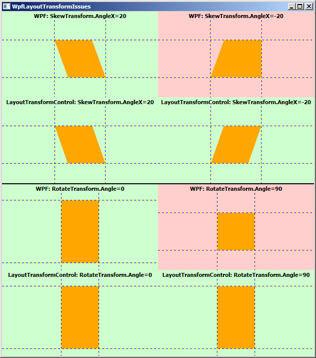
The sample WPF application shown here (note: complete source code is attached to this post) demonstrates two variants of the problematic scenarios; one rendered by WPF's LayoutTransform and the other by LayoutTransformControl. The top four cells demonstrate the first scenario and the bottom four cells demonstrate the second. Cells on the left show a variant that both implementations agree on while cells on the right show a small modification that demonstrates conflicting behavior. I've shaded the problematic sections red to help identify them. Here's how it looks:

The XAML for top scenario's red quadrant is this:
<Grid Background="Orange">
    <Grid.LayoutTransform>
        <SkewTransform AngleX="-20"/>
    </Grid.LayoutTransform>
    <Grid MinHeight="75" MinWidth="75"/>
</Grid>
It's a simple skew on a free-sized Grid with arbitrary content (for simplicity, the content is another Grid with MinWidth/MinHeight, but this could be a Button or any other typical content). The behavior for positive skew angles makes sense to me, but the behavior for negative angles seems inconsistent and causes undesirable clipping of the content (which is really obvious when applied to a Button). The corresponding XAML for LayoutTransformControl's "correct" rendering is:
<l:LayoutTransformControl>
    <l:LayoutTransformControl.Transform>
        <SkewTransform AngleX="-20"/>
    </l:LayoutTransformControl.Transform>
    <Grid Background="Orange">
        <Grid MinHeight="75" MinWidth="75"/>
    </Grid>
</l:LayoutTransformControl>
The XAML for bottom scenario's red quadrant is this:
<Grid Width="75">
    <Grid Background="Orange">
        <Grid.LayoutTransform>
            <RotateTransform Angle="90"/>
        </Grid.LayoutTransform>
        <Grid MinHeight="125" MinWidth="125"/>
    </Grid>
</Grid>
It's a width-constrained, free-sized Grid with arbitrary content. The behavior for Angle=0 (or 180) makes sense to me, but the behavior for Angle=90 (or 270) does not; at this angle the content should be vertically unbounded and should stretch to the full 125 pixels of the inner Grid. Changing the nature of the outer constraint from width to height exhibits the same "doesn't stretch" behavior at Angle=90 (or 270). The corresponding XAML for LayoutTransformControl's "correct" rendering is:
<Grid Width="75">
    <l:LayoutTransformControl>
        <l:LayoutTransformControl.Transform>
            <RotateTransform Angle="90"/>
        </l:LayoutTransformControl.Transform>
        <Grid Background="Orange">
            <Grid MinHeight="125" MinWidth="125"/>
        </Grid>
    </l:LayoutTransformControl>
</Grid>
I reported both of these issues to the WPF team when I found them, but unfortunately they weren't able to address them for the .NET 3.5 SP1 release. Although it might put LayoutTransformControl out of a job, I'm optimistic that both will be fixed in a future update of WPF. :) For the time being, though, I humbly suggest giving LayoutTransformControl a try if you encounter unexpected behavior like this. It's probably the quickest, easiest patch you'll find!