The blog of dlaa.me

Freedom isn't free [Tip: When creating a DependencyProperty, follow the handy convention of "wrapper+register+static+virtual"]

Tip

When creating a DependencyProperty, follow the handy convention of "wrapper+register+static+virtual"

Explanation

The fundamental steps for defining a Silverlight/WPF DependencyProperty are fairly rigid and not open to a great deal of flexibility (as I discuss in this earlier tip about the CLR wrapper). However, there's a bit more freedom once you add a default value or a PropertyChangedCallback delegate to the mix - but don't let it go to your head! :) For convenience and flexibility, I recommend the pattern shown below; the same one used by most of the core Silverlight and WPF controls. Observe that while the PropertyMetadata constructor requires a static delegate for property change notifications, doing instance-specific work in a static method is inconvenient. Therefore, the static method below does the bare minimum before handing execution off to a more appropriate instance method. (Aside: Explicit casts are safe because the DependencyProperty infrastructure is responsible for honoring the contract of the Register call.) The extra level of indirection also provides an opportunity to pass more meaningful parameters to the change handler: the property's old value and its new value. And because the instance method is virtual, subclasses can override it to receive their own notification of property changes easily and efficiently. Working with DependencyProperty can be tricky enough; do yourself a favor and start with a solid foundation.

Good Example

public int MyProperty
{
    get { return (int)GetValue(MyPropertyProperty); }
    set { SetValue(MyPropertyProperty, value); }
}
public static readonly DependencyProperty MyPropertyProperty = DependencyProperty.Register(
    "MyProperty", typeof(int), typeof(MyControl), new PropertyMetadata(0, OnMyPropertyChanged));
private static void OnMyPropertyChanged(DependencyObject d, DependencyPropertyChangedEventArgs e)
{
    ((MyControl)d).OnMyPropertyChanged((int)e.OldValue, (int)e.NewValue);
}
protected virtual void OnMyPropertyChanged(int oldValue, int newValue)
{
    // TODO: Handle property change
}

More information

Do one thing, and do it well [Tip: The CLR wrapper for a DependencyProperty should do its job and nothing more]

Tip

The CLR wrapper for a DependencyProperty should do its job and nothing more

Explanation

The CLR wrapper for a Silverlight/WPF DependencyProperty exists purely as a convenience to the developer. The "real" value of a DependencyProperty is stored by the system and accessed by the GetValue and SetValue methods. In fact, parts of the system will only access the value in that manner (possible examples: XAML parser, storyboard animations, etc.). And even if that weren't the case, the fact that the DependencyProperty field is public means that other parts of an application might do so as well (and there is no way of knowing when or stopping them). Therefore, it's not possible to ensure that any custom logic added to the CLR property's set or get wrapper implementation will run every time the DependencyProperty is accessed. Unless you're a fan of inconsistent state, hard to find bugs, or the like, it is typically unwise to violate this convention.

Good Example

public int MyProperty
{
    get { return (int)GetValue(MyPropertyProperty); }
    set { SetValue(MyPropertyProperty, value); }
}

More information

Q: How do you eat an elephant? A: One bite at a time... [Announcing a new "Development Tips" series on my blog!]

With all that's going on lately, more and more people are moving their development efforts to Silverlight and WPF. What's nice is that there are already a lot of great resources available to help developers learn the basics of Silverlight and WPF programming. Whether you prefer books, videos, blogs, etc., there's no shortage of material out there to help you get started!

But what about the next stage? What do you do to learn the finer points of the platform? The subtle nuances? The tricks? The traps??

One of my goals for this blog is to help intermediate and advanced developers shed their inhibitions and get more intimately involved with the platform. Therefore, many of my posts push the boundaries or do things in ways that might not be completely obvious to a newcomer. But there's another facet to becoming a proficient developer - learning best practices and incorporating them into your daily routine. To that end, I'll be doing a new series of posts tagged "Development Tips"!

The idea is that each tip will include a short, clear directive, a brief, easy to understand explanation, a simple example, and a few links to more information. Some of the tips are bound to be things just about everyone knows, while others will probably be new to some of you. Some can be found in the documentation for the platform, but others will be simple conventions that have been found to make life easier. And though there are exceptions to every rule, I won't be calling them out because I want to keep the recommendations clear and concise.

I'm going to try to avoid controversial topics, but it would be silly not to expect some discontent every now and then. :) If you disagree with something I've written, please leave a comment explaining why you disagree what you recommend instead. I'll follow up on comments like that and if there are enough people who call me out on something, I'll revisit the topic in a new post highlighting the controversy. Of course, I'm not claiming that anything I recommend is definitively the best technique! Every situation is different and everyone has their own favorite ways of doing things. Rather, I'd like to share some tips that I've found to work well in my experience - and that seem likely to help others in similar situations.

Okay, enough boring background already - the next post will be the first of the Development Tips!


PS - That link in the previous sentence takes you to my blog's tag filter for "Development Tips". I'll tag every tip like that so it will be easy to see them all in one place.

Confessions of a ListBox groupie [Using IValueConverter to create a grouped list of items simply and flexibly]

A customer recently asked how to implement a simple "grouped ListBox" experience in Silverlight (now available in desktop, mobile, and extra crispy flavor!), so I dashed off this sample to show one way that's pretty easy to work with.

Well, actually, the first thing I did was ask if DataGrid (which supports grouping natively) was an option - but the customer felt strongly about using a ListBox, so here we are...

The core of my solution is a custom IValueConverter implementation. If you've read my blog much, you were probably expecting that because I tend to be a pretty big fan. As usual, IValueConverter is convenient because it allows us to easily transform the source data into something that looks how we want without needing to modify the actual data source or values. In fact, the rest of the application doesn't really need to know what's going on - this is a (mostly) UI-only solution.

Okay, not needing to modify the original data is a nice advantage. What else would we like to see in a good solution? Well, it would be nice if it were easy to customize the appearance of items and their group headers without writing any code. And it would be nice if the grouping logic were flexible enough to allow grouping on any criteria (ex: value of a property, value ranges, first letter of name, etc.). And of course we want the designer to have the flexibility to hook everything up in XAML.


That seems like a pretty reasonable list of requirements - and we can handle them all without a problem. But first, let's see it in action:

GroupingItemsControlConverter sample

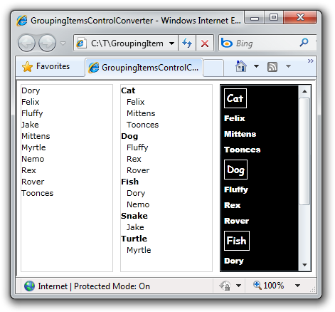
On the left is the original data in a simple ItemsControl, in the center is a grouped version of that same data (just like we wanted!), and on the right is the same grouping of that data - this time a little more fancy and in a ListBox so the items are selectable! The XAML for the middle example looks like this:

<Grid.Resources>
    <delay:GroupingItemsControlConverter x:Key="GroupingItemsControlConverter"/>

    <delay:GroupingItemsControlConverterParameters x:Key="SimpleGroupingItemsControlConverterParameter">
        <delay:GroupingItemsControlConverterParameters.GroupSelector>
            <local:AnimalSpeciesGroupSelector/>
        </delay:GroupingItemsControlConverterParameters.GroupSelector>

        <delay:GroupingItemsControlConverterParameters.GroupHeaderTemplate>
            <DataTemplate>
                <ContentControl Content="{Binding}" FontWeight="Bold"/>
            </DataTemplate>
        </delay:GroupingItemsControlConverterParameters.GroupHeaderTemplate>

        <delay:GroupingItemsControlConverterParameters.ItemTemplate>
            <DataTemplate>
                <ContentControl Content="{Binding Name}" Padding="8 0 0 0"/>
            </DataTemplate>
        </delay:GroupingItemsControlConverterParameters.ItemTemplate>
    </delay:GroupingItemsControlConverterParameters>

</Grid.Resources>

<!-- ... -->

<ItemsControl
    ItemsSource="{Binding Converter={StaticResource GroupingItemsControlConverter},
        ConverterParameter={StaticResource SimpleGroupingItemsControlConverterParameter}}"/>


[Click here to download the complete source code for the GroupingItemsControlConverter sample as a Silverlight 4 Visual Studio 2010 solution.]


How does it work? Fairly simply, actually! Once parameters have been validated, the GroupingItemsControlConverter class makes a call to Linq's GroupBy extension method using the custom grouping method specified and follows with a call to the OrderBy extension method. The results are then output as a sequence of ContentControl instances with a custom DataTemplate applied according to whether each thing is a group header or an item. This pattern should seem pretty familiar; it's the standard ItemsControl model mixed together with something kind of like implicit DataTemplates. The GroupingItemsControlConverterParameters class lets you specify the GroupHeaderTemplate, the ItemTemplate, and an class implementing the IGroupingItemsControlConverterSelector interface. And don't worry, the custom implementation of that interface is quite trivial - here's what the sample application uses:

// Simple IGroupingItemsControlConverterSelector implementation for grouping by an Animal's species
public class AnimalSpeciesGroupSelector : IGroupingItemsControlConverterSelector
{
    public Func<object, IComparable> GetGroupSelector()
    {
        return (o) => ((Animal)o).Species;
    }
}


As you can see, the simple example really is pretty simple. :) The fancier example on the right is very similar, except that it uses a bit more XAML to get that "black is the new white" effect that's becoming so popular lately. And it makes use of my SetterValueBindingHelper implementation which adds support for specifying a Binding in the Value of a Setter on Silverlight to bind the ListBoxItem's IsEnabled property to another simple IValueConverter to disable the headers so they can't be clicked on or selected.

Aside: Yes, I know that the very top group header is selectable when using the keyboard on current Silverlight bits. No, it's not my bug. Yes, I already reported it to the relevant people. :)


Those of you familiar with my blog may be wondering why I haven't mentioned that everything here works on WPF, too... Okay, fine, I fully expect that what I've done here will work exactly the same on WPF as it does on Silverlight. :) However, WPF's support of additional features like implicit DataTemplates means that I'd probably implement this solution a little differently on WPF. If you're itching to use this code as-is on WPF, go right ahead; I don't anticipate any problems with that. But if you do, maybe spend just a bit of time thinking about how you would do things differently on WPF...


Here's the complete implementation of GroupingItemsControlConverter and its helper classes for those who are interested:

/// <summary>
/// Class that implements simple grouping for ItemsControl and its subclasses (ex: ListBox)
/// </summary>
public class GroupingItemsControlConverter : IValueConverter
{
    /// <summary>
    /// Modifies the source data before passing it to the target for display in the UI.
    /// </summary>
    /// <param name="value">The source data being passed to the target.</param>
    /// <param name="targetType">The Type of data expected by the target dependency property.</param>
    /// <param name="parameter">An optional parameter to be used in the converter logic.</param>
    /// <param name="culture">The culture of the conversion.</param>
    /// <returns>The value to be passed to the target dependency property.</returns>
    public object Convert(object value, Type targetType, object parameter, CultureInfo culture)
    {
        // Validate parameters
        var valueAsIEnumerable = value as IEnumerable;
        if(null == valueAsIEnumerable)
        {
            throw new ArgumentException("GroupingItemsControlConverter works for only IEnumerable inputs.", "value");
        }
        var parameterAsGroupingItemsControlConverterParameter = parameter as GroupingItemsControlConverterParameters;
        if (null == parameterAsGroupingItemsControlConverterParameter)
        {
            throw new ArgumentException("Missing required GroupingItemsControlConverterParameter.", "parameter");
        }
        var groupSelectorAsIGroupingItemsControlConverterSelector =
            parameterAsGroupingItemsControlConverterParameter.GroupSelector as IGroupingItemsControlConverterSelector;
        if (null == groupSelectorAsIGroupingItemsControlConverterSelector)
        {
            throw new ArgumentException(
                "GroupingItemsControlConverterParameter.GroupSelector must be non-null and implement IGroupingItemsControlConverterSelector.",
                "parameter");
        }

        // Return the grouped results
        return ConvertAndGroupSequence(valueAsIEnumerable.Cast<object>(), parameterAsGroupingItemsControlConverterParameter);
    }

    /// <summary>
    /// Converts and groups the values of the specified sequence according to the settings of the specified parameters.
    /// </summary>
    /// <param name="sequence">Sequence of items.</param>
    /// <param name="parameters">Parameters for the grouping operation.</param>
    /// <returns>Converted and grouped sequence.</returns>
    private IEnumerable<object> ConvertAndGroupSequence(IEnumerable<object> sequence, GroupingItemsControlConverterParameters parameters)
    {
        // Validate parameters
        var groupSelector = ((IGroupingItemsControlConverterSelector)(parameters.GroupSelector)).GetGroupSelector();
        if (null == groupSelector)
        {
            throw new NotSupportedException("IGroupingItemsControlConverterSelector.GetGroupSelector must return a non-null value.");
        }

        // Do the grouping and ordering
        var groupedOrderedSequence = sequence.GroupBy(groupSelector).OrderBy(g => g.Key);

        // Return the wrapped results
        foreach (var group in groupedOrderedSequence)
        {
            yield return new ContentControl { Content = group.Key, ContentTemplate = parameters.GroupHeaderTemplate };
            foreach (var item in group)
            {
                yield return new ContentControl { Content = item, ContentTemplate = parameters.ItemTemplate };
            }
        }
    }

    /// <summary>
    /// Modifies the target data before passing it to the source object. This method is called only in TwoWay bindings.
    /// </summary>
    /// <param name="value">The target data being passed to the source.</param>
    /// <param name="targetType">The Type of data expected by the source object.</param>
    /// <param name="parameter">An optional parameter to be used in the converter logic.</param>
    /// <param name="culture">The culture of the conversion.</param>
    /// <returns>The value to be passed to the source object.</returns>
    public object ConvertBack(object value, Type targetType, object parameter, CultureInfo culture)
    {
        throw new NotImplementedException("GroupingItemsControlConverter does not support ConvertBack.");
    }
}

/// <summary>
/// Class that represents the input parameters to the GroupingItemsControlConverter class.
/// </summary>
public class GroupingItemsControlConverterParameters
{
    /// <summary>
    /// Template to use for the header for a group.
    /// </summary>
    public DataTemplate GroupHeaderTemplate { get; set; }

    /// <summary>
    /// Template to use for the items of a group.
    /// </summary>
    public DataTemplate ItemTemplate { get; set; }

    /// <summary>
    /// Selector to use for determining the grouping of the sequence.
    /// </summary>
    public IGroupingItemsControlConverterSelector GroupSelector { get; set; }
}

/// <summary>
/// Interface for classes to be used as a selector for the GroupingItemsControlConverterParameters class.
/// </summary>
public interface IGroupingItemsControlConverterSelector
{
    /// <summary>
    /// Function that returns the group selector.
    /// </summary>
    /// <returns>Key to use for grouping.</returns>
    Func<object, IComparable> GetGroupSelector();
}

My new home page, refreshed [Updated collection of great Silverlight/WPF Data Visualization resources!]

Some great content has been published since I posted my previous collection of Silverlight/WPF Charting links. What's more, the November 2009 release of the Silverlight Toolkit and the February 2010 release of the WPF Toolkit have both been released, so please have a look at them if you haven't already!

Now, without further ado, here are all links that are fit to print (FYI: previously published links are gray):

Overviews (100 level)

Scenarios (200 level)

Internals (300 level)

Team Member posts (Partner level)

My posts (Ego level)

My many thanks go out to everyone who has spent time helping people learn how to use Silverlight/WPF Data Visualization!

PS - If I've missed any good resources, please leave a comment with a link - I'm always happy to find more great content! :)

PPS - The most recent version of this collection will always be pointed to by http://cesso.org/r/DVLinks. If you're going to create a favorite or link to this post, please use that URL so you'll always be up to date.

Turn your head and check out this post [How to: Easily rotate the axis labels of a Silverlight/WPF Toolkit chart]

When someone asked me how to rotate the axis labels of a chart from the Data Visualization package of the Silverlight Toolkit/WPF Toolkit earlier today, I realized it was time for a quick blog post. Because when I've answered a question two or three times, it's usually a pretty good sign that I'll keep on answering it for some time. I usually try to head that kind of thing off at the pass, so here's my post on the topic for the benefit of future generations. :)

The typical scenario here is that someone has a chart and it's working well, but their axis labels are very long and end up overlapping - even after the default axis behavior of putting them in alternating rows to prevent such a problem kicks in:

Overlapping axis labels


The typical solution is to rotate the axis labels - and it's easy once you know where to look. The key here is to customize the Template of the AxisLabel instances that are used to render the labels. And it's quite simple to do so by providing a Style with a Template Setter for the AxisLabelStyle property of the Axis subclass in question:

Rotated axis labels on WPF

Yeah, it looks great on paper; but that description was a mouthful...

It's probably easier to understand in XAML - here's the complete code for the sample above with the interesting part highlighted:

<Window x:Class="WpfApplication1.MainWindow"
        xmlns="http://schemas.microsoft.com/winfx/2006/xaml/presentation"
        xmlns:x="http://schemas.microsoft.com/winfx/2006/xaml"
        xmlns:charting="clr-namespace:System.Windows.Controls.DataVisualization.Charting;assembly=System.Windows.Controls.DataVisualization.Toolkit"
        xmlns:sys="clr-namespace:System;assembly=mscorlib"
        xmlns:spec="clr-namespace:System.Collections.Specialized;assembly=System"
        Title="RotatedAxisLabelsWPF"
        Width="500"
        Height="350">
    <Grid>
        <charting:Chart
            Title="Animals With Long Names">
            <charting:ColumnSeries
                Title="Character count"
                DependentValueBinding="{Binding Length}"
                IndependentValueBinding="{Binding}">
                <charting:ColumnSeries.ItemsSource>
                    <spec:StringCollection>
                        <sys:String>Bumblebee</sys:String>
                        <sys:String>Caterpillar</sys:String>
                        <sys:String>Hippopotamus</sys:String>
                        <sys:String>Rhinoceros</sys:String>
                        <sys:String>Velociraptor</sys:String>
                    </spec:StringCollection>
                </charting:ColumnSeries.ItemsSource>
                <charting:ColumnSeries.IndependentAxis>
                    <charting:CategoryAxis
                        Orientation="X">
                        <charting:CategoryAxis.AxisLabelStyle>
                            <Style TargetType="charting:AxisLabel">
                                <Setter Property="Template">
                                    <Setter.Value>
                                        <ControlTemplate TargetType="charting:AxisLabel">
                                            <TextBlock Text="{TemplateBinding FormattedContent}">
                                                <TextBlock.LayoutTransform>
                                                    <RotateTransform Angle="-60"/>
                                                </TextBlock.LayoutTransform>
                                            </TextBlock>
                                        </ControlTemplate>
                                    </Setter.Value>
                                </Setter>
                            </Style>
                        </charting:CategoryAxis.AxisLabelStyle>
                    </charting:CategoryAxis>
                </charting:ColumnSeries.IndependentAxis>
            </charting:ColumnSeries>
        </charting:Chart>
    </Grid>
</Window>

Like I said, it's all pretty standard stuff once you know where to look. Of course, you can rotate the labels all the way to 90 degrees if you want them to take the least amount of space possible. But 60 degrees seemed like a suitably rakish angle. ;)


Unfortunately, we can't declare "Mission Accomplished" quite yet... While the Data Visualization assembly itself works exactly the same on WPF and Silverlight, the platforms themselves aren't identical quite yet. Specifically, there's no support for LayoutTransform in Silverlight (and RenderTransform is simply not appropriate here). Fortunately, I've filled the LayoutTransform gap with my LayoutTransformer class - and it's already part of the Silverlight Toolkit!

The syntax changes just a bit, but the concept is exactly the same:

<UserControl x:Class="SilverlightApplication1.MainPage"
    xmlns="http://schemas.microsoft.com/winfx/2006/xaml/presentation"
    xmlns:x="http://schemas.microsoft.com/winfx/2006/xaml"
    xmlns:charting="clr-namespace:System.Windows.Controls.DataVisualization.Charting;assembly=System.Windows.Controls.DataVisualization.Toolkit"
    xmlns:sys="clr-namespace:System;assembly=mscorlib"
    xmlns:toolkit="clr-namespace:System.Windows.Controls;assembly=System.Windows.Controls.Toolkit"
    xmlns:layout="clr-namespace:System.Windows.Controls;assembly=System.Windows.Controls.Layout.Toolkit">
    <Grid>
        <charting:Chart
            Title="Animals With Long Names">
            <charting:ColumnSeries
                Title="Character count"
                DependentValueBinding="{Binding Length}"
                IndependentValueBinding="{Binding}">
                <charting:ColumnSeries.ItemsSource>
                    <toolkit:ObjectCollection>
                        <sys:String>Bumblebee</sys:String>
                        <sys:String>Caterpillar</sys:String>
                        <sys:String>Hippopotamus</sys:String>
                        <sys:String>Rhinoceros</sys:String>
                        <sys:String>Velociraptor</sys:String>
                    </toolkit:ObjectCollection>
                </charting:ColumnSeries.ItemsSource>
                <charting:ColumnSeries.IndependentAxis>
                    <charting:CategoryAxis
                        Orientation="X">
                        <charting:CategoryAxis.AxisLabelStyle>
                            <Style TargetType="charting:AxisLabel">
                                <Setter Property="Template">
                                    <Setter.Value>
                                        <ControlTemplate TargetType="charting:AxisLabel">
                                            <layout:LayoutTransformer>
                                                <layout:LayoutTransformer.LayoutTransform>
                                                    <RotateTransform Angle="-60"/>
                                                </layout:LayoutTransformer.LayoutTransform>
                                                <TextBlock Text="{TemplateBinding FormattedContent}"/>
                                            </layout:LayoutTransformer>
                                        </ControlTemplate>
                                    </Setter.Value>
                                </Setter>
                            </Style>
                        </charting:CategoryAxis.AxisLabelStyle>
                    </charting:CategoryAxis>
                </charting:ColumnSeries.IndependentAxis>
            </charting:ColumnSeries>
        </charting:Chart>
    </Grid>
</UserControl>

Mission accomplished:

Rotated axis labels on Silverlight


There you have it: AxisLabelStyle is your new best friend. A friend with benefits, one might say, because there are other cool things you can do by customizing the AxisLabel Style.

So please: go forth and enjoy your new friend!

Highlighting a "weak" contribution [Enhancements make preventing memory leaks with WeakEventListener even easier!]

It was back in March of last year that I explained the motivation for the WeakEventListener class I'd started using in the Silverlight Toolkit's Data Visualization assembly. Since then, a few other Toolkit controls have added WeakEventListener where necessary - but otherwise not much has changed...

Then, a few days ago, I saw that Beat Kiener had written a post detailing the specifics of how WeakEventListener really works. Where I focused more on saying why WeakEventListener is necessary, Beat does a great job of showing why - with lots of pretty diagrams and a detailed explanation. He even identifies a mistake users of WeakEventListener might make and outlines a simple tweak to the original implementation to prevent it! Beat's post is a good read, and I recommend it for anyone who's interested in this stuff.

But wait, there's more! Beat followed with a post about a wrapper to simplify the common usage pattern shared by every WeakEventListener consumer. Whereas WeakEventListener is a little tricky to use correctly, Beat's wrapper is easy to get right - and still gets the job done! So if you've wanted to make use of WeakEventListener, but were intimidated by the technical details, please have a look at these two posts because I think you'll find it's really quite approachable. :)


PS - If you think you have a memory leak, but aren't sure, this post I wrote about using WinDbg, SOS, and GCRoot to diagnose .NET memory leaks may be helpful.

This is what happens when two Toolkits fall in love... [The February 2010 release of the WPF Toolkit is now available!]

The WPF Toolkit team has just published the February 2010 release of the WPF Toolkit! In addition to a variety of bug fixes for DataGrid, DatePicker, Calendar, and Visual State Manager, this release also includes the latest changes to the Data Visualization assembly for Silverlight and WPF, bringing the official WPF implementation up to date with the November 2009 release of the Silverlight Toolkit. And because sharing the Silverlight Toolkit's Data Visualization assembly with WPF Toolkit customers has worked out so well, this release of the WPF Toolkit introduces three other controls from the Silverlight Toolkit: AutoCompleteBox (SDK documentation), Accordion, and Rating!


WPF Toolkit February 2010 installer


Just as with the Data Visualization assembly, the WPF Toolkit implementation of AutoCompleteBox, Accordion, and Rating are almost identical copies of the latest Silverlight Toolkit implementations - we've even kept the same assembly names and structure. Therefore, everything you already know and love about these controls on Silverlight (including your code and XAML) should translate seamlessly to WPF! Even the Visual Studio 2008 design-time experience for these controls should be the same; we've brought the Visual Studio design-time assemblies over, too!

These controls have been part of the Silverlight Toolkit long enough that there are plenty of great resources on the web for information, examples, and more. I expect WPF developers will come up to speed quickly and be able to start taking advantage of them in WPF applications in no time! :)


Aside: This release of the WPF Toolkit targets the version of WPF that is part of .NET 3.5 (just as previous releases did). There isn't a version of the WPF Toolkit specifically for .NET 4 - largely because many of the controls in the WPF Toolkit were folded into WPF 4 itself!


Those of you who follow the progress of the Data Visualization project already know that I maintain a collection of helpful links from all over the web here: http://cesso.org/r/DVLinks. Another handy resource for new users is my DataVisualizationDemos sample project which runs on Silverlight 3, Silverlight 4, WPF 3.5, and WPF 4 and provides examples of a bunch of different things made possible by the Data Visualization project. Finally, there are some WPF Toolkit-specific notes that are part of my WPF Toolkit June 2009 announcement and which may be worth reviewing. (In particular, the "Build Notes" section covers an issue that occasionally trips people up when trying to compile the design-time assemblies themselves.)


Release notes: For a summary of the changes to the WPF version of Data Visualization since the June 2009 WPF Toolkit and numerous code/XAML examples, please have a look at my announcements for the July 2009, October 2009, and November 2009 releases of the Silverlight Toolkit.


It's always exciting when there's a new Toolkit release - and a bit of a relief because there's a lot of work that goes on behind the scenes to make these possible. I'd like to thank the WPF Toolkit team for their continued support of Data Visualization and for their willingness to include additional controls from the Silverlight Toolkit. In particular, I'd like to thank Patrick Danino who did nearly all the work to port the three new controls over to WPF, test them, and resolve a few platform incompatibilities that came up! His efforts went well beyond what I expected when he and I first talked about the idea and it has been a pleasure working with him on this. If any bugs happened to sneak through, it's not for lack of effort on Patrick's part. :) Please don't blame him - blame me instead!

No trees were harmed in the making of this blog post [How to: Successfully print a Chart with the Silverlight 4 Beta]

One of the big requests people have had for Silverlight was the ability to print, so one thing that's new in the Silverlight 4 Beta is the PrintDocument class which enables applications to print anything they want! There isn't an excess of fancy bells and whistles quite yet, but the support Silverlight provides is enough to do just about everything - it's just that sometimes you might need to do a little more than you expect. :) It's the classic "crawl, walk, run" approach to feature delivery, and this is a great first step that will be a welcome addition for everyone who's been wanting to print with Silverlight.

Okay, so that's all well and good and people can print any content they want and it all looks beautiful and works perfectly, right? Pretty much, yes! Well, except for certain scenarios involving charts from the Silverlight/WPF Data Visualization assembly. :( To be clear, if you try to print a Chart that's already in the visual tree, it works just fine and what you see really is what you get. But if you've tried to create custom content specifically for printing (for example: a different layout, maybe some page headers and footers, etc.) and that content included a Chart instance, you probably noticed a minor issue: none of the data points showed up on the page. Darn, it sure is hard to tell what's going on without those data points...


Fortunately, a bit of mental debugging reveals what's going on here. Charting's data points fade in by default - from Opacity 0 to 1 over the course of 0.5 seconds via a Visual State Manager transition. That's cool and it works great in the visual tree - however, when you're creating print-specific visuals and immediately printing them, those data points don't have a chance to do much fading in... So they're actually all there on the printed page, but they're at Opacity 0, so you can't see them!

What to do? Well, the most convenient thing would be for the Chart code to somehow know it was going to be printed and SkipToFill those pesky animations. But there's no official way for a control to know it's being created for printing. There are a few tricks the Chart could use to make an educated guess, but it doesn't do so yet - and I'm not sure that's the right answer anyway. So the next most obvious thing would be to re-Template the DataPoints to replace the default fading Template with one that doesn't fade, but instead starts fully visible. And as you'd expect, this works just fine - the data points show up and look great!

However, that's a lot of work that you probably don't want to have to do. It would be nice if there were a middle ground - some technique that was maybe a little bit of a hack, but that was really easy to implement and worked just about all the time...


And the good news is that there is such a hack! The idea builds upon the observation that printing a Chart from the visual tree works correctly - so let's start by popping our new, print-ready chart into the visual tree to give it a chance to get all pretty, then print it once that's done. That seems easy enough, let's try it:

// Create customized content for printing
var chart = new Chart { Title = "My Printed Chart" };
var series = new LineSeries
{
    ItemsSource = (PointCollection)Resources["Items"],
    DependentValuePath = "Y",
    IndependentValuePath = "X",
};
chart.Series.Add(series);
var content = new Border
{
    BorderBrush = new SolidColorBrush(Colors.Magenta),
    BorderThickness = new Thickness(10),
    Child = chart,
};

// Create container for putting content in the visual tree invisibly
var visualTreeContainer = new Grid
{
    Width = 1000,
    Height = 1000,
    Opacity = 0,
};

// Put content in the visual tree to initialize
visualTreeContainer.Children.Add(content);
LayoutRoot.Children.Add(visualTreeContainer);

// Prepare to print
var printDocument = new PrintDocument();
printDocument.PrintPage += delegate(object obj, PrintPageEventArgs args)
{
    // Unparent the content for adding to PageVisual
    visualTreeContainer.Children.Remove(content);
    args.PageVisual = content;
};

// Print the content
printDocument.Print();

// Remove container from the visual tree
LayoutRoot.Children.Remove(visualTreeContainer);

Note that the sample application is creating a completely new Chart instance here (with a print-specific title and custom magenta frame) - and that the printed output looks just like it should:

ChartPrinting sample output


[Click here to download the source code for the ChartPrinting sample for the Silverlight 4 Beta as a Visual Studio 2010 solution]


The Chart is added to the visual tree before the print dialog is shown - so it has plenty of time for those 0.5 second animations to play to completion while the user interacts with the dialog. The only sketchy bit is that an exceedingly fast user could possibly manage to print a Chart before the animations had run all the way to completion. Yes, well, I said it was a hack up front, didn't I? :) If you want rock-solid printing behavior, you probably ought to be re-templating the data points in order to ensure the initial visuals are exactly as you want them. But if you're just interested in printing something attractive with a minimum of fuss or inconvenience - and your users aren't hopped up on performance enhancing drugs - you'll probably be quite successful with this technique instead.


PS - The XPS Printer driver is a fantastic tool for testing printing scenarios like this one. By printing to a file and opening that file in the XPS Viewer application that comes with Windows, I was able to avoid wasting a single sheet of paper during the course of this investigation. Highly recommended!

This one time, at band camp... [A banded StackPanel implementation for Silverlight and WPF!]

Recently, I came across this article in the Expression Newsletter showing how to create a three-column ListBox. In it, Victor Gaudioso shows a Blend-only technique for creating a Silverlight/WPF ListBox with three columns. [And I award him extra credit for using the Silverlight Toolkit to do so! :) ] The technique described in that article is a great way to custom the interface layout without writing any code.

But it can get a little harder when the elements in the ListBox aren't all the same size: a row with larger elements may only be able to fit two items across before wrapping, while a row with smaller elements may fit four items or more! Such things can typically be avoided by specifying the exact size of all the items and the container itself (otherwise the user might resize the window and ruin the layout). But while hard-coding an application's UI size can be convenient at times, it's not always an option.


For those times when it's possible to write some code, specialized layout requirements can usually be implemented more reliably and more accurately with a custom Panel subclass. Victor started by looking for a property he could use to set the number of columns for the ListBox, and there's nothing like that by default. So I've written some a custom layout container to provide it - and because I've created a new Panel, this banded layout can be applied anywhere in an application - not just inside a ListBox!

The class I created is called BandedStackPanel and it behaves like a normal StackPanel, except that it includes a Bands property to specify how many vertical/horizontal bands to create. When Bands is set to its default value of 1, BandedStackPanel looks the same as StackPanel - when the value is greater than 1, additional bands show up automatically! And because BandedStackPanel is an integral part of the layout process, it's able to ensure that there are always exactly as many bands as there should be - regardless of how big or small the elements are and regardless of how the container is resized.


Vertical BandedStackPanel on Silverlight


[Click here to download the source code for BandedStackPanel and the Silverlight/WPF sample application in a Visual Studio 2010 solution]


The sample application shown here has a test panel on the left to play around with and a ListBox at the right to demonstrate how BandedStackPanel can be used to satisfy the original requirements of the article. The ComboBoxes at the top of the window allow you to customize the behavior of both BandedStackPanel instances. And, of course, BandedStackPanel works great on WPF as well as on Silverlight. :)


Horizontal BandedStackPanel on WPF


The way to use BandedStackPanel with a ListBox is the same as any other ItemsControl layout customization: via the ItemsControl.ItemsPanel property:

<ListBox>
    <ListBox.ItemsPanel>
        <ItemsPanelTemplate>
            <delay:BandedStackPanel Bands="3"/>
        </ItemsPanelTemplate>
    </ListBox.ItemsPanel>
    <ListBoxItem Content="ListBoxItem 0"/>
    <ListBoxItem Content="ListBoxItem 1"/>
    <ListBoxItem Content="ListBoxItem 2"/>
    ...
</ListBox>


That's pretty much all there is to it! The Silverlight/WPF layout system is very powerful and can be made to do all kinds of weird and wonderful things without writing a single line of code. But for those times when your needs are very specific, nothing beats a custom Panel for really nailing the scenario!


PS - The implementation of BandedStackPanel is fairly straightforward. The only real complexity is abstracting out the handling of both the horizontal and vertical orientations so the same code can be used for both. I followed much the same approach the Silverlight Toolkit's WrapPanel uses and introduced a dedicated OrientedLength class that allows the code to deal in terms of primary/secondary growth directions instead of specifically manipulating width and height. Once the abstraction of OrientedLength is in place, the implementations of MeasureOverride and ArrangeOverride are pretty much what you'd expect. Here they are for those who might be interested:

/// <summary>
/// Implements custom measure logic.
/// </summary>
/// <param name="constraint">Constraint to measure within.</param>
/// <returns>Desired size.</returns>
protected override Size MeasureOverride(Size constraint)
{
    var bands = Bands;
    var orientation = Orientation;
    // Calculate the Size to Measure children with
    var constrainedLength = new OrientedLength(orientation, constraint);
    constrainedLength.PrimaryLength = double.PositiveInfinity;
    constrainedLength.SecondaryLength /= bands;
    var availableLength = constrainedLength.Size;
    // Measure each child
    var band = 0;
    var levelLength = new OrientedLength(orientation);
    var usedLength = new OrientedLength(orientation);
    foreach (UIElement child in Children)
    {
        child.Measure(availableLength);
        // Update for the band/level of this child
        var desiredLength = new OrientedLength(orientation, child.DesiredSize);
        levelLength.PrimaryLength = Math.Max(levelLength.PrimaryLength, desiredLength.PrimaryLength);
        levelLength.SecondaryLength += desiredLength.SecondaryLength;
        // Move to the next band
        band = (band + 1) % bands;
        if (0 == band)
        {
            // Update for the complete level; reset for the next one
            usedLength.PrimaryLength += levelLength.PrimaryLength;
            usedLength.SecondaryLength = Math.Max(usedLength.SecondaryLength, levelLength.SecondaryLength);
            levelLength.PrimaryLength = 0;
            levelLength.SecondaryLength = 0;
        }
    }
    // Update for the partial level at the end
    usedLength.PrimaryLength += levelLength.PrimaryLength;
    usedLength.SecondaryLength = Math.Max(usedLength.SecondaryLength, levelLength.SecondaryLength);
    // Return the used size
    return usedLength.Size;
}

/// <summary>
/// Implements custom arrange logic.
/// </summary>
/// <param name="arrangeSize">Size to arrange to.</param>
/// <returns>Used size.</returns>
protected override Size ArrangeOverride(Size arrangeSize)
{
    var bands = Bands;
    var orientation = Orientation;
    var count = Children.Count;
    // Prepare the Rect to arrange children with
    var arrangeLength = new OrientedLength(orientation, arrangeSize);
    arrangeLength.SecondaryLength /= bands;
    // Arrange each child
    for (var i = 0; i < count; i += bands)
    {
        // Determine the length of the current level
        arrangeLength.PrimaryLength = 0;
        arrangeLength.SecondaryOffset = 0;
        for (var band = 0; (band < bands) && (i + band < count); band++)
        {
            var desiredLength = new OrientedLength(orientation, Children[i + band].DesiredSize);
            arrangeLength.PrimaryLength = Math.Max(arrangeLength.PrimaryLength, desiredLength.PrimaryLength);
        }
        // Arrange each band within the level
        for (var band = 0; (band < bands) && (i + band < count); band++)
        {
            Children[i + band].Arrange(arrangeLength.Rect);
            arrangeLength.SecondaryOffset += arrangeLength.SecondaryLength;
        }
        // Update for the next level
        arrangeLength.PrimaryOffset += arrangeLength.PrimaryLength;
    }
    // Return the arranged size
    return arrangeSize;
}