No matter how fast things are, they never seem to be fast enough. Even if we had the world's most optimized code in the Silverlight/WPF Data Visualization assembly, I bet there would still be a couple of people who wanted better performance. :) Unfortunately, we have don't have the world's most optimized code, and performance concerns represent one of the most common customer issues with Charting. While I wish we had the resources to commit to a few weeks of focused performance work, things just haven't panned out like that so far.
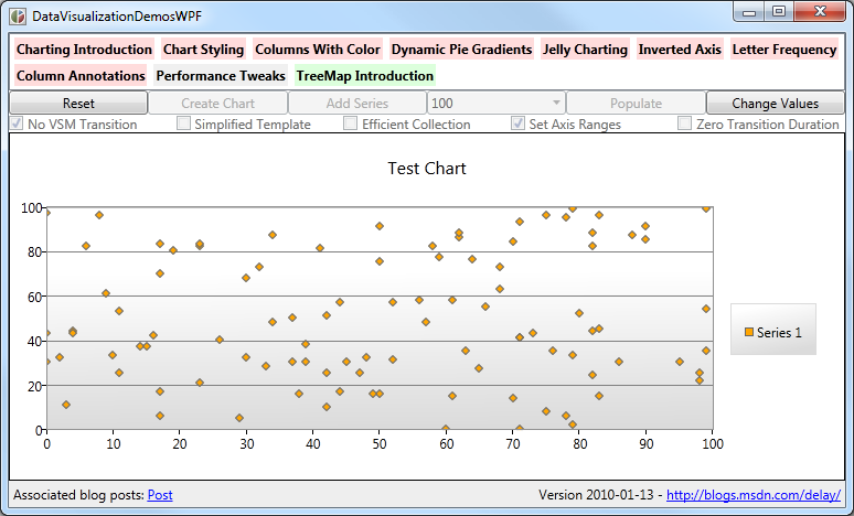
Instead, I've got the next best thing: a collection of simple changes anyone can make to noticeably improve the performance of common scenarios with today's bits! To demonstrate the impact of each of these tips, I've created a new "Performance Tweaks" tab in my DataVisualizationDemos sample application. The controls on this new page let you pick-and-choose which optimizations you'd like to see - then allow you to run simple scenarios to get a feel for how effective those tweaks are. And because DataVisualizationDemos compiles for and runs on Silverlight 3, Silverlight 4, WPF 3.5, and WPF 4, it's easy to get a feel for how much benefit you can expect to see on any supported platform.
For each of the seven tips below, I list simple steps that show the performance benefit of the tip using the new sample page. Performance improvements are best experienced in person, so I encourage interested readers to download the demo and follow along at home! :)
[Click here to download the complete source code for the cross-platform DataVisualizationDemos sample application.]

Tip: Use fewer data points
Okay, this first tip is really obvious - but it's still valid! Fewer data points means less to process, less to manage, and less to render - all of which mean that scenarios with few points to tend to be faster and smoother than those with many points. You can often reduce the number of points in a scenario by plotting fewer values, aggregating similar values together, or by showing subsets of the whole data. This approach isn't always practical, but when it is, it's usually a big win - and has the added benefit that the resulting chart is less cluttered and can even be easier to understand!
Aside: Typical performance guidance for Silverlight and WPF recommends capping the total number of UI elements in the low- to mid-hundreds. Given that each of Charting's DataPoint instances instantiates around 5 UI elements, it's easy to see why rendering a chart with 1000 data points can start to bog the system down.
Slow: Reset, check only Simplified Template, Create Chart, Add Series, 1000 points, Populate
Fast: Reset, check only Simplified Template, Create Chart, Add Series, 50 points, Populate
Tip: Turn off the fade in/out VSM animations
By default, data points fade in and fade out over the period of a half second. This fade is controlled by a Visual State Manager state transition in the usual manner and therefore each DataPoint instance runs its own private animation. When there are lots of data points coming and going, the overhead of all these parallel animations can start to slow things down. Fortunately, the DataPoint classes are already written to handle missing states, so getting rid of these animations is a simple matter of modifying the default Template to remove the "RevealStates"/"Shown" and/or "RevealStates"/"Hidden" states.
Slow: Reset, uncheck everything, Create Chart, Add Series, 100 points, Populate
Fast: Reset, check only No VSM Transition, Create Chart, Add Series, 100 points, Populate
Tip: Change to a simpler DataPoint Template
I mentioned above that overwhelming the framework with lots of UI elements can slow things down. So in cases where it's not possible to display fewer points, it's still possible to display fewer elements by creating a custom Template that's simpler than the default. There is a lot of room here to creatively balance simplicity (speed) and visual appeal (attractiveness) here, but for the purposes of my demonstration, I've gone with something that's about as simple as it gets:
<Style x:Key="SimplifiedTemplate" TargetType="charting:ScatterDataPoint">
    <Setter Property="Template">
        <Setter.Value>
            <ControlTemplate TargetType="charting:ScatterDataPoint">
                <Grid
                    Width="5"
                    Height="5"
                    Background="{TemplateBinding Background}"/>
            </ControlTemplate>
        </Setter.Value>
    </Setter>
</Style>
Aside: This tip and the previous one are the only two tips that are mutually exclusive (because they both involve providing a custom DataPointStyle for the series). Otherwise, you have complete freedom to mix-and-match whatever tweaks work well for your scenario!
Slow: Reset, uncheck everything, Create Chart, Add Series, 100 points, Populate
Fast: Reset, check only Simplified Template, Create Chart, Add Series, 100 points, Populate
Tip: Specify fixed ranges for the axes
For convenience and ease-of-use, Charting's axes automatically analyze the data that's present in order to provide reasonable default values for their minimum, maximum, and interval. This works quite well in practice and you should hardly ever have to override the automatic range. However, the code that determines the automatic axis ranges isn't free. This cost isn't significant for static data, but if the underlying values are changing a lot, the small cost can accumulate and become noticeable. If you're fortunate enough to know the ranges over which your data will vary, explicitly specifying the axes and giving them fixed ranges will completely eliminate this overhead.
Slow: Silverlight 3, Reset, uncheck everything, Create Chart, Add Series, 100 points, Populate, Change Values
Fast: Silverlight 3, Reset, check only Set Axis Ranges, Create Chart, Add Series, 100 points, Populate, Change Values
Tip: Add the points more efficiently
Silverlight/WPF Charting is built around a model where any changes to the data are automatically shown on the screen. This is accomplished by detecting classes that implement the INotifyPropertyChanged interface and collections that implement the INotifyCollectionChanged interface and registering to find out about changes as they occur. This approach is incredibly easy for developers because it means all they have to touch is their own data classes - and Charting handles everything else! However, this system can be counterproductive in one scenario: starting with an empty collection and adding a bunch of data points all at once. By default, each new data point generates a change notification which prompts Charting to re-analyze the data, re-compute the axis properties, re-layout the visuals, etc.. It would be more efficient to add all the points at once and then send a single notification to Charting that its data has changed. Unfortunately, the otherwise handy ObservableCollection class doesn't offer a good way of doing this. Fortunately, it's pretty easy to add:
// Custom class adds an efficient AddRange method for adding many items at once
// without causing a CollectionChanged event for every item
public class AddRangeObservableCollection<T> : ObservableCollection<T>
{
    private bool _suppressOnCollectionChanged;

    public void AddRange(IEnumerable<T> items)
    {
        if (null == items)
        {
            throw new ArgumentNullException("items");
        }
        if (items.Any())
        {
            try
            {
                _suppressOnCollectionChanged = true;
                foreach (var item in items)
                {
                    Add(item);
                }
            }
            finally
            {
                _suppressOnCollectionChanged = false;
                OnCollectionChanged(new NotifyCollectionChangedEventArgs(NotifyCollectionChangedAction.Reset));
            }
        }
    }

    protected override void OnCollectionChanged(NotifyCollectionChangedEventArgs e)
    {
        if (!_suppressOnCollectionChanged)
        {
            base.OnCollectionChanged(e);
        }
    }
}
Slow: Reset, uncheck everything, Create Chart, Add Series, 500 points, Populate
Fast: Reset, check only Efficient Collection, Create Chart, Add Series, 500 points, Populate
Tip: Disable the data change animations
Because people perceive changes better when they're able to see the change happening, Charting animates all value changes to the underlying data points. So instead of a bar in a bar chart suddenly getting longer when its bound data value changes, the bar smoothly animates from its old value to its new value. This approach has another benefit: it calls attention to the value that's changed in a way that an instantaneous jump wouldn't. However, animating value changes can take a toll when there are lots of changes happening at the same time or when there are a continuous stream of changes over a long time. In cases like these, it can be helpful to lessen the default duration of the animation (a half second) by lowering the value of the series's TransitionDuration property - all the way down to 0 if that's what it takes.
Slow: Silverlight 3, Reset, uncheck everything, Create Chart, Add Series, 100 points, Populate, Change Values
Fast: Silverlight 3, Reset, check only Zero Transition Duration, Create Chart, Add Series, 100 points, Populate, Change Values
Tip: Use a different platform or version
Though they offer basically identical APIs, Silverlight and WPF are implemented very differently under the covers - and what performs poorly on one platform may run quite well on the other. Even staying with the same platform, Silverlight 4 contains a number of improvements relative to Silverlight 3 (as does WPF 4 vs. WPF 3.5). Therefore, if you have the freedom to choose your target platform, a bit of prototyping early on may help to identify the best choice for your scenario.
Slow: Silverlight 3, Reset, uncheck everything, Create Chart, Add Series, 100 points, Populate, Change Values
Fast: WPF 3.5, Reset, uncheck everything, Create Chart, Add Series, 100 points, Populate, Change Values
