The blog of dlaa.me

Posts tagged "Silverlight Toolkit"

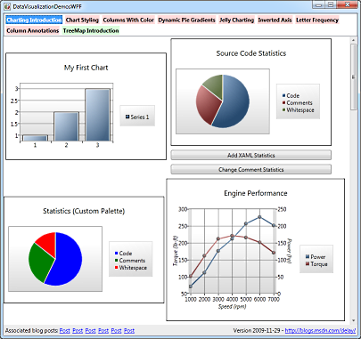
Turn your head and check out this post [How to: Easily rotate the axis labels of a Silverlight/WPF Toolkit chart]

When someone asked me how to rotate the axis labels of a chart from the Data Visualization package of the Silverlight Toolkit/WPF Toolkit earlier today, I realized it was time for a quick blog post. Because when I've answered a question two or three times, it's usually a pretty good sign that I'll keep on answering it for some time. I usually try to head that kind of thing off at the pass, so here's my post on the topic for the benefit of future generations. :)

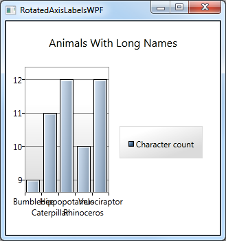
The typical scenario here is that someone has a chart and it's working well, but their axis labels are very long and end up overlapping - even after the default axis behavior of putting them in alternating rows to prevent such a problem kicks in:

Overlapping axis labels


The typical solution is to rotate the axis labels - and it's easy once you know where to look. The key here is to customize the Template of the AxisLabel instances that are used to render the labels. And it's quite simple to do so by providing a Style with a Template Setter for the AxisLabelStyle property of the Axis subclass in question:

Rotated axis labels on WPF

Yeah, it looks great on paper; but that description was a mouthful...

It's probably easier to understand in XAML - here's the complete code for the sample above with the interesting part highlighted:

<Window x:Class="WpfApplication1.MainWindow"
        xmlns="http://schemas.microsoft.com/winfx/2006/xaml/presentation"
        xmlns:x="http://schemas.microsoft.com/winfx/2006/xaml"
        xmlns:charting="clr-namespace:System.Windows.Controls.DataVisualization.Charting;assembly=System.Windows.Controls.DataVisualization.Toolkit"
        xmlns:sys="clr-namespace:System;assembly=mscorlib"
        xmlns:spec="clr-namespace:System.Collections.Specialized;assembly=System"
        Title="RotatedAxisLabelsWPF"
        Width="500"
        Height="350">
    <Grid>
        <charting:Chart
            Title="Animals With Long Names">
            <charting:ColumnSeries
                Title="Character count"
                DependentValueBinding="{Binding Length}"
                IndependentValueBinding="{Binding}">
                <charting:ColumnSeries.ItemsSource>
                    <spec:StringCollection>
                        <sys:String>Bumblebee</sys:String>
                        <sys:String>Caterpillar</sys:String>
                        <sys:String>Hippopotamus</sys:String>
                        <sys:String>Rhinoceros</sys:String>
                        <sys:String>Velociraptor</sys:String>
                    </spec:StringCollection>
                </charting:ColumnSeries.ItemsSource>
                <charting:ColumnSeries.IndependentAxis>
                    <charting:CategoryAxis
                        Orientation="X">
                        <charting:CategoryAxis.AxisLabelStyle>
                            <Style TargetType="charting:AxisLabel">
                                <Setter Property="Template">
                                    <Setter.Value>
                                        <ControlTemplate TargetType="charting:AxisLabel">
                                            <TextBlock Text="{TemplateBinding FormattedContent}">
                                                <TextBlock.LayoutTransform>
                                                    <RotateTransform Angle="-60"/>
                                                </TextBlock.LayoutTransform>
                                            </TextBlock>
                                        </ControlTemplate>
                                    </Setter.Value>
                                </Setter>
                            </Style>
                        </charting:CategoryAxis.AxisLabelStyle>
                    </charting:CategoryAxis>
                </charting:ColumnSeries.IndependentAxis>
            </charting:ColumnSeries>
        </charting:Chart>
    </Grid>
</Window>

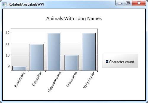
Like I said, it's all pretty standard stuff once you know where to look. Of course, you can rotate the labels all the way to 90 degrees if you want them to take the least amount of space possible. But 60 degrees seemed like a suitably rakish angle. ;)


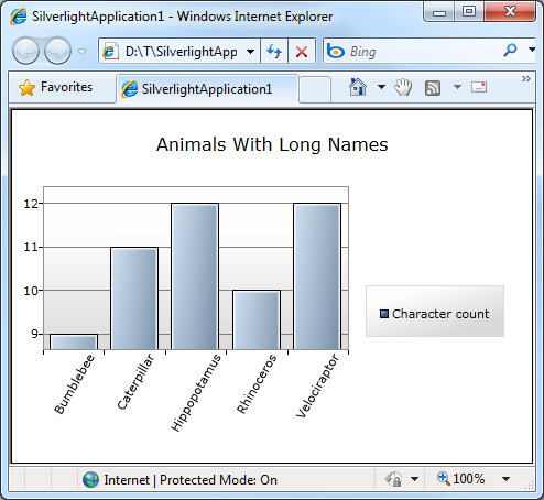
Unfortunately, we can't declare "Mission Accomplished" quite yet... While the Data Visualization assembly itself works exactly the same on WPF and Silverlight, the platforms themselves aren't identical quite yet. Specifically, there's no support for LayoutTransform in Silverlight (and RenderTransform is simply not appropriate here). Fortunately, I've filled the LayoutTransform gap with my LayoutTransformer class - and it's already part of the Silverlight Toolkit!

The syntax changes just a bit, but the concept is exactly the same:

<UserControl x:Class="SilverlightApplication1.MainPage"
    xmlns="http://schemas.microsoft.com/winfx/2006/xaml/presentation"
    xmlns:x="http://schemas.microsoft.com/winfx/2006/xaml"
    xmlns:charting="clr-namespace:System.Windows.Controls.DataVisualization.Charting;assembly=System.Windows.Controls.DataVisualization.Toolkit"
    xmlns:sys="clr-namespace:System;assembly=mscorlib"
    xmlns:toolkit="clr-namespace:System.Windows.Controls;assembly=System.Windows.Controls.Toolkit"
    xmlns:layout="clr-namespace:System.Windows.Controls;assembly=System.Windows.Controls.Layout.Toolkit">
    <Grid>
        <charting:Chart
            Title="Animals With Long Names">
            <charting:ColumnSeries
                Title="Character count"
                DependentValueBinding="{Binding Length}"
                IndependentValueBinding="{Binding}">
                <charting:ColumnSeries.ItemsSource>
                    <toolkit:ObjectCollection>
                        <sys:String>Bumblebee</sys:String>
                        <sys:String>Caterpillar</sys:String>
                        <sys:String>Hippopotamus</sys:String>
                        <sys:String>Rhinoceros</sys:String>
                        <sys:String>Velociraptor</sys:String>
                    </toolkit:ObjectCollection>
                </charting:ColumnSeries.ItemsSource>
                <charting:ColumnSeries.IndependentAxis>
                    <charting:CategoryAxis
                        Orientation="X">
                        <charting:CategoryAxis.AxisLabelStyle>
                            <Style TargetType="charting:AxisLabel">
                                <Setter Property="Template">
                                    <Setter.Value>
                                        <ControlTemplate TargetType="charting:AxisLabel">
                                            <layout:LayoutTransformer>
                                                <layout:LayoutTransformer.LayoutTransform>
                                                    <RotateTransform Angle="-60"/>
                                                </layout:LayoutTransformer.LayoutTransform>
                                                <TextBlock Text="{TemplateBinding FormattedContent}"/>
                                            </layout:LayoutTransformer>
                                        </ControlTemplate>
                                    </Setter.Value>
                                </Setter>
                            </Style>
                        </charting:CategoryAxis.AxisLabelStyle>
                    </charting:CategoryAxis>
                </charting:ColumnSeries.IndependentAxis>
            </charting:ColumnSeries>
        </charting:Chart>
    </Grid>
</UserControl>

Mission accomplished:

Rotated axis labels on Silverlight


There you have it: AxisLabelStyle is your new best friend. A friend with benefits, one might say, because there are other cool things you can do by customizing the AxisLabel Style.

So please: go forth and enjoy your new friend!

Highlighting a "weak" contribution [Enhancements make preventing memory leaks with WeakEventListener even easier!]

It was back in March of last year that I explained the motivation for the WeakEventListener class I'd started using in the Silverlight Toolkit's Data Visualization assembly. Since then, a few other Toolkit controls have added WeakEventListener where necessary - but otherwise not much has changed...

Then, a few days ago, I saw that Beat Kiener had written a post detailing the specifics of how WeakEventListener really works. Where I focused more on saying why WeakEventListener is necessary, Beat does a great job of showing why - with lots of pretty diagrams and a detailed explanation. He even identifies a mistake users of WeakEventListener might make and outlines a simple tweak to the original implementation to prevent it! Beat's post is a good read, and I recommend it for anyone who's interested in this stuff.

But wait, there's more! Beat followed with a post about a wrapper to simplify the common usage pattern shared by every WeakEventListener consumer. Whereas WeakEventListener is a little tricky to use correctly, Beat's wrapper is easy to get right - and still gets the job done! So if you've wanted to make use of WeakEventListener, but were intimidated by the technical details, please have a look at these two posts because I think you'll find it's really quite approachable. :)


PS - If you think you have a memory leak, but aren't sure, this post I wrote about using WinDbg, SOS, and GCRoot to diagnose .NET memory leaks may be helpful.

This is what happens when two Toolkits fall in love... [The February 2010 release of the WPF Toolkit is now available!]

The WPF Toolkit team has just published the February 2010 release of the WPF Toolkit! In addition to a variety of bug fixes for DataGrid, DatePicker, Calendar, and Visual State Manager, this release also includes the latest changes to the Data Visualization assembly for Silverlight and WPF, bringing the official WPF implementation up to date with the November 2009 release of the Silverlight Toolkit. And because sharing the Silverlight Toolkit's Data Visualization assembly with WPF Toolkit customers has worked out so well, this release of the WPF Toolkit introduces three other controls from the Silverlight Toolkit: AutoCompleteBox (SDK documentation), Accordion, and Rating!


WPF Toolkit February 2010 installer


Just as with the Data Visualization assembly, the WPF Toolkit implementation of AutoCompleteBox, Accordion, and Rating are almost identical copies of the latest Silverlight Toolkit implementations - we've even kept the same assembly names and structure. Therefore, everything you already know and love about these controls on Silverlight (including your code and XAML) should translate seamlessly to WPF! Even the Visual Studio 2008 design-time experience for these controls should be the same; we've brought the Visual Studio design-time assemblies over, too!

These controls have been part of the Silverlight Toolkit long enough that there are plenty of great resources on the web for information, examples, and more. I expect WPF developers will come up to speed quickly and be able to start taking advantage of them in WPF applications in no time! :)


Aside: This release of the WPF Toolkit targets the version of WPF that is part of .NET 3.5 (just as previous releases did). There isn't a version of the WPF Toolkit specifically for .NET 4 - largely because many of the controls in the WPF Toolkit were folded into WPF 4 itself!


Those of you who follow the progress of the Data Visualization project already know that I maintain a collection of helpful links from all over the web here: http://cesso.org/r/DVLinks. Another handy resource for new users is my DataVisualizationDemos sample project which runs on Silverlight 3, Silverlight 4, WPF 3.5, and WPF 4 and provides examples of a bunch of different things made possible by the Data Visualization project. Finally, there are some WPF Toolkit-specific notes that are part of my WPF Toolkit June 2009 announcement and which may be worth reviewing. (In particular, the "Build Notes" section covers an issue that occasionally trips people up when trying to compile the design-time assemblies themselves.)


Release notes: For a summary of the changes to the WPF version of Data Visualization since the June 2009 WPF Toolkit and numerous code/XAML examples, please have a look at my announcements for the July 2009, October 2009, and November 2009 releases of the Silverlight Toolkit.


It's always exciting when there's a new Toolkit release - and a bit of a relief because there's a lot of work that goes on behind the scenes to make these possible. I'd like to thank the WPF Toolkit team for their continued support of Data Visualization and for their willingness to include additional controls from the Silverlight Toolkit. In particular, I'd like to thank Patrick Danino who did nearly all the work to port the three new controls over to WPF, test them, and resolve a few platform incompatibilities that came up! His efforts went well beyond what I expected when he and I first talked about the idea and it has been a pleasure working with him on this. If any bugs happened to sneak through, it's not for lack of effort on Patrick's part. :) Please don't blame him - blame me instead!

No trees were harmed in the making of this blog post [How to: Successfully print a Chart with the Silverlight 4 Beta]

One of the big requests people have had for Silverlight was the ability to print, so one thing that's new in the Silverlight 4 Beta is the PrintDocument class which enables applications to print anything they want! There isn't an excess of fancy bells and whistles quite yet, but the support Silverlight provides is enough to do just about everything - it's just that sometimes you might need to do a little more than you expect. :) It's the classic "crawl, walk, run" approach to feature delivery, and this is a great first step that will be a welcome addition for everyone who's been wanting to print with Silverlight.

Okay, so that's all well and good and people can print any content they want and it all looks beautiful and works perfectly, right? Pretty much, yes! Well, except for certain scenarios involving charts from the Silverlight/WPF Data Visualization assembly. :( To be clear, if you try to print a Chart that's already in the visual tree, it works just fine and what you see really is what you get. But if you've tried to create custom content specifically for printing (for example: a different layout, maybe some page headers and footers, etc.) and that content included a Chart instance, you probably noticed a minor issue: none of the data points showed up on the page. Darn, it sure is hard to tell what's going on without those data points...


Fortunately, a bit of mental debugging reveals what's going on here. Charting's data points fade in by default - from Opacity 0 to 1 over the course of 0.5 seconds via a Visual State Manager transition. That's cool and it works great in the visual tree - however, when you're creating print-specific visuals and immediately printing them, those data points don't have a chance to do much fading in... So they're actually all there on the printed page, but they're at Opacity 0, so you can't see them!

What to do? Well, the most convenient thing would be for the Chart code to somehow know it was going to be printed and SkipToFill those pesky animations. But there's no official way for a control to know it's being created for printing. There are a few tricks the Chart could use to make an educated guess, but it doesn't do so yet - and I'm not sure that's the right answer anyway. So the next most obvious thing would be to re-Template the DataPoints to replace the default fading Template with one that doesn't fade, but instead starts fully visible. And as you'd expect, this works just fine - the data points show up and look great!

However, that's a lot of work that you probably don't want to have to do. It would be nice if there were a middle ground - some technique that was maybe a little bit of a hack, but that was really easy to implement and worked just about all the time...


And the good news is that there is such a hack! The idea builds upon the observation that printing a Chart from the visual tree works correctly - so let's start by popping our new, print-ready chart into the visual tree to give it a chance to get all pretty, then print it once that's done. That seems easy enough, let's try it:

// Create customized content for printing
var chart = new Chart { Title = "My Printed Chart" };
var series = new LineSeries
{
    ItemsSource = (PointCollection)Resources["Items"],
    DependentValuePath = "Y",
    IndependentValuePath = "X",
};
chart.Series.Add(series);
var content = new Border
{
    BorderBrush = new SolidColorBrush(Colors.Magenta),
    BorderThickness = new Thickness(10),
    Child = chart,
};

// Create container for putting content in the visual tree invisibly
var visualTreeContainer = new Grid
{
    Width = 1000,
    Height = 1000,
    Opacity = 0,
};

// Put content in the visual tree to initialize
visualTreeContainer.Children.Add(content);
LayoutRoot.Children.Add(visualTreeContainer);

// Prepare to print
var printDocument = new PrintDocument();
printDocument.PrintPage += delegate(object obj, PrintPageEventArgs args)
{
    // Unparent the content for adding to PageVisual
    visualTreeContainer.Children.Remove(content);
    args.PageVisual = content;
};

// Print the content
printDocument.Print();

// Remove container from the visual tree
LayoutRoot.Children.Remove(visualTreeContainer);

Note that the sample application is creating a completely new Chart instance here (with a print-specific title and custom magenta frame) - and that the printed output looks just like it should:

ChartPrinting sample output


[Click here to download the source code for the ChartPrinting sample for the Silverlight 4 Beta as a Visual Studio 2010 solution]


The Chart is added to the visual tree before the print dialog is shown - so it has plenty of time for those 0.5 second animations to play to completion while the user interacts with the dialog. The only sketchy bit is that an exceedingly fast user could possibly manage to print a Chart before the animations had run all the way to completion. Yes, well, I said it was a hack up front, didn't I? :) If you want rock-solid printing behavior, you probably ought to be re-templating the data points in order to ensure the initial visuals are exactly as you want them. But if you're just interested in printing something attractive with a minimum of fuss or inconvenience - and your users aren't hopped up on performance enhancing drugs - you'll probably be quite successful with this technique instead.


PS - The XPS Printer driver is a fantastic tool for testing printing scenarios like this one. By printing to a file and opening that file in the XPS Viewer application that comes with Windows, I was able to avoid wasting a single sheet of paper during the course of this investigation. Highly recommended!

This one time, at band camp... [A banded StackPanel implementation for Silverlight and WPF!]

Recently, I came across this article in the Expression Newsletter showing how to create a three-column ListBox. In it, Victor Gaudioso shows a Blend-only technique for creating a Silverlight/WPF ListBox with three columns. [And I award him extra credit for using the Silverlight Toolkit to do so! :) ] The technique described in that article is a great way to custom the interface layout without writing any code.

But it can get a little harder when the elements in the ListBox aren't all the same size: a row with larger elements may only be able to fit two items across before wrapping, while a row with smaller elements may fit four items or more! Such things can typically be avoided by specifying the exact size of all the items and the container itself (otherwise the user might resize the window and ruin the layout). But while hard-coding an application's UI size can be convenient at times, it's not always an option.


For those times when it's possible to write some code, specialized layout requirements can usually be implemented more reliably and more accurately with a custom Panel subclass. Victor started by looking for a property he could use to set the number of columns for the ListBox, and there's nothing like that by default. So I've written some a custom layout container to provide it - and because I've created a new Panel, this banded layout can be applied anywhere in an application - not just inside a ListBox!

The class I created is called BandedStackPanel and it behaves like a normal StackPanel, except that it includes a Bands property to specify how many vertical/horizontal bands to create. When Bands is set to its default value of 1, BandedStackPanel looks the same as StackPanel - when the value is greater than 1, additional bands show up automatically! And because BandedStackPanel is an integral part of the layout process, it's able to ensure that there are always exactly as many bands as there should be - regardless of how big or small the elements are and regardless of how the container is resized.


Vertical BandedStackPanel on Silverlight


[Click here to download the source code for BandedStackPanel and the Silverlight/WPF sample application in a Visual Studio 2010 solution]


The sample application shown here has a test panel on the left to play around with and a ListBox at the right to demonstrate how BandedStackPanel can be used to satisfy the original requirements of the article. The ComboBoxes at the top of the window allow you to customize the behavior of both BandedStackPanel instances. And, of course, BandedStackPanel works great on WPF as well as on Silverlight. :)


Horizontal BandedStackPanel on WPF


The way to use BandedStackPanel with a ListBox is the same as any other ItemsControl layout customization: via the ItemsControl.ItemsPanel property:

<ListBox>
    <ListBox.ItemsPanel>
        <ItemsPanelTemplate>
            <delay:BandedStackPanel Bands="3"/>
        </ItemsPanelTemplate>
    </ListBox.ItemsPanel>
    <ListBoxItem Content="ListBoxItem 0"/>
    <ListBoxItem Content="ListBoxItem 1"/>
    <ListBoxItem Content="ListBoxItem 2"/>
    ...
</ListBox>


That's pretty much all there is to it! The Silverlight/WPF layout system is very powerful and can be made to do all kinds of weird and wonderful things without writing a single line of code. But for those times when your needs are very specific, nothing beats a custom Panel for really nailing the scenario!


PS - The implementation of BandedStackPanel is fairly straightforward. The only real complexity is abstracting out the handling of both the horizontal and vertical orientations so the same code can be used for both. I followed much the same approach the Silverlight Toolkit's WrapPanel uses and introduced a dedicated OrientedLength class that allows the code to deal in terms of primary/secondary growth directions instead of specifically manipulating width and height. Once the abstraction of OrientedLength is in place, the implementations of MeasureOverride and ArrangeOverride are pretty much what you'd expect. Here they are for those who might be interested:

/// <summary>
/// Implements custom measure logic.
/// </summary>
/// <param name="constraint">Constraint to measure within.</param>
/// <returns>Desired size.</returns>
protected override Size MeasureOverride(Size constraint)
{
    var bands = Bands;
    var orientation = Orientation;
    // Calculate the Size to Measure children with
    var constrainedLength = new OrientedLength(orientation, constraint);
    constrainedLength.PrimaryLength = double.PositiveInfinity;
    constrainedLength.SecondaryLength /= bands;
    var availableLength = constrainedLength.Size;
    // Measure each child
    var band = 0;
    var levelLength = new OrientedLength(orientation);
    var usedLength = new OrientedLength(orientation);
    foreach (UIElement child in Children)
    {
        child.Measure(availableLength);
        // Update for the band/level of this child
        var desiredLength = new OrientedLength(orientation, child.DesiredSize);
        levelLength.PrimaryLength = Math.Max(levelLength.PrimaryLength, desiredLength.PrimaryLength);
        levelLength.SecondaryLength += desiredLength.SecondaryLength;
        // Move to the next band
        band = (band + 1) % bands;
        if (0 == band)
        {
            // Update for the complete level; reset for the next one
            usedLength.PrimaryLength += levelLength.PrimaryLength;
            usedLength.SecondaryLength = Math.Max(usedLength.SecondaryLength, levelLength.SecondaryLength);
            levelLength.PrimaryLength = 0;
            levelLength.SecondaryLength = 0;
        }
    }
    // Update for the partial level at the end
    usedLength.PrimaryLength += levelLength.PrimaryLength;
    usedLength.SecondaryLength = Math.Max(usedLength.SecondaryLength, levelLength.SecondaryLength);
    // Return the used size
    return usedLength.Size;
}

/// <summary>
/// Implements custom arrange logic.
/// </summary>
/// <param name="arrangeSize">Size to arrange to.</param>
/// <returns>Used size.</returns>
protected override Size ArrangeOverride(Size arrangeSize)
{
    var bands = Bands;
    var orientation = Orientation;
    var count = Children.Count;
    // Prepare the Rect to arrange children with
    var arrangeLength = new OrientedLength(orientation, arrangeSize);
    arrangeLength.SecondaryLength /= bands;
    // Arrange each child
    for (var i = 0; i < count; i += bands)
    {
        // Determine the length of the current level
        arrangeLength.PrimaryLength = 0;
        arrangeLength.SecondaryOffset = 0;
        for (var band = 0; (band < bands) && (i + band < count); band++)
        {
            var desiredLength = new OrientedLength(orientation, Children[i + band].DesiredSize);
            arrangeLength.PrimaryLength = Math.Max(arrangeLength.PrimaryLength, desiredLength.PrimaryLength);
        }
        // Arrange each band within the level
        for (var band = 0; (band < bands) && (i + band < count); band++)
        {
            Children[i + band].Arrange(arrangeLength.Rect);
            arrangeLength.SecondaryOffset += arrangeLength.SecondaryLength;
        }
        // Update for the next level
        arrangeLength.PrimaryOffset += arrangeLength.PrimaryLength;
    }
    // Return the arranged size
    return arrangeSize;
}

"I feel the need... the need for SPEED!" [Seven simple, performance-boosting tweaks for common Silverlight/WPF Charting scenarios]

No matter how fast things are, they never seem to be fast enough. Even if we had the world's most optimized code in the Silverlight/WPF Data Visualization assembly, I bet there would still be a couple of people who wanted better performance. :) Unfortunately, we have don't have the world's most optimized code, and performance concerns represent one of the most common customer issues with Charting. While I wish we had the resources to commit to a few weeks of focused performance work, things just haven't panned out like that so far.

Instead, I've got the next best thing: a collection of simple changes anyone can make to noticeably improve the performance of common scenarios with today's bits! To demonstrate the impact of each of these tips, I've created a new "Performance Tweaks" tab in my DataVisualizationDemos sample application. The controls on this new page let you pick-and-choose which optimizations you'd like to see - then allow you to run simple scenarios to get a feel for how effective those tweaks are. And because DataVisualizationDemos compiles for and runs on Silverlight 3, Silverlight 4, WPF 3.5, and WPF 4, it's easy to get a feel for how much benefit you can expect to see on any supported platform.

For each of the seven tips below, I list simple steps that show the performance benefit of the tip using the new sample page. Performance improvements are best experienced in person, so I encourage interested readers to download the demo and follow along at home! :)


[Click here to download the complete source code for the cross-platform DataVisualizationDemos sample application.]


Performance Tweaks Demo


Tip: Use fewer data points

Okay, this first tip is really obvious - but it's still valid! Fewer data points means less to process, less to manage, and less to render - all of which mean that scenarios with few points to tend to be faster and smoother than those with many points. You can often reduce the number of points in a scenario by plotting fewer values, aggregating similar values together, or by showing subsets of the whole data. This approach isn't always practical, but when it is, it's usually a big win - and has the added benefit that the resulting chart is less cluttered and can even be easier to understand!

Aside: Typical performance guidance for Silverlight and WPF recommends capping the total number of UI elements in the low- to mid-hundreds. Given that each of Charting's DataPoint instances instantiates around 5 UI elements, it's easy to see why rendering a chart with 1000 data points can start to bog the system down.

Slow: Reset, check only Simplified Template, Create Chart, Add Series, 1000 points, Populate

Fast: Reset, check only Simplified Template, Create Chart, Add Series, 50 points, Populate


Tip: Turn off the fade in/out VSM animations

By default, data points fade in and fade out over the period of a half second. This fade is controlled by a Visual State Manager state transition in the usual manner and therefore each DataPoint instance runs its own private animation. When there are lots of data points coming and going, the overhead of all these parallel animations can start to slow things down. Fortunately, the DataPoint classes are already written to handle missing states, so getting rid of these animations is a simple matter of modifying the default Template to remove the "RevealStates"/"Shown" and/or "RevealStates"/"Hidden" states.

Slow: Reset, uncheck everything, Create Chart, Add Series, 100 points, Populate

Fast: Reset, check only No VSM Transition, Create Chart, Add Series, 100 points, Populate


Tip: Change to a simpler DataPoint Template

I mentioned above that overwhelming the framework with lots of UI elements can slow things down. So in cases where it's not possible to display fewer points, it's still possible to display fewer elements by creating a custom Template that's simpler than the default. There is a lot of room here to creatively balance simplicity (speed) and visual appeal (attractiveness) here, but for the purposes of my demonstration, I've gone with something that's about as simple as it gets:

<Style x:Key="SimplifiedTemplate" TargetType="charting:ScatterDataPoint">
    <Setter Property="Template">
        <Setter.Value>
            <ControlTemplate TargetType="charting:ScatterDataPoint">
                <Grid
                    Width="5"
                    Height="5"
                    Background="{TemplateBinding Background}"/>
            </ControlTemplate>
        </Setter.Value>
    </Setter>
</Style>
Aside: This tip and the previous one are the only two tips that are mutually exclusive (because they both involve providing a custom DataPointStyle for the series). Otherwise, you have complete freedom to mix-and-match whatever tweaks work well for your scenario!

Slow: Reset, uncheck everything, Create Chart, Add Series, 100 points, Populate

Fast: Reset, check only Simplified Template, Create Chart, Add Series, 100 points, Populate


Tip: Specify fixed ranges for the axes

For convenience and ease-of-use, Charting's axes automatically analyze the data that's present in order to provide reasonable default values for their minimum, maximum, and interval. This works quite well in practice and you should hardly ever have to override the automatic range. However, the code that determines the automatic axis ranges isn't free. This cost isn't significant for static data, but if the underlying values are changing a lot, the small cost can accumulate and become noticeable. If you're fortunate enough to know the ranges over which your data will vary, explicitly specifying the axes and giving them fixed ranges will completely eliminate this overhead.

Slow: Silverlight 3, Reset, uncheck everything, Create Chart, Add Series, 100 points, Populate, Change Values

Fast: Silverlight 3, Reset, check only Set Axis Ranges, Create Chart, Add Series, 100 points, Populate, Change Values


Tip: Add the points more efficiently

Silverlight/WPF Charting is built around a model where any changes to the data are automatically shown on the screen. This is accomplished by detecting classes that implement the INotifyPropertyChanged interface and collections that implement the INotifyCollectionChanged interface and registering to find out about changes as they occur. This approach is incredibly easy for developers because it means all they have to touch is their own data classes - and Charting handles everything else! However, this system can be counterproductive in one scenario: starting with an empty collection and adding a bunch of data points all at once. By default, each new data point generates a change notification which prompts Charting to re-analyze the data, re-compute the axis properties, re-layout the visuals, etc.. It would be more efficient to add all the points at once and then send a single notification to Charting that its data has changed. Unfortunately, the otherwise handy ObservableCollection class doesn't offer a good way of doing this. Fortunately, it's pretty easy to add:

// Custom class adds an efficient AddRange method for adding many items at once
// without causing a CollectionChanged event for every item
public class AddRangeObservableCollection<T> : ObservableCollection<T>
{
    private bool _suppressOnCollectionChanged;

    public void AddRange(IEnumerable<T> items)
    {
        if (null == items)
        {
            throw new ArgumentNullException("items");
        }
        if (items.Any())
        {
            try
            {
                _suppressOnCollectionChanged = true;
                foreach (var item in items)
                {
                    Add(item);
                }
            }
            finally
            {
                _suppressOnCollectionChanged = false;
                OnCollectionChanged(new NotifyCollectionChangedEventArgs(NotifyCollectionChangedAction.Reset));
            }
        }
    }

    protected override void OnCollectionChanged(NotifyCollectionChangedEventArgs e)
    {
        if (!_suppressOnCollectionChanged)
        {
            base.OnCollectionChanged(e);
        }
    }
}

Slow: Reset, uncheck everything, Create Chart, Add Series, 500 points, Populate

Fast: Reset, check only Efficient Collection, Create Chart, Add Series, 500 points, Populate


Tip: Disable the data change animations

Because people perceive changes better when they're able to see the change happening, Charting animates all value changes to the underlying data points. So instead of a bar in a bar chart suddenly getting longer when its bound data value changes, the bar smoothly animates from its old value to its new value. This approach has another benefit: it calls attention to the value that's changed in a way that an instantaneous jump wouldn't. However, animating value changes can take a toll when there are lots of changes happening at the same time or when there are a continuous stream of changes over a long time. In cases like these, it can be helpful to lessen the default duration of the animation (a half second) by lowering the value of the series's TransitionDuration property - all the way down to 0 if that's what it takes.

Slow: Silverlight 3, Reset, uncheck everything, Create Chart, Add Series, 100 points, Populate, Change Values

Fast: Silverlight 3, Reset, check only Zero Transition Duration, Create Chart, Add Series, 100 points, Populate, Change Values


Tip: Use a different platform or version

Though they offer basically identical APIs, Silverlight and WPF are implemented very differently under the covers - and what performs poorly on one platform may run quite well on the other. Even staying with the same platform, Silverlight 4 contains a number of improvements relative to Silverlight 3 (as does WPF 4 vs. WPF 3.5). Therefore, if you have the freedom to choose your target platform, a bit of prototyping early on may help to identify the best choice for your scenario.

Slow: Silverlight 3, Reset, uncheck everything, Create Chart, Add Series, 100 points, Populate, Change Values

Fast: WPF 3.5, Reset, uncheck everything, Create Chart, Add Series, 100 points, Populate, Change Values

Wrap music [A more flexible balanced WrapPanel implementation for Silverlight and WPF!]

In my last post, I told the story of a customer who asked for an easy way to make the Silverlight/WPF WrapPanel use all available space to spread its children out evenly instead of bunching them up together. The following sample shows off the default WrapPanel behavior on top - and my alternate BalancedWrapPanel behavior on the bottom:

BalancedWrapPanel, Horizontal, ItemWidth and ItemHeight set

The default WrapPanel behavior fills each horizontal (or vertical) line as much as it can before moving on to the next line, but leaves any extra space at the end of each line. BalancedWrapPanel began as a copy of the WrapPanel code (available as part of the Silverlight Toolkit) and contains a modified copy of one of the helper methods that instead distributes the unsightly chunk of extra space evenly through the entire column (or row). That was what I set out to do with BalancedWrapPanel, so I was fairly happy with the results. Unfortunately, the customer wasn't 100% satisfied...

In particular, the desire was for those items in the last line to align with the items above instead of centering like they do in my initial implementation. It's a perfectly reasonable request - and something I thought about when I first started on BalancedWrapPanel! But things are a little tricky because those orderly columns only show up when the ItemWidth and/or ItemHeight properties are set. In fact, the WrapPanel code doesn't actually have any concept of columns at all! Rather, the columns you see are a natural consequence of the algorithm laying out lots of constant-width items within constant-width bounds. So the columns are very real, but the code doesn't really know anything about them. And they don't even exist when ItemWidth/ItemHeight aren't set; despite each column of this vertically-oriented BalancedWrapPanel being vertically balanced, there are no overall rows in the horizontal direction because all the elements are different sizes:

BalancedWrapPanel, Vertical, ItemWidth and ItemHeight not set

When I was first thinking about this scenario, it seemed to me that I'd need to add some code to track the columns and then do things differently for the last line in order to keep everything aligned properly. I was afraid this additional code would overly complicate the original sample, and decided not to implement it until and unless someone asked. Besides, it's called BalancedWrapPanel, so it seemed natural that everything should be balanced! :)

But now that I had a specific request, I thought more carefully and realized that not only was it easy to align the last items, but that it was also a tad more efficient to do so! I didn't want to change the current behavior of BalancedWrapPanel (because I think that's what people expect), but I wanted to enable the new aligning behavior, too. So I added a new property to align the last items, but it only works when ItemWidth/ItemHeight are set (otherwise it has no effect because items can be all different sizes and don't line up to begin with). I considered trying to explain this technicality in the name of the new property, but everything I came up with was long and cumbersome. So the new property is simply named AlignLastItems - setting it to True changes the first example to look like this instead:

BalancedWrapPanel, Horizontal, ItemWidth and ItemHeight set, AlignLastItems set

Notice how the basic WrapPanel behavior is maintained, but the items are spread out evenly and there are no gaping holes. And there you have it - a balanced WrapPanel implementation that should work for most common scenarios. What's more, the customer is satisfied and maybe other folks will start using BalancedWrapPanel in their projects, too!


Click here to download the source code for BalancedWrapPanel and the Silverlight/WPF demo application.


PS - Please refer to my previous BalancedWrapPanel post for information about why I coded it like I did along with some other details.

PPS - As I mention above, the changes from what I'd already written were surprisingly minimal. Other than adding the AlignLastItems DependencyProperty, the only differences are highlighted below:

private void ArrangeLine(int lineStart, int lineEnd, double? directDelta, double directMaximum, double indirectOffset, double indirectGrowth)
{
    Orientation o = Orientation;
    bool isHorizontal = o == Orientation.Horizontal;
    UIElementCollection children = Children;
    double directLength = 0.0;
    double itemCount = 0.0;
    double itemLength = isHorizontal ? ItemWidth : ItemHeight;

    if (AlignLastItems && !itemLength.IsNaN())
    {
        // Length is easy to calculate in this case
        itemCount = Math.Floor(directMaximum / itemLength);
        directLength = itemCount * itemLength;
    }
    else
    {
        // Make first pass to calculate the slack space
        itemCount = lineEnd - lineStart;
        for (int index = lineStart; index < lineEnd; index++)
        {
            // Get the size of the element
            UIElement element = children[index];
            OrientedSize elementSize = new OrientedSize(o, element.DesiredSize.Width, element.DesiredSize.Height);

            // Determine if we should use the element's desired size or the
            // fixed item width or height
            double directGrowth = directDelta != null ?
                directDelta.Value :
                elementSize.Direct;

            // Update total length
            directLength += directGrowth;
        }
    }

    // Determine slack
    double directSlack = directMaximum - directLength;
    double directSlackSlice = directSlack / (itemCount + 1.0);
    double directOffset = directSlackSlice;

    // Make second pass to arrange items
    for (int index = lineStart; index < lineEnd; index++)
    {
        // Get the size of the element
        UIElement element = children[index];
        OrientedSize elementSize = new OrientedSize(o, element.DesiredSize.Width, element.DesiredSize.Height);

        // Determine if we should use the element's desired size or the
        // fixed item width or height
        double directGrowth = directDelta != null ?
            directDelta.Value :
            elementSize.Direct;

        // Arrange the element
        Rect bounds = isHorizontal ?
            new Rect(directOffset, indirectOffset, directGrowth, indirectGrowth) :
            new Rect(indirectOffset, directOffset, indirectGrowth, directGrowth);
        element.Arrange(bounds);

        // Update offset for next time
        directOffset += directGrowth + directSlackSlice;
    }
}

That's a WrapPanel and I am outta here... [A balanced WrapPanel implementation for Silverlight and WPF!]

A customer contacted me a few days ago asking whether there was an easy way to make the Silverlight/WPF WrapPanel use all available space to spread its children out evenly instead of bunching them up against each other as it usually does. Instead of trying to explain what I mean by that, please have a look at the top half of the following screen shot:

BalancedWrapPanel, Horizontal, ItemWidth and ItemHeight set

The default WrapPanel behavior fills each horizontal (or vertical) line as much as it can before moving on to the next line - but it leaves all the extra space at the end of the line. That big, vertical gap of empty space at the right of the colored boxes is a bit unsightly, so what would be nice is if WrapPanel distributed the extra space across the entire line - kind of like you see in the bottom half of the window above!

My reply to the customer was that I didn't know of a way to do this with WrapPanel as-is, but that it should be pretty straightforward to modify the code and add the balancing logic. Well, I got curious on the bus yesterday, so I went ahead and implemented BalancedWrapPanel, the control I used in the second example above.


Click here to download the source code for BalancedWrapPanel and the Silverlight/WPF demo application.


To implement this alternate behavior, I started with the WrapPanel source code that comes with the Silverlight Toolkit. For WPF 3.5 (or Silverlight 4), I needed to copy WrapPanel.cs, OrientedSize.cs, and NumericExtensions.cs. For Silverlight 3 (which doesn't have LengthConverter) I also needed to copy LengthConverter.cs and TypeConverters.cs. I renamed "WrapPanel" to "BalancedWrapPanel" everywhere, linked the copied files into a new Visual Studio solution containing sample projects for Silverlight 3 and WPF 3.5, and compiled successfully. After that, it was just a matter of tweaking the code a bit, and I was done!

I've highlighted my additions to the existing helper method below:

private void ArrangeLine(int lineStart, int lineEnd, double? directDelta, double directMaximum, double indirectOffset, double indirectGrowth
{
    Orientation o = Orientation;
    bool isHorizontal = o == Orientation.Horizontal;
    UIElementCollection children = Children;

    // Make first pass to calculate the slack space
    double directLength = 0.0;
    for (int index = lineStart; index < lineEnd; index++)
    {
        // Get the size of the element
        UIElement element = children[index];
        OrientedSize elementSize = new OrientedSize(o, element.DesiredSize.Width, element.DesiredSize.Height);

        // Determine if we should use the element's desired size or the
        // fixed item width or height
        double directGrowth = directDelta != null ?
            directDelta.Value :
            elementSize.Direct;

        // Update total length
        directLength += directGrowth;
    }

    // Determine slack
    double directSlack = directMaximum - directLength;
    double directSlackSlice = directSlack / (lineEnd - lineStart + 1.0);
    double directOffset = directSlackSlice;

    // Make second pass to arrange items
    for (int index = lineStart; index < lineEnd; index++)
    {
        // Get the size of the element
        UIElement element = children[index];
        OrientedSize elementSize = new OrientedSize(o, element.DesiredSize.Width, element.DesiredSize.Height);

        // Determine if we should use the element's desired size or the
        // fixed item width or height
        double directGrowth = directDelta != null ?
            directDelta.Value :
            elementSize.Direct;

        // Arrange the element
        Rect bounds = isHorizontal ?
            new Rect(directOffset, indirectOffset, directGrowth, indirectGrowth) :
            new Rect(indirectOffset, directOffset, indirectGrowth, directGrowth);
        element.Arrange(bounds);

        // Update offset for next time
        directOffset += directGrowth + directSlackSlice;
    }
}

That's all there is to it: a few simple changes, a wave of the magic compiler wand, and POOF! a more pleasing layout for both platforms.

Woot! :)


Notes:

  • I could have refactored the method above for a slightly more efficient solution, but decided the code would be easier to understand if I changed as little as possible and kept the edits distinct.

  • Alternatively, I could have subclassed WrapPanel and implemented my changes in ArrangeOverride. This would have had the benefit of requiring fewer files from the Silverlight Toolkit, but would have required somewhat more code on my part. I didn't see a particularly compelling argument for either option, so I chose copy+edit because it demonstrates how really easy it is to reuse code from the Silverlight Toolkit, because it's more flexible in general, and because it makes it easy to add further enhancements in the future.

  • The example screen shot above uses WrapPanel's ItemWidth and ItemHeight properties to specify that all items should take up the same space. That seemed like the most likely case for someone who wants to use the new balancing behavior. However, the changes I've made work just as well when these properties are unset (i.e., NaN). They also work well when using a vertically-oriented BalancedWrapPanel - as the following screen shot shows:

    BalancedWrapPanel, Vertical, ItemWidth and ItemHeight not set
  • If you download the source code and build for Silverlight 4, you'll get the following warning because Silverlight 4 adds support for LengthConverter:

    warning CS0436: The type 'System.Windows.LengthConverter' in '...\LengthConverter.cs' conflicts with the imported type 'System.Windows.LengthConverter' in '...\System.Windows.Controls.Toolkit.dll'.

    You can either ignore the warning or remove the files LengthConverter.cs and TypeConverters.cs from the project.

Two birds, squared! [Silverlight/WPF Data Visualization Development Release 3 and a DataVisualizationDemos update]

We shipped the November 2009 release of the Silverlight Toolkit a little over a week ago and it includes a handful of improvements to the Data Visualization assembly. It also adds support for the new Silverlight 4 Beta! And while we were busy getting the October/November Toolkits out the door, the WPF team previewed WPF 4 along with the .NET 4 and Visual Studio 2010 Beta!

Which means there are now four platforms of interest to developers: Silverlight 3, Silverlight 4, WPF 3.5, and WPF 4. And the Silverlight/WPF Data Visualization assembly supports them all!


Silverlight/WPF Data Visualization Development Release 3

As with previous Data Visualization Development Releases, I've updated to the most recent Toolkit code. And like last time, the Silverlight Toolkit shipped most recently so the code in the new Development Release is identical to what just went out with the Silverlight 3/4 Toolkits. However, people using Data Visualization on WPF 3.5 or 4 can take advantage of the latest changes by updating to the binaries included with this Development Release or by compiling the corresponding code themselves.

[Click here to download the SilverlightWpfDataVisualization solution including complete source code and pre-compiled binaries for all four platforms.]

Notes:

  • This is the first release I know of that supports four different platforms with distinct implementations on each. While the code and XAML are 99+% identical across the platforms, each has at least one customization that makes it unique. [Bonus points for identifying them all! :) ]
  • Previously, there was a single Visual Studio 2008 SilverlightWpfDataVisualization.sln file for both Silverlight 3 and WPF 3.5. Because Silverlight 4 and WPF 4 use Visual Studio 2010, there's a new SilverlightWpfDataVisualization4.sln file for those two platforms. The two solutions (and the projects within) look and act exactly the same - they're separate because they compile with different tools and because separation lets people who haven't upgraded continue to use the VS 2008 solution.
  • I always strive for code that builds with no compile or code analysis warnings, and that's still the case when compiling for Silverlight 3, WPF 3.5, and Silverlight 4 (though the last is a bit of a cheat because code analysis doesn't work there yet). But the new .NET 4 tools include some improvements, and there were three new kinds of warnings when I first compiled for WPF 4. Two of them were easily addressed with trivial changes I already made, but the third requires a bit more (potentially destabilizing) work that was not done for this release: Warning 2 CA1062 : Microsoft.Design : In externally visible method 'Foo', validate parameter 'Bar' before using it. As it happens, there was already a work item for this task because we knew we weren't checking everywhere we should. So if you see this warning when compiling the WPF 4 assembly, please don't be alarmed!
  • Whereas it used to be fine to wrap platform-specific code in #if SILVERLIGHT blocks, that doesn't work anymore because there are now cross-version changes within each platform. Therefore, I've switched to the form #if !NO_FEATURE instead. It's usually best to avoid double-negatives, but their use here is a consequence of a deliberate decision. My goal is that, by default, the code tries to use every feature it supports and if the target platform doesn't implement something, there's a compile error. At which point it's easy to identify the problem and add the relevant #define to the project file to "turn off" the unsupported feature. This seem better to me than forcing developers to know all the relevant flags and use them to "turn on" features for each platform. Just another example of the pit of success, really... :)
  • WPF 4 includes the Visual State Manager classes in the framework, so the WPF 4 Data Visualization assembly no longer has a dependency on the WPF Toolkit!


DataVisualizationDemos on WPF 4


DataVisualizationDemos Sample Project Updated

The DataVisualizationDemos application is a collection of all the Data Visualization samples I've posted to my blog. Like the Data Visualization assembly itself, the demo application runs on Silverlight 3 and 4 as well as WPF 3.5 and 4 and shares the same code and XAML across all four platforms. Not only is it a convenient way to look at a variety of sample code, it also has links back to the relevant blog posts for more detail about each sample.

Click here to download the complete source code for the cross-platform DataVisualizationDemos sample application.

Notes:

  • I've followed the same dual-solution and #if approaches that I describe above.
  • Because WPF 4 now supports easing functions, the "Gelatin Sales" example on the "Charting Introduction" tab runs on that platform - as does the entire "Jelly Charting" demo. And boy, is it smooth on WPF! :)


With the release of Silverlight/WPF Data Visualization Development Release 3, it's easy for anyone to compile and run the Data Visualization assembly on any of Microsoft's four premier development platforms. So what are you waiting for? ;)

Sharing isn't easy for anyone [Tricks for sharing the same XAML files across Silverlight and WPF]

I casually mentioned two tricks for sharing the same XAML across Silverlight and WPF in the notes of a post a couple weeks ago. I used both techniques in my DataVisualizationDemos project (which compiles for Silverlight and WPF from the same source code) and wanted to call them out for others in similar situations. The feedback I got was quite positive - until Brian Elgaard Bennett tried the subclassing trick with HierarchicalDataTemplate. While there's no reason that shouldn't work, it doesn't.

What's going on is that WPF doesn't support subclassing DataTemplate or any of its children. What's worse, nobody expects this when they bump into it! [I know a few of us have independently reported the same issue to the WPF team - it's kind of like a rite of passage. :) ] So the right people are aware of the problem, and maybe - just maybe - the new XAML parser in .NET 4 will help fix things. But that doesn't matter for WPF 3.5 development today - and because my XAML sharing trick relies on subclassing, the situation seems pretty dire.


But I'm stubborn, so I thought about the situation a little and foolishly said I had an idea that should work. Unfortunately - like most of my ideas - it didn't work the first time. Or the second time. Or the third. Or...

I think it was something like the ninety-ninth idea that finally worked.

"Genius is one percent inspiration, ninety-nine percent perspiration." - Thomas Edison

Well, I won't claim this is genius or anything, but the ratio sure seems right. :)


[Click here to download the complete source code for the SharingXamlSilverlightWpf sample.]


The way I've solved the HierarchicalDataTemplate problem is a lot like the way I went about things before. However, I've implemented it a little differently this time around, so if you want a quick-and-dirty solution and don't care about HierarchicalDataTemplate, then do it the way I did in my previous post. But if you want a more complete, more comprehensive solution, please keep reading...


First, here's the XAML we'll be sharing. There's nothing fancy, just some standard controls that are part of the core framework for WPF, and part of the SDK/Toolkit for Silverlight.

<UserControl x:Class="SharingXamlSilverlightWpf_SL.MainPage"
    xmlns="http://schemas.microsoft.com/winfx/2006/xaml/presentation"
    xmlns:x="http://schemas.microsoft.com/winfx/2006/xaml"
    xmlns:systemWindows="clr-namespace:System.Windows;assembly=PresentationFramework"
    xmlns:systemWindowsControls="clr-namespace:System.Windows.Controls;assembly=PresentationFramework">
    <StackPanel>
        <systemWindowsControls:DockPanel>
            <TextBlock Text="Inside a DockPanel"/>
        </systemWindowsControls:DockPanel>

        <systemWindowsControls:Viewbox Height="40">
            <TextBlock Text="Inside a ViewBox"/>
        </systemWindowsControls:Viewbox>

        <systemWindowsControls:TreeView>
            <systemWindowsControls:TreeViewItem
                Header="Inside a TreeView(Item)"
                ItemsSource="{Binding}"
                IsExpanded="True">
                <systemWindowsControls:TreeViewItem.ItemTemplate>
                    <systemWindows:HierarchicalDataTemplate>
                        <TextBlock Text="{Binding}"/>
                    </systemWindows:HierarchicalDataTemplate>
                </systemWindowsControls:TreeViewItem.ItemTemplate>
            </systemWindowsControls:TreeViewItem>
        </systemWindowsControls:TreeView>
    </StackPanel>
</UserControl>
Aside: In the ideal world, we wouldn't need to use an XML namespace prefix under Silverlight and therefore this problem would never come up in the first place. Unfortunately, Silverlight 3 and the Silverlight 4 Beta don't support XmlnsDefinitionAttribute, so the fact that the SDK/Toolkit assemblies already properly implement it doesn't help us.

The interesting thing to note above is that all the relevant controls (DockPanel, Viewbox, TreeView, TreeViewItem, and HierarchicalDataTemplate) have a prefix and that things look just like you'd expect them to under WPF if you went to the trouble of specifying the namespace explicitly. And, in fact, that's all there is for WPF - just be explicit with the XAML and you're done!

So what's the magic that makes this work on Silverlight? Well, it's nothing in the application project there, either - just like with WPF there are no special changes required! However, there is an extra assembly on the Silverlight side...

Before I totally spoil the surprise, here's the code for that assembly:

extern alias SWC;
extern alias SWCT;
using System.Windows.Markup;
using SystemWindows = SWC::System.Windows;
using SystemWindowsControls = SWC::System.Windows.Controls;
using SystemWindowsControlsToolkit = SWCT::System.Windows.Controls;

namespace System.Windows
{
    // Stub class for HierarchicalDataTemplate
    public class HierarchicalDataTemplate : SystemWindows.HierarchicalDataTemplate
    {
    }
}

namespace System.Windows.Controls
{
    // Stub class for DockPanel
    public class DockPanel : SystemWindowsControlsToolkit.DockPanel
    {
    }

    // Stub class for TreeView
    public class TreeView : SystemWindowsControls.TreeView
    {
    }

    // Stub class for TreeViewItem
    public class TreeViewItem : SystemWindowsControls.TreeViewItem
    {
    }

    // Stub class for Viewbox
    // Silverlight's Viewbox is sealed, so simulate it with a ContentControl wrapper
    public class Viewbox : ContentControl
    {
        public Viewbox()
        {
            Template = (ControlTemplate)XamlReader.Load(@"
                <ControlTemplate
                    xmlns=""http://schemas.microsoft.com/winfx/2006/xaml/presentation""
                    xmlns:controls=""clr-namespace:System.Windows.Controls;assembly=System.Windows.Controls.Toolkit"">
                    <controls:Viewbox>
                        <ContentPresenter/>
                    </controls:Viewbox>
                </ControlTemplate>");
        }
    }
}

Aside from some extern alias/using stuff at the top to disambiguate references, there's nothing here we didn't see last time around - in fact, the subclassing trick for HierarchicalDataTemplate looks just like it does for the other classes.

But I thought that trick didn't work for HierarchicalDataTemplate?

Right, it doesn't work on WPF - but this assembly is Silverlight-only.

Then you need a matching assembly for WPF or else the project won't compile because of the XMLNS reference.

Unless the corresponding assembly already exists on WPF.

Oh, no you didn't...

Oh, yes I did! :)


The Silverlight-only assembly is named PresentationFramework.dll, the same name as the platform assembly that contains the actual implementations of the controls for WPF. The Silverlight platform doesn't have a PresentationFramework.dll, and this latest trick takes advantage of that fact to sneak one in. Because Silverlight doesn't suffer from the same DataTemplate subclassing bug, it's perfectly okay to subclass HierarchicalDataTemplate there.

So the original subclassing trick does 95% of what we want, the control wrapping trick adds Viewbox, and the PresentationFramework trick adds HierarchicalDataTemplate - which means we're 100% covered!


Well, at least until someone contacts me to report another problem. Which would no doubt be interesting to debug and I'd certainly want to have a look.

But not right now. Adding that same-named assembly has left me feeling a little slimy and I think I need a shower before I spend more time on this. :)