We've just published the July 2009 release of the Silverlight Toolkit to help celebrate today's release of Silverlight 3!
Silverlight 3 includes a wide variety of new features that significantly enhance the platform and make developing powerful applications easier than ever!
The Silverlight Toolkit helps extends the Silverlight platform by offering a compelling set of additional controls to enable even more advanced scenarios.
I encourage everyone to have a look at the live samples for Silverlight 2 or Silverlight 3, download the Toolkit installer, and enjoy!
Note: The Silverlight Toolkit includes support for both Silverlight 2 and Silverlight 3, so please have a look even if you're not upgrading to 3 today. :)
That said, you're probably here because what you really care about is Silverlight/WPF Charting!
You may remember my last post announcing the June 2009 release of the WPF Toolkit with the first official release of WPF Charting.
I'm pleased to announce that this release of Silverlight Charting is almost exactly in sync with its WPF Charting sibling!
There were just two notable change that happened too late to be included with WPF Charting - they're in italics below (along with a third, very minor tweak):
Notable Changes
Included new TreeMap control!
Please refer to the second half of this post for lots more about what a TreeMap is, what it's good for, and how to use it!
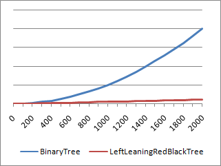
Improved performance of internal data structures for many common scenarios.
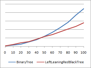
Charting now makes use of left-leaning red-black trees to maintain properly balanced data structures.
For more detail on this change, please refer to my post about the LeftLeaningRedBlackTree implementation.
Numerous bug fixes for animation inconsistencies between Silverlight and WPF.
Storyboards and Animations sometimes behave a little differently on Silverlight/WPF, and a good bit of effort was spent trying to ensure that Charting will behave the same way on both platforms.
In most cases, this was a matter of finding an implementation both platforms agreed on - in some it meant resorting to small, localized #if blocks.
Fixed handling of data objects with non-unique hash codes.
When each data object had a unique hash code, things already worked fine.
But data sets containing items sharing the same hash code could exhibit incorrect behavior in previous releases.
Most typical data sets would not have encountered this problem because hash codes are nearly always unique - but there are certain classes that report quite UNunique hash codes and could trigger the problem fairly easily.
This is no longer an issue.
Corrected behavior of charts at very small sizes and during animations.
Some third party controls offer so-called "fluid" layout in which size changes are all animated and elements can easily shrink to a size of 0x0.
This kind of environment could previously trigger layout bugs that would result in an unhandled exception from the Chart control.
These issues have been fixed and dynamic layout changes are now handled seamlessly.
Improved the performance of BubbleSeries.
Scenarios with many bubbles animating simultaneously could have previously exhibited some sluggishness.
In this release for Silverlight we've implemented an optimization that saves a significant amount of time in such cases.
Animations of BubbleSeries data changes are now considerably smoother.
Breaking Changes
IRequireGlobalSeriesIndex's GlobalSeriesIndexChanged method takes a nullable int parameter.
This should affect only people who have written custom Series implementations - and the code change is a trivial.
Other Changes
Many other fixes and improvements.
-
Better handling of non-
double data by shared Series
-
Addition of
StrokeMiterLimit to the Polyline used by LineSeries
-
Fixes for edge case scenarios when removing a
Series
-
Ability to set
Series.Title with a Binding (on Silverlight 3 and WPF)
-
Automatic inheritance of the
Foreground property by the Title control
-
Visual improvements to the
LegendItem DataPoint marker
-
Improvement to
AreaSeries default Style StrokeThickness behavior
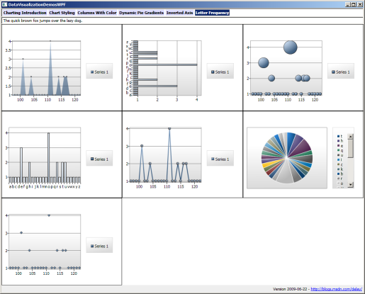
In my earlier post about WPF Charting, I announced a new DataVisualizationDemos sample that consolidates all the Charting samples I've posted to my blog into one handy place and compiles/runs on both Silverlight and WPF.
I've just updated DataVisualizationDemos for this release so it includes everything through the "Letter Frequency" sample I introduced last time, the original easing functions sample from the March 2009 release notes, my recent "Jelly Charting" demonstration, and a completely new sample:
Click here to download the complete source code for the DataVisualizationDemos sample application.
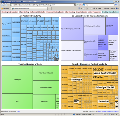
The new sample shows off the TreeMap control that's now part of the System.Windows.Controls.DataVisualization namespace.
The Wikipedia entry explains TreeMaps in detail; the executive summary is that TreeMaps are used to visualize the values of a single property (ex: team scores) across an entire data set.
They do this by adjusting the size (i.e., area) of each element so items with larger values are bigger, items with smaller values are littler, and the relative proportions are correct.
There are some different algorithms to do this layout; our TreeMap implements the common "squarified" algorithm.
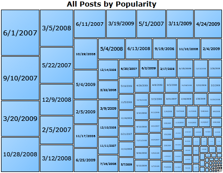
But enough background - let's use a TreeMap to visualize some data!
To begin, imagine that we have a data set listing all the blog posts I've made and the following details for each: post date, length, tags, and relative popularity.
(Aside: The popularity measure is not accurate because it's based on an incomplete set of statistics - but it's sufficient for our purposes.)
Let's begin by displaying all the posts ranked by popularity - that looks like this:
The XAML is a tad verbose, but it's quite easy to understand:
<datavis:TreeMap
    x:Name="AllPosts"
    ItemsSource="{Binding}">
    <datavis:TreeMap.ItemDefinition>
        <datavis:TreeMapItemDefinition
            ValueBinding="{Binding Popularity}">
            <DataTemplate>
                <Grid>
                    <Border
                        BorderBrush="Black"
                        BorderThickness="1"
                        Background="#ff7fc3ff"
                        Margin="0 0 1 1">
                        <Grid Background="{StaticResource GradientOverlay}">
                            <controls:Viewbox Margin="3 0 3 0">
                                <TextBlock Text="{Binding FormattedDate}"/>
                            </controls:Viewbox>
                        </Grid>
                        <ToolTipService.ToolTip>
                            <StackPanel>
                                <TextBlock Text="{Binding Title}"/>
                                <TextBlock Text="{Binding FormattedTags}" FontStyle="Italic"/>
                                <TextBlock Text="{Binding FormattedDate}"/>
                            </StackPanel>
                        </ToolTipService.ToolTip>
                    </Border>
                </Grid>
            </DataTemplate>
        </datavis:TreeMapItemDefinition>
    </datavis:TreeMap.ItemDefinition>
</datavis:TreeMap>
We start out by creating a TreeMap and pointing it at our data set using the standard ItemsControl pattern of setting the ItemsSource property.
Then we specify a TreeMapItemDefinition to describe what the items should look like and provide a Binding to identify the value we're visualizing.
At this point, you may be wondering whether there's a corresponding TreeMapItem control for each element (think ListBoxItem).
Well, there is not.
The reason being that TreeMaps are often used to display very large data sets with hundreds of elements - and it turns out that the overhead of having a wrapper control for each of those elements adds up quickly.
So TreeMap takes the slightly different approach of allowing you to define a DataTemplate for its item (as with ItemsControl.ItemTemplate).
This DataTemplate can be as simple or as complex as you'd like - and can even use a custom TreeMapItem-like control - so there's no loss of flexibility.
However, there's a big win in performance: this approach is roughly four times faster!
The contents of the DataTemplate used here are pretty typical: a border around some text that's bound to the underlying data object and a helpful ToolTip to display more detail when the user mouses over the element.
It's as easy as that!
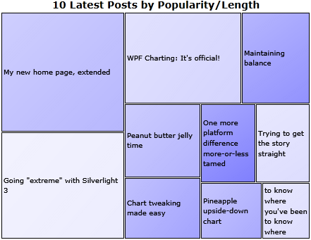
Okay, let's get a little more advanced and display two values at the same time!
The conventional way of showing a second value in a TreeMap is by varying the color of the items, so we'll do that.
Size corresponds to popularity as before, but now we're using color saturation to visualize post length (where darker=longer):
The basic TreeMap definition is basically the same as last time - the interesting part is the contents of the Interpolators collection:
...
<datavis:TreeMap.Interpolators>
    <datavis:SolidColorBrushInterpolator
        TargetName="Border"
        TargetProperty="Background"
        DataRangeBinding="{Binding Length}"
        From="#ffeeeeff"
        To="#ff8080ff"/>
</datavis:TreeMap.Interpolators>
...
What's an Interpolator?
It's a new concept we've introduced for TreeMap to automatically map a particular value ("Length" in this case) to a range of something.
In this case, the something is colors, so we're using SolidColorBrushInterpolator which works great for backgrounds and foregrounds.
There's also DoubleInterpolator which is handy for changing opacity, font size, and things like that.
And if you want to do something different, it's simple to create your own mapping by deriving from Interpolator (or RangeInterpolator<T>)!
We've purposely made SolidColorBrushInterpolator easy to use - note how it cleanly incorporates the familiar notions of Storyboard's TargetName and TargetProperty properties with ColorAnimation's From and To.
The remaining property, DataRangeBinding, provides a Binding that's used to identify the relevant variable on the data objects.
Once everything's in place, the Interpolator automatically interpolates each value according to where it falls in the overall range of values!
It's a simple, yet powerful concept that makes it easy to build powerful visualizations without writing any code at all.
And please note that the TreeMap.Interpolators property is a collection, so you can add as many of these as you'd like in order to visualize multiple values or control multiple properties!
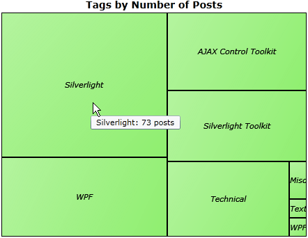
This time, instead of visualizing posts, let's visualize tags.
Specifically, let's see how many posts have been tagged with each tag name (remembering that some posts have multiple tags):
The aggregation of per-post data into per-tag data is made easy by a simple bit of Linq that first creates a unique tag/post object for each tag/post pairing, then groups these all by tag, and finally selects them into a new collection of objects:
var blogPostsByTag = blogPosts
    .SelectMany(p => p.Tags.Select(t => new { Tag = t, Post = p }))
    .GroupBy(p => p.Tag)
    .Select(g => new BlogTag { Tag = g.Key, Posts = g.Select(p => p.Post).ToArray() });
After that, creating the TreeMap is easy - it's just a minor variation of what we've already seen.
For our final trick, let's enhance the previous sample so we can see posts sorted by popularity within each tag grouping:
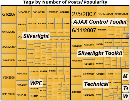
This is pretty easy to do as well - it's the previous TreeMap with copies of the first TreeMap nested inside each tag node!
Nested TreeMaps?
Sure!
Like I said, the DataTemplate model is totally flexible.
The outer TreeMap creates the bounding boxes, and the inner TreeMaps sub-divide them according to post popularity.
No sweat... :)
As I hope you'll agree, the new TreeMap is a pretty cool addition to the Data Visualization assembly!
And we wouldn't have it if not for the tireless efforts of the folks on the GPD-E (Global Product Development Europe) team who we partnered with to deliver this new control.
In particular, all the real work was done by Cristian Costache, Marek Latuskiewicz, and Gareth Bradshaw - I mainly helped coordinate things and do a bit of testing.
I'd like to extend my sincere thanks to these guys for their passion and dedication these past few weeks!
Please check out their blogs for more information about TreeMap in the coming weeks! :)
PS - If you have any questions or feedback, the right places to start are the Silverlight Discussion Forum or the WPF Discussion List.
Bugs and feature requests can be logged with the Silverlight Issue Tracker or the WPF Issue Tracker.
Please raise issues that are clearly unique to one platform or the other in the obvious place.
But for general questions and things that are common to both platforms, the Silverlight forum/list is probably a better place because there's more context and history there.
PPS - TreeMap is currently available only as part of the Silverlight Toolkit.
However, it should run perfectly well on WPF; in fact, I did that as part of the testing process!
Interested parties can recompile the Silverlight source code for WPF in order to start playing with TreeMaps on WPF today; the process should be pretty easy because both the Silverlight and WPF Toolkits are open source and share the same source code files/layout/etc..
However, I'll be posting more about this in the next few days and hope to have explicit directions and a script to make the entire process easy for everyone! :)