The blog of dlaa.me

Great Silverlight charts are still just a click away [ChartBuilder sample and source code updated for Charting's December 08 release]

In yesterday's announcement of the December 08 release of Charting for Silverlight, I outlined some of the new Charting features and mentioned a forthcoming update to my ChartBuilder tool to show off the new features. (Background reading for ChartBuilder: Introduction and "user's guide", Updates.)

The new ChartBuilder is now live on the web - and I've even updated my sample screenshot! :)

You can click this text or the image below to run the latest ChartBuilder in your browser.

ChartBuilder

[And click here to download the complete ChartBuilder source code.]

Release notes:

  • Added support for new series type BubbleSeries. To keep thing simple and avoid needing to specify another set of values, the bubble size is bound to the dependent value of the series.
  • Added support for the new Independent(Range|Category)Axis and Dependent(Range|Category)Axis properties of the Column/Bar/Line/Scatter/Bubble series types. Off by default, either axis can be enabled by checking the relevant box in the settings panel for a series - then customized as always.
  • Added a ToolTip for the "Axes" header label to display the current value of the Chart.ActualAxes property in pseudo-XAML. More of a diagnostic aid than anything, this information can help understand the interaction between axes and series - and what's really going on behind the scenes.
  • Increased the maximum number of stand-alone Axis instances from 2 to 4 now that multiple axes are supported.
  • Various other improvements.
  • Updated the version to 2008-12-07.

ChartBuilder continues to be tremendously useful to me as an interactive Charting test application. The plethora of knobs, dials, and switches that represent a user experience designer's worst nightmare [ :) ] enable a degree of scenario testing that has helped find and fix a wide variety of issues. Furthermore, the interactive nature of the tool - and the ease with which it enables mocking up samples for answers on the Silverlight Controls and Silverlight Toolkit forum - has really seemed to help people understand Charting more easily.

My hope is that ChartBuilder can be just as useful to you - so if you've got ideas after using it, please let me know!

Silverlight Charting gets a host of improvements [Silverlight Toolkit December 08 release now available!]

The December 08 release of the Silverlight Toolkit was published a short while ago. Just about every control in the Toolkit got some love and attention for this release and I encourage you to have a look, download it, and enjoy!

That said, readers of my blog know that I'm all about the Charting. :) So just like my original Charting announcement and overview post, here's an announcement of the December 08 Charting release and an overview of some of the high points. By now, I assume folks have had time to play around with Charting and are starting to get into some more advanced scenarios, so the samples are going to be a little more technical than before. If you want a refresher on basic Charting concepts, please have a look at my original overview - all of those concepts still apply.

Though the Charting team was down to just two of us for this release, Jafar and I have done our best to deliver some pretty compelling new features. It's important to note that there are a few breaking changes from the November 08 release, but I hope you'll agree that the new functionality is worth the minor inconvenience of updating existing Charting code. As it happens, if you don't explicitly use the Axis class, you probably won't need to change anything at all!


I wrote the following summary for the release notes, and it seems like a good way to begin:

Notable Changes

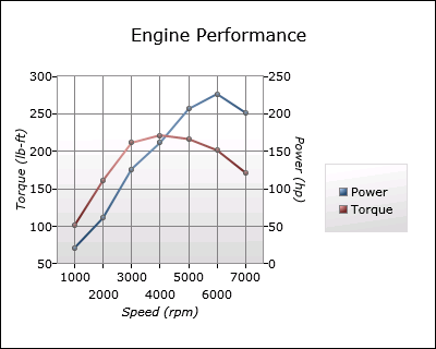
Support has been added for arbitrary numbers of Axes for a Chart. A key and significant consequence of this change is that it is now possible to mix previously incompatible Series in the same chart (example: Column and Bar). The former "automatically share axes when possible" behavior remains present and can be used to render two series with a shared independent axis and different dependent axes in order to display related-but-differently-scaled values (example: an engine's torque and RPM).

The Column/Bar/Line/Scatter Series classes expose two new (optional) properties which specify a particular Axis instance to be used by the Series (rather than letting the Series choose from the Chart's Axes collection as it does by default). These properties allow very specific customization of each Series' axes in situations where maximum control is desired.

A design-time assembly for Charting has been created which is automatically used by Blend and Visual Studio to enhance the design-time experience. Most class properties are now categorized into custom "Data Visualization" and "Data Visualization Styles" categories to make them easier to find - while particularly common properties are now found in the "Common" category. ToolTips identify the purpose of each control and property, and Toolbox icons are automatically associated with each class. (Note: Some of these features are only supported by one of the design tools.)

The design-time behavior of DataPoints has been enhanced: DataPoints are now visible by default when dropped onto the design surface in Blend, so styling them is easier. PieDataPoint now creates a default Geometry (that can be customized interactively with the ActualRatio and ActualOffsetRatio properties) which makes it possible to see and understand relevant styling changes. DataPoints in a Chart show up in Visual Studio without a refresh of the design surface.

The Chart class is now decorated with ContentPropertyAttribute("Series") which means that it is no longer necessary to explicitly wrap Series with <charting:Chart.Series> ... </charting:Chart.Series> in XAML. Additionally, this enables Blend to display a Chart's Series in the "Objects and Timeline" pane and makes accessing the properties of a Series considerably easier. Example of simplified XAML syntax:

    <charting:Chart>
        <charting:PieSeries ... />
    </charting:Chart>

The behavior of the Axis classes during animations that expand or shrink the range of displayed data has been changed so that the animation of the size change is smooth (vs. jumping between axis intervals). This significantly increases the ease with which dynamic data changes can be observed and understood by the viewer.

The DataPointSeries class (a subclass of Series) has been unsealed to make the task of writing a custom Series considerably easier. While this change doesn't expose the entire hierarchy on which the "in-box" Series are built, it is a significant benefit to developers because DataPointSeries implements many of the key Series notions: the ItemsSource property, DataPoint creation, dynamic data detection, change animation, show/hide transitions, DataPoint selection, and more.

A new Series type, BubbleSeries, has been added (along with its associated BubbleDataPoint class). BubbleSeries is similar in nature to ScatterSeries, but conveys additional information by using the size of the data points to display an additional dependent value for each of the data points.

In scenarios where multiple columns/bars (of ColumnSeries/BarSeries) share the same category, all such data points will now be automatically displayed overlapping so that smaller values will no longer be obscured from view by larger values.

Breaking Changes

The Axis.AxisType property has been replaced by a corresponding hierarchy of Axis classes. The concrete classes map directly to the AxisType values that were removed: LinearAxis, DateTimeAxis, CategoryAxis. In addition to improving overall API consistency, a consequence of this refactoring is that the LinearAxis.Minimum/Maximum properties are now strongly typed as double and the corresponding properties on DateTimeAxis are strongly typed as DateTime - both of which improve development-time and design-time usability.

The Axis.ShouldIncludeZero property has been removed; this property is has no meaning for some axis types and is typically not needed because the same thing can be accomplished by setting Minimum or Maximum accordingly. A consequence of this is that Column/Bar charts will usually not include the 0 value by default (and therefore the "beginnings" of the columns/bars can be truncated). This behavior is consistent with Excel (demonstrated by creating a column chart of the values 10, 11, and 12 in Excel), though truncation is more likely because Charting's heuristics are more aggressive with regard to excluding 0.

Other Changes

Various UI improvements and bug fixes.

Whew - there's a lot of good stuff in there! :)


So now that we have an idea what's new, let's start by looking at the support for multiple axes with a common scenario: charting two quantities that are related, but measured in different units and/or on different scales. For the purposes of this demonstration, let's chart the performance characteristics of an imaginary engine:

Chart with multiple axes

[Note: Complete source code for all of the sample charts here can be found in the ChartingIntroduction.zip file attached to this post.]

The XAML for this Chart is straightforward (and discussed below):

<charting:Chart Title="Engine Performance">
    <!-- Power curve -->
    <charting:LineSeries
        Title="Power"
        ItemsSource="{StaticResource EngineMeasurementCollection}"
        IndependentValueBinding="{Binding Speed}"
        DependentValueBinding="{Binding Power}"
        MarkerWidth="5"
        MarkerHeight="5">
        <!-- Vertical axis for power curve -->
        <charting:LineSeries.DependentRangeAxis>
            <charting:LinearAxis
                Orientation="Vertical"
                Title="Power (hp)"
                Minimum="0"
                Maximum="250"
                Interval="50"
                ShowGridLines="True"/>
        </charting:LineSeries.DependentRangeAxis>
    </charting:LineSeries>
    <!-- Torque curve -->
    <charting:LineSeries
        Title="Torque"
        ItemsSource="{StaticResource EngineMeasurementCollection}"
        IndependentValueBinding="{Binding Speed}"
        DependentValueBinding="{Binding Torque}"
        MarkerWidth="5"
        MarkerHeight="5">
        <!-- Vertical axis for torque curve -->
        <charting:LineSeries.DependentRangeAxis>
            <charting:LinearAxis
                Orientation="Vertical"
                Title="Torque (lb-ft)"
                Minimum="50"
                Maximum="300"
                Interval="50"/>
        </charting:LineSeries.DependentRangeAxis>
    </charting:LineSeries>
    <charting:Chart.Axes>
        <!-- Shared horizontal axis -->
        <charting:LinearAxis
            Orientation="Horizontal"
            Title="Speed (rpm)"
            Interval="1000"
            ShowGridLines="True"/>
    </charting:Chart.Axes>
</charting:Chart>

We start with the usual Chart object to contain the series - but now we can put the series directly inside the Chart tags instead of inside nested Chart.Series tags (though that syntax still works and is fully supported). There are two LineSeries here (one for torque and one for power) and each starts out as you'd expect by hooking up to the data and doing a bit of customization. But then there's something new: the LineSeries.DependentRangeAxis property is used to identify a specific LinearAxis. Every series type (other than PieSeries which doesn't have axes) now exposes a Dependent???Axis property and an Independent???Axis property (where "???" is "Range" or "Category" depending on which series it is).

Normally, a series will search the Chart.Axis collection to find an axis that it can use - but when these new properties are set, it always uses the specified axis. So in this example we're providing a specific LinearAxis for each LineSeries to use and we're customizing it slightly to get the chart looking just how we want. Having specified both LineSeries in this manner, a third LinearAxis is added to the Chart.Axis collection where it will be found - and used - by both LineSeries when they acquire an independent value axis.


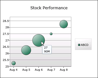
Moving on, here's a chart using the new BubbleSeries in a financial scenario (for a fictional stock ticker symbol). It's the usual "stock price by date" chart we've all seen before - but this chart is also showing the trading volume each day by varying the size the data points:

Bubble chart

The XAML for that Chart is what you'd expect:

<charting:Chart Title="Stock Performance">
    <!-- Stock price and volume -->
    <charting:BubbleSeries
        Title="ABCD"
        ItemsSource="{StaticResource StockDataCollection}"
        IndependentValueBinding="{Binding Date}"
        DependentValueBinding="{Binding Price}"
        SizeValueBinding="{Binding Volume}"
        DataPointStyle="{StaticResource CustomBubbleDataPointStyle}"/>
    <charting:Chart.Axes>
        <!-- Axis for custom labels -->
        <charting:DateTimeAxis
            Orientation="Horizontal">
            <charting:DateTimeAxis.AxisLabelStyle>
                <Style TargetType="charting:DateTimeAxisLabel">
                    <Setter Property="StringFormat" Value="{}{0:MMM d}"/>
                </Style>
            </charting:DateTimeAxis.AxisLabelStyle>
        </charting:DateTimeAxis>
    </charting:Chart.Axes>
</charting:Chart>

BubbleSeries is used just like a ScatterSeries, but it exposes an additional property SizeValueBinding that works just like Independent/DependentValueBinding to identify the source of the size values. The DataPointStyle property specifies a custom style for BubbleDataPoint (not shown here) where we've added the day's volume to the ToolTip of each bubble. This custom style was created in the usual manner - by starting from the default style for BubbleDataPoint and making the desired changes. (I did so in Visual Studio's XAML editor, but it could just as easily be done in Blend.)

Tweaking things just a little more, the independent value axis is customized by setting its AxisLabelStyle property and providing a style for the new DateTimeAxisLabel class. DateTime/NumericAxis/AxisLabel are the classes used to display an axis's labels. In this case we've provided a custom StringFormat so that the dates are all displayed in the friendly Month+Day pattern seen above. DateTimeAxisLabel offers specific StringFormat properties for each supported IntervalType - but in this case we've simply used the StringFormat property which conveniently overrides the other, more specific types.


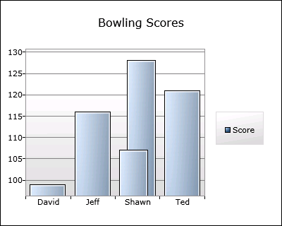
Next up is a fairly typical column chart showing made-up bowling scores for some of the people on the Toolkit team. But there's twist because there are two "Shawn"s on the team:

Chart with overlapping columns

By now, the XAML is probably kind of boring in its predictability:

<charting:Chart Title="Bowling Scores">
    <!-- Scores -->
    <charting:ColumnSeries
        Title="Score"
        ItemsSource="{StaticResource ScoreDataCollection}"
        IndependentValueBinding="{Binding Player}"
        DependentValueBinding="{Binding Score}">
        <charting:ColumnSeries.IndependentCategoryAxis>
            <!-- Axis for automatic sorting -->
            <charting:CategoryAxis
                Orientation="Horizontal"
                SortOrder="Ascending"/>
        </charting:ColumnSeries.IndependentCategoryAxis>
    </charting:ColumnSeries>
</charting:Chart>

This is a standard ColumnSeries, which is specifying a IndependentCategoryAxis so the new SortOrder property of CategoryAxis can be used to automatically sort the category names. This data set contains two items with the independent value "Shawn". Previously, both would have been displayed in the same category slot with the same width which means the column in front could have obscured the one in back and led viewers to believe that only four scores were being displayed. But now ColumnSeries and BarSeries automatically detect this situation and overlap columns/bars in the same category slot (after sorting them by size). This behavior makes it clear that five values are being shown and makes it easy to hover over either of the "Shawn"s to get a ToolTip with the associated score.


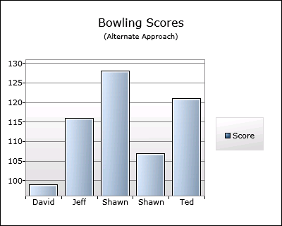
The previous chart is interesting for another reason, too: it's using the natural, simple way to display the data, but a purist might argue that it's also the "wrong" way to do so... [Jafar and I actually had this "argument" - I won't say who took which position. :) ] Categorizing by player name works well enough, but what if we also had an image for each player and we wanted to display that image instead of their name? Changing the ColumnSeries.IndependentValueBinding property might work, but it's become obvious that we're mixing display concerns and data concerns.

When maintaining developer/designer separation is critical, what's probably more appropriate is to categorize by the actual data object - and then display it however we want. Here's a chart that does just that:

Chart with unique categories

And here's the XAML - which is a bit more complicated than before, but still quite manageable:

<charting:Chart>
    <!-- Customized Title -->
    <charting:Chart.Title>
        <StackPanel>
            <TextBlock
                Text="Bowling Scores"
                HorizontalAlignment="Center"/>
            <TextBlock
                Text="(Alternate Approach)"
                FontSize="10"
                HorizontalAlignment="Center"/>
        </StackPanel>
    </charting:Chart.Title>
    <!-- Scores -->
    <charting:ColumnSeries
        Title="Score"
        ItemsSource="{StaticResource ScoreDataCollection}"
        IndependentValueBinding="{Binding}"
        DependentValueBinding="{Binding Score}">
        <charting:ColumnSeries.IndependentCategoryAxis>
            <!-- Axis for automatic sorting and custom labels -->
            <charting:CategoryAxis
                Orientation="Horizontal"
                SortOrder="Ascending">
                <charting:CategoryAxis.AxisLabelStyle>
                    <Style TargetType="charting:AxisLabel">
                        <Setter Property="Template">
                            <Setter.Value>
                                <ControlTemplate TargetType="charting:AxisLabel">
                                    <TextBlock Text="{Binding Player}"/>
                                </ControlTemplate>
                            </Setter.Value>
                        </Setter>
                    </Style>
                </charting:CategoryAxis.AxisLabelStyle>
            </charting:CategoryAxis>
        </charting:ColumnSeries.IndependentCategoryAxis>
    </charting:ColumnSeries>
</charting:Chart>

Now that we've set IndependentValueBinding to the data objects themselves, there are automatically five categories (one for each of the five objects in the data set). (Aside: CategoryAxis will still sort them for us because the data objects implement the IComparable interface.) Once the data is set up "properly", all that's left to do is customize how the objects are displayed - and this is done by providing a custom template for the AxisLabel class (something that's already been discussed).

One other thing to note above is how the Chart.Title property is set to a tree of UI elements instead of the usual string. Chart.Title (and other such properties in Charting) follows the ContentControl model because it makes simple things simple while also allowing more advanced scenarios. In this case, all we've done is provide a "subtitle" - but we could also have gone much further and created something very customized.


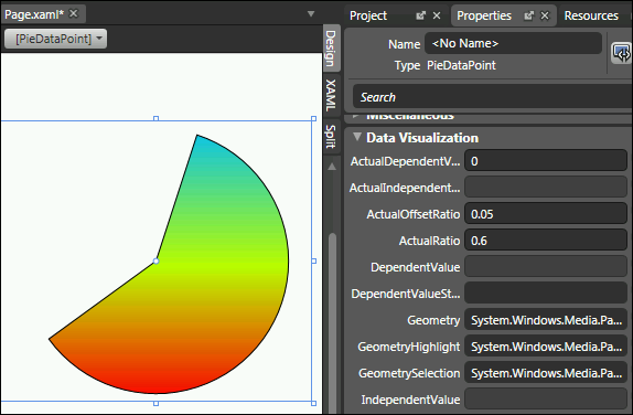
The last thing I wanted to highlight was some of the design-time enhancements for Charting in this release. Data points were previously a little tricky to customize because their default state is not visible (which allows the reveal/show animation to fade them in without flicker). Data points now check if they're being used in design-time and will automatically play their reveal/show animation so that they're visible on the design surface by default. PieDataPoint used to be extra tricky because its Geometry property is only set when it's actually being used by PieSeries. But now it knows about design-time and its ActualRatio/ActualOffsetRatio properties can be changed to interactively evaluate different styling approaches. Here's a stand-alone PieDataPoint in Blend showing off both of these improvements (along with the new "Data Visualization" property category):

PieDataPoint in Blend


I hope you're excited by some of the new functionality we've just looked at from the December 08 release of Charting! And naturally, we've made a some other improvements, too! :) You can browse the live Charting sample page to find out more - then download the December 08 Toolkit release and start playing around with the new stuff! As always, if you have questions about Charting, you can ask them in the Silverlight Controls forum. If you think you've found a bug, please report it with the Issue Tracker in the Toolkit's CodePlex site.


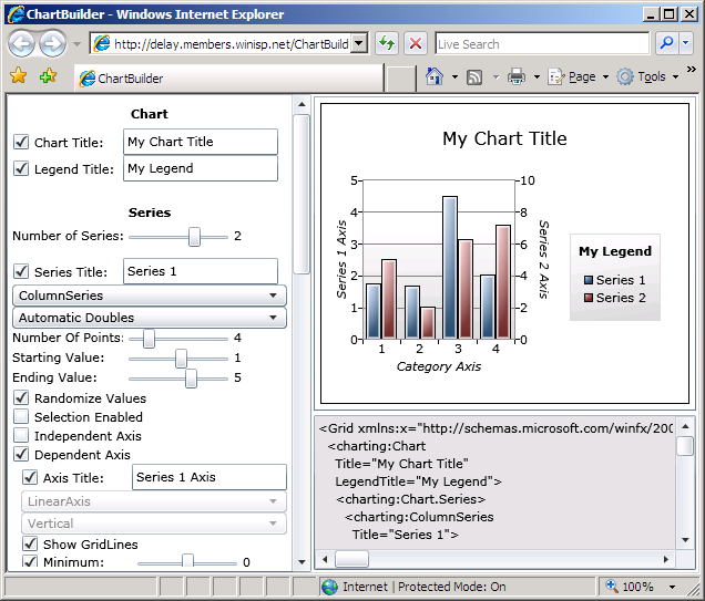
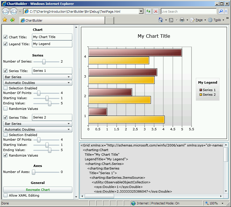
PS - If you're looking for an update to my ChartBuilder application (Background reading: Introduction, Update) to show off the new Charting functionality, please stay tuned because it will be available very soon! :)

PPS - I'm on vacation in December, so responses to blog comments and emails may be delayed. But please don't let that stop you from contacting me: I'll follow up on everything I get - I just might be a little slower than usual. :)

[ChartingIntroduction.zip]

Having problems with layout? Switch to Plan B! [LayoutTransformControl scenarios for WPF]

When I first wrote about adding full LayoutTransform fidelity to Silverlight with my LayoutTransformControl project, I mentioned that I'd found two scenarios where LayoutTransformControl's behavior differed from WPF's LayoutTransform. (Background reading for LayoutTransformControl: Motivation and introduction for Beta 1, Significant enhancements and update for Beta 2, Update for RTW, Fixes for two edge case bugs) These two differences were intentional because it seemed to me that the corresponding WPF behavior was incorrect. Now you can judge for yourself. :)

The sample WPF application shown here (note: complete source code is attached to this post) demonstrates two variants of the problematic scenarios; one rendered by WPF's LayoutTransform and the other by LayoutTransformControl. The top four cells demonstrate the first scenario and the bottom four cells demonstrate the second. Cells on the left show a variant that both implementations agree on while cells on the right show a small modification that demonstrates conflicting behavior. I've shaded the problematic sections red to help identify them. Here's how it looks:

WPF LayoutTransform issue demonstration

The XAML for top scenario's red quadrant is this:

<Grid Background="Orange">
    <Grid.LayoutTransform>
        <SkewTransform AngleX="-20"/>
    </Grid.LayoutTransform>
    <Grid MinHeight="75" MinWidth="75"/>
</Grid>

It's a simple skew on a free-sized Grid with arbitrary content (for simplicity, the content is another Grid with MinWidth/MinHeight, but this could be a Button or any other typical content). The behavior for positive skew angles makes sense to me, but the behavior for negative angles seems inconsistent and causes undesirable clipping of the content (which is really obvious when applied to a Button). The corresponding XAML for LayoutTransformControl's "correct" rendering is:

<l:LayoutTransformControl>
    <l:LayoutTransformControl.Transform>
        <SkewTransform AngleX="-20"/>
    </l:LayoutTransformControl.Transform>
    <Grid Background="Orange">
        <Grid MinHeight="75" MinWidth="75"/>
    </Grid>
</l:LayoutTransformControl>

The XAML for bottom scenario's red quadrant is this:

<Grid Width="75">
    <Grid Background="Orange">
        <Grid.LayoutTransform>
            <RotateTransform Angle="90"/>
        </Grid.LayoutTransform>
        <Grid MinHeight="125" MinWidth="125"/>
    </Grid>
</Grid>

It's a width-constrained, free-sized Grid with arbitrary content. The behavior for Angle=0 (or 180) makes sense to me, but the behavior for Angle=90 (or 270) does not; at this angle the content should be vertically unbounded and should stretch to the full 125 pixels of the inner Grid. Changing the nature of the outer constraint from width to height exhibits the same "doesn't stretch" behavior at Angle=90 (or 270). The corresponding XAML for LayoutTransformControl's "correct" rendering is:

<Grid Width="75">
    <l:LayoutTransformControl>
        <l:LayoutTransformControl.Transform>
            <RotateTransform Angle="90"/>
        </l:LayoutTransformControl.Transform>
        <Grid Background="Orange">
            <Grid MinHeight="125" MinWidth="125"/>
        </Grid>
    </l:LayoutTransformControl>
</Grid>

I reported both of these issues to the WPF team when I found them, but unfortunately they weren't able to address them for the .NET 3.5 SP1 release. Although it might put LayoutTransformControl out of a job, I'm optimistic that both will be fixed in a future update of WPF. :) For the time being, though, I humbly suggest giving LayoutTransformControl a try if you encounter unexpected behavior like this. It's probably the quickest, easiest patch you'll find!

[WpfLayoutTransformIssues.zip]

An unexceptional layout improvement [Two LayoutTransformControl fixes for Silverlight 2!]

I'd almost finished patting myself on the back for managing to implement WPF's LayoutTransform on Silverlight using just the RenderTransform available on that platform. (Background reading for LayoutTransformControl: Motivation and introduction for Beta 1, Significant enhancements and update for Beta 2, Update for RTW) Yes, everything was peachy - until I was contacted by kind reader Matthew Serbinski with a report of an InvalidOperationException being thrown by Silverlight when using LayoutTransformControl with a ScaleTransform with ScaleY=0... :(

You've probably already recognized ScaleY=0 as something of an edge case for layout: a value which collapses everything into nothingness. I looked into how WPF's LayoutTransform code handled this situation and discovered that it specifically detected circumstances corresponding to a transformation matrix without an inverse - and skipped performing the usual layout computations. My LayoutTransformControl implementation didn't look for this special case, ended up violating one of the rules of the layout system, and triggered the reported exception.

So I added a little bit of code to handle such input the same way WPF does. And while I was at it, I checked to see if maybe there were other special cases that LayoutTransformControl wasn't handling properly... Sure enough, I found one other scenario: that of needing to layout within an container having no width or height. In this case, LayoutTransformControl's behavior wasn't wrong enough to cause an exception (or any visible problem I noticed), but I made a similar tweak for consistency with WPF.

Changes in place, I modified the LayoutTransformControl sample application, its Silverlight test framework, and its WPF test framework to allow setting both ScaleX and ScaleY to 0. (I'd formerly limited ScaleX/ScaleY to positive values which is why I didn't realize there was a problem myself.) Then I spent some time playing around with the test apps: trying all kinds of things and looking for any other anomalous behavior. Nothing turned up, so I updated the LayoutTransformControl source code download and started writing this post... :)

LayoutTransformControl Sample Application

Changes to code always involve a certain amount of risk that a regression will be introduced. Fortunately, the changes here are small, self-contained, and easy to test - so I'm optimistic they won't cause problems for those of you already using LayoutTransformControl in your projects. Of course, if there are any new problems - or existing ones I don't know about yet! - please let me know and I'll look into them as quickly as I can.

Thank you for your help - happy LayoutTransform-ing!

Shamelessly benefitting from the work of others [Links to Silverlight Airlines and Surface samples for RTW!]

I try to keep up with migrating my various samples to the latest Silverlight Beta/RTW releases, but I don't always have the chance to do so as quickly as I'd like. That's why it was great to find that someone had already done some of the work for me. Two someones, in fact! :)


Silverlight Airlines Demo

The original Silverlight Airlines demo my team did for MIX 07 is available on the Silverlight.net gallery:
[Runnable Sample]
[Source Code]


Silverlight Surface Demo

My popular Silverlight Surface demo has been updated by pureBlue consulting to include video support:
[Runnable Sample]
[Source Code]


To be clear, I wasn't involved with the porting efforts and I haven't reviewed the source code for either sample. However, I bet these are both still great learning resources for new Silverlight developers!

Thank you to everyone out there who's helping to make Silverlight fun and easy to learn.

A fix for simple HTML display in Silverlight [HtmlTextBlock bug fix for Silverlight 2 RTW!]

I updated my HtmlTextBlock sample for RTW last night and got an email from kind reader Ed Silverton this morning pointing out a problem setting FontSize on a standalone instance of the control. (Background reading: HtmlTextBlock Announcement for the Alpha, Improvements, Beta 1 Update, Data Binding Support, Beta 2 Update, RTW Update) Unfortunately, this problem does not demonstrate itself in the sample project, so I missed it. :( Sorry about that!

Ed's scenario was that of setting the FontSize or Foreground properties in the XAML for an instance of HtmlTextBlock; he observed that they did not take effect. What I think happened is that these Silverlight properties became inheritable between Silverlight Beta 2 and RTW, so the code in HtmlTextBlock to set up TemplateBindings to them was interfering with their normal operation. I simply removed the code in HtmlTextBlock that deals with the inheritable properties: FontFamily, FontSize, FontStretch, FontStyle, FontWeight, and Foreground. (Note that TextDecorations doesn't count because it's not present on the Control class HtmlTextBlock derives from.) After that, all was well.

Mostly, that is... Ed's scenario now worked fine and so did the sample page - except for when the font size was changed to a small value. After that, changes to the font or size had no effect. Specifically, this problem seems to occur once the size of the text is small enough that the TextBlock fits completely within the bounds of the HtmlTextBlock. Not completely surprisingly, any changes to the TextBlock.Text property cause it to update itself correctly. I don't have a great deal more time to investigate this at the moment, and it's seeming like it may be an issue with Silverlight's TextBlock (I'll follow up internally), so I worked around the problem in the sample page (note: not the HtmlTextBlock code which I think is correct) by resetting the Text property when the font or size is changed by the user.

HtmlTextBlock Demonstration

I've updated the HtmlTextBlock demonstration page and the source code download, so you can try things out in your browser and/or download the code to see how it works!

Sigh, I knew yesterday's painless migration of this sample went too smoothly to be true... :)

My take on simple HTML display in Silverlight [HtmlTextBlock sample updated for Silverlight 2 RTW!]

A couple of readers have asked about an update to my long-running HtmlTextBlock sample for Silverlight 2 RTW. (Background reading: HtmlTextBlock Announcement for the Alpha, Improvements, Beta 1 Update, Data Binding Support, Beta 2 Update) One person went so far as to migrate it himself after emailing me! :) He said the process went well, and I spent a bit of time on the bus ride home doing the migration myself to understand what was involved.

HtmlTextBlock Demonstration

I've updated the HtmlTextBlock demonstration page and the source code download, so you can try things out in your browser and/or download the code to see how it works!

Notes:

  • The only change to the Beta 2 code was to handle the fact that the type of the object returned by HtmlDocument.GetElementsByTagName is now a base class of the HtmlElement instance the code was expecting. After a simple application of the as operator, the code compiles and works like before!

That's it!

Gee, I wish everything went this smoothly... :)

My new home page [A collection of great Silverlight Charting resources!]

It's been nearly two weeks since the Silverlight Toolkit's November release. I've been trying to keep up with what's been written about Charting and want to summarize some of the most helpful posts I've seen so far.

Overviews (100 level)

Scenarios (200 level)

Internals (300 level)

My own Charting posts (Ego level)

Many, many thanks to everyone who has spent time helping others learn how to use Silverlight Charting!

PS - If I've missed any good resources, please leave a comment and to them - I'm always happy to find good Charting content! :)

Improving ChartBuilder's cultural sensitivity [ChartBuilder app/source updated!]

Kind readers Eugenio and Thimp independently reported that the initial version of ChartBuilder did not work well on machines with certain culture settings. Specifically, ChartBuilder was inadvertently using the CurrentCulture for formatting numbers in XAML and that's a problem because the XAML is parsed according to the InvariantCulture. For example, on German machines ChartBuilder would write a double value to XAML as "1,23" according to the German culture settings - and the XAML parser would complain that wasn't a valid value. I'm usually able to catch problems like this by running code analysis and fixing all the Microsoft.Globalization warnings like CA1305, but in this case the code was calling objectInstance.ToString() which doesn't have any IFormatProvider-based overloads and therefore generates no warnings.

My sincerest apologies to anyone who was affected by this problem. I have switched one of my machines to the German locale and will leave it there for a couple of days as punishment. :)

I made the culture fix on my bus ride this morning and had a bit of extra time, so I also made the following improvements:

  • Added support for the Axis.Interval property. Now it's possible to customize the frequency of the labels, tickmarks, and gridlines on an axis.
  • Added the "datavis" xmlns prefix so it's already present for people who might need to reference it. [Like me when I posted a sample to the forums the other day. :) ]
  • Updated the version to 2008/11/06.

Again, sorry for any trouble. I hope the updated ChartBuilder works well for everyone - and that you enjoy the minor improvements!


You can click this text or the image below to run the latest ChartBuilder in your browser.

ChartBuilder

[And click here to download the complete ChartBuilder source code.]

Easily create an ISO from a CD/DVD [Releasing ExtractISO tool and source]

A few years back I found myself in need of a tool to create an ISO image from a CD I owned. I searched around a bit, but the only tools I could find to do that were part of much larger programs and cost money I didn't want to spend. The concept seemed simple enough that I figured it would be fairly easy to write my own tool to do this. So I did. :)

ExtractISO is a native, console-mode application that does what its name suggests: extracts the contents of a CD or DVD and saves it to a file. The tool and complete source code are attached to this post as ExtractISO.zip. Here's the documentation that comes with it:

====================================
==  ExtractISO                    ==
==  http://blogs.msdn.com/Delay/  ==
====================================


Summary
=======

ExtractISO - Creates an ISO image file from a CD/DVD

ExtractISO reads raw sectors from the specified CD/DVD volume and writes them
to the specified ISO image file.  The resulting file can be burned to a blank
CD/DVD disc, mounted in a virtual CD/DVD drive, or opened in an ISO viewer.

For a discussion of the limitations of this process, please refer to:
   http://www.cdrfaq.org/faq02.html#S2-28

Note that direct access to a CD/DVD volume requires administrative privileges.

ExtractISO attempts to read damaged media by retrying failed reads a few times
before giving up. In the event of a persistent read failure, the partial output
file is not deleted so that subsequent extraction attempts (possibly after
cleaning the media and/or using a different drive to read it) can be attempted
without the loss of any successfully extracted data.

Syntax: ExtractISO D: File.iso
   D: is the CD/DVD drive to extract from
   File.iso is the file to write to


Version History
===============

Version 1.11, 2008-11-04
Improved formatting of "bytes extracted" display value
Initial public release

Version 1.10, 2006-03-12
Added support for damaged media recovery (see above)

Version 1.01, 2005-05-18
Fixed silly integer overflow problem with "bytes extracted" display
Note: Problem affected display only; no functional impact

Version 1.0, 2005-04-27
Initial release

ExtractISO has been available to anyone inside Microsoft since I wrote it. Last week, I got an unexpected request to make it public so certain customers could use it. I was happy to do so, but one thing had been bothering me for a while: the status display of the bytes extracted so far didn't group by thousands. Instead of "1,000,000", the counter displayed as "1000000" which I find more difficult to parse. This was such a small issue, I never got around to fixing it - but now seemed like the ideal time to do so!

Unfortunately, this formatting task which is so simple in .NET seems to be quite a bit more involved with the Win32 API. The first problem is that printf doesn't support outputting the thousands separator. I considered using something like the sample code the previous link suggests, but wanted something simpler and easier to understand. A bit of research turned up the GetNumberFormat API which seemed like the perfect solution. However, the GetNumberFormat API suffers from at least two notable shortcomings: it's not easy to customize the output and the input needs to be a string. I did a quick test and found that the output of GetNumberFormat for "1000000" is "1,000,000.00" (on my machine using the default United States settings). This is close to what I wanted, but displaying the integral byte count with two digits of decimal precision just seems silly to me. So I looked for an easy way to customize the output via NUMBERFMT, and ran into the same issues Michael talks about in the post I linked to. When further research turned up no better alternatives, I decided to use GetNumberFormat and then "fix" its output by calling GetLocaleInfo(LOCALE_SDECIMAL) and removing everything after the localized decimal character(s). I like this approach because it is almost all platform code (i.e., code I don't have to write/test) and should be correct for all cultures where numbers are written as "1,000,000.00", "1.000.000,00", etc..

Other than the formatting issue I've just discussed, I made no other changes to the ExtractISO implementation. The only things I did were to update some of the VERSIONINFO settings, tweak the Build.cmd script, and recompile with the latest Visual Studio 2008.

ExtractISO works reasonably quickly, but it's worth mentioning that performance was specifically not a goal when I wrote it. The code implements a simple read/write loop with a 1 MB buffer and makes no attempt to interleave the two operations. The large-ish buffer should help minimize the overhead of the read/write calls, but I suspect a different implementation that issues the reads and writes in parallel would be faster. However, achieving that parallelism comes at the price of complexity - and I didn't feel the time it would have taken to write and debug that code was justified here. Even at top speed, the extraction operation is going to take a minute or two - an extra minute on top of that seems a small price to pay for simpler, easier to maintain code. You are welcome to disagree, of course. :) If you develop a faster implementation, I'd love to hear about it!

ExtractISO is a simple tool with a simple purpose - and one that I've used quite happily for a number of years now. If you've got a hankering for ISOs and like free stuff, please have a look at ExtractISO!

PS - ExtractISO cannot be used to duplicate audio CDs or copy-protected DVDs: audio CDs use a different storage scheme than data CDs and copy-protected DVDs store their encryption key in an "inaccessible" location of the disk.

[ExtractISO.zip]