The blog of dlaa.me

IValueConverter: The Swiss Army Knife of Bindings [PropertyViewer sample is a WPF/Silverlight visualization and debugging aid!]

If you've made much use of data binding in WPF or Silverlight, you've probably come across the IValueConverter interface. IValueConverter sits between the data source and destination and gives the developer a chance to examine/alter/replace the data as it flows through the converter. It's been my experience that IValueConverter is a powerful and versatile tool for application developers.

As part of a recent project, I wanted to display some of an object's properties in a simple list. Specifically, I had an instance and I wanted to display a list of "Property Name: Property Value" entries for each property of that object. My background with ListBox led me to naturally think of using ItemsControl for the basis of my property viewer; the ItemsControl content model (with its support for DataTemplates) seemed like a natural fit.

Aside: One of the key things XAML enables is a distinct separation of implementation from representation. By explicitly separating most aspects of how an application looks (XAML) from how it works (code) as part of the developer/designer workflow, WPF and Silverlight help to enforce a level of encapsulation (in the object-oriented programming sense) that makes programs easier to write and maintain. In the ideal world, a program's functionality is entirely expressed in its code - and so it's possible for others to completely change that application's appearance without knowing or caring how it's implemented. Just like the web has CSS restyling contests, WPF has reskinning competitions!

So I knew I wanted to use ItemsControl and I knew I wanted to keep the UI aspects of the property viewer in XAML-space (what it looked like, what properties it displayed, etc.). I started looking at how IValueConverter might help and that led to the solution I describe here. PropertyViewer ends up being quite simple to use - and a good demonstration of the power of IValueConverter!

Here's the comment header from the code:

/// <summary>
/// IValueConverter implementation that expands some/all of an object's
/// public properties as a collection of bindable name/value instances.
/// </summary>
/// <remarks>
/// * Bindable instances are of type PropertyDetails, a contained class
///   that exposes a property's Name and Value as properties.
/// * All public properties are enumerated by default; ConverterParameter
///   can be used to specify which properties will be enumerated (and in
///   which order) by passing a space-delimited list of names.
/// * If DisplayNameAttribute is associated with a property, DisplayName
///   will be used instead of the property name.
/// * PropertyViewer can be used for simple data visualization, debugging
///   of Bindings, and more.
/// </remarks>
/// <example>
/// For ItemsControl/ListBox (accessing the object via DataContext):
///   ItemsSource="{Binding Converter={StaticResource PropertyViewer}}"
/// As above, but with a custom property list:
///   ItemsSource="{Binding Converter={StaticResource PropertyViewer},
///     ConverterParameter='PropertA PropertyB'}}"
/// For ItemsControl/ListBox, but specifying the object via Source:
///   ItemsSource="{Binding Source={StaticResource ObjectInstance}
///     Converter={StaticResource PropertyViewer}}"
/// </example>
public class PropertyViewer : IValueConverter
{ ... }

Like the comment says, it's easy to hook up a PropertyViewer:

<ItemsControl ItemsSource="{Binding Converter={StaticResource PropertyViewer}}"/>

Customizing the PropertyViewer is also easy:

<ItemsControl ItemsSource="{Binding Converter={StaticResource PropertyViewer},
    ConverterParameter='Species EatsBugs RelativeMass'}">

Because the end result is a collection of objects, all the existing ItemsControl knowledge and techniques can be used to completely customize the look and feel of the property viewer!

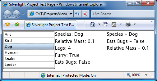
The examples above came from a simple application I wrote to demonstrate PropertyViewer in action. By design, the exact same XAML and code work on both WPF and Silverlight. To prove it, I attached the complete source code for the combined Visual Studio 2008 solution to this blog (download it from the link at the bottom of this post). The sample displays a list of animals, one default PropertyViewer, and one customized PropertyViewer. Select any animal to find out more about it (note that the PropertyViewer updates automatically when the data source changes).

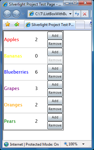
Here's what it looks like on WPF:
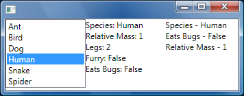
WPF Sample

And on Silverlight:

Silverlight Sample

Thanks to the power of IValueConverter, it's easy to use PropertyViewer to display an object's properties in a customizable way. Additionally, PropertyViewer can help troubleshoot data bindings: just drop one in the target location and you can see the available properties along with their current values. I originally wrote this for my project - but now I hope you can use it in yours!

[PropertyViewer.zip]

Buttons in a ListBox, and More [Demonstration of some useful Silverlight techniques]

One scenario I've seen cause a bit of trouble on the Silverlight Controls Forum is that of putting a Button in a ListBox. There are two aspects of this that seem to cause difficulty and I thought it would be helpful to demonstrate the complete scenario in a runnable, self-contained sample. (Please Download the ZIP file attached to the bottom of this post for all the code/XAML in a ready-to-go Visual Studio 2008 + Silverlight Tools solution.) While I was developing the sample, I threw in a couple of other handy techniques that may not be widely known. The sample application shows a typical shopping cart experience where products are listed and their quantities can be interactively changed:

"Buttons in a ListBox" Sample Application

Details on the button scenario:

  • One problem with putting a Button in a ListBox is that by default the Button can be clicked only when the corresponding ListBoxItem is selected. This is an unfortunate consequence of a very late change to Silverlight Beta 1 that causes ListBox to receive duplicate GotFocus/LostFocus events. For most controls the duplication is harmless, but for ListBox it interferes with ListBox's attempts to preserve WPF's focus/selection behavior when a focusable control (like Button) is clicked on. Fortunately, Button (and its subclasses like CheckBox) expose the ClickMode property which can be used to work around the problem. Simply changing the Button's ClickMode enumeration from the default value of Release to Press does the trick.
    <Button ... ClickMode="Press" ... />
  • Another problem people tend to have is hooking up an event handler to Buttons in a ListBox. While this can be a little tricky to do in code (specifically when the ItemTemplate is being used), it's quite easy to do in XAML by specifying a value for the Click event. Visual Studio generates the code for the event handler automatically, so this ends up being elegant and simple.
    <Button ... Click="Add_Click" ... />

Other points of interest:

  • ListBox's ItemsSource property is used to specify the items as a collection of the custom class Product and its ItemTemplate property is used to display those objects appropriately (coloring the text, adding Buttons, etc.).
    For lots more about configuring and using ListBox, please see my ListBox/ScrollViewer FAQ.
  • The Add/Remove Buttons directly modify the Quantity property of the Product objects. While that would not normally be enough to automatically update the UI, the Product class implements the INotifyPropertyChanged interface which can be thought of as kind of a light-weight DependencyProperty for non-DependencyObjects. More simply, it's an easy way to add change notifications to simple classes that Silverlight's data binding framework can use to automatically respond to property changes. In this case, updates to the Quantity property fire the PropertyChanged event and the displayed quantity gets updated automatically.
    public int Quantity
    {
        get { return _quantity; }
        set
        {
            _quantity = value;
            // Fire PropertyChanged event to notify listeners of changed value
            var handler = PropertyChanged;
            if (null != handler)
            {
                handler.Invoke(this, new PropertyChangedEventArgs("Quantity"));
            }
        }
    }
    private int _quantity;
    
    public event PropertyChangedEventHandler PropertyChanged;
    
  • It's nice when the UI automatically prevents invalid actions - in this case it's an invalid action for the user to remove items when the quantity is already 0 (as it is for "Bananas" in the image above). While it would be possible to create a dedicated bool property of the Product class and bind the Remove Button's IsEnabled property to it, there's a more elegant way. What the sample does is bind the Remove Button's IsEnabled property to the Quantity property - using an IValueConverter to convert the int type to a bool automatically. This nicely avoids adding otherwise unused properties to the Product object and helps to isolate the relevant logic.
    // Simple IValueConverter returns true iff the value is positive
    // Used to toggle Remove button's IsEnabled when Quantity changes between 0 and 1
    public class IntIsPositive : IValueConverter
    {
        public object Convert(object value, Type targetType, object parameter, CultureInfo culture)
        {
            return (0 < ((int)value));
        }
        public object ConvertBack(object value, Type targetType, object parameter, CultureInfo culture)
        {
            throw new NotImplementedException();
        }
    }
    

At the risk of straying too far from the original scenario, I think the additional techniques I've shown here support it nicely and improve the user experience notably. I hope this sample helps people with their own projects - and maybe introduces a useful trick or two!

Enjoy!

[ListBoxWithButtons.zip]

Proof-of-concept Silverlight XPS reader gets some Beta 1 love [SimpleSilverlightXpsViewer updated for Silverlight 2 Beta 1!]

After a few customer requests to update my SimpleSilverlightXpsViewer proof-of-concept XPS reader for Silverlight 2 Beta 1, I finally found time to do so. :) I've just updated the original SimpleSilverlightXpsViewer demonstration page and also updated the original source code download - so you can try it out in your own browser and/or download the code to see how it works!

SimpleSilverlightXpsViewer Application

Click on the image above to play around with the application in your browser. More details about what it is doing and how it works are available in the original SimpleSilverlightXpsViewer post.

Notes:

  • This was a fairly straightforward port from the original 1.1 Alpha implementation to 2 Beta 1. I have not changed the manual Canvas-based layout to automatic layout via Grid/StackPanel/etc. - but I'd definitely take that approach if I were writing it from scratch today!
  • The XAML didn't change at all - and most of the necessary code changes are detailed in the Breaking Changes in Silverlight 2 document on MSDN.
  • Because of the file:// URL restrictions introduced a while ago as part of the 1.1 Refresh, the sample code includes a separate web site. I explain more in the second half of my post outlining changes for the 1.1 Refresh.
  • One notable improvement is that I was able to #define SETSOURCE (see the discussion in the original post) and therefore the images are all being accessed from the XPS document itself instead of needing to be pulled out as separate files! I removed the associated #if/#endif blocks because they are no longer relevant.
  • I still didn't see any way around the Glyphs.FontUri issue (discussed in the same section of the original post), so the fonts remain separate like before.
  • Silverlight occasionally renders the "pageGraphic" Rectangle incorrectly. The obvious consequence of this is that the white page background disappears if it extends outside the Silverlight control's edges (e.g., you've zoomed in or panned). It's possible to verify that you're in this situation because the black page border is also not drawn properly. I've found that a simple refresh of the web page typically corrects the problem.

Blogging code samples a tad more easily [Updated free ConvertClipboardRtfToHtmlText tool and source code!]

Kind readers gave some great feedback on my previous post of the ConvertClipboardRtfToHtmlText tool and source code. Accordingly, I have made three small tweaks to the tool:

  • The code to detect the start of the RTF text worked only if Visual Studio's font size was set to 8pt. That's what I use, but it's not the default, so this would cause problems for most people who tried the tool. The relevant code no longer looks for a specific font-size.
  • Tab characters in the RTF text were ignored, causing layout problems for code with tabs (vs. spaces). Tabs are now auto-expanded to the mostly-standard value of 4 spaces.
  • The use of the private Color class was unnecessary because it added nothing over System.Drawing.Color. System.Drawing.Color is now used to save a few lines of code.

The sample code and tool in the previous post have been updated with these changes, so please go there to get the latest version.

Improved access to Silverlight 2's generic.xaml resources [SilverlightDefaultStyleBrowser available via ClickOnce]

In response to my previous post announcing the SilverlightDefaultStyleBrowser tool for working with default styles for Silverlight 2 controls, I got an email from Rob Relyea suggesting that I make SilverlightDefaultStyleBrowser available via ClickOnce as well. (For those who may not be familiar with it, here's a brief ClickOnce overview.) ClickOnce is simple to configure, adds a Start Menu entry automatically, supports seamlessly updating an application, and installs/uninstalls on Vista as standard user without requiring elevation - so this was easy to do!

SilverlightDefaultStyleBrowser sample image

[Click here or on the image above to install SilverlightDefaultStyleBrowser with ClickOnce.]

The functionality of SilverlightDefaultStyleBrowser is the same whether you use the executable in the ZIP or use the ClickOnce version - so pick whatever suits you best. And have fun styling those controls! :)

Note: The source code for SilverlightDefaultStyleBrowser is available only in the ZIP file download.

Improving everyone's access to Silverlight 2's generic.xaml resources [SilverlightDefaultStyleBrowser tool and source code]

When customizing the look and feel of a Silverlight 2 control, people usually want to start with a copy of the control's default visuals. Unfortunately, getting at the default XAML for a control isn't always obvious or easy. A control's default XAML is stored in a specially named resource of the control's assembly and that resource (named generic.xaml) isn't particularly easy to get at by default. The good news is that the controls in the Silverlight 2 Beta 1 SDK/Tools are documented on MSDN and that documentation includes the default styles.

But sometimes I prefer something a little "closer to the metal", so I wrote a small WPF 3.5 application to improve this experience for developers and designers working with Silverlight 2 controls. SilverlightDefaultStyleBrowser is a simple application that automatically extracts the default styles from an assembly's generic.xaml, lists the available control styles, and presents them in an easy-to-browse manner with syntax highlighting, automatic formatting, and expandable/collapsible nodes. The common scenario of copying a Style or Template is made easy by two dedicated buttons that do just that!

SilverlightDefaultStyleBrowser sample image

[Click here or on the image above to download a ZIP of the SilverlightDefaultStyleBrowser tool - and its complete WPF 3.5 source code.]

Using SilverlightDefaultStyleBrowser is deliberately simple. When the application loads, it automatically looks in the Silverlight SDK default install directory, parses all the assemblies it finds there, and adds the relevant styles to its list (as seen in the image above). Adding additional assemblies is as easy as hitting the "Add Assembly" button, selecting the assemblies, and hitting OK. Once the styles are loaded, simply select the control of interest to browse its default XAML. The "Copy Style to Clipboard" button copies the XAML for the entire style to the clipboard. The "Copy Template to Clipboard" button copies just the template XAML from within the Style (probably the more common scenario). Paste the copied XAML directly into your Silverlight application, tweak it or customize it, and you're set - it's that easy!

Notes:

  • SilverlightDefaultStyleBrowser tries to make things as easy as possible, but sometimes it's still necessary to edit the generated XAML a bit to get it to compile. Usually, this is because the XAML is referencing a non-default namespace that didn't get copied over because it wasn't directly part of the XAML (ex: the "local:" prefix in a TargetType attribute). In these cases, it's necessary to add the xmlns mapping manually. However, the default behavior of SilverlightDefaultStyleBrowser should provide a simple paste-and-go experience in most cases.
  • If you paste some XAML and then get the compile error "An item with the same key has already been added.", it's probably because you checked the "Namespaces" CheckBox. Doing so turns off SilverlightDefaultStyleBrowser's default behavior of removing the default "xmlns" and "xmlns:x" declarations from the XAML it provides (to avoid this very compile error). If you changed that setting because you wanted the pure, untouched XAML, then it's your job to remove the redundant namespaces - otherwise just uncheck the CheckBox and hit the "Copy" button again. :)
  • WatermarkedTextBox in the System.Windows.Controls.Extended assembly is not listed because that control uses its own private XAML resource instead of generic.xaml. You'll need to refer to the documentation if you want that control's default XAML.
  • The mysterious entry for "Control" actually applies to the GridSplitter control from the System.Windows.Controls.Extended assembly which is using a non-standard mechanism to store this style.
  • The templates for Silverlight 2 Beta 1 controls that are not part of the SDK (ex: TextBox, ItemsControl) are not stored in generic.xaml form and are therefore unavailable to SilverlightDefaultStyleBrowser even if you add all the assemblies in the Silverlight install directory.

Silverlight and WPF are all about allowing developers and designers to easily customize the look and feel of their applications. I hope SilverlightDefaultStyleBrowser helps make that process even easier for both groups!

Code to support new features doesn't write itself [HtmlTextBlock sample gets data binding support!]

In the comments to my post about porting the HtmlTextBlock sample to Silverlight 2 Beta 1, kind reader eibrahim pointed out that Silverlight 2's data binding feature wasn't working with HtmlTextBlock. I explained why in a reply to that comment:

This is a consequence of me doing as simple a port as possible. :( Recall that Silverlight 1.1 Alpha did not support data binding, so this issue simply couldn't exist there. Now that Silverlight 2 Beta 1 supports data binding, HtmlTextBlock needs a minor change to support it. In particular, its properties need to be backed by DependencyProperties in order for data binding to work as we'd like. I'll be updating the sample soon to add this support ...

I've just finished updating the code to back each of the settable HtmlTextBlock properties that mirror TextBlock properties with a DependencyProperty in order to enable data binding and maintain HtmlTextBlock as "plug-compatible" with TextBlock as possible. Most of this was pretty straightforward (boring) typing, so I'll confess that I have not tested each property individually. :| But I did create a simple project (attached to this post) demonstrating HtmlTextBlock data binding - both standalone and within a ListBox DataTemplate - that interested readers can use to play around with this. I've also updated the HtmlTextBlock.cs file in the existing HtmlTextBlock source code download.

Thanks for the feedback, eibrahim, I hope you and others find that the new data binding support works well and enables even more compelling scenarios!

[HtmlTextBlockAndDataBinding.zip]

Continuing support for simple HTML display in Silverlight [HtmlTextBlock sample updated for Silverlight 2 Beta 1!]

A few months ago when Silverlight 1.1 Alpha was all the rage, I wrote a sample control that made a best-effort attempt to display simple HTML markup in Silverlight. The original HtmlTextBlock post described the control's purpose and the follow-up post detailed a number of improvements to HtmlTextBlock. (Please continue to refer to those posts for background and implementation details.) Now that Silverlight 2 Beta 1 is released, I've had a few internal and external requests to modify HtmlTextBlock to work with the latest Silverlight bits.

HtmlTextBlock Demonstration

I've updated the original HtmlTextBlock demonstration page and also updated the original source code download, so don't hesitate to try things out in your own browser and/or download the code to see how it works!

Notes:

  • There were no fundamental changes to the features HtmlTextBlock uses, so the port from 1.1 Alpha to 2 Beta 1 was straightforward.
  • Thanks to Silverlight 2's flexible layout system, the code to override Width/Height/ActualWidth/ActualHeight and handle the Loaded event is all now unnecessary and has been removed.
  • The XAML passed to Control.InitializeFromXaml now specifies the default XML namespace.
  • Silverlight 2 Beta 1's TextBlock exposes the new properties LineHeight, LineStackingStrategy, and TextAlignment which HtmlTextBlock mirrors.
  • A handful of properties/classes changed names/types slightly.
  • The syntax for creating an instance of the Silverlight control in HTML has changed to use the <OBJECT> tag.

Curiously, certain text/style/size combinations don't seem to render under Silverlight 2 Beta 1. For example, viewing the initial sample text at Verdana/8, Lucida Sans Unicode/10, or Times New Roman/10 shows an empty box. Because changing the font face/size doesn't actually change the Silverlight object tree that HtmlTextBlock creates, I'm inclined to believe this is a rendering issue with the Silverlight Beta rather than a bug in HtmlTextBlock. However, if anyone finds otherwise, please let me know!

It's always great to hear that people have found value in the stuff I've posted to my blog. I hope that those of you who are using HtmlTextBlock continue using it successfully with Silverlight 2 Beta 1 - and that newcomers find something useful as well!

Blogging code samples should be easy [Free ConvertClipboardRtfToHtmlText tool and source code!]

I've been including a lot of source code examples in my blog lately and needed a good way to paste properly formatted code in blog posts. I write my posts in HTML and wanted a tool that was easy to use, simple to install, produced concise HTML, and worked well with Visual Studio 2008. I was aware of a handful of tools for this purpose but none of them were quite what I was looking for, so I wrote my own one evening. :)

Caveat: ConvertClipboardRtfToHtmlText is a simple utility written for my specific scenario. I'm releasing the tool and code here in case anyone wants to use it, enhance it, or whatever. I have NOT attempted to write a solid, general-purpose RTF-to-HTML converter. Instead, ConvertClipboardRtfToHtmlText assumes its input is in the exact format used by Visual Studio 2008 (and probably VS 2005).

Using ConvertClipboardRtfToHtmlText is simple:

  1. Copy code (C#, XAML, etc.) to clipboard from Visual Studio 2008
  2. Run ConvertClipboardRtfToHtmlText to convert the RTF representation of the code on the clipboard to HTML as text (there's no UI because the tool does the conversion and immediately exits)
  3. Paste the HTML code on the clipboard into your blog post, web page, etc.

I'm the first to acknowledge there's a lot of room for improvement in step #2. :) While the current implementation is good enough for my purposes, I encourage interested parties to consider turning this into a real application - maybe with a notify icon and a system-wide hotkey. If you do so, please let me know because I'd love to check it out!

The compiled tool and code are available in a ZIP file attached to this post. The complete source code is also available below. Naturally, I used ConvertClipboardRtfToHtmlText to post its own source code. :)

Enjoy!

Updated 2008-04-02: Minor changes to code and tool


using System;
using System.Collections.Generic;
using System.Drawing;
using System.Text;
using System.Windows.Forms;

// Convert Visual Studio 2008 RTF clipboard format into HTML by replacing the
// clipboard contents with its HTML representation in text format suitable for
// pasting into a web page or blog.
// USE: Copy to clipboard in VS, run this app (no UI), paste converted text
// NOTE: This is NOT a general-purpose RTF-to-HTML converter! It works well
// enough on the simple input I've tried, but may break for other input.
// TODO: Convert into a real application with a notify icon and hotkey.
namespace ConvertClipboardRtfToHtmlText
{
    static class ConvertClipboardRtfToHtmlText
    {
        private const string colorTbl = "\\colortbl;\r\n";
        private const string colorFieldTag = "cf";
        private const string tabExpansion = "    ";

        [STAThread]
        static void Main()
        {
            if (Clipboard.ContainsText(TextDataFormat.Rtf))
            {
                // Create color table, populate with default color
                List<Color> colors = new List<Color>();
                Color defaultColor = Color.FromArgb(0, 0, 0);
                colors.Add(defaultColor);

                // Get RTF
                string rtf = Clipboard.GetText(TextDataFormat.Rtf);

                // Parse color table
                int i = rtf.IndexOf(colorTbl);
                if (-1 != i)
                {
                    i += colorTbl.Length;
                    while ((i < rtf.Length) && ('}' != rtf[i]))
                    {
                        // Add color to color table
                        SkipExpectedText(rtf, ref i, "\\red");
                        byte red = (byte)ParseNumericField(rtf, ref i);
                        SkipExpectedText(rtf, ref i, "\\green");
                        byte green = (byte)ParseNumericField(rtf, ref i);
                        SkipExpectedText(rtf, ref i, "\\blue");
                        byte blue = (byte)ParseNumericField(rtf, ref i);
                        colors.Add(Color.FromArgb(red, green, blue));
                        SkipExpectedText(rtf, ref i, ";");
                    }
                }
                else
                {
                    throw new NotSupportedException("Missing/unknown colorTbl.");
                }

                // Find start of text and parse
                i = rtf.IndexOf("\\fs");
                if (-1 != i)
                {
                    // Skip font size tag
                    while ((i < rtf.Length) && (' ' != rtf[i]))
                    {
                        i++;
                    }
                    i++;

                    // Begin building HTML text
                    StringBuilder sb = new StringBuilder();
                    sb.AppendFormat("<pre><span style='color:#{0:x2}{1:x2}{2:x2}'>",
                        defaultColor.R, defaultColor.G, defaultColor.B);
                    while (i < rtf.Length)
                    {
                        if ('\\' == rtf[i])
                        {
                            // Parse escape code
                            i++;
                            if ((i < rtf.Length) &&
                                (('{' == rtf[i]) || ('}' == rtf[i]) || ('\\' == rtf[i])))
                            {
                                // Escaped '{' or '}' or '\'
                                sb.Append(rtf[i]);
                            }
                            else
                            {
                                // Parse tag
                                int tagEnd = rtf.IndexOf(' ', i);
                                if (-1 != tagEnd)
                                {
                                    if (rtf.Substring(i, tagEnd - i).StartsWith(colorFieldTag))
                                    {
                                        // Parse color field tag
                                        i += colorFieldTag.Length;
                                        int colorIndex = ParseNumericField(rtf, ref i);
                                        if ((colorIndex < 0) || (colors.Count <= colorIndex))
                                        {
                                            throw new NotSupportedException("Bad color index.");
                                        }

                                        // Change to new color
                                        sb.AppendFormat(
                                            "</span><span style='color:#{0:x2}{1:x2}{2:x2}'>",
                                            colors[colorIndex].R, colors[colorIndex].G,
                                            colors[colorIndex].B);
                                    }
                                    else if("tab" == rtf.Substring(i, tagEnd-i))
                                    {
                                        sb.Append(tabExpansion);
                                    }

                                    // Skip tag
                                    i = tagEnd;
                                }
                                else
                                {
                                    throw new NotSupportedException("Malformed tag.");
                                }
                            }
                        }
                        else if ('}' == rtf[i])
                        {
                            // Terminal curly; done
                            break;
                        }
                        else
                        {
                            // Normal character; HTML-escape '<', '>', and '&'
                            switch (rtf[i])
                            {
                                case '<':
                                    sb.Append("&lt;");
                                    break;
                                case '>':
                                    sb.Append("&gt;");
                                    break;
                                case '&':
                                    sb.Append("&amp;");
                                    break;
                                default:
                                    sb.Append(rtf[i]);
                                    break;
                            }
                        }
                        i++;
                    }

                    // Finish building HTML text
                    sb.Append("</span></pre>");

                    // Update the clipboard text
                    Clipboard.SetText(sb.ToString());
                }
                else
                {
                    throw new NotSupportedException("Missing text section.");
                }
            }
        }

        // Skip the specified text
        private static void SkipExpectedText(string s, ref int i, string text)
        {
            foreach (char c in text)
            {
                if ((s.Length <= i) || (c != s[i]))
                {
                    throw new NotSupportedException("Expected text missing.");
                }
                i++;
            }
        }

        // Parse a numeric field
        private static int ParseNumericField(string s, ref int i)
        {
            int value = 0;
            while ((i < s.Length) && char.IsDigit(s[i]))
            {
                value *= 10;
                value += s[i] - '0';
                i++;
            }
            return value;
        }
    }
}

[ConvertClipboardRtfToHtmlText.zip]

LB-SV-WHY [Three wacky uses for Silverlight 2's ListBox and ScrollViewer!]

In my Silverlight 2 ListBox/ScrollViewer FAQ I described some common scenarios and demonstrated how to implement them with sample XAML/code. In this post I demonstrate three UNcommon ListBox/ScrollViewer scenarios - again showing the XAML/code that makes them possible.

Because sometimes the power of a thing only becomes clear when it's being abused. :)


ListBox: Planets

When I saw Beatriz Costa's "PlanetsListBox" WPF demo of a fully functioning ListBox that looked like the solar system, I was stunned and knew I had to port it to Silverlight.

Planets shown smaller than actual size

So I downloaded the WPF project, created a new Silverlight application, copied over the implementations of the classes SolarSystem, SolarSystemObject, and ConvertOrbit, and went to work migrating the XAML. With one small exception, the code had no changes for Silverlight. As you'd expect, the XAML got a variety of minor tweaks because Silverlight is a subset of WPF and I was moving in the "wrong" direction. In particular, I made the following changes to the original implementation:

  • Switched to inline styles because Silverlight does not support implicit styles
  • Switched from a Trigger-based selection indicator (the yellow circle) to one based on the Silverlight parts model
  • Manually created Canvas bindings in PrepareContainerForItemOverride because Silverlight wasn't creating the attached property bindings in XAML
  • Manually created ToolTip contents/bindings in a custom IValueConverter because bindings in the ToolTip XAML were unexpectedly seeing a null DataContext
  • Changed the type of SolarSystemObject.Image from Uri to string and changed the image resource paths so that binding to Silverlight's Image.Source worked
  • Switched to Canvas.Top because Silverlight does not support Canvas.Bottom
  • Converted all images to JPEG format because GIF is not supported by Silverlight


ListBox: Slideshow

One day I was working on a perfectly sensible ListBox sample with images when my teammate Ted suggested making a simple Slideshow with ListBox. It's not the craziest idea he's ever had, so I decided to humor him.

It's not much of a list anymore...

The basic idea is simple: Populate the ListBox with images and then size it so only one of them shows at a time. You can use the dedicated Previous/Next Buttons to change slides - or click on the ListBox and press the usual keys (arrow Up/Down, Home/End, Page Up/Down). Because the Button states are updated in the SelectionChanged handler, they're kept in sync. Here's the complete implementation:

<UserControl x:Class="ListBoxSlideShow.Page"
    xmlns="http://schemas.microsoft.com/client/2007"
    xmlns:x="http://schemas.microsoft.com/winfx/2006/xaml"
    xmlns:controls="clr-namespace:System.Windows.Controls;assembly=System.Windows.Controls">
    <Grid HorizontalAlignment="Center" VerticalAlignment="Center">

        <!-- Column/row definitions -->
        <Grid.ColumnDefinitions>
            <ColumnDefinition Width="Auto"/>
            <ColumnDefinition Width="Auto"/>
        </Grid.ColumnDefinitions>
        <Grid.RowDefinitions>
            <RowDefinition Height="*"/>
            <RowDefinition Height="Auto"/>
        </Grid.RowDefinitions>

        <!-- ListBox slide display -->
        <ListBox
            x:Name="Display" Grid.ColumnSpan="2" Width="484" Height="364"
            controls:ScrollViewer.HorizontalScrollBarVisibility="Hidden"
            controls:ScrollViewer.VerticalScrollBarVisibility="Hidden">

            <!-- Style to size all images to desired size -->
            <ListBox.ItemContainerStyle>
                <Style TargetType="ListBoxItem">
                    <Setter Property="Width" Value="480"/>
                    <Setter Property="Height" Value="360"/>
                </Style>
            </ListBox.ItemContainerStyle>

            <!-- Slide images -->
            <!-- Note: Sample images are from C:\Windows\Web\Wallpaper\*
                       Update that path if necessary for your machine -->
            <Image Source="img10.jpg"/>
            <Image Source="img7.jpg"/>
            <Image Source="img8.jpg"/>
            <Image Source="img9.jpg"/>
        </ListBox>

        <!-- Previous/Next buttons -->
        <Button x:Name="Previous" Grid.Column="0" Grid.Row="1" Content="Previous"/>
        <Button x:Name="Next" Grid.Column="1" Grid.Row="1" Content="Next"/>
    </Grid>
</UserControl>
using System;
using System.Windows.Controls;

namespace ListBoxSlideShow
{
    public partial class Page : UserControl
    {
        public Page()
        {
            InitializeComponent();

            // Hook button event handlers to change slides
            Previous.Click += delegate { ChangeSlide(Display.SelectedIndex - 1); };
            Next.Click += delegate { ChangeSlide(Display.SelectedIndex + 1); };

            // Update button states if necessary
            Display.SelectionChanged += delegate
            {
                Previous.IsEnabled = (0 < Display.SelectedIndex);
                Next.IsEnabled = (Display.SelectedIndex < Display.Items.Count - 1);
            };

            // Change to first slide
            ChangeSlide(0);
        }

        private void ChangeSlide(int index)
        {
            // Select specified slide and bring it into view
            Display.SelectedIndex = Math.Max(0, Math.Min(Display.Items.Count - 1, index));
            Display.ScrollIntoView(Display.SelectedItem);
        }
    }
}


ScrollViewer: Marquee

On a discussion list one day, someone innocently asked for a way to scroll text. I immediately thought: <MARQUEE>!

Welcome back to Web 1.0!

Again, the idea is simple: Put arbitrary content inside a ScrollViewer, hide its ScrollBars, and adjust its HorizontalOffset on a timer. I chose to have the content bounce at each end, but you could just as easily snap it back to the beginning. Here's the complete implementation:

<UserControl x:Class="ScrollViewerMarquee.Page"
    xmlns="http://schemas.microsoft.com/client/2007"
    xmlns:x="http://schemas.microsoft.com/winfx/2006/xaml">
    <Grid>

        <!-- Marquee-like ScrollViewer -->
        <ScrollViewer x:Name="Marquee" Width="200"
                      VerticalAlignment="Center"
                      HorizontalScrollBarVisibility="Hidden"
                      VerticalScrollBarVisibility="Disabled">

            <!-- Arbitrary nested content -->
            <TextBlock Text=" This message bounces! "
                       FontFamily="Arial Black" FontSize="40"/>
        </ScrollViewer>
    </Grid>
</UserControl>
using System;
using System.Windows.Controls;
using System.Windows.Threading;

namespace ScrollViewerMarquee
{
    public partial class Page : UserControl
    {
        // Timer and direction variables
        private DispatcherTimer _timer;
        private int _delta = 1;

        public Page()
        {
            InitializeComponent();

            // Create timer to tick every 10ms
            _timer = new DispatcherTimer
            {
                Interval = TimeSpan.FromMilliseconds(10)
            };

            // Attach a Tick handler to do the scrolling
            _timer.Tick += delegate
            {
                // Adjust the horizontal offset
                Marquee.ScrollToHorizontalOffset(Marquee.HorizontalOffset + _delta);

                // Flip direction if necessary
                if ((0 < Marquee.ViewportWidth) &&  // (NOOP if not visible yet)
                    ((Marquee.ScrollableWidth <= Marquee.HorizontalOffset) ||
                     (Marquee.HorizontalOffset <= 0)))
                {
                    _delta = -_delta;
                }
            };

            // Start the timer
            _timer.Start();
        }
    }
}


I've made the complete source code I used to build these samples available as an attachment to this post for anyone to play around with. If you come up with your own wacky use for ListBox or ScrollViewer, please let me know. It's always interesting to see the clever, creative ways people end up using stuff like this!

[LB-SV-WHY.zip]