The blog of dlaa.me

Posts tagged "WPF"

Gettin' blobby with it [Sharing the code for a simple Silverlight 4 REST-based cloud-oriented file management app for Azure and S3]

I've described the "app building" process before in this post about my HeadTraxExtreme sample for the Silverlight 3 Beta and a later in this update of HeadTraxExtreme for the Silverlight 3 RTW. The gist is that:

... everyone comes up with an idea for a medium-sized application they think could be built with the bits at hand - then goes off and tries to build as much of that application as they can before time runs out. The emphasis is on testing new scenarios, coming up with creative ways of integrating components, and basically just getting the same kind of experience with the framework that customers have every day. Coming up with a beautifully architected solution is nice if it happens, but not specifically a goal. Rather, the point is to help people take a holistic look at how everything works together...

App building is a great way to get exposure to parts of the product you don't normally deal with and can help give team members a more complete view of the platform they work on. I had another app building opportunity recently and my goal was to create a utility application I've been wanting for a while.

Here's where I got in the bit of time I had:


BlobStore with silly sample data

Disclaimer: In case it's not completely obvious, none of the file names above is accurate. :)


The Sales Pitch

Did you ever want an easy way to transfer files between two machines on semi-isolated networks (ex: home and work)? Looking for an easier way to publish content to the web? Tired of sending yourself files as email attachments all the time? Sneaker-net got you down? Well, your dreams have just come true!

BlobStore is the hot new craze that's taking the world by storm. It's a small, lightweight Silverlight 4 application that acts as a basic front-end for the Windows Azure Simple Data Storage and the Amazon Simple Storage Service (S3)! Just run the BlobStore app, point it at a properly provisioned Azure or S3 account (see below for details on provisioning), and all of a sudden sharing files with yourself and others becomes as simple as dragging and dropping them! BlobStore makes it easy to manage your files by providing a feature-rich (okay, that's an exaggeration) interface that allows you to view, download, or delete files and copy their URL to the clipboard easy-peasy. Logon credentials are stored on your machine so there's no need to remember long account passwords - once you've connected once, future connections are simple and painless.

But wait, there's more!

If you download right now, you'll also get the complete source code from which you can explore all the inner workings of this life-changing application. Included with every code download is a free REST wrapper for basic Azure and S3 blob access that handles all the tricky Authorization header details for you. It's almost guaranteed to make your next Azure/S3 application a snap to develop and a wild success in the marketplace.

So now how much would you pay? :)


BlobStore login screen


Featured Silverlight 4 Features

  • Asynchronous networking
    • Windows Azure REST API
    • Amazon S3 REST API
    • Authorization HTTP header
    • Custom HTTP verbs
    • Client HTTP stack
    • Real-time progress indication
  • View/view model separation
    • INotifyPropertyChanged interface
    • ICommand interface
    • Simple DelegateCommand implementation
    • Extensive data binding
  • Design-time experience
    • Design-time data
    • Design tool-friendly experience
  • Isolated Storage
    • For user preferences
    • For files
  • Controls
    • Custom DependencyPropertys
    • Visual State Manager
    • Custom control Templates
    • Custom UserControls
  • Clipboard access
  • Right click support
  • Custom unhandled exception handler

Potential Enhancements (TODOs)

  • Smooth various rough edges
  • Support running out-of-browser
  • Ability to automatically provision new Azure/S3 accounts
  • Better handling of web service failures
  • Encrypt logon information in isolated storage
  • Additional metadata for each blob (file size, MD5 hash, etc.)
  • Support Silverlight-based file downloads (i.e., SaveFileDialog)
  • Support marking blobs private (i.e., not world-readable)

Potential v.Next Enhancements (features not supported by Silverlight 4)

  • Set/get clipboard access for data (ex: images, files)
  • Support for downloading by dragging files out of the plug-in

Notes

  • In addition to supporting Azure and S3, BlobStore allows you to use Silverlight's isolated storage for the blob service. This works fine for playing around and general experimentation, but it's important to note that the web browser isn't able to download from isolated storage, so files "uploaded" to isolated storage can't be "downloaded" with the browser.
  • Access to an isolated storage "account" requires a non-empty account name and key - any name and key will work.
  • Isolated storage support is present only for testing purposes (and so people without a provisioned account can play around); I haven't verified that BlobStore works well if access to isolated storage has been disabled or runs out of space.
  • Developer documentation for the two online services can be found at the following locations: Windows Azure, Amazon S3
  • Despite my Silverlight Toolkit pedigree, BlobStore uses no Toolkit or SDK controls - it's 100% core framework-y goodness!


[Click here to run the BlobStore application in your browser.]

[Click here to download the complete source code for the Silverlight 4 BlobStore sample.]


BlobStore upload progress screen


Provisioning

Before BlobStore can access an Azure/S3 account, that account needs to be provisioned to allow access by a Silverlight browser-based application and permit unauthenticated third parties to download content. Steve Marx has a great overview of provisioning an Azure account - the basic steps are to create the special $root container, make it world-readable, and upload a clientaccesspolicy.xml file that lets Silverlight know the cross-domain access is okay. For an S3 account, the concept is the same, but the implementation is a bit simpler - just upload a clientaccesspolicy.xml file and make it world-readable.

These one-time provisioning steps can be done manually, in code, or with one of the public tools for Azure or S3. The clientaccesspolicy.xml file I use is taken from Steve's example with a tweak to make support for http and https more explicit:

<?xml version="1.0" encoding="utf-8"?>
<access-policy>
  <cross-domain-access>
    <policy>
      <allow-from http-methods="*" http-request-headers="*">
        <domain uri="http://*" />
        <domain uri="https://*" />
      </allow-from>
      <grant-to>
        <resource path="/" include-subpaths="true" />
      </grant-to>
    </policy>
  </cross-domain-access>
</access-policy>


Summary

BlobStore was a fun project to work on and it gave me some nice exposure to Silverlight's networking stack (which I don't normally get a chance to use). There are some rough edges I didn't get around to smoothing over, but on the whole I think BlobStore turned out pretty well: it's small and quick to download, easy to use, it simplifies something I do every day, and it was a great learning experience!

Aside: You can even use BlobStore to publish Silverlight applications (just upload the XAP and HTML file), so it's got that recursive thing going for it, too...

I'd never claim BlobStore is the best example of application design, but I did try to follow "best practices" in most cases; there are some interesting techniques in there that some of you may not have seen in action. And if writing and sharing BlobStore helps others learn how to develop better Silverlight applications, we all win. :)


Enjoy!

If found, please return to... [Using XAML to create a custom wallpaper image for your mobile device]

Background

These days it seems like everybody has a mobile device with them practically all the time. It's pretty amazing that we're able to be "always connected" - technology has made great progress! However, humankind hasn't changed nearly as quickly, and occasional forgetfulness is still a part of everyone's life. :) So it's fairly common that someone forgets their device in a meeting room, drops it out of their pocket on the bus, or otherwise misplaces it. What's to be done?

Well, there are all kinds of high-tech approaches like GPS location services, network-based tracking, and the like. But sometimes a low-tech solution works, too! In particular, just slapping a label with your name and phone number on the back is probably enough to get a lost device returned when someone finds it. But that's really low-tech - and besides, some people don't want to mar the shiny surface of their pretty hardware with stickers, etchings, and the like...


One solution

I propose a mid-tech approach. It begins with the observation that most mobile devices allow you to customize the default wallpaper image. Because "pixels is pixels", it's clear the custom wallpaper image could include text - and that text is perfect for our purposes! Creating a custom wallpaper is quite easy and leads to a nice, attractive experience like this:

Custom wallpaper on an iPod touch

The example above uses an iPod touch (it's an iPhone without the phone), but the concept applies to any device that allows you to customize the login screen wallpaper (even laptops!).


One implementation

Creating a custom wallpaper can be done in lots of different ways. For the purposes of this exercise, I wanted complete control over the layout, high quality graphics, and a flexible, hierarchical, vector-based approach. The answer was obvious: XAML! :)

So I created a simple WPF application and added some scaffolding to represent the size of the device and the placement of its UI overlays. (Aside: I could have used Silverlight, too; WPF seemed like it might make the image capture step a smidge easier.) With that framework in place, it was easy to create the custom content you see here with an image, some layout containers, and some text. The resulting MobileDeviceHomeScreenMaker application looks like this (and I mean exactly like this: no title, no borders, etc.):

Custom wallpaper application

From there, it's easy to get the custom wallpaper onto the device:

  1. Left-click on the MobileDeviceHomeScreenMaker window to hide the overlays
  2. Press Alt+Print Screen to copy the foreground window to the clipboard
  3. Paste it into your favorite graphics program (I used Windows Paint)
  4. Save the image to a file (I used the lossless PNG format)
  5. Transfer that image to the device (with a dedicated sync program, by surfing to it on the web, etc.)
  6. Tell the device to use the custom image as its wallpaper (in the settings app, from the photo viewer, etc.)

It's really that easy! All that's left is to...

[Click here to download the complete MobileDeviceHomeScreenMaker .NET 4 application as a Visual Studio 2010 solution.]


The XAML

<!--
MobileDeviceHomeScreenMaker
http://blogs.msdn.com/delay/
-->

<Window x:Class="MobileDeviceHomeScreenMaker.MainWindow"
        xmlns="http://schemas.microsoft.com/winfx/2006/xaml/presentation"
        xmlns:x="http://schemas.microsoft.com/winfx/2006/xaml"
        Title="MobileDeviceHomeScreenMaker"
        SizeToContent="WidthAndHeight"
        ResizeMode="NoResize"
        WindowStyle="None"
        WindowStartupLocation="CenterScreen"
        Background="Black">

    <!-- Frame -->
    <Grid Height="480" Width="320">
        <Grid.RowDefinitions>
            <RowDefinition Height="116"/>
            <RowDefinition Height="*"/>
            <RowDefinition Height="96"/>
        </Grid.RowDefinitions>

        <!-- Instructional ToolTip -->
        <ToolTipService.ToolTip>
            <ToolTip>
                <StackPanel>
                    <TextBlock Text="Left-click toggles overlay"/>
                    <TextBlock Text="Right-click closes window"/>
                    <TextBlock Text="Alt-PrintScreen captures"/>
                </StackPanel>
            </ToolTip>
        </ToolTipService.ToolTip>

        <!-- Overall background -->
        <Grid.Background>
            <ImageBrush
                ImageSource="C:\Users\Public\Pictures\Sample Pictures\Tulips.jpg"
                Stretch="UniformToFill"
                Opacity="0.9"/>
        </Grid.Background>

        <!-- Top and bottom overlays -->
        <Label
            x:Name="TimeOverlay"
            Grid.Row="0"
            Background="#80808080"
            Content="Time"
            HorizontalContentAlignment="Center"
            VerticalContentAlignment="Center"
            Foreground="White"
            FontSize="40"
            FontWeight="Bold"/>
        <Label
            x:Name="SlideOverlay"
            Grid.Row="2"
            Background="#80808080"
            Content="Slide"
            HorizontalContentAlignment="Center"
            VerticalContentAlignment="Center"
            Foreground="White"
            FontSize="40"
            FontWeight="Bold"/>

        <!-- Container for content -->
        <Grid
            Grid.Row="1">

            <Grid
                HorizontalAlignment="Center"
                VerticalAlignment="Center">
                <StackPanel
                    TextBlock.Foreground="White"
                    TextBlock.FontSize="16"
                    TextBlock.FontFamily="Segoe UI Light"
                    TextOptions.TextHintingMode="Fixed"
                    TextOptions.TextRenderingMode="Grayscale">
                    <StackPanel.Effect>
                        <DropShadowEffect
                            BlurRadius="2"
                            ShadowDepth="1"
                            RenderingBias="Quality"/>
                    </StackPanel.Effect>
                    <TextBlock
                        Text="mobile user"
                        FontSize="28"
                        FontFamily="Segoe UI Semibold"/>
                    <Grid Height="12"/>
                    <TextBlock
                        Text="mobile.user@example.com"/>
                    <Grid Height="12"/>
                    <TextBlock
                        Text="+1 (555) 555-5555"/>
                    <Grid Height="12"/>
                    <TextBlock
                        Text="One Mobile Way"/>
                    <TextBlock
                        Text="Mobile Town, MO 12345"
                        Margin="0 -2 0 0"/>
                </StackPanel>
            </Grid>

        </Grid>
    </Grid>
</Window>

Nobody likes a show-off [Today's DataVisualizationDemos release includes new demos showing off stacked series behavior]

My DataVisualizationDemos application is a collection of nearly all the Data Visualization samples I've posted to my blog. And just like the Data Visualization assembly (get Silverlight/WPF Data Visualization Development Release 4 here!), the demo application runs on Silverlight 3, Silverlight 4, WPF 3.5, and WPF 4 and shares the same code and XAML across all platforms. It's a handy way to look at bunch of sample code running on any of the supported platforms. What's more, each demo page has hyperlinks to relevant blog post(s) for more detail about each scenario, so it's a good learning tool as well! :)


Click here to download the complete source code for the cross-platform DataVisualizationDemos sample application.


Stacked Series demo

Of the two completely new demos, the prettiest is definitely the "Stacked Series" sample shown above. Its interface is simple - you choose one to three sets of stacked data for examples of all four stacking types and can control the nature of that data: positive/mixed/negative small/large ints/doubles. As you might guess, the corresponding value changes are fully animated, so it's pleasing to watch the charts flow from one configuration to another.

There's also a check-box for switching the examples from "normal" stacked mode into "100%" stacked mode. This transition is not animated because what goes on behind the scenes is a swap of the series types in use. Similarly, choosing a different kind of independent value from the combo-box (string, consecutive numbers, random numbers, or dates) re-creates the data and is not animated.

Disclaimer: As soon as you start playing around with negative values, you'll think you've found a bad rendering bug. But before you fire off an email telling me what a bone-head I am for getting things wrong, please finish reading this post... :)


Text-To-Chart demo

The less attractive - but arguably more interesting - of the two new demos is the "Text-To-Chart" sample shown above. What it lacks in sophisticated UI polish, it makes up for in flexibility. The idea is that you (or me when I'm testing things!) can paste simple tabular data directly from Excel and see how it looks in any of the eight new stacked series types. The dependent values of a single series go down and different series go across (using tab, space, or ';' as a delimiter). It's flexible, so you can have any number of dependent values or series! Independent values are generated automatically according to row number; the only requirement is that every row needs to have the same number of values (i.e., no missing data). If everything checks out, you get a pretty chart of the data - if not, the text turns red to indicate a problem that needs to be corrected.

After a little while playing around with negative numbers, you might end up with the chart shown below;

Stacked area series with negative values - TextToChart

Clearly, this is a rendering bug - that can't possibly be correct! Let's try it in Excel to see how it's supposed to look so we can tell the developer what a complete bone-head he is:

Stacked area series with negative values - Excel

Oh, snap, it's not a bug after all! :) Whereas the behavior of stacked bar and column charts is fairly intuitively obvious in the presence of negative values, the behavior of stacked line and area charts is not. But it turns out that Excel implements a fairly simple algorithm here - and once I stared at things long enough to figure out what it was, my stacked series charts suddenly matched Excel in all the weird scenarios I've tried so far.

Of course, that's not to say there aren't still bugs in the stacked series implementation - there are bound to be because everything has bugs. But the good news is that I may not be a total bone-head after all. That said, if you run into a scenario where the output from the stacked series code differs from that of Excel, I'd love to hear about it - and "Text-To-Chart" provides a really easy way of sending a bug report! :)


Performance Tweaks with a Compatible series

The last thing I wanted to call out is that I've updated the "Performance Tweaks" sample (above) to allow the creation of a "Compatible" ScatterSeries (shown above) in addition to the normal kind. You can read more about what I mean in my detailed discussion of the new stacked series support. What's important to know is that holding down the Ctrl key switches the "Add Series" button to an "Add Compatible Series" button - and the resulting series name in the legend will be "Standard" or "Compatible" accordingly.

This makes it easy to see some of the performance improvements I discuss in that blog post for yourself. One good example is the following: Reset, Create Chart, Add Series, Populate, [watch as the points fade in], Change Values, [watch as they move], Change Values, etc.. Now repeat those same steps with a Compatible series and note how everything runs faster!

Aside: If you're on WPF, you may need to increase the number of points before you start seeing a difference.


And there you have it: cool new samples to go with the new Data Visualization features. The DataVisualizationDemos application is one of my favorite test cases because it implements a bunch of different scenarios with a variety of different techniques and it runs everywhere the Data Visualization assembly does. (Or at least it did until Windows Phone 7 showed up... Hum, maybe I'll port to that platform next time...)

DataVisualizationDemos has been a tremendous help for me and I hope you enjoy it, too!

Phone-y charts [Silverlight/WPF Data Visualization Development Release 4 and Windows Phone 7 Charting sample!]

The April '10 release of the Silverlight Toolkit brought stacked series support to the Data Visualization assembly on the Silverlight 4 platform! You can read an overview here and get a detailed description here. Almost simultaneously, the WPF team released WPF 4 as part of .NET 4 and Visual Studio 2010.

So it's time for an updated version of my Silverlight/WPF Data Visualization Development Release. Like the previous version, this one continues to support the four platforms of interest to most .NET developers: Silverlight 3, Silverlight 4, WPF 3.5, and WPF 4. But what about Windows Phone 7, the new fifth platform for .NET developers? Yeah, it's supported, too! :)


Silverlight/WPF Data Visualization Development Release 4

As with previous Data Visualization Development Releases, I've updated the code and binaries to match the most recent Toolkit release. The Silverlight 4 Toolkit shipped most recently, so the code in this Development Release is identical to what just went out with that. Which means people using Data Visualization on Silverlight 3, Windows Phone 7, WPF 3.5, or WPF 4 can also take advantage of the latest round of improvements by updating their applications to use the binaries included with this Development Release (or by compiling the included source code themselves).

Notes:

  • The directions for using this release are the same as last time, so please have a look at earlier posts if you're new to this or need a refresher.
  • It's easy to use Data Visualization on Windows Phone 7: simply add a reference to the pre-compiled System.Windows.Controls.DataVisualization.Toolkit.dll assembly from this Development Release and a reference to the System.Windows.Controls.dll assembly from the Silverlight 3 SDK (it contains the implementation of Legend's base class HeaderedItemsControl). Then write the same code/XAML you would for any of the other platforms - it's all interchangeable!
    Aside: The version of Silverlight used by Windows Phone 7 is conceptually equivalent to Silverlight 3 with a variety of Silverlight 4 enhancements throughout.
  • All the same cross-platform shared code/XAML goodness of previous Development Releases still applies.

[Click here to download the SilverlightWpfDataVisualization solution including complete source code and pre-compiled binaries for all platforms.]


Windows Phone 7 Data Visualization Sample

Trying to use the November 2009 version of the Data Visualization assembly on Windows Phone 7 doesn't work because there's a bug in the Phone version of the .NET Framework that causes bogus exceptions. That bug will be fixed in a future drop of Windows Phone 7 developer bits, but for now it was simplest to work around it myself so folks could start playing around with Data Visualization on the phone today. I wrote the sample application below to show that the Silverlight 3 version of Data Visualization now works seamlessly on Windows Phone 7. And while I was at it, I went ahead and customized the default UI a bit (mostly just tweaking colors and backgrounds) so things really fit in with the overall look and feel of the platform:

Sample in portrait orientation

As part of this, I made some trivial Template customizations for the Chart element and added just a smidge of code to switch Templates when the device orientation changes. This allows the sample application to make better use of the available screen space (note how the Legend moves and changes shape):

Sample in landscape orientation

Notes:

  • Please be sure to open MainPage.xaml in the development environment before hitting F5 to run the sample - otherwise it seems that deployment of the application to the emulator fails with the message "Object reference not set to an instance of an object.".
  • For convenience, I've included the two required assemblies in the ZIP for the sample - all you need in order to build and run is the Windows Phone Developer Tools CTP which can be downloaded for free here.
  • Though this is hardly the most interesting chart ever, I hope some of what I show here inspires others to achieve greater things! :)


[Click here to download the complete Windows Phone 7 Data Visualization sample application.]

Developer test case, customer win! [Using ContextMenu to implement SplitButton and MenuButton for Silverlight (or WPF)]

A great way to test a new control is to make use of it in a real-world scenario. So one of the things I did just before we published the April '10 release of the Silverlight Toolkit (click here for my full write-up) was to take the ContextMenu code I'd written out for a little test drive. One of my "stretch goals" for ContextMenu had been to use it to implement a "split button" ever since teammate Ted Glaza brought up the idea during an API review. To make a short story even shorter: it worked! :)

SplitButton and MenuButton
<splitButton:SplitButton Content="Open" Click="Open_Click">
    <splitButton:SplitButton.ButtonMenuItemsSource>
        <toolkit:MenuItem Header="Open" Click="Open_Click"/>
        <toolkit:MenuItem Header="Open read-only" Click="OpenReadOnly_Click"/>
        <toolkit:MenuItem Header="Open as copy" Click="OpenCopy_Click"/>
    </splitButton:SplitButton.ButtonMenuItemsSource>
</splitButton:SplitButton>


To get us all on the same page, here's a discussion of split button and menu button in the Windows User Experience Interaction Guidelines. These controls are normal-looking buttons that show a popup menu of other items in certain cases. Because I wanted SplitButton to be a Button, I derived and added a single collection-typed property called ButtonMenuItemsSource which follows the same ItemsControl pattern everyone is already familiar with (and that ContextMenu uses for its items). That done, all that's necessary is to wire up a bit of additional code to support popping the menu when the little arrow (which I call the "split element") is clicked. The default Style/Template of SplitButton is a direct copy of the default for Button - the only change is that the original ContentPresenter has been replaced with a Grid that positions the split element and divider graphics just to the right of the replacement ContentPresenter. To enable complete customization of SplitButton, the ContextMenu is part of the default Template.

Here's how things look after the replacement:

<Grid>
    <Grid.ColumnDefinitions>
        <ColumnDefinition/>
        <ColumnDefinition Width="Auto"/>
        <ColumnDefinition Width="Auto"/>
    </Grid.ColumnDefinitions>
    <ContentPresenter x:Name="contentPresenter" Content="{TemplateBinding Content}" ContentTemplate="{TemplateBinding ContentTemplate}" VerticalAlignment="{TemplateBinding VerticalContentAlignment}" HorizontalAlignment="{TemplateBinding HorizontalContentAlignment}" Margin="{TemplateBinding Padding}"/>
    <Rectangle Grid.Column="1" Width="1" Fill="{TemplateBinding Foreground}" Opacity="0.4" Margin="0 4 0 4"/>
    <Grid x:Name="SplitElement" Grid.Column="2" Background="Transparent">
        <toolkit:ContextMenuService.ContextMenu>
            <toolkit:ContextMenu ItemsSource="{Binding ButtonMenuItemsSource, RelativeSource={RelativeSource TemplatedParent}}" Foreground="{TemplateBinding Foreground}" FlowDirection="{TemplateBinding FlowDirection}"/>
        </toolkit:ContextMenuService.ContextMenu>
        <Path Data="M 0,0 L 8,0 L 4,4 Z" Fill="{TemplateBinding Foreground}" Margin="2 0 4 0" VerticalAlignment="Center"/>
    </Grid>
</Grid>

What's great is that simply tweaking this template to make the split element be the background of the entire button gets most of the way to MenuButton! After that, all it takes is a subclass and two lines of code!


That's really all there is to it! To be clear, I didn't set out to build the world's best SplitButton ever - my primary goal was to get some good ContextMenu testing done. (Speaking of which, I found (and fixed) a bug in the process, so it was definitely worthwhile!) Just now, I spent a bit more time cleaning up my SplitButton implementation and adding some polish like XML comments, keyboard support, RTL support, etc., and at this point I think SplitButton and MenuButton could be used in many applications as-is. If you do that, I'd love to hear about it! :)


[Click here to download the complete source code for SplitButton/MenuButton and the sample application shown above.]


Note: The sample project is for Silverlight 4, but everything I do here can be applied to WPF as well. That said, if I were going to port this code to WPF, one of the things I'd look into doing differently (in addition to updating the Style/Template!) is the positioning logic. WPF's ContextMenu supports additional positioning logic via the Placement/PlacementTarget properties that could be used to simplify this implementation even further!

The one with all the goofy heading names [Detailed information about the Silverlight Toolkit's new stacked series support]

Yesterday's publication of the April '10 release of the Silverlight Toolkit includes a bunch of new functionality. If you haven't read my release notes post, now might be a good time to do so...

Okay, thanks. :) I intentionally didn't go into much detail about the improvements to the Data Visualization assembly in that post because that's the point of this post. So let's get started!


Motivation

Some of the top customer requests for Silverlight/WPF Data Visualization have been:

  • Stacked series
  • Better performance
  • A pony

This release of the Toolkit delivers on two of those. (Sorry, you're going to have to wait a little while longer for the pony.)


StackedSeries


Implementation

The primary goal for Data Visualization in this release of the Toolkit was to implement support for stacked series. I started out by looking at ways of adding that functionality to the existing series hierarchy (based on the DataPointSeries base class). There were two options that seemed interesting, so I played around with each for a bit. But while both definitely seemed viable, neither felt completely right to me. I was also very concerned about accidentally breaking existing scenarios with the addition of the new stacking code (i.e., primum non nocere). At the same time, I'd become curious about the merits of an alternate implementation we'd talked about a couple of times...

So I experimented with merging all the ideas by implementing stacking support with a new, distinct series hierarchy and building everything up from the ISeries interface. While this would obviously create more work in some respects (duplicating portions of existing functionality), it also meant that I could factor everything I learned from working with the original hierarchy into the new design. Along the way, I kept to a strict rule: no modifications to existing Charting code beyond necessary bug fixes (and there were only one or two of these). With this approach, I could be fairly confident about minimizing the risk to existing applications and scenarios. And besides, the fact that it's so easy to do is a great example of Charting's flexible extensibility model! :)

As a result, the new stacked series hierarchy is completely compatible with the original series hierarchy and all of the existing Chart/Axis/DataPoint/etc. infrastructure. (Although it doesn't usually make a lot of sense, you can even mix both hierarchies in the same chart!) The original hierarchy was fairly DataPoint-centric: everything revolved around DataPoint instances, their management, their display, etc.. Consequently, the base class of the original series hierarchy was named DataPointSeries. Now, while the new hierarchy also manages DataPoints, the heart of it is centered around definitions of each series (much like how the Grid class uses definitions to describe its layout). Therefore, the base class of the new hierarchy is named DefinitionSeries for consistency with the original hierarchy as well as the naming conventions used elsewhere by Charting. The definitions that control this new hierarchy are put inside an instance of the DefinitionSeries class to define individual series. The definition class is therefore named SeriesDefinition (in keeping with the same naming pattern and akin to Grid's RowDefinition).

If you've been paying close attention so far (or perhaps really if you haven't), you see that a DefinitionSeries contains SeriesDefinitions and might wonder "Golly, won't that naming juxtaposition be confusing?". Well, it's actually pretty easy to keep straight if you remember the naming pattern is DistinguishingCharacteristic+TypeName. :) But what's far more significant is that most code will never deal with the DefinitionSeries class directly - it's an abstract base class and can't be instantiated in XAML. What people will end up using are one of the eight new series types, all of which are fairly unambiguously named:
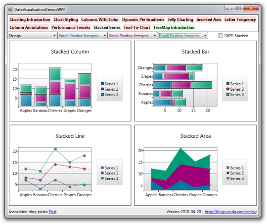
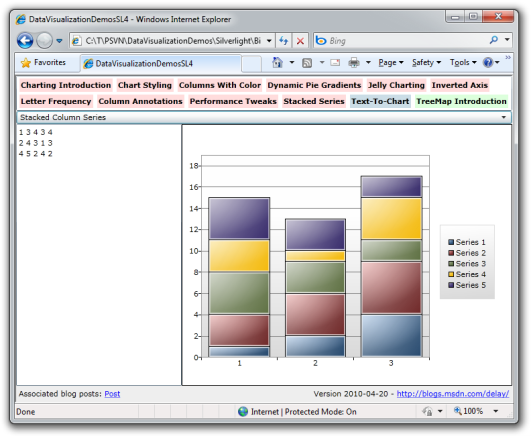
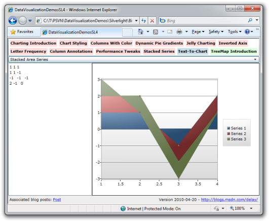
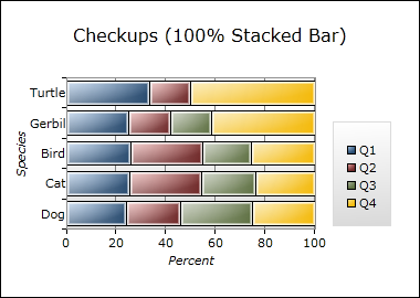
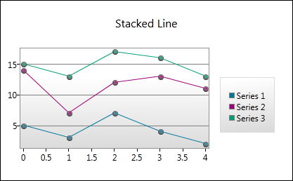
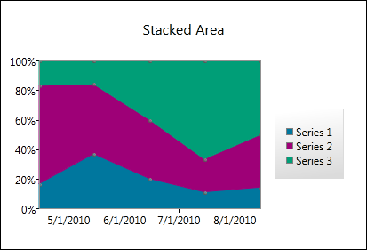
  • StackedBarSeries
  • StackedColumnSeries
  • StackedLineSeries
  • StackedAreaSeries
  • Stacked100BarSeries
  • Stacked100ColumnSeries
  • Stacked100LineSeries
  • Stacked100AreaSeries

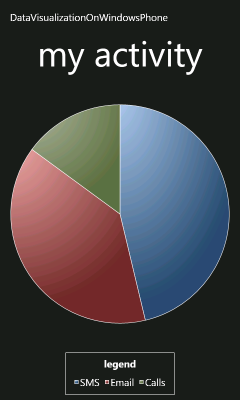
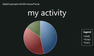
The first four classes listed above are "normal" stacked implementations of a bar/column/line/area series; the last four types are their "100%" stacked variants. "Normal" stacked series render based on the actual values of the data involved (ex: 10, 3.25, 712) whereas the 100% stacked series display the dependent values as percentages of the whole (kind of like how pie charts work - everything always adds up to 100%).


StackedSeries


Supplication

The first hierarchy was based on series instances which worked together at times (in the case of multiple column and bar series). The new hierarchy is based on a single instance coordinating an arbitrary number of constituent series definitions. Why the difference? Coordination. Where stacked series are concerned, data points from one member series have a very strong dependence - and effect - on the positions of points in the other series. While it would certainly be possible to coordinate this effort in the original model (as we do for columns that share the same category slot), there's a distinct lack of a conceptual "owner" and it's also not clear where to put properties that affect the stacked series as an whole (ex: an explicit axis). By creating a single entity to represent the stacked series "group", the answers become obvious. So the question becomes whether it makes sense to have a "simple wrapper with sophisticated children" or a "sophisticated wrapper with simple children". And it seems pretty clear that things will be easier all around if the parent/wrapper class is not just the place where common properties are set, but also where all the logic for managing the stacked series lives.


Inspiration

The original hierarchy was designed with extreme extensibility in mind - and one of the things customers frequently comment on is just how flexible things are and how easy it is to build on top of. But flexibility has its price - one of the other things customers comment on is how they'd like better performance. (And don't forget the pony.) Because the existing hierarchy seemed to have extensibility pretty well covered, what I wanted to do with the new hierarchy was focus on performance. To that end, one of the most significant changes I made is that the stacked series hierarchy keeps itself out of the business of managing the DataPoint lifecycle (something that causes a decent amount of overhead for the old hierarchy). Instead, DefinitionSeries uses an ItemsControl to handle the gory details of container creation, realization, deletion, etc.. What's particularly nice is that this is exactly what ItemsControl is designed and optimized for, so it's a great example of using the right tool for the job.

Another potential bottleneck for the original series stack is that it makes most changes "on demand" - by which I mean that as soon as a value change is detected for the user's data object, that change gets propagated through the entire system. Now, that's a perfectly reasonable approach to take and it nicely ensures everything is always up to date. But it also suffers from a pretty big drawback: when many things are changing at the same time, there's a whole lot of wasted effort. So when the new stacked series hierarchy finds out about a value change, it simply leaves itself a little reminder to update the relevant graphic during the next update pass - and then returns immediately without doing anything else. In the simple scenario of isolated onesey-twosey changes, the net result is about the same amount of work for both series hierarchies - but in scenarios where lots of things are changing at the same time, the new approach turns an ~O(N+) problem into an ~O(1) one because all those cascading, overlapping changes collapse into a single "update everything at once" operation. (Yes, I'm playing fast and loose with big O notation here - the idea is that instead of doing what amounts to the same positioning calculations over and over again, it's done just once.)


StackedSeries


Duplication

If you think about it for a bit, it seems obvious that a StackedLineSeries plotting just one series should look more or less identical to a normal LineSeries plotting the same data. So it really ought to be possible to use a stacked series in most of the same places its non-stacked counterpart makes sense. Which would be little more than a superficial parlor trick if there weren't a compelling reason to use the seemingly more complex implementation in the simpler scenario... [Aside: Hold that thought for just a moment. :) ]

Even without a compelling functional reason to substitute like this, there's a very good testing reason to switch: suddenly every existing Charting application becomes a test case for the new stacked series hierarchy! If there were an easy way to substitute a stacked series (with its slightly different API) into an existing scenario, this would help identify all kinds of issues with the new hierarchy. (Trust me, I speak from experience.) And that's why I created the System.Windows.Controls.DataVisualization.Charting.Compatible namespace. It contains five classes named ColumnSeries, BarSeries, LineSeries, AreaSeries, and ScatterSeries which are API-wise virtually identical to the original series implementations of the same names, but use the new stacked series code under the hood. Which makes it trivial to substitute them for their non-stacked counterparts.

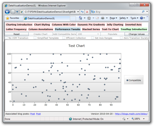
Aside: Where did a stacked implementation of ScatterSeries come from? Nowhere, actually - it's just a stacked LineSeries with an invisible line. :) Which means it suffers from some completely unnecessary overhead because it burns cycles managing a line nobody can see and it has all the overhead of supporting stacking. However, we'll find out in a moment that it can still outperform the original, unburdened ScatterSeries implementation!

These "Compatible" classes don't show up in the design tools because I don't want anyone to confuse the two same-named implementations of the same behavior. But if you want to make the switch, all it takes is a trivial XAML/code edit to convert many scenarios over. This conversion can be a tad more involved when there's a lot of code that directly manipulates the base classes of the old hierarchy, but the process is usually quite simple and straightforward. I should know, I performed this conversion for every public Charting sample I've written as part of my testing efforts!


Implication

I've probably way over-done the foreshadowing, so the following revelation isn't likely to surprise anyone: the stacked series hierarchy can be significantly faster than its non-stacked counterpart! Of course, I don't guarantee that every scenario is faster. In fact, I'd be very surprised if that were the case - there are certain aspects of the new implementation that I know to be suboptimal. However, some scenarios are very noticeably faster in practice. To demonstrate that, I've enhanced the "Performance Tweaks" page of my DataVisualizationDemos application (which I'll be releasing a new version of shortly!) to allow the creation of a "Compatible" ScatterSeries. Comparing the two implementations highlights some clear performance wins for the stacked hierarchy: configurations that bog down the system when using the original series hierarchy are reasonably snappy with the stacked one. Looking at it from the opposite direction, this means it can be possible to get the same level of performance with more points on the screen simply by switching to the new hierarchy.

Another interesting side effect of having a parallel implementation is that the two are not likely to have the same bugs. Specifically, there are some scenarios I know to be problematic with the original series implementation that literally "just work" when converted to the new implementation. I've already seen this happen in practice with two different customer apps - I was able to work around a problematic behavior in the original stack simply by switching to the new stack. Of course, no code is perfect - and as much as I've tried to find all the bugs in the new code, there are certain to be problems I don't know about yet. So this duality is hardly a panacea. That said, it's a nice trick to have in your back pocket for those times where it is relevant and can save you a bunch of time debugging something you didn't have to!


StackedSeries


Enumeration

The new hierarchy looks and behaves basically the same as the old hierarchy in most respects - and all the concepts people are used to dealing with still apply. API-wise, nearly all the same properties are still available and do the same thing they've always done - they're just split across the DefinitionSeries classes and SeriesDefinition according to where they make the most sense. Though there is one deliberate omission and a few details have changed just a bit. Here's the scoop:

  • Setting DependentValuePath or DependentValueBinding is now required (the former is the simple form that takes a property name to use as the path of a Binding; the latter is the advanced form that takes a full Binding which may be specifically customized by the developer). Similarly, setting IndependentValuePath or IndependentValueBinding is now also required. We'd originally thought it would be nice for users if we avoided the need to set these properties, but some people ended up confused anyway. Because supporting that behavior also complicated the implementation, the stacked series hierarchy doesn't try to be clever here. One of each pair must be set. Always.
  • On a very related note, the exception type and message that result when the Binding/Path properties aren't set is not always as clear as it could be with the original series hierarchy. But because of the new hierarchy's stricter requirements, it's possible for to give a very relevant, specific error message in these cases.
  • I mentioned that there's a single property that's absent from the new hierarchy: AnimationSequence. While the original idea of making it easy for users to stagger the show/hide transitions of the DataPoints seemed cool, very few people seemed to use this feature in practice. And like above, this feature required a non-trivial amount of rather involved code that occasionally tripped people up or caused problems. Therefore, AnimationSequence is not available on the stacked series classes.
  • The base class of Legend was changed to HeaderedItemsControl in the previous Toolkit release, but the Title property wasn't removed in order to avoid breaking existing templates. Unfortunately, that left Legend with two different properties corresponding to the same thing: Title and Header (the latter coming from HeaderedItemsControl). While I think "Title" is a better name for what the properties mean for Legend, the duplication required synchronizing their contents and there were situations where this introduced problems. Therefore, Legend's Title property has been removed and all relevant templates have been updated to refer to the Header property.
  • It used to be that attempts to customize the Legend's Visibility property via the Chart.LegendStyle were ineffectual. Regrettably, Legend itself stomped on its own Visibility property as part of its attempt to hide when it had no content to display. That annoying behavior has been corrected in this release and it's now possible to hide the Legend by setting its Visibility to Collapsed with the LegendStyle property.
  • While doing performance measurements for the stacked series hierarchy, I discovered some unfortunate inefficiencies in the axis stack. The relevant code has been tuned for this release and the resulting performance improvements will be visible to all series implementations.
  • The color of the line/area graphic for the original LineSeries and AreaSeries is derived from the Background of the effective DataPointStyle for the series. This makes sense and can be convenient - but it can also be confusing when users set the PolylineStyle or PathStyle properties, too. And because these two properties couldn't previously be set in the Palette of a Chart, the designer story wasn't as good as it could have been here. Therefore, I've added a DataShapeStyle property to the stacked series hierarchy which can be used just like DataPointStyle and is also fetched from the relevant ResourceDictionary palette entry. Similarly, I've added DataShapeStyle entries to the default Palette entries so the appearance of the stacked series classes should be more obvious and more readily customized.
  • I mentioned above that DefinitionSeries uses ItemsControl for all its point management - but that's not quite true... It really uses ListBox, and because ListBox supports single- and multi-select modes, it was rather easy to plumb that support through to DefinitionSeries as well. Therefore, instead of exposing an IsSelectionEnabled property like the original series classes do, the stacked series classes expose a SelectionModes property which can be set to None, Single, or Multiple. The corresponding read/write properties SelectedIndex, SelectedItem, SelectedItems, and the SelectionChanged event (a true RoutedEvent on WPF) are also available and behave just like they do for ListBox.
  • In one of those rare cases where the default behavior "just makes sense", the result of using the "Compatible" 
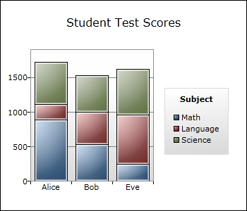
ColumnSeries or BarSeries to display a series with one or more items that share the same independent value is that the columns with shared values stack with each other. If that seems obvious to you, I agree! :) What's interesting is that we spent a decent amount of time discussing what *should* happen during the implementation of the original ColumnSeries before settling on the current "staggered" behavior. (There's an example of this near the middle of this post.) And while I still think staggering is the right behavior for the original implementation, I was quite pleased when I saw that the new implementation handled this edge case automatically and sensibly!


Consternation

Okay, this blog post ended up being heavy on explanation and light on code - so I apologize to all the code junkies out there. :) Don't worry, though, I've got your fix coming! In the next few days I'll be posting an updated version of my Silverlight/WPF Data Visualization Development Release along with an updated DataVisualizationDemos sample that includes two new samples to show off stacked series. And I'll be including a little treat just to keep things interesting...


Whew! If you've read this far, I commend you! I hope you learned something along the way or at least enjoyed the journey. My next post will focus on code - I promise. :)

"I would prefer even to fail with honor than to win by cheating" [Tip: For a truly read-only custom DependencyProperty in Silverlight, use a read-only CLR property instead]

Tip

For a truly read-only custom DependencyProperty in Silverlight, use a read-only CLR property instead

Explanation

My last tip outlined the best way I knew to approximate a WPF-like read-only DependencyProperty on Silverlight. (Aside: It's also a good way to implement coercion.) However, it suffers from the unavoidable problem that the actual DependencyProperty is still writable and can "twitch" if written to. The comments for that post proved to be very interesting - with two suggestions for alternate techniques. I looked into them both (and stumbled across a third myself) to understand their merits. Unfortunately, the technique I stumbled across and the one Morten Nielsen (SharpGIS) suggested both suffer from this same issue: the DependencyProperty is still writable and there are ways to sneak around the protections and write to it anyway. (Aside: Morten's solution is fiendishly clever and well worth having a look at.) However, the technique suggested by Dr. WPF doesn't have that limitation - it produces a guaranteed read-only property. The catch is that it's not actually a DependencyProperty! However, Dr. WPF points out that a read-only DependencyProperty doesn't actually need to be a DependencyProperty as long as the class implements INotifyPropertyChanged. What's great is that there's no loss of functionality with the implementation shown below, and no need to try to subvert the platform! The thing to remember is that you can't use TemplateBinding to get at it - you'll need to use Binding + RelativeSource instead. Overall, this is a very nice solution - even if it does bend the rules just a bit... :)

Good Example

public class MyControl : Control, INotifyPropertyChanged
{
    public int MyReadOnly
    {
        get { return _myReadOnly; }
        protected set
        {
            if (value != _myReadOnly)
            {
                int oldValue = _myReadOnly;
                _myReadOnly = value;
                OnMyReadOnlyChanged(oldValue, _myReadOnly);
                PropertyChangedEventHandler handler = PropertyChanged;
                if (null != handler)
                {
                    handler.Invoke(this, new PropertyChangedEventArgs("MyReadOnly"));
                }
            }
        }
    }
    private int _myReadOnly;
    protected virtual void OnMyReadOnlyChanged(int oldValue, int newValue)
    {
        // TODO: Handle property change
    }
    public event PropertyChangedEventHandler PropertyChanged;
}
<ControlTemplate TargetType="local:MyControl">
    <ContentControl Content="{Binding MyReadOnly, RelativeSource={RelativeSource TemplatedParent}}"/>
</ControlTemplate>

More information

Sometimes you just gotta do the best you can [Tip: Read-only custom DependencyProperties don't exist in Silverlight, but can be closely approximated]

Tip

Read-only custom DependencyProperties don't exist in Silverlight, but can be closely approximated

Explanation

My last tip discussed a special case of creating a Silverlight/WPF DependencyProperty where it's necessary to create a read-only property. (Aside: Read-only DependencyProperties are read-only outside the owning class, but can be changed by the class itself at any time.) This task is quite simple on WPF where a single call to RegisterReadOnly does it all. However, Silverlight (as of version 4) does not support the RegisterReadOnly method, so if you want a read-only DependencyProperty on that platform, you'll need to do some extra work. Unfortunately, I don't think it's possible to do a perfect job - but you can get fairly close with something like the code below. The basic principle is to catch illegal attempts to change the property's value (i.e., those coming from outside the owning class) and undo those changes as quickly and silently as possible. For convenience, the CLR wrapper's setter hides the details from users of the class (in a notable exception to one of the earlier tips). The code looks a little more complicated than it really is because it tries to be resilient to exceptions and because it uses two state variables to avoid calling the class's virtual OnPropertyChanged method when recovering from a bogus change. For consistency, the exception that's thrown after an invalid attempt to change the property's value is similar to the corresponding exception on WPF. And while this approach can't prevent bound values from seeing the property "twitch" briefly, I also don't know of a way to avoid that (recall that the DependencyProperty itself must be public so other code can create Bindings to it). Like I said above, this isn't perfect - but it's pretty close. :)

Good Example

public int MyReadOnly
{
    get { return (int)GetValue(MyReadOnlyProperty); }
    protected set
    {
        try
        {
            _changingMyReadOnly = true;
            SetValue(MyReadOnlyProperty, value);
        }
        finally
        {
            _changingMyReadOnly = false;
        }
    }
}
private bool _changingMyReadOnly;
private bool _restoringMyReadOnly;
public static readonly DependencyProperty MyReadOnlyProperty = DependencyProperty.Register(
    "MyReadOnly", typeof(int), typeof(MyControl), new PropertyMetadata(0, OnMyReadOnlyChanged));
private static void OnMyReadOnlyChanged(DependencyObject d, DependencyPropertyChangedEventArgs e)
{
    MyControl myControl = (MyControl)d;
    if (myControl._changingMyReadOnly)
    {
        if (!myControl._restoringMyReadOnly)
        {
            myControl.OnMyReadOnlyChanged((int)e.OldValue, (int)e.NewValue);
        }
    }
    else
    {
        try
        {
            myControl._restoringMyReadOnly = true;
            myControl.MyReadOnly = (int)e.OldValue;
        }
        finally
        {
            myControl._restoringMyReadOnly = false;
        }
        throw new InvalidOperationException("'MyReadOnly' property is read-only and cannot be modified.");
    }
}
protected virtual void OnMyReadOnlyChanged(int oldValue, int newValue)
{
    // TODO: Handle property change
}

More information

That's why it's called the default *value* instead of default *values* [Tip: The default value of a DependencyProperty is shared by all instances of the class that registers it]

Tip

The default value of a DependencyProperty is shared by all instances of the class that registers it

Explanation

The last two tips explained how to set the default value of a Silverlight/WPF DependencyProperty. But there's something you need to be aware of when you're using either technique: the default value of a DependencyProperty is shared by all instances of a class. This doesn't tend to matter for value types, immutable reference types, and sharable types (like brushes), but it affects mutable reference types and can lead to unexpected behavior. The most common scenario is creating a collection-type DependencyProperty (for something like Collection(T)) - the intent is for each instance to have its own unique collection, but because the default value is shared, all instances end up sharing the same list! In such cases, there are two things to change: make the DependencyProperty read-only (with RegisterReadOnly) and initialize the property in the class constructor. [Didn't a previous tip say that was bad? Yes, but this scenario is special. :) ] When a class exposes a collection-type DependencyProperty, the intent is typically to use the same collection instance for the life of the object. And that's what makes it okay to set the property in the constructor: it doesn't matter that nobody can override the default value with a Style because they're not supposed to anyway. Next time: Why this can't be done on Silverlight.

Good Example

public Collection<string> MyStringCollection
{
    get { return (Collection<string>)GetValue(MyStringCollectionProperty); }
}
protected static readonly DependencyPropertyKey MyStringCollectionPropertyKey =
    DependencyProperty.RegisterReadOnly(
        "MyStringCollection",
        typeof(Collection<string>),
        typeof(MyControl),
        new PropertyMetadata(null));
public static readonly DependencyProperty MyStringCollectionProperty =
    MyStringCollectionPropertyKey.DependencyProperty;

public MyControl()
{
    SetValue(MyStringCollectionPropertyKey, new Collection<string>());
}

More information

When you have two good options, go with the easier one [Tip: Set DependencyProperty default values in a class's default style if it's more convenient]

Tip

Set DependencyProperty default values in a class's default style if it's more convenient

Explanation

In the previous tip, I explained why it's usually wrong to assign a value to a Silverlight/WPF DependencyProperty in the constructor for a class. The preferred way is to pass the default value in the call to Register, but there's another good option: set the property's starting value in the default Style for the control by putting it in generic.xaml. A control's default style is applied when it is first created and the corresponding changes to its DependencyProperty values have very low precedence (though not as low as the default value passed to Register). Therefore, this is a safe place to set default values without the risk of overriding application-level customizations. A nice benefit of this approach is that it allows the value to be specified in XAML - which offers a designer-friendly syntax and can sometimes be easier to understand. In the example below, a rather complicated Brush is constructed in XAML; the matching code to create that same brush would not be as clear. Next time: Something to watch out for when setting default values.

Good Example

<ResourceDictionary
    xmlns="http://schemas.microsoft.com/winfx/2006/xaml/presentation"
    xmlns:local="clr-namespace:DevelopmentTips">
    <Style TargetType="local:MyControl">
        <Setter Property="MyBrush">
            <Setter.Value>
                <LinearGradientBrush>
                    <GradientStop Color="Red" Offset="0"/>
                    <GradientStop Color="Green" Offset="0.5"/>
                    <GradientStop Color="Blue" Offset="1"/>
                </LinearGradientBrush>
            </Setter.Value>
        </Setter>
    </Style>
</ResourceDictionary>

More information