The blog of dlaa.me

Posts tagged "Silverlight"

Lying to the layout system for a good cause [Bringing LayoutTransform to Silverlight 2!]

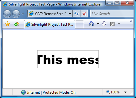
People who want to rotate visual elements in Silverlight 2 are likely to use RotateTransform within RenderTransform - but they may not always get the results they expect! For example, using RenderTransform to achieve the following effect:

Sweet

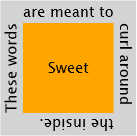
Actually renders like this:

Whoops

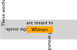
But the problem isn't with RenderTransform - it's with using the wrong tool for the job! By design, RenderTransform applies its transformations (a rotation in this case) after the layout system has performed its measure/arrange pass. So when the elements in the example are being measured and arranged, the text is still horizontal. It's only after everything has been positioned that the text is finally rotated - and ends up in the "wrong" place. While it's possible to correct for this discrepancy by hard-coding all the relevant offsets in the XAML (very brittle and error-prone) or by adjusting all the offsets in code (only slightly more flexible - and a lot more work), these aren't great alternatives.

The right tool for the job is LayoutTransform which applies its transformations before the layout pass. With LayoutTransform, the text in the example is already rotated by the time the elements are measured and arranged, and the desired effect can be achieved quite simply.

But there's a catch: LayoutTransform doesn't exist in Silverlight 2 (Beta 1)...

However, there's no reason to let that stop us. Rotation is rotation whenever it happens, so maybe there's a way to get the already-optimized RenderTransform implementation to do the real work earlier in the layout pass. Unfortunately, we can't change when RenderTransform is applied.

But it turns out that we can tell a very carefully crafted set of lies to the layout system during the measure/arrange pass in order to convince it to lay things out as if it supported LayoutTransform - then we let RenderTransform do the work of actually rotating the content. The result is that we've got something that looks like LayoutTransform and behaves like LayoutTransform - so it might as well be LayoutTransform! :)

I've done just this and the result is something I've called LayoutTransformControl. The complete implementation can be found in LayoutTransformControl.cs in the attached ZIP. The XAML for LayoutTransformControl is quite simple and follows the well-known WPF Decorator model (ex: Border, Viewbox):

<local:LayoutTransformControl Angle="15">
    <TextBlock Text="I am rotated 15 degrees!"/>
</local:LayoutTransformControl>

Note: This assumes the "local" namespace prefix has been mapped to an assembly containing the LayoutTransformControl implementation:

xmlns:local="clr-namespace:LayoutTransformControlSample;assembly=YourAssemblyName"

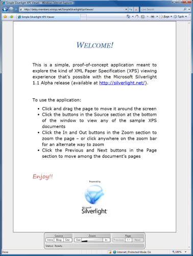
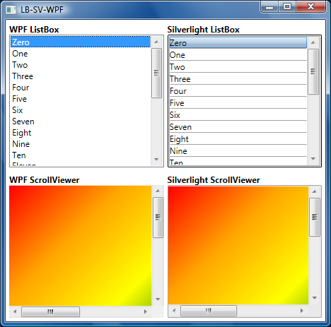
In fact, the first picture of this post (the one that looked right!) was done with LayoutTransformControl. But it's easy to get simple scenarios right... So I also wrote a sample application that lets you interactively change the rotation angle and swap in different content:

LayoutTransformControl Sample Application

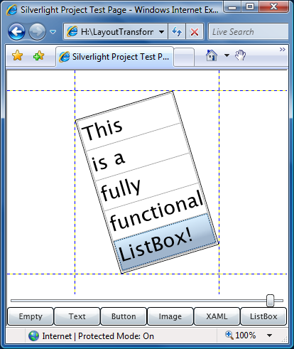
Attribution: The XAML example came from a post on designerslove.net; the image is from the set of stock Windows Vista wallpapers.

But it's easy to get a sample right... So I also wrote a test harness to exercise a handful of interesting elements in most of the interesting constraint scenarios and show RenderTransform along with LayoutTransformControl:

LayoutTransformControl Test Matrix on Silverlight

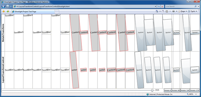
But the rules of layout are sufficiently complex and subtle that it's hard to tell if LayoutTransformControl is behaving properly without knowing how it's supposed to behave... So the test harness (and LayoutTransformControl!) also runs under WPF where LayoutTransform is supported and can be used to visually verify that LayoutTransformControl is doing what it should by comparing the bottom two rows:

LayoutTransformControl Test Matrix on WPF

Whew! :)

So - after all that posturing and seemingly comprehensive test coverage, you might expect me to be confident that LayoutTransformControl behaves correctly under all circumstances. Well... no. LayoutTransform is conceptually simple, but exhibits all kinds of weird and unexpected behaviors in practice. I've lost count of the number of times I had to stare at a bit of LayoutTransform output and figure out why it's correct - sometimes more than once for the same output! Add to that the fact that LayoutTransformControl is doing everything outside the core layout system, and I'm kind of surprised any of this works... :)

I do believe that LayoutTransformControl behaves correctly in all scenarios I've subjected it to, but I would not be surprised at all to hear about other scenarios where it breaks down. If you think you've found such a scenario, please let me know and I'll try to figure out what might be going on. (But before you do, please check the behavior on WPF - that's the first thing I'll do anyway!)

Notes:

  • This release of LayoutTransformControl supports only rotation because that's by far the most common scenario. However, I'm prepared to add support for scale, skew, and matrix if folks find this useful. (Party trivia: Translation has no effect during LayoutTransform.)
  • For the most part, using LayoutTransformControl is simply a matter of wrapping the desired content and setting the angle. But it's important to note that some properties will need to be moved from the child control to LayoutTransformControl. For example, when positioning things within a Grid, the Grid.Column and Grid.Row attached properties need to be set on LayoutTransformControl in order to be recognized by the parent Grid.
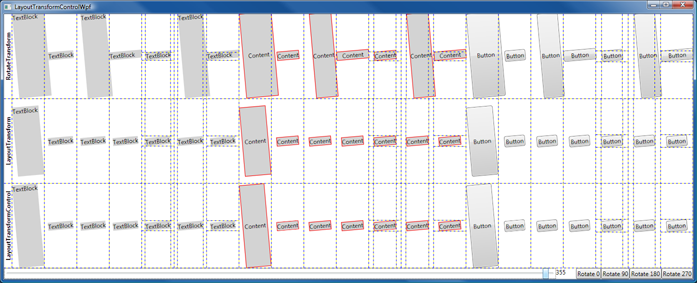
  • Examination of the test matrices above reveals two things that deserve more explanation:
    • Thing 1: The sizing of the Buttons in the Silverlight test matrix is different than in the WPF matrix. At first glance, the sizing seems to be wrong, but that's not actually the case. The default Button style in Silverlight Beta 1 has a bug that interferes with proper layout (and is completely unrelated to LayoutTransformControl). This can be seen with a simple example; adding the following to a new project should show a small, centered Button just like it does on WPF:
      <Button Content="Button" HorizontalAlignment="Center" VerticalAlignment="Center"/>
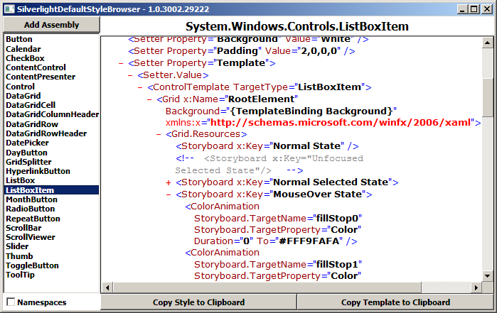
      However, on Silverlight Beta 1 the result is a very large Button instead. The problem is that the template in the default style includes the following:
      <Path Stretch="Fill" .../>
      The Stretch on that Path element causes the Button to measure much larger than it should (and a similar issue with the Line element affects the default ListBoxItem style). It's because the Button behaves as it does that sizing with LayoutTransformControl looks like it does. It's comforting to note that applying the Silverlight Button style to a WPF Button and using the real LayoutTransform gives the same wrong-looking behavior.
    • Thing 2: The rotated rectangle used by LayoutTransformControl for its child content is slightly different than that used by LayoutTransform under certain circumstances. This causes the child control to layout in a slightly longer, narrower rectangle and can be seen in the first column of the WPF test matrix. Perhaps surprisingly, this difference is deliberate. When determining the parameters of the rotated rectangle, the WPF algorithm finds the largest rectangle possible (as measured by area). It just so happens that the algorithm I came up with manages to find an even larger rectangle in certain cases. :) As far as I've seen, the algorithm in LayoutTransformControl is never worse - and sometimes better - so I decided it's a winner.
  • The example elements in the test matrix were chosen as follows:
    • Button - Represents the classic layout-friendly control which has a preferred size, but is willing to go smaller or larger as space permits
    • ContentControl - Containing a Border and a TextBlock, this simple Button-like layout acts like a Button should on Silverlight
    • TextBlock - Interesting for layout because it refuses to render smaller than the size it asked for
  • I've omitted any technical discussion of how LayoutTransformControl works from this blog post. For now, curious readers can refer to the commented source code. If there's interest, I'll write a follow-up post explaining what's really going on under the covers.

LayoutTransformControl was an interesting project that demonstrates once again the power and versatility of the WPF/Silverlight layout system. LayoutTransform and RenderTransform are like peanut butter and jelly - and I'm glad to help reunite them on Silverlight. If you've got a layout problem and RenderTransform isn't doing what you need, maybe LayoutTransformControl is the solution!

[LayoutTransformControl.zip]

IValueConverter: The Swiss Army Knife of Bindings [PropertyViewer sample is a WPF/Silverlight visualization and debugging aid!]

If you've made much use of data binding in WPF or Silverlight, you've probably come across the IValueConverter interface. IValueConverter sits between the data source and destination and gives the developer a chance to examine/alter/replace the data as it flows through the converter. It's been my experience that IValueConverter is a powerful and versatile tool for application developers.

As part of a recent project, I wanted to display some of an object's properties in a simple list. Specifically, I had an instance and I wanted to display a list of "Property Name: Property Value" entries for each property of that object. My background with ListBox led me to naturally think of using ItemsControl for the basis of my property viewer; the ItemsControl content model (with its support for DataTemplates) seemed like a natural fit.

Aside: One of the key things XAML enables is a distinct separation of implementation from representation. By explicitly separating most aspects of how an application looks (XAML) from how it works (code) as part of the developer/designer workflow, WPF and Silverlight help to enforce a level of encapsulation (in the object-oriented programming sense) that makes programs easier to write and maintain. In the ideal world, a program's functionality is entirely expressed in its code - and so it's possible for others to completely change that application's appearance without knowing or caring how it's implemented. Just like the web has CSS restyling contests, WPF has reskinning competitions!

So I knew I wanted to use ItemsControl and I knew I wanted to keep the UI aspects of the property viewer in XAML-space (what it looked like, what properties it displayed, etc.). I started looking at how IValueConverter might help and that led to the solution I describe here. PropertyViewer ends up being quite simple to use - and a good demonstration of the power of IValueConverter!

Here's the comment header from the code:

/// <summary>
/// IValueConverter implementation that expands some/all of an object's
/// public properties as a collection of bindable name/value instances.
/// </summary>
/// <remarks>
/// * Bindable instances are of type PropertyDetails, a contained class
///   that exposes a property's Name and Value as properties.
/// * All public properties are enumerated by default; ConverterParameter
///   can be used to specify which properties will be enumerated (and in
///   which order) by passing a space-delimited list of names.
/// * If DisplayNameAttribute is associated with a property, DisplayName
///   will be used instead of the property name.
/// * PropertyViewer can be used for simple data visualization, debugging
///   of Bindings, and more.
/// </remarks>
/// <example>
/// For ItemsControl/ListBox (accessing the object via DataContext):
///   ItemsSource="{Binding Converter={StaticResource PropertyViewer}}"
/// As above, but with a custom property list:
///   ItemsSource="{Binding Converter={StaticResource PropertyViewer},
///     ConverterParameter='PropertA PropertyB'}}"
/// For ItemsControl/ListBox, but specifying the object via Source:
///   ItemsSource="{Binding Source={StaticResource ObjectInstance}
///     Converter={StaticResource PropertyViewer}}"
/// </example>
public class PropertyViewer : IValueConverter
{ ... }

Like the comment says, it's easy to hook up a PropertyViewer:

<ItemsControl ItemsSource="{Binding Converter={StaticResource PropertyViewer}}"/>

Customizing the PropertyViewer is also easy:

<ItemsControl ItemsSource="{Binding Converter={StaticResource PropertyViewer},
    ConverterParameter='Species EatsBugs RelativeMass'}">

Because the end result is a collection of objects, all the existing ItemsControl knowledge and techniques can be used to completely customize the look and feel of the property viewer!

The examples above came from a simple application I wrote to demonstrate PropertyViewer in action. By design, the exact same XAML and code work on both WPF and Silverlight. To prove it, I attached the complete source code for the combined Visual Studio 2008 solution to this blog (download it from the link at the bottom of this post). The sample displays a list of animals, one default PropertyViewer, and one customized PropertyViewer. Select any animal to find out more about it (note that the PropertyViewer updates automatically when the data source changes).

Here's what it looks like on WPF:

WPF Sample

And on Silverlight:

Silverlight Sample

Thanks to the power of IValueConverter, it's easy to use PropertyViewer to display an object's properties in a customizable way. Additionally, PropertyViewer can help troubleshoot data bindings: just drop one in the target location and you can see the available properties along with their current values. I originally wrote this for my project - but now I hope you can use it in yours!

[PropertyViewer.zip]

Buttons in a ListBox, and More [Demonstration of some useful Silverlight techniques]

One scenario I've seen cause a bit of trouble on the Silverlight Controls Forum is that of putting a Button in a ListBox. There are two aspects of this that seem to cause difficulty and I thought it would be helpful to demonstrate the complete scenario in a runnable, self-contained sample. (Please Download the ZIP file attached to the bottom of this post for all the code/XAML in a ready-to-go Visual Studio 2008 + Silverlight Tools solution.) While I was developing the sample, I threw in a couple of other handy techniques that may not be widely known. The sample application shows a typical shopping cart experience where products are listed and their quantities can be interactively changed:

"Buttons in a ListBox" Sample Application

Details on the button scenario:

  • One problem with putting a Button in a ListBox is that by default the Button can be clicked only when the corresponding ListBoxItem is selected. This is an unfortunate consequence of a very late change to Silverlight Beta 1 that causes ListBox to receive duplicate GotFocus/LostFocus events. For most controls the duplication is harmless, but for ListBox it interferes with ListBox's attempts to preserve WPF's focus/selection behavior when a focusable control (like Button) is clicked on. Fortunately, Button (and its subclasses like CheckBox) expose the ClickMode property which can be used to work around the problem. Simply changing the Button's ClickMode enumeration from the default value of Release to Press does the trick.
    <Button ... ClickMode="Press" ... />
  • Another problem people tend to have is hooking up an event handler to Buttons in a ListBox. While this can be a little tricky to do in code (specifically when the ItemTemplate is being used), it's quite easy to do in XAML by specifying a value for the Click event. Visual Studio generates the code for the event handler automatically, so this ends up being elegant and simple.
    <Button ... Click="Add_Click" ... />

Other points of interest:

  • ListBox's ItemsSource property is used to specify the items as a collection of the custom class Product and its ItemTemplate property is used to display those objects appropriately (coloring the text, adding Buttons, etc.).
    For lots more about configuring and using ListBox, please see my ListBox/ScrollViewer FAQ.
  • The Add/Remove Buttons directly modify the Quantity property of the Product objects. While that would not normally be enough to automatically update the UI, the Product class implements the INotifyPropertyChanged interface which can be thought of as kind of a light-weight DependencyProperty for non-DependencyObjects. More simply, it's an easy way to add change notifications to simple classes that Silverlight's data binding framework can use to automatically respond to property changes. In this case, updates to the Quantity property fire the PropertyChanged event and the displayed quantity gets updated automatically.
    public int Quantity
    {
        get { return _quantity; }
        set
        {
            _quantity = value;
            // Fire PropertyChanged event to notify listeners of changed value
            var handler = PropertyChanged;
            if (null != handler)
            {
                handler.Invoke(this, new PropertyChangedEventArgs("Quantity"));
            }
        }
    }
    private int _quantity;
    
    public event PropertyChangedEventHandler PropertyChanged;
    
  • It's nice when the UI automatically prevents invalid actions - in this case it's an invalid action for the user to remove items when the quantity is already 0 (as it is for "Bananas" in the image above). While it would be possible to create a dedicated bool property of the Product class and bind the Remove Button's IsEnabled property to it, there's a more elegant way. What the sample does is bind the Remove Button's IsEnabled property to the Quantity property - using an IValueConverter to convert the int type to a bool automatically. This nicely avoids adding otherwise unused properties to the Product object and helps to isolate the relevant logic.
    // Simple IValueConverter returns true iff the value is positive
    // Used to toggle Remove button's IsEnabled when Quantity changes between 0 and 1
    public class IntIsPositive : IValueConverter
    {
        public object Convert(object value, Type targetType, object parameter, CultureInfo culture)
        {
            return (0 < ((int)value));
        }
        public object ConvertBack(object value, Type targetType, object parameter, CultureInfo culture)
        {
            throw new NotImplementedException();
        }
    }
    

At the risk of straying too far from the original scenario, I think the additional techniques I've shown here support it nicely and improve the user experience notably. I hope this sample helps people with their own projects - and maybe introduces a useful trick or two!

Enjoy!

[ListBoxWithButtons.zip]

Proof-of-concept Silverlight XPS reader gets some Beta 1 love [SimpleSilverlightXpsViewer updated for Silverlight 2 Beta 1!]

After a few customer requests to update my SimpleSilverlightXpsViewer proof-of-concept XPS reader for Silverlight 2 Beta 1, I finally found time to do so. :) I've just updated the original SimpleSilverlightXpsViewer demonstration page and also updated the original source code download - so you can try it out in your own browser and/or download the code to see how it works!

SimpleSilverlightXpsViewer Application

Click on the image above to play around with the application in your browser. More details about what it is doing and how it works are available in the original SimpleSilverlightXpsViewer post.

Notes:

  • This was a fairly straightforward port from the original 1.1 Alpha implementation to 2 Beta 1. I have not changed the manual Canvas-based layout to automatic layout via Grid/StackPanel/etc. - but I'd definitely take that approach if I were writing it from scratch today!
  • The XAML didn't change at all - and most of the necessary code changes are detailed in the Breaking Changes in Silverlight 2 document on MSDN.
  • Because of the file:// URL restrictions introduced a while ago as part of the 1.1 Refresh, the sample code includes a separate web site. I explain more in the second half of my post outlining changes for the 1.1 Refresh.
  • One notable improvement is that I was able to #define SETSOURCE (see the discussion in the original post) and therefore the images are all being accessed from the XPS document itself instead of needing to be pulled out as separate files! I removed the associated #if/#endif blocks because they are no longer relevant.
  • I still didn't see any way around the Glyphs.FontUri issue (discussed in the same section of the original post), so the fonts remain separate like before.
  • Silverlight occasionally renders the "pageGraphic" Rectangle incorrectly. The obvious consequence of this is that the white page background disappears if it extends outside the Silverlight control's edges (e.g., you've zoomed in or panned). It's possible to verify that you're in this situation because the black page border is also not drawn properly. I've found that a simple refresh of the web page typically corrects the problem.

Improved access to Silverlight 2's generic.xaml resources [SilverlightDefaultStyleBrowser available via ClickOnce]

In response to my previous post announcing the SilverlightDefaultStyleBrowser tool for working with default styles for Silverlight 2 controls, I got an email from Rob Relyea suggesting that I make SilverlightDefaultStyleBrowser available via ClickOnce as well. (For those who may not be familiar with it, here's a brief ClickOnce overview.) ClickOnce is simple to configure, adds a Start Menu entry automatically, supports seamlessly updating an application, and installs/uninstalls on Vista as standard user without requiring elevation - so this was easy to do!

SilverlightDefaultStyleBrowser sample image

[Click here or on the image above to install SilverlightDefaultStyleBrowser with ClickOnce.]

The functionality of SilverlightDefaultStyleBrowser is the same whether you use the executable in the ZIP or use the ClickOnce version - so pick whatever suits you best. And have fun styling those controls! :)

Note: The source code for SilverlightDefaultStyleBrowser is available only in the ZIP file download.

Improving everyone's access to Silverlight 2's generic.xaml resources [SilverlightDefaultStyleBrowser tool and source code]

When customizing the look and feel of a Silverlight 2 control, people usually want to start with a copy of the control's default visuals. Unfortunately, getting at the default XAML for a control isn't always obvious or easy. A control's default XAML is stored in a specially named resource of the control's assembly and that resource (named generic.xaml) isn't particularly easy to get at by default. The good news is that the controls in the Silverlight 2 Beta 1 SDK/Tools are documented on MSDN and that documentation includes the default styles.

But sometimes I prefer something a little "closer to the metal", so I wrote a small WPF 3.5 application to improve this experience for developers and designers working with Silverlight 2 controls. SilverlightDefaultStyleBrowser is a simple application that automatically extracts the default styles from an assembly's generic.xaml, lists the available control styles, and presents them in an easy-to-browse manner with syntax highlighting, automatic formatting, and expandable/collapsible nodes. The common scenario of copying a Style or Template is made easy by two dedicated buttons that do just that!

SilverlightDefaultStyleBrowser sample image

[Click here or on the image above to download a ZIP of the SilverlightDefaultStyleBrowser tool - and its complete WPF 3.5 source code.]

Using SilverlightDefaultStyleBrowser is deliberately simple. When the application loads, it automatically looks in the Silverlight SDK default install directory, parses all the assemblies it finds there, and adds the relevant styles to its list (as seen in the image above). Adding additional assemblies is as easy as hitting the "Add Assembly" button, selecting the assemblies, and hitting OK. Once the styles are loaded, simply select the control of interest to browse its default XAML. The "Copy Style to Clipboard" button copies the XAML for the entire style to the clipboard. The "Copy Template to Clipboard" button copies just the template XAML from within the Style (probably the more common scenario). Paste the copied XAML directly into your Silverlight application, tweak it or customize it, and you're set - it's that easy!

Notes:

  • SilverlightDefaultStyleBrowser tries to make things as easy as possible, but sometimes it's still necessary to edit the generated XAML a bit to get it to compile. Usually, this is because the XAML is referencing a non-default namespace that didn't get copied over because it wasn't directly part of the XAML (ex: the "local:" prefix in a TargetType attribute). In these cases, it's necessary to add the xmlns mapping manually. However, the default behavior of SilverlightDefaultStyleBrowser should provide a simple paste-and-go experience in most cases.
  • If you paste some XAML and then get the compile error "An item with the same key has already been added.", it's probably because you checked the "Namespaces" CheckBox. Doing so turns off SilverlightDefaultStyleBrowser's default behavior of removing the default "xmlns" and "xmlns:x" declarations from the XAML it provides (to avoid this very compile error). If you changed that setting because you wanted the pure, untouched XAML, then it's your job to remove the redundant namespaces - otherwise just uncheck the CheckBox and hit the "Copy" button again. :)
  • WatermarkedTextBox in the System.Windows.Controls.Extended assembly is not listed because that control uses its own private XAML resource instead of generic.xaml. You'll need to refer to the documentation if you want that control's default XAML.
  • The mysterious entry for "Control" actually applies to the GridSplitter control from the System.Windows.Controls.Extended assembly which is using a non-standard mechanism to store this style.
  • The templates for Silverlight 2 Beta 1 controls that are not part of the SDK (ex: TextBox, ItemsControl) are not stored in generic.xaml form and are therefore unavailable to SilverlightDefaultStyleBrowser even if you add all the assemblies in the Silverlight install directory.

Silverlight and WPF are all about allowing developers and designers to easily customize the look and feel of their applications. I hope SilverlightDefaultStyleBrowser helps make that process even easier for both groups!

Code to support new features doesn't write itself [HtmlTextBlock sample gets data binding support!]

In the comments to my post about porting the HtmlTextBlock sample to Silverlight 2 Beta 1, kind reader eibrahim pointed out that Silverlight 2's data binding feature wasn't working with HtmlTextBlock. I explained why in a reply to that comment:

This is a consequence of me doing as simple a port as possible. :( Recall that Silverlight 1.1 Alpha did not support data binding, so this issue simply couldn't exist there. Now that Silverlight 2 Beta 1 supports data binding, HtmlTextBlock needs a minor change to support it. In particular, its properties need to be backed by DependencyProperties in order for data binding to work as we'd like. I'll be updating the sample soon to add this support ...

I've just finished updating the code to back each of the settable HtmlTextBlock properties that mirror TextBlock properties with a DependencyProperty in order to enable data binding and maintain HtmlTextBlock as "plug-compatible" with TextBlock as possible. Most of this was pretty straightforward (boring) typing, so I'll confess that I have not tested each property individually. :| But I did create a simple project (attached to this post) demonstrating HtmlTextBlock data binding - both standalone and within a ListBox DataTemplate - that interested readers can use to play around with this. I've also updated the HtmlTextBlock.cs file in the existing HtmlTextBlock source code download.

Thanks for the feedback, eibrahim, I hope you and others find that the new data binding support works well and enables even more compelling scenarios!

[HtmlTextBlockAndDataBinding.zip]

Continuing support for simple HTML display in Silverlight [HtmlTextBlock sample updated for Silverlight 2 Beta 1!]

A few months ago when Silverlight 1.1 Alpha was all the rage, I wrote a sample control that made a best-effort attempt to display simple HTML markup in Silverlight. The original HtmlTextBlock post described the control's purpose and the follow-up post detailed a number of improvements to HtmlTextBlock. (Please continue to refer to those posts for background and implementation details.) Now that Silverlight 2 Beta 1 is released, I've had a few internal and external requests to modify HtmlTextBlock to work with the latest Silverlight bits.

HtmlTextBlock Demonstration

I've updated the original HtmlTextBlock demonstration page and also updated the original source code download, so don't hesitate to try things out in your own browser and/or download the code to see how it works!

Notes:

  • There were no fundamental changes to the features HtmlTextBlock uses, so the port from 1.1 Alpha to 2 Beta 1 was straightforward.
  • Thanks to Silverlight 2's flexible layout system, the code to override Width/Height/ActualWidth/ActualHeight and handle the Loaded event is all now unnecessary and has been removed.
  • The XAML passed to Control.InitializeFromXaml now specifies the default XML namespace.
  • Silverlight 2 Beta 1's TextBlock exposes the new properties LineHeight, LineStackingStrategy, and TextAlignment which HtmlTextBlock mirrors.
  • A handful of properties/classes changed names/types slightly.
  • The syntax for creating an instance of the Silverlight control in HTML has changed to use the <OBJECT> tag.

Curiously, certain text/style/size combinations don't seem to render under Silverlight 2 Beta 1. For example, viewing the initial sample text at Verdana/8, Lucida Sans Unicode/10, or Times New Roman/10 shows an empty box. Because changing the font face/size doesn't actually change the Silverlight object tree that HtmlTextBlock creates, I'm inclined to believe this is a rendering issue with the Silverlight Beta rather than a bug in HtmlTextBlock. However, if anyone finds otherwise, please let me know!

It's always great to hear that people have found value in the stuff I've posted to my blog. I hope that those of you who are using HtmlTextBlock continue using it successfully with Silverlight 2 Beta 1 - and that newcomers find something useful as well!

LB-SV-WHY [Three wacky uses for Silverlight 2's ListBox and ScrollViewer!]

In my Silverlight 2 ListBox/ScrollViewer FAQ I described some common scenarios and demonstrated how to implement them with sample XAML/code. In this post I demonstrate three UNcommon ListBox/ScrollViewer scenarios - again showing the XAML/code that makes them possible.

Because sometimes the power of a thing only becomes clear when it's being abused. :)


ListBox: Planets

When I saw Beatriz Costa's "PlanetsListBox" WPF demo of a fully functioning ListBox that looked like the solar system, I was stunned and knew I had to port it to Silverlight.

Planets shown smaller than actual size

So I downloaded the WPF project, created a new Silverlight application, copied over the implementations of the classes SolarSystem, SolarSystemObject, and ConvertOrbit, and went to work migrating the XAML. With one small exception, the code had no changes for Silverlight. As you'd expect, the XAML got a variety of minor tweaks because Silverlight is a subset of WPF and I was moving in the "wrong" direction. In particular, I made the following changes to the original implementation:

  • Switched to inline styles because Silverlight does not support implicit styles
  • Switched from a Trigger-based selection indicator (the yellow circle) to one based on the Silverlight parts model
  • Manually created Canvas bindings in PrepareContainerForItemOverride because Silverlight wasn't creating the attached property bindings in XAML
  • Manually created ToolTip contents/bindings in a custom IValueConverter because bindings in the ToolTip XAML were unexpectedly seeing a null DataContext
  • Changed the type of SolarSystemObject.Image from Uri to string and changed the image resource paths so that binding to Silverlight's Image.Source worked
  • Switched to Canvas.Top because Silverlight does not support Canvas.Bottom
  • Converted all images to JPEG format because GIF is not supported by Silverlight


ListBox: Slideshow

One day I was working on a perfectly sensible ListBox sample with images when my teammate Ted suggested making a simple Slideshow with ListBox. It's not the craziest idea he's ever had, so I decided to humor him.

It's not much of a list anymore...

The basic idea is simple: Populate the ListBox with images and then size it so only one of them shows at a time. You can use the dedicated Previous/Next Buttons to change slides - or click on the ListBox and press the usual keys (arrow Up/Down, Home/End, Page Up/Down). Because the Button states are updated in the SelectionChanged handler, they're kept in sync. Here's the complete implementation:

<UserControl x:Class="ListBoxSlideShow.Page"
    xmlns="http://schemas.microsoft.com/client/2007"
    xmlns:x="http://schemas.microsoft.com/winfx/2006/xaml"
    xmlns:controls="clr-namespace:System.Windows.Controls;assembly=System.Windows.Controls">
    <Grid HorizontalAlignment="Center" VerticalAlignment="Center">

        <!-- Column/row definitions -->
        <Grid.ColumnDefinitions>
            <ColumnDefinition Width="Auto"/>
            <ColumnDefinition Width="Auto"/>
        </Grid.ColumnDefinitions>
        <Grid.RowDefinitions>
            <RowDefinition Height="*"/>
            <RowDefinition Height="Auto"/>
        </Grid.RowDefinitions>

        <!-- ListBox slide display -->
        <ListBox
            x:Name="Display" Grid.ColumnSpan="2" Width="484" Height="364"
            controls:ScrollViewer.HorizontalScrollBarVisibility="Hidden"
            controls:ScrollViewer.VerticalScrollBarVisibility="Hidden">

            <!-- Style to size all images to desired size -->
            <ListBox.ItemContainerStyle>
                <Style TargetType="ListBoxItem">
                    <Setter Property="Width" Value="480"/>
                    <Setter Property="Height" Value="360"/>
                </Style>
            </ListBox.ItemContainerStyle>

            <!-- Slide images -->
            <!-- Note: Sample images are from C:\Windows\Web\Wallpaper\*
                       Update that path if necessary for your machine -->
            <Image Source="img10.jpg"/>
            <Image Source="img7.jpg"/>
            <Image Source="img8.jpg"/>
            <Image Source="img9.jpg"/>
        </ListBox>

        <!-- Previous/Next buttons -->
        <Button x:Name="Previous" Grid.Column="0" Grid.Row="1" Content="Previous"/>
        <Button x:Name="Next" Grid.Column="1" Grid.Row="1" Content="Next"/>
    </Grid>
</UserControl>
using System;
using System.Windows.Controls;

namespace ListBoxSlideShow
{
    public partial class Page : UserControl
    {
        public Page()
        {
            InitializeComponent();

            // Hook button event handlers to change slides
            Previous.Click += delegate { ChangeSlide(Display.SelectedIndex - 1); };
            Next.Click += delegate { ChangeSlide(Display.SelectedIndex + 1); };

            // Update button states if necessary
            Display.SelectionChanged += delegate
            {
                Previous.IsEnabled = (0 < Display.SelectedIndex);
                Next.IsEnabled = (Display.SelectedIndex < Display.Items.Count - 1);
            };

            // Change to first slide
            ChangeSlide(0);
        }

        private void ChangeSlide(int index)
        {
            // Select specified slide and bring it into view
            Display.SelectedIndex = Math.Max(0, Math.Min(Display.Items.Count - 1, index));
            Display.ScrollIntoView(Display.SelectedItem);
        }
    }
}


ScrollViewer: Marquee

On a discussion list one day, someone innocently asked for a way to scroll text. I immediately thought: <MARQUEE>!

Welcome back to Web 1.0!

Again, the idea is simple: Put arbitrary content inside a ScrollViewer, hide its ScrollBars, and adjust its HorizontalOffset on a timer. I chose to have the content bounce at each end, but you could just as easily snap it back to the beginning. Here's the complete implementation:

<UserControl x:Class="ScrollViewerMarquee.Page"
    xmlns="http://schemas.microsoft.com/client/2007"
    xmlns:x="http://schemas.microsoft.com/winfx/2006/xaml">
    <Grid>

        <!-- Marquee-like ScrollViewer -->
        <ScrollViewer x:Name="Marquee" Width="200"
                      VerticalAlignment="Center"
                      HorizontalScrollBarVisibility="Hidden"
                      VerticalScrollBarVisibility="Disabled">

            <!-- Arbitrary nested content -->
            <TextBlock Text=" This message bounces! "
                       FontFamily="Arial Black" FontSize="40"/>
        </ScrollViewer>
    </Grid>
</UserControl>
using System;
using System.Windows.Controls;
using System.Windows.Threading;

namespace ScrollViewerMarquee
{
    public partial class Page : UserControl
    {
        // Timer and direction variables
        private DispatcherTimer _timer;
        private int _delta = 1;

        public Page()
        {
            InitializeComponent();

            // Create timer to tick every 10ms
            _timer = new DispatcherTimer
            {
                Interval = TimeSpan.FromMilliseconds(10)
            };

            // Attach a Tick handler to do the scrolling
            _timer.Tick += delegate
            {
                // Adjust the horizontal offset
                Marquee.ScrollToHorizontalOffset(Marquee.HorizontalOffset + _delta);

                // Flip direction if necessary
                if ((0 < Marquee.ViewportWidth) &&  // (NOOP if not visible yet)
                    ((Marquee.ScrollableWidth <= Marquee.HorizontalOffset) ||
                     (Marquee.HorizontalOffset <= 0)))
                {
                    _delta = -_delta;
                }
            };

            // Start the timer
            _timer.Start();
        }
    }
}


I've made the complete source code I used to build these samples available as an attachment to this post for anyone to play around with. If you come up with your own wacky use for ListBox or ScrollViewer, please let me know. It's always interesting to see the clever, creative ways people end up using stuff like this!

[LB-SV-WHY.zip]

LB-SV-WPF [Silverlight 2's ListBox and ScrollViewer controls running on WPF!]

In the Silverlight 2 ListBox/ScrollViewer FAQ, I mentioned that I'd done a lot of Silverlight control development on WPF. I spoke with a number of people at MIX08 last week and many of you wanted to know more. So I've created a Visual Studio solution with one project to compile these Silverlight controls on WPF and another project to run the corresponding unit tests. I've also implemented a simple demonstration of the WPF ListBox/ScrollViewer running side-by-side with the Silverlight ListBox/ScrollViewer (all on WPF):

Silverlight 2's ListBox and ScrollViewer running on WPF

While there are some obvious style differences between the default look and feel of the two platforms, the control functionality is very similar. To prove it, I've attached a ZIP of the solution to this blog post so you can run the demo application on your own machine. [Aside: I did not say the behavior was identical, just very similar. :) ]

And though I didn't enable code coverage by default, those of you with the Visual Studio Code Coverage feature installed can easily turn it on by editing the LocalTestRun.testrunconfig settings. When compiled for WPF, ListBox and ScrollViewer live in the WPF namespace to avoid colliding with WPF's classes in System.Windows.Controls. So we can see below that the overall coverage for these controls is a smidge under 80% (the uncovered code is mostly involved with user interface manipulation (ex: mouse and key input) which I wasn't able to flush out because I ran out of time):

Code coverage for the ListBox and ScrollViewer unit tests

So if you were wondering whether it was possible to easily share code, XAML, and unit tests across both Silverlight and WPF, the answer is a definite YES! :)


Notes:

  • In this case, the code for ListBox, ListBoxItem, ScrollViewer, and ScrollContentPresenter is taken from Silverlight, but the underlying implementations of ItemsControl, ContentPresenter, and ScrollBar are provided by WPF. (So some behavior differences in the dependent controls are reflected by ListBox/ScrollViewer.)
  • I wanted to make as few changes as possible when creating this sample - here's a summary of what I did:
    • Created a new WPF project.
    • Copied all code files directly from the public Silverlight 2 Beta 1 controls source code download.
    • Copied default styles from the associated generic.xaml file to the new project's Window1.xaml as implicit styles for the Silverlight control implementations.
    • Removed TemplateBindings from ContentPresenter/ScrollContentPresenter because they're not necessary on WPF (the ContentControl-ContentPresenter hook-up is done automatically) and removed Setters for related properties.
    • Added Animations to ListBoxItem's "Normal State" because the "restore default settings" behavior that's core to Silverlight's parts model specification is not present on WPF.
    • Added a few calls to Math.Round to ListBox's IsOnCurrentPage method. (I deliberately avoided duplicating WPF's MS.Internal.Double.Util.* helper methods for the Silverlight ListBox and have seen no problems because of that. However, when running the sample on WPF, I found a few situations where the double rounding issues were causing problems, so I patched the relevant location with a simple workaround.)
    • Added SnapsToDevicePixels=True to applicable elements in the copied style definitions. (Silverlight doesn't support SnapsToDevicePixels in Beta 1, so this property isn't used by the default Beta 1 control templates.)
    • Updated the assembly name for some XAML used by the unit tests.
    • More details: Search the solution for comments with the text "LB-SV-WPF:"
  • Because they're relevant, here are a few details from the previous post:

    What's the meaning of the WPF/WPFIMPLEMENTATION defines in the controls source code? The development of ListBox (+ListBoxItem) and ScrollViewer (+ScrollContentPresenter) was done in parallel with the development of their base types (e.g., ItemsControl, ContentControl) and also in parallel with the development of the Silverlight 2 platform itself. To minimize the risk/impact of developing on a changing foundation, I did much of my development and unit testing on WPF by deriving from the corresponding base classes, using only the subset of WPF that Silverlight exposes, and avoiding features specific to either platform as much as possible.

    When compiling and running on WPF, I would add "WPF" to the list of conditional compilation symbols for the project. Therefore, code inside an #if WPF block applies only when running on WPF. In many cases, the pattern is #if WPF ... #else ... #endif and this corresponds to instances where some bit of code needed to be different between the two platforms (typically because it used features that weren't identical across both). In some cases, the relevant code only applies to one platform and the #else is missing or #if !WPF is used instead.

    The meaning of "WPFIMPLEMENTATION" is similar and is used by the unit tests for code that applies only when testing the WPF implementations of ListBox or ScrollViewer. I used unit tests in three different scenarios to help ensure the code was as correct and compatible as possible: testing the Silverlight implementation on Silverlight, testing the Silverlight implementation on WPF (#if WPF), and testing the WPF implementation on WPF (#if WPF, #if WPFIMPLEMENTATION). Though it may seem silly at first, the point of testing the WPF implementation on WPF was to make sure the unit tests were validating the correct behavior.

[LB-SV-WPF.zip]