The blog of dlaa.me

Back online! [MSDN blogging platform upgraded, comments re-enabled, new content on the way...]

My last post talked about the upcoming MSDN blogging platform upgrade. That upgrade took place during last week and new posts/comments for this blog were consequently disabled.

Today, I'm happy to report the upgrade was successfully completed and this blog is back online! I have some new articles in the queue and look forward to posting them soon...

Thank you for your patience - I hope you enjoy the new blogging platform!

Going dark [MSDN blogging platform being upgraded - NO new posts or comments next week]

The administrators of the MSDN blogging platform are performing a software upgrade and will be putting all blogs into read-only mode on Sunday, May 16th. New posts and new comments will not be possible for this blog during the transition. The upgrade is expected to finish by Monday, May 24th - but difficulties during the migration could push that date back. I'll post a quick note once the dust has settled and things are back to normal.

In the meantime, you should be able to contact me using the old platform's email form. Alternatively, I can be reached on Twitter as @DavidAns.

Thank you for your patience - see you on the other side! :)

Gettin' blobby with it [Sharing the code for a simple Silverlight 4 REST-based cloud-oriented file management app for Azure and S3]

I've described the "app building" process before in this post about my HeadTraxExtreme sample for the Silverlight 3 Beta and a later in this update of HeadTraxExtreme for the Silverlight 3 RTW. The gist is that:

... everyone comes up with an idea for a medium-sized application they think could be built with the bits at hand - then goes off and tries to build as much of that application as they can before time runs out. The emphasis is on testing new scenarios, coming up with creative ways of integrating components, and basically just getting the same kind of experience with the framework that customers have every day. Coming up with a beautifully architected solution is nice if it happens, but not specifically a goal. Rather, the point is to help people take a holistic look at how everything works together...

App building is a great way to get exposure to parts of the product you don't normally deal with and can help give team members a more complete view of the platform they work on. I had another app building opportunity recently and my goal was to create a utility application I've been wanting for a while.

Here's where I got in the bit of time I had:


BlobStore with silly sample data

Disclaimer: In case it's not completely obvious, none of the file names above is accurate. :)


The Sales Pitch

Did you ever want an easy way to transfer files between two machines on semi-isolated networks (ex: home and work)? Looking for an easier way to publish content to the web? Tired of sending yourself files as email attachments all the time? Sneaker-net got you down? Well, your dreams have just come true!

BlobStore is the hot new craze that's taking the world by storm. It's a small, lightweight Silverlight 4 application that acts as a basic front-end for the Windows Azure Simple Data Storage and the Amazon Simple Storage Service (S3)! Just run the BlobStore app, point it at a properly provisioned Azure or S3 account (see below for details on provisioning), and all of a sudden sharing files with yourself and others becomes as simple as dragging and dropping them! BlobStore makes it easy to manage your files by providing a feature-rich (okay, that's an exaggeration) interface that allows you to view, download, or delete files and copy their URL to the clipboard easy-peasy. Logon credentials are stored on your machine so there's no need to remember long account passwords - once you've connected once, future connections are simple and painless.

But wait, there's more!

If you download right now, you'll also get the complete source code from which you can explore all the inner workings of this life-changing application. Included with every code download is a free REST wrapper for basic Azure and S3 blob access that handles all the tricky Authorization header details for you. It's almost guaranteed to make your next Azure/S3 application a snap to develop and a wild success in the marketplace.

So now how much would you pay? :)


BlobStore login screen


Featured Silverlight 4 Features

  • Asynchronous networking
    • Windows Azure REST API
    • Amazon S3 REST API
    • Authorization HTTP header
    • Custom HTTP verbs
    • Client HTTP stack
    • Real-time progress indication
  • View/view model separation
    • INotifyPropertyChanged interface
    • ICommand interface
    • Simple DelegateCommand implementation
    • Extensive data binding
  • Design-time experience
    • Design-time data
    • Design tool-friendly experience
  • Isolated Storage
    • For user preferences
    • For files
  • Controls
    • Custom DependencyPropertys
    • Visual State Manager
    • Custom control Templates
    • Custom UserControls
  • Clipboard access
  • Right click support
  • Custom unhandled exception handler

Potential Enhancements (TODOs)

  • Smooth various rough edges
  • Support running out-of-browser
  • Ability to automatically provision new Azure/S3 accounts
  • Better handling of web service failures
  • Encrypt logon information in isolated storage
  • Additional metadata for each blob (file size, MD5 hash, etc.)
  • Support Silverlight-based file downloads (i.e., SaveFileDialog)
  • Support marking blobs private (i.e., not world-readable)

Potential v.Next Enhancements (features not supported by Silverlight 4)

  • Set/get clipboard access for data (ex: images, files)
  • Support for downloading by dragging files out of the plug-in

Notes

  • In addition to supporting Azure and S3, BlobStore allows you to use Silverlight's isolated storage for the blob service. This works fine for playing around and general experimentation, but it's important to note that the web browser isn't able to download from isolated storage, so files "uploaded" to isolated storage can't be "downloaded" with the browser.
  • Access to an isolated storage "account" requires a non-empty account name and key - any name and key will work.
  • Isolated storage support is present only for testing purposes (and so people without a provisioned account can play around); I haven't verified that BlobStore works well if access to isolated storage has been disabled or runs out of space.
  • Developer documentation for the two online services can be found at the following locations: Windows Azure, Amazon S3
  • Despite my Silverlight Toolkit pedigree, BlobStore uses no Toolkit or SDK controls - it's 100% core framework-y goodness!


[Click here to run the BlobStore application in your browser.]

[Click here to download the complete source code for the Silverlight 4 BlobStore sample.]


BlobStore upload progress screen


Provisioning

Before BlobStore can access an Azure/S3 account, that account needs to be provisioned to allow access by a Silverlight browser-based application and permit unauthenticated third parties to download content. Steve Marx has a great overview of provisioning an Azure account - the basic steps are to create the special $root container, make it world-readable, and upload a clientaccesspolicy.xml file that lets Silverlight know the cross-domain access is okay. For an S3 account, the concept is the same, but the implementation is a bit simpler - just upload a clientaccesspolicy.xml file and make it world-readable.

These one-time provisioning steps can be done manually, in code, or with one of the public tools for Azure or S3. The clientaccesspolicy.xml file I use is taken from Steve's example with a tweak to make support for http and https more explicit:

<?xml version="1.0" encoding="utf-8"?>
<access-policy>
  <cross-domain-access>
    <policy>
      <allow-from http-methods="*" http-request-headers="*">
        <domain uri="http://*" />
        <domain uri="https://*" />
      </allow-from>
      <grant-to>
        <resource path="/" include-subpaths="true" />
      </grant-to>
    </policy>
  </cross-domain-access>
</access-policy>


Summary

BlobStore was a fun project to work on and it gave me some nice exposure to Silverlight's networking stack (which I don't normally get a chance to use). There are some rough edges I didn't get around to smoothing over, but on the whole I think BlobStore turned out pretty well: it's small and quick to download, easy to use, it simplifies something I do every day, and it was a great learning experience!

Aside: You can even use BlobStore to publish Silverlight applications (just upload the XAP and HTML file), so it's got that recursive thing going for it, too...

I'd never claim BlobStore is the best example of application design, but I did try to follow "best practices" in most cases; there are some interesting techniques in there that some of you may not have seen in action. And if writing and sharing BlobStore helps others learn how to develop better Silverlight applications, we all win. :)


Enjoy!

We've secretly changed this control's DataContext - let's see if it notices! [Workaround for a Silverlight data binding bug affecting various scenarios - including DataGrid+ContextMenu]

I was contacted by Simon Weaver via Twitter about a problem where the Bindings for MenuItems of a ContextMenu on a DataGrid were acting as though they were associated with a different row than they really were. This seemed pretty weird until Yifung Lin, one of the original DataGrid developers, suggested this might be due to the row recycling behavior DataGrid uses to improve performance. It turns out he was right - but the rabbit hole goes much deeper than that...

Sample application showing bug

Working from an internal reproduction of the problem Brian Braeckel created, I found that I was able to simplify the scenario significantly - to the point of removing ContextMenu and DataGrid entirely! Signs were pointing strongly to this being a bug in the Silverlight framework, but before I started crying wolf, I wanted someone to review my work to be sure I hadn't over-simplified things. Fortunately, RJ Boeke was around and not only confirmed the validity of my repro, but also pointed out further simplifications!


When all is said and done, the bug is pretty easy to describe:

If a Binding points to an element via its ElementName or Source parameters and the DataContext of a parent of that element changes, that change will NOT be propagated through the Binding. However, if the DataContext of the element itself changes, the change will be propagated correctly.

RJ and I were both kind of surprised to find this bug in Silverlight 4, but when Sage LaTorra looked into this from the QA side, he reported the same problem with Silverlight 3. Which - in a weird kind of way - is actually good news because it means things haven't gotten worse with Silverlight 4 and existing applications won't break unexpectedly!

Unfortunately, the DataGrid+ContextMenu scenario relies on this exact behavior to work correctly... When a ContextMenu is about to be displayed, a Popup is created, the menu UI is added to it, and it's shown. Because the Popup isn't in the visual tree, the ContextMenu won't see the right DataContext by default - so it sets up a Binding with its Source set to the ContextMenu's owner element. This works well and the DataContext then "flows" into the Popup where MenuItems can see it and bind to it successfully. The problem in the DataGrid scenario arises when DataGrid decides to recycle one of its rows by swapping one DataContext for another. Though this is a perfectly legitimate thing to do, it runs afoul of this bug and breaks the scenario.


Fortunately, there's an easy workaround. Even better: it works for all known instances of the problem, not just the DataGrid+ContextMenu kind! Here's an example of code that demonstrates the bug when the DataContext of a parent element is changed (which you can do in the sample application by clicking on the red or green background):

<!-- Simple example of the broken scenario -->
<Grid x:Name="SimpleBroken" Grid.Column="0" Grid.RowSpan="2" Background="Red">
    <TextBlock Text="{Binding DataContext, ElementName=SimpleBroken}"/>
</Grid>

And here's what it looks like with the workaround applied:

<!-- Simple example of the workaround -->
<delay:DataContextPropagationGrid x:Name="SimpleWorking" Grid.Column="1" Grid.RowSpan="2" Background="Green">
    <TextBlock Text="{Binding DataContext, ElementName=SimpleWorking}"/>
</delay:DataContextPropagationGrid>

Pretty similar, huh? The way this works is that the DataContextPropagationGrid class derives from Grid, listens for DataContext changes in the usual manner, then uses the fact that changes to the local value of DataContext work to "re-broadcast" the change to any Bindings targeting it via ElementName or Source. The important thing to note is that any Binding broken because of the underlying platform bug needs to be pointed at the DataContextPropagationGrid wrapper instead - and should then behave correctly.

Aside: I haven't historically considered Grid for workaround scenarios like this. However, it seems like a good fit: Grid can be wrapped around nearly anything without side-effects, it allows multiple children for scenarios where that might be necessary, it's familiar to developers and designers, and it keeps the workaround code simple!


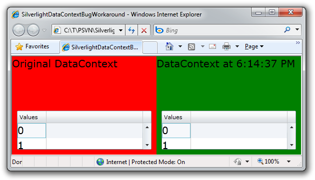
Just to "close the loop", here's an example of a DataGrid+ContextMenu demonstrating the problem:

DataGrid+ContextMenu showing bug

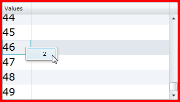
To reproduce it yourself, run the sample application, right-click on every row of the red DataGrid (everything will be correct), then scroll to the end of the list and do the same - you'll quickly find a mis-match like I show above. The fix is as easy as introducing the DataContextPropagationGrid class (as I did for the green DataGrid) - the important thing is to be sure to attach the ContextMenu to the DataContextPropagationGrid so the workaround has a chance to do its thing:

<!-- DataGrid+ContextMenu example of the workaround -->
<sdk:DataGrid Grid.Column="1" Grid.Row="1" AutoGenerateColumns="False" Margin="10">
    <sdk:DataGrid.Columns>
        <sdk:DataGridTemplateColumn Header="Values">
            <sdk:DataGridTemplateColumn.CellTemplate>
                <DataTemplate>
                    <delay:DataContextPropagationGrid>
                        <toolkit:ContextMenuService.ContextMenu>
                            <toolkit:ContextMenu>
                                <toolkit:MenuItem Header="{Binding}"/>
                            </toolkit:ContextMenu>
                        </toolkit:ContextMenuService.ContextMenu>
                        <TextBlock Text="{Binding}"/>
                    </delay:DataContextPropagationGrid>
                </DataTemplate>
            </sdk:DataGridTemplateColumn.CellTemplate>
        </sdk:DataGridTemplateColumn>
    </sdk:DataGrid.Columns>
</sdk:DataGrid>


If you run into this Silverlight bug in the DataGrid+ContextMenu scenario, please apply the DataContextPropagationGrid workaround and things should work properly. And if you happen run into the bug in some other scenario, the good news is that the DataContextPropagationGrid workaround should work there, too! Just be mindful to point the Binding's ElementName or Source at the DataContextPropagationGrid element, and you're good to go.


[Click here to download the complete source code for the SilverlightDataContextBugWorkaround sample.]


PS - Here's the code for the workaround:

using System.Windows;
using System.Windows.Controls;
using System.Windows.Data;

namespace Delay
{
    /// <summary>
    /// Class to help work around a Silverlight bug where DataContext changes to
    /// an element aren't propagated through Bindings on child elements that use
    /// ElementName or Source.
    /// </summary>
    public class DataContextPropagationGrid : Grid
    {
        /// <summary>
        /// Initializes a new instance of the DataContextPropagationGrid class.
        /// </summary>
        public DataContextPropagationGrid()
        {
            // Create a Binding to keep InheritedDataContextProperty correct
            SetBinding(InheritedDataContextProperty, new Binding());
        }

        /// <summary>
        /// Identifies the InheritedDataContext DependencyProperty.
        /// </summary>
        public static readonly DependencyProperty InheritedDataContextProperty =
            DependencyProperty.Register(
                "InheritedDataContext",
                typeof(object),
                typeof(DataContextPropagationGrid),
                new PropertyMetadata(null, OnInheritedDataContextChanged));

        /// <summary>
        /// Handles changes to the InheritedDataContext DependencyProperty.
        /// </summary>
        /// <param name="d">Instance with property change.</param>
        /// <param name="e">Property change details.</param>
        private static void OnInheritedDataContextChanged(DependencyObject d, DependencyPropertyChangedEventArgs e)
        {
            DataContextPropagationGrid workaround = (DataContextPropagationGrid)d;
            // Update local value of DataContext to prompt Silverlight to update problematic Bindings
            workaround.DataContext = e.NewValue;
            // Unset local value of DataContext so it will continue to inherit from the parent
            workaround.ClearValue(FrameworkElement.DataContextProperty);
        }
    }
}

The joys of being an early adopter... [Upgraded my Windows Phone 7 Charting example to go with the April Developer Tools Refresh]

Last week saw the release of the Windows Phone Developer Tools CTP - April Refresh, a free set of tools and an emulator that lets everyone get started writing Windows Phone 7 applications. Not only is the application platform for Windows Phone 7 based on the same Silverlight framework many of us already know and love, but the tools run on any standard Windows machine and the inclusion of the device emulator means you can test apps on the device without having a device. It's a great developer story and I'm a big fan!

Sample in portrait orientation


However, because Windows Phone 7 is still under development, early adopters sometimes need to deal with a few rough edges... :) I'd heard of occasional difficulties when folks tried to update their applications to run on the April Tools Refresh, so I thought it would be a good learning experience to update an application myself. The obvious choice was my "Silverlight Data Visualization assembly running on Windows Phone 7" blog post sample. Here's how it went for me on a machine that already had the April Refresh installed:

  1. Downloaded source code from my blog, unblocked the ZIP file, and extracted its contents.
  2. Opened DataVisualizationOnWindowsPhone.sln in Visual Studio - which immediately showed a message that I was using a solution created with a previous release of the tools and listed a specific change that needed to be made to one of the files.
  3. I would have been happy to let the tool make that change for me, but it didn't offer to, so I added the 9 new Capability entries to WMAppManifest.xml in the Properties folder just like it suggested:
    ...
    <Capabilities>
      <Capability Name="ID_CAP_NETWORKING" />
      <Capability Name="ID_CAP_LOCATION" />
      <Capability Name="ID_CAP_SENSORS" />
      <Capability Name="ID_CAP_MICROPHONE" />
      <Capability Name="ID_CAP_MEDIALIB" />
      <Capability Name="ID_CAP_GAMERSERVICES" />
      <Capability Name="ID_CAP_PHONEDIALER" />
      <Capability Name="ID_CAP_PUSH_NOTIFICATION" />
      <Capability Name="ID_CAP_WEBBROWSERCOMPONENT" />
    </Capabilities>
    ...
  4. I tried running the application, but got a blank screen in the emulator and the dreaded FileLoadException that results from a bug in the April Refresh where it fails to run any application referencing an assembly with a digital signature. The System.Windows.Controls.DataVisualization.Toolkit.dll assembly used by the sample is from my Developer Release 4 which I build myself and don't sign, but the System.Windows.Controls.dll assembly it depends on is from the November 2009 Silverlight 3 release of the Silverlight Toolkit and is signed.
  5. So I stripped the signing from the Silverlight Toolkit assembly using the steps Tim Heuer outlines in this blog post and replaced the signed assembly with the unsigned version I'd just created.
    Aside: Yes, this is super-goofy - but I'm told it's going to be fixed!
  6. Having done that, I tried running the application again, but got the error "Object reference not set to an instance of an object.". But because I ran into that same problem with the previous tools release, I knew to open MainPage.xaml in Visual Studio and try running the app again.
  7. This time around, it ran successfully and I spent some time admiring the beautiful pie chart in all its portrait and landscape glory. :)


So, when all is said and done, this ended up being more involved than I expected - but once I jumped through the hoops, my sample application worked exactly the same as it did when I wrote it. I'm happy to report that Charting still runs fine on Windows Phone 7 - and that I've updated the source code download with these changes so nobody else needs to repeat the process! :)


[Click here to download the updated Windows Phone 7 Data Visualization sample application.]

The one that got away [Simple workarounds for a visual problem when toggling a ContextMenu MenuItem's IsEnabled property directly]

A few days ago, Martin Naughton and Tiago Halm de Carvalho e Branco independently contacted me to report a problem they were having with the new ContextMenu control in the April '10 release of the Silverlight Toolkit. In both cases, they were toggling the IsEnabled property of a MenuItem directly and reported that the control's visuals weren't updating correctly. I was a little surprised at first because I knew I'd tested dynamic changes to the enabled state and I'd seen them work properly. But once I created a test project to investigate the report, I saw how the problem scenario was different.

The approach I focused my testing on (and which works correctly by all accounts) is the ICommand (Command/CommandParameter) scenario where the enabled state of the MenuItem is controlled by the CanExecute method of the ICommand implementation. In this scenario, the MenuItem changes its own IsEnabled state and updates its visuals explicitly, so everything is always in sync. But the code from the bug reports wasn't using ICommand; it was manipulating the IsEnabled property directly. The bug is that MenuItem doesn't find out about those changes - the indirect reason being that it doesn't own the IsEnabled property (which it inherits from Control). Because MenuItem doesn't know about the change, it doesn't know to update its visual state. :(

MenuItemIsEnabledWorkaround demonstration

Fortunately, there are some easy workarounds!


Workarounds

  • Do nothing. I've already checked in a fix for this bug and it will be part of the next Silverlight Toolkit release. If the scenario doesn't matter to you before then, you don't need to worry about it. Otherwise, maybe you can...
  • Patch the code, recompile the System.Windows.Controls.Input.Toolkit assembly, and use that in your project. I don't expect most people will want to take this approach, but if it suits you, then it's the next best thing to having a new Toolkit build. Here's the unified diff for the change to MenuItem.cs:
    @@ -143,6 +143,7 @@
             public MenuItem()
             {
                 DefaultStyleKey = typeof(MenuItem);
    +            IsEnabledChanged += new DependencyPropertyChangedEventHandler(HandleIsEnabledChanged);
                 UpdateIsEnabled();
             }
     
    @@ -301,6 +302,16 @@
             }
     
             /// <summary>
    +        /// Called when the IsEnabled property changes.
    +        /// </summary>
    +        /// <param name="sender">Source of the event.</param>
    +        /// <param name="e">Event arguments.</param>
    +        private void HandleIsEnabledChanged(object sender, DependencyPropertyChangedEventArgs e)
    +        {
    +            ChangeVisualState(true);
    +        }
    +
    +        /// <summary>
             /// Changes to the correct visual state(s) for the control.
             /// </summary>
             /// <param name="useTransitions">True to use transitions; otherwise false.</param>
    But if you're not sure how or where to apply that change (or what to do afterward), this is probably not the best option for you. Instead, you might...
  • Switch from manually toggling the IsEnabled property to doing so indirectly via an ICommand implementation. In general, ICommand-based approaches are more consistent with the MVVM pattern and can be more architecturally pure. If you're not already familiar with the technique, it could be worthwhile to read about it: here's a overview of commanding in WPF. That said, it's not always convenient to make changes like this, and sometimes directly toggling IsEnabled really is the best approach. If so, then another option is to...
  • "Bounce" the Template property to null and back after changing the IsEnabled property. The bug is mainly cosmetic: the internal state is correct, but the visuals aren't. Therefore, any change to MenuItem that prompts it to update its visual state will correct the problem. While giving the MenuItem focus would work, too, a less intrusive way is to change the value of the control's Template property. But because we don't really want to change the Template, it's necessary to restore the original value. The following code demonstrates this technique:
    // "Bouncing" the Template after toggling works around the issue
    menuItemBounce.IsEnabled = !menuItemBounce.IsEnabled;
    var template = menuItemBounce.Template;
    menuItemBounce.Template = null;
    menuItemBounce.Template = template;
    Because a well-behaved control updates its visual states after getting a new Template, and because MenuItem is well-behaved (usually!), this "bounce" is enough to solve the problem. But maybe you're setting the IsEnabled property with a Binding or don't want to incur the cost of swapping out visuals like this. No problem, you can always...
  • Set the MenuItemIsEnabledWorkaround.IsActive attached property (from the code in my sample project) for a seamless workaround. Based on the observation that direct manipulation of the IsEnabled property is rarely associated with the use of an ICommand implementation and the fact that the ICommand scenario works properly today, I created a self-contained workaround that's easy to use. The MenuItemIsEnabledWorkaround class exposes an attached DependencyProperty and implements the ICommand interface. When IsActive is set to True on a MenuItem, an instance of the MenuItemIsEnabledWorkaround class is created and assigned to the MenuItem's Command property. This instance is also hooked up to the MenuItem's IsEnabledChanged event - when that event fires, the MenuItemIsEnabledWorkaround's CanExecuteChanged event is also fired and its CanExecute method reports the new value of the IsEnabled property. That may sound complicated, but it's simple in practice:
    <toolkit:MenuItem
        x:Name="menuItemWorkaround"
        Header="MenuItem with workaround active"
        delay:MenuItemIsEnabledWorkaround.IsActive="True"/>
    // Activating the workaround in XAML requires no code changes
    menuItemWorkaround.IsEnabled = !menuItemWorkaround.IsEnabled;
    By changing the IsEnabled scenario into an ICommand scenario, MenuItemIsEnabledWorkaround sidesteps the bug and saves the day!


Examples

I've created a sample application to demonstrate the use of the last two workarounds in practice. It contains a simple ContextMenu with three MenuItems and toggles their IsEnabled state every second (whether the menu is open or not). You'll see either of the last two workarounds is enough to keep the corresponding MenuItem's visual state up to date.

[Click here to download the MenuItemIsEnabledWorkaround sample application and source code.]


It's never fun when a bug sneaks by you. :( But it is nice when there are a variety of good options that don't involve jumping through hoops to implement. If you've run into this bug, I apologize for the trouble - and I hope these options help get you going again!

If found, please return to... [Using XAML to create a custom wallpaper image for your mobile device]

Background

These days it seems like everybody has a mobile device with them practically all the time. It's pretty amazing that we're able to be "always connected" - technology has made great progress! However, humankind hasn't changed nearly as quickly, and occasional forgetfulness is still a part of everyone's life. :) So it's fairly common that someone forgets their device in a meeting room, drops it out of their pocket on the bus, or otherwise misplaces it. What's to be done?

Well, there are all kinds of high-tech approaches like GPS location services, network-based tracking, and the like. But sometimes a low-tech solution works, too! In particular, just slapping a label with your name and phone number on the back is probably enough to get a lost device returned when someone finds it. But that's really low-tech - and besides, some people don't want to mar the shiny surface of their pretty hardware with stickers, etchings, and the like...


One solution

I propose a mid-tech approach. It begins with the observation that most mobile devices allow you to customize the default wallpaper image. Because "pixels is pixels", it's clear the custom wallpaper image could include text - and that text is perfect for our purposes! Creating a custom wallpaper is quite easy and leads to a nice, attractive experience like this:

Custom wallpaper on an iPod touch

The example above uses an iPod touch (it's an iPhone without the phone), but the concept applies to any device that allows you to customize the login screen wallpaper (even laptops!).


One implementation

Creating a custom wallpaper can be done in lots of different ways. For the purposes of this exercise, I wanted complete control over the layout, high quality graphics, and a flexible, hierarchical, vector-based approach. The answer was obvious: XAML! :)

So I created a simple WPF application and added some scaffolding to represent the size of the device and the placement of its UI overlays. (Aside: I could have used Silverlight, too; WPF seemed like it might make the image capture step a smidge easier.) With that framework in place, it was easy to create the custom content you see here with an image, some layout containers, and some text. The resulting MobileDeviceHomeScreenMaker application looks like this (and I mean exactly like this: no title, no borders, etc.):

Custom wallpaper application

From there, it's easy to get the custom wallpaper onto the device:

  1. Left-click on the MobileDeviceHomeScreenMaker window to hide the overlays
  2. Press Alt+Print Screen to copy the foreground window to the clipboard
  3. Paste it into your favorite graphics program (I used Windows Paint)
  4. Save the image to a file (I used the lossless PNG format)
  5. Transfer that image to the device (with a dedicated sync program, by surfing to it on the web, etc.)
  6. Tell the device to use the custom image as its wallpaper (in the settings app, from the photo viewer, etc.)

It's really that easy! All that's left is to...

[Click here to download the complete MobileDeviceHomeScreenMaker .NET 4 application as a Visual Studio 2010 solution.]


The XAML

<!--
MobileDeviceHomeScreenMaker
http://blogs.msdn.com/delay/
-->

<Window x:Class="MobileDeviceHomeScreenMaker.MainWindow"
        xmlns="http://schemas.microsoft.com/winfx/2006/xaml/presentation"
        xmlns:x="http://schemas.microsoft.com/winfx/2006/xaml"
        Title="MobileDeviceHomeScreenMaker"
        SizeToContent="WidthAndHeight"
        ResizeMode="NoResize"
        WindowStyle="None"
        WindowStartupLocation="CenterScreen"
        Background="Black">

    <!-- Frame -->
    <Grid Height="480" Width="320">
        <Grid.RowDefinitions>
            <RowDefinition Height="116"/>
            <RowDefinition Height="*"/>
            <RowDefinition Height="96"/>
        </Grid.RowDefinitions>

        <!-- Instructional ToolTip -->
        <ToolTipService.ToolTip>
            <ToolTip>
                <StackPanel>
                    <TextBlock Text="Left-click toggles overlay"/>
                    <TextBlock Text="Right-click closes window"/>
                    <TextBlock Text="Alt-PrintScreen captures"/>
                </StackPanel>
            </ToolTip>
        </ToolTipService.ToolTip>

        <!-- Overall background -->
        <Grid.Background>
            <ImageBrush
                ImageSource="C:\Users\Public\Pictures\Sample Pictures\Tulips.jpg"
                Stretch="UniformToFill"
                Opacity="0.9"/>
        </Grid.Background>

        <!-- Top and bottom overlays -->
        <Label
            x:Name="TimeOverlay"
            Grid.Row="0"
            Background="#80808080"
            Content="Time"
            HorizontalContentAlignment="Center"
            VerticalContentAlignment="Center"
            Foreground="White"
            FontSize="40"
            FontWeight="Bold"/>
        <Label
            x:Name="SlideOverlay"
            Grid.Row="2"
            Background="#80808080"
            Content="Slide"
            HorizontalContentAlignment="Center"
            VerticalContentAlignment="Center"
            Foreground="White"
            FontSize="40"
            FontWeight="Bold"/>

        <!-- Container for content -->
        <Grid
            Grid.Row="1">

            <Grid
                HorizontalAlignment="Center"
                VerticalAlignment="Center">
                <StackPanel
                    TextBlock.Foreground="White"
                    TextBlock.FontSize="16"
                    TextBlock.FontFamily="Segoe UI Light"
                    TextOptions.TextHintingMode="Fixed"
                    TextOptions.TextRenderingMode="Grayscale">
                    <StackPanel.Effect>
                        <DropShadowEffect
                            BlurRadius="2"
                            ShadowDepth="1"
                            RenderingBias="Quality"/>
                    </StackPanel.Effect>
                    <TextBlock
                        Text="mobile user"
                        FontSize="28"
                        FontFamily="Segoe UI Semibold"/>
                    <Grid Height="12"/>
                    <TextBlock
                        Text="mobile.user@example.com"/>
                    <Grid Height="12"/>
                    <TextBlock
                        Text="+1 (555) 555-5555"/>
                    <Grid Height="12"/>
                    <TextBlock
                        Text="One Mobile Way"/>
                    <TextBlock
                        Text="Mobile Town, MO 12345"
                        Margin="0 -2 0 0"/>
                </StackPanel>
            </Grid>

        </Grid>
    </Grid>
</Window>

Nobody likes a show-off [Today's DataVisualizationDemos release includes new demos showing off stacked series behavior]

My DataVisualizationDemos application is a collection of nearly all the Data Visualization samples I've posted to my blog. And just like the Data Visualization assembly (get Silverlight/WPF Data Visualization Development Release 4 here!), the demo application runs on Silverlight 3, Silverlight 4, WPF 3.5, and WPF 4 and shares the same code and XAML across all platforms. It's a handy way to look at bunch of sample code running on any of the supported platforms. What's more, each demo page has hyperlinks to relevant blog post(s) for more detail about each scenario, so it's a good learning tool as well! :)


Click here to download the complete source code for the cross-platform DataVisualizationDemos sample application.


Stacked Series demo

Of the two completely new demos, the prettiest is definitely the "Stacked Series" sample shown above. Its interface is simple - you choose one to three sets of stacked data for examples of all four stacking types and can control the nature of that data: positive/mixed/negative small/large ints/doubles. As you might guess, the corresponding value changes are fully animated, so it's pleasing to watch the charts flow from one configuration to another.

There's also a check-box for switching the examples from "normal" stacked mode into "100%" stacked mode. This transition is not animated because what goes on behind the scenes is a swap of the series types in use. Similarly, choosing a different kind of independent value from the combo-box (string, consecutive numbers, random numbers, or dates) re-creates the data and is not animated.

Disclaimer: As soon as you start playing around with negative values, you'll think you've found a bad rendering bug. But before you fire off an email telling me what a bone-head I am for getting things wrong, please finish reading this post... :)


Text-To-Chart demo

The less attractive - but arguably more interesting - of the two new demos is the "Text-To-Chart" sample shown above. What it lacks in sophisticated UI polish, it makes up for in flexibility. The idea is that you (or me when I'm testing things!) can paste simple tabular data directly from Excel and see how it looks in any of the eight new stacked series types. The dependent values of a single series go down and different series go across (using tab, space, or ';' as a delimiter). It's flexible, so you can have any number of dependent values or series! Independent values are generated automatically according to row number; the only requirement is that every row needs to have the same number of values (i.e., no missing data). If everything checks out, you get a pretty chart of the data - if not, the text turns red to indicate a problem that needs to be corrected.

After a little while playing around with negative numbers, you might end up with the chart shown below;

Stacked area series with negative values - TextToChart

Clearly, this is a rendering bug - that can't possibly be correct! Let's try it in Excel to see how it's supposed to look so we can tell the developer what a complete bone-head he is:

Stacked area series with negative values - Excel

Oh, snap, it's not a bug after all! :) Whereas the behavior of stacked bar and column charts is fairly intuitively obvious in the presence of negative values, the behavior of stacked line and area charts is not. But it turns out that Excel implements a fairly simple algorithm here - and once I stared at things long enough to figure out what it was, my stacked series charts suddenly matched Excel in all the weird scenarios I've tried so far.

Of course, that's not to say there aren't still bugs in the stacked series implementation - there are bound to be because everything has bugs. But the good news is that I may not be a total bone-head after all. That said, if you run into a scenario where the output from the stacked series code differs from that of Excel, I'd love to hear about it - and "Text-To-Chart" provides a really easy way of sending a bug report! :)


Performance Tweaks with a Compatible series

The last thing I wanted to call out is that I've updated the "Performance Tweaks" sample (above) to allow the creation of a "Compatible" ScatterSeries (shown above) in addition to the normal kind. You can read more about what I mean in my detailed discussion of the new stacked series support. What's important to know is that holding down the Ctrl key switches the "Add Series" button to an "Add Compatible Series" button - and the resulting series name in the legend will be "Standard" or "Compatible" accordingly.

This makes it easy to see some of the performance improvements I discuss in that blog post for yourself. One good example is the following: Reset, Create Chart, Add Series, Populate, [watch as the points fade in], Change Values, [watch as they move], Change Values, etc.. Now repeat those same steps with a Compatible series and note how everything runs faster!

Aside: If you're on WPF, you may need to increase the number of points before you start seeing a difference.


And there you have it: cool new samples to go with the new Data Visualization features. The DataVisualizationDemos application is one of my favorite test cases because it implements a bunch of different scenarios with a variety of different techniques and it runs everywhere the Data Visualization assembly does. (Or at least it did until Windows Phone 7 showed up... Hum, maybe I'll port to that platform next time...)

DataVisualizationDemos has been a tremendous help for me and I hope you enjoy it, too!

Phone-y charts [Silverlight/WPF Data Visualization Development Release 4 and Windows Phone 7 Charting sample!]

The April '10 release of the Silverlight Toolkit brought stacked series support to the Data Visualization assembly on the Silverlight 4 platform! You can read an overview here and get a detailed description here. Almost simultaneously, the WPF team released WPF 4 as part of .NET 4 and Visual Studio 2010.

So it's time for an updated version of my Silverlight/WPF Data Visualization Development Release. Like the previous version, this one continues to support the four platforms of interest to most .NET developers: Silverlight 3, Silverlight 4, WPF 3.5, and WPF 4. But what about Windows Phone 7, the new fifth platform for .NET developers? Yeah, it's supported, too! :)


Silverlight/WPF Data Visualization Development Release 4

As with previous Data Visualization Development Releases, I've updated the code and binaries to match the most recent Toolkit release. The Silverlight 4 Toolkit shipped most recently, so the code in this Development Release is identical to what just went out with that. Which means people using Data Visualization on Silverlight 3, Windows Phone 7, WPF 3.5, or WPF 4 can also take advantage of the latest round of improvements by updating their applications to use the binaries included with this Development Release (or by compiling the included source code themselves).

Notes:

  • The directions for using this release are the same as last time, so please have a look at earlier posts if you're new to this or need a refresher.
  • It's easy to use Data Visualization on Windows Phone 7: simply add a reference to the pre-compiled System.Windows.Controls.DataVisualization.Toolkit.dll assembly from this Development Release and a reference to the System.Windows.Controls.dll assembly from the Silverlight 3 SDK (it contains the implementation of Legend's base class HeaderedItemsControl). Then write the same code/XAML you would for any of the other platforms - it's all interchangeable!
    Aside: The version of Silverlight used by Windows Phone 7 is conceptually equivalent to Silverlight 3 with a variety of Silverlight 4 enhancements throughout.
  • All the same cross-platform shared code/XAML goodness of previous Development Releases still applies.

[Click here to download the SilverlightWpfDataVisualization solution including complete source code and pre-compiled binaries for all platforms.]


Windows Phone 7 Data Visualization Sample

Trying to use the November 2009 version of the Data Visualization assembly on Windows Phone 7 doesn't work because there's a bug in the Phone version of the .NET Framework that causes bogus exceptions. That bug will be fixed in a future drop of Windows Phone 7 developer bits, but for now it was simplest to work around it myself so folks could start playing around with Data Visualization on the phone today. I wrote the sample application below to show that the Silverlight 3 version of Data Visualization now works seamlessly on Windows Phone 7. And while I was at it, I went ahead and customized the default UI a bit (mostly just tweaking colors and backgrounds) so things really fit in with the overall look and feel of the platform:

Sample in portrait orientation

As part of this, I made some trivial Template customizations for the Chart element and added just a smidge of code to switch Templates when the device orientation changes. This allows the sample application to make better use of the available screen space (note how the Legend moves and changes shape):

Sample in landscape orientation

Notes:

  • Please be sure to open MainPage.xaml in the development environment before hitting F5 to run the sample - otherwise it seems that deployment of the application to the emulator fails with the message "Object reference not set to an instance of an object.".
  • For convenience, I've included the two required assemblies in the ZIP for the sample - all you need in order to build and run is the Windows Phone Developer Tools CTP which can be downloaded for free here.
  • Though this is hardly the most interesting chart ever, I hope some of what I show here inspires others to achieve greater things! :)


[Click here to download the complete Windows Phone 7 Data Visualization sample application.]

Developer test case, customer win! [Using ContextMenu to implement SplitButton and MenuButton for Silverlight (or WPF)]

A great way to test a new control is to make use of it in a real-world scenario. So one of the things I did just before we published the April '10 release of the Silverlight Toolkit (click here for my full write-up) was to take the ContextMenu code I'd written out for a little test drive. One of my "stretch goals" for ContextMenu had been to use it to implement a "split button" ever since teammate Ted Glaza brought up the idea during an API review. To make a short story even shorter: it worked! :)

SplitButton and MenuButton
<splitButton:SplitButton Content="Open" Click="Open_Click">
    <splitButton:SplitButton.ButtonMenuItemsSource>
        <toolkit:MenuItem Header="Open" Click="Open_Click"/>
        <toolkit:MenuItem Header="Open read-only" Click="OpenReadOnly_Click"/>
        <toolkit:MenuItem Header="Open as copy" Click="OpenCopy_Click"/>
    </splitButton:SplitButton.ButtonMenuItemsSource>
</splitButton:SplitButton>


To get us all on the same page, here's a discussion of split button and menu button in the Windows User Experience Interaction Guidelines. These controls are normal-looking buttons that show a popup menu of other items in certain cases. Because I wanted SplitButton to be a Button, I derived and added a single collection-typed property called ButtonMenuItemsSource which follows the same ItemsControl pattern everyone is already familiar with (and that ContextMenu uses for its items). That done, all that's necessary is to wire up a bit of additional code to support popping the menu when the little arrow (which I call the "split element") is clicked. The default Style/Template of SplitButton is a direct copy of the default for Button - the only change is that the original ContentPresenter has been replaced with a Grid that positions the split element and divider graphics just to the right of the replacement ContentPresenter. To enable complete customization of SplitButton, the ContextMenu is part of the default Template.

Here's how things look after the replacement:

<Grid>
    <Grid.ColumnDefinitions>
        <ColumnDefinition/>
        <ColumnDefinition Width="Auto"/>
        <ColumnDefinition Width="Auto"/>
    </Grid.ColumnDefinitions>
    <ContentPresenter x:Name="contentPresenter" Content="{TemplateBinding Content}" ContentTemplate="{TemplateBinding ContentTemplate}" VerticalAlignment="{TemplateBinding VerticalContentAlignment}" HorizontalAlignment="{TemplateBinding HorizontalContentAlignment}" Margin="{TemplateBinding Padding}"/>
    <Rectangle Grid.Column="1" Width="1" Fill="{TemplateBinding Foreground}" Opacity="0.4" Margin="0 4 0 4"/>
    <Grid x:Name="SplitElement" Grid.Column="2" Background="Transparent">
        <toolkit:ContextMenuService.ContextMenu>
            <toolkit:ContextMenu ItemsSource="{Binding ButtonMenuItemsSource, RelativeSource={RelativeSource TemplatedParent}}" Foreground="{TemplateBinding Foreground}" FlowDirection="{TemplateBinding FlowDirection}"/>
        </toolkit:ContextMenuService.ContextMenu>
        <Path Data="M 0,0 L 8,0 L 4,4 Z" Fill="{TemplateBinding Foreground}" Margin="2 0 4 0" VerticalAlignment="Center"/>
    </Grid>
</Grid>

What's great is that simply tweaking this template to make the split element be the background of the entire button gets most of the way to MenuButton! After that, all it takes is a subclass and two lines of code!


That's really all there is to it! To be clear, I didn't set out to build the world's best SplitButton ever - my primary goal was to get some good ContextMenu testing done. (Speaking of which, I found (and fixed) a bug in the process, so it was definitely worthwhile!) Just now, I spent a bit more time cleaning up my SplitButton implementation and adding some polish like XML comments, keyboard support, RTL support, etc., and at this point I think SplitButton and MenuButton could be used in many applications as-is. If you do that, I'd love to hear about it! :)


[Click here to download the complete source code for SplitButton/MenuButton and the sample application shown above.]


Note: The sample project is for Silverlight 4, but everything I do here can be applied to WPF as well. That said, if I were going to port this code to WPF, one of the things I'd look into doing differently (in addition to updating the Style/Template!) is the positioning logic. WPF's ContextMenu supports additional positioning logic via the Placement/PlacementTarget properties that could be used to simplify this implementation even further!