Each one is the best - for different definitions of "best" [The BestFitPanel collection of layout containers provides flexible, easy-to-use options for Silverlight, WPF, and Windows Phone applications]
Just over a year ago, a couple of readers asked me about a WPF/Silverlight Panel that arranged things to make "best use" of available space without requiring the developer to set a bunch of stuff up in advance or know how many child elements there would be. Interestingly, this is not a scenario the default Panel implementations handle particularly well...
-
Grid [WPF/SL/WP] is capable of pretty much anything, but requires the developer to explicitly specify how everything lines up relative to the rows and columns they must manually define.
-
StackPanel [WPF/SL/WP] arranges an arbitrary number of items in a tightly-packed line, but overflows when there are too many and leaves empty space when there are too few.
-
Canvas [WPF/SL/WP] provides the ultimate in flexibility, but contains absolutely no layout logic and pushes all that overhead onto the developer.
-
WrapPanel [WPF/SLTK/WPTK] flows its elements "book-style" left-to-right, top-to-bottom, but runs content off the screen when there's not enough room and can size things surprisingly unless you tell it how big items should be.
Aside: When scrolling content that doesn't fit is acceptable,
WrapPanelcan be quite a good choice. And if you like the idea, but want something a little more aesthetically pleasing, please have a look at my BalancedWrapPanel implementation...:) Further aside: On the other hand, if you're looking for something more like a
StackPanelbut with multiple columns (or rows), you might instead be interested in my BandedStackPanel implementation. -
DockPanel [WPF/SLTK] crams everything against the edge of its layout slot and leaves a big "chunk" in the center for whatever element is lucky enough to end up there.
-
UniformGrid [WPF] does okay at sensible layout without a lot of fuss - but its default behavior can leave a lot of blank space and so it's best if you tell it in advance how many items there are.
That said, please don't get me wrong: I'm not complaining about the default set of layout containers - I think they're all good at what they do! However, in the context of the original "just do the right thing for me" scenario, none of them quite seems ideal.
So when this question came up before, I mentioned I'd written some code that seemed pretty relevant, but that it was for Windows Forms and therefore didn't map cleanly to the different layout model used by Silverlight and WPF. Soon thereafter, I created a sample project to implement a "best fit" panel for Silverlight and WPF (and got nearly all the code written!) - but then found myself distracted by other topics and never managed to write it up formally...
Until now!
Today I'm sharing the three Panel classes I originally wrote for Silverlight and WPF, two abstract base classes they're built on, an extra Panel I wrote just for this post and a Windows Phone 7 sample application! (Because this code supports Silverlight 3, it works just as well on the phone as on the desktop.) Hopefully the extra goodness in today's release will offset the delay in posting it...
The foundation for everything, BestFitPanel is an abstract base class that implements MeasureOverride and ArrangeOverride to arrange its children in a grid that's M columns wide and N rows high. What's nice is that the values of M and N are left to subclasses to define by overriding the CalculateBestFit method. Therefore, a subclass only needs to worry about columns/rows and the base class only needs to worry about handling layout.
MostBigPanel is a BestFitPanel subclass that figures out which values of M and N maximize the length of the smaller dimension (be it width or height) of each item. In other words, it avoids long, skinny rectangles in favor of more evenly proportioned ones.
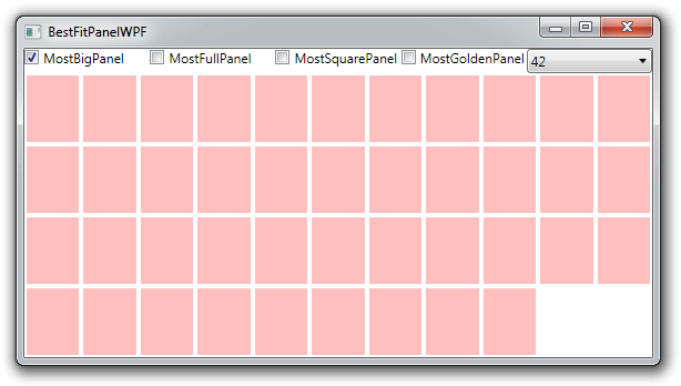
MostFullPanel is a BestFitPanel subclass that maximizes the total area occupied by the Panel's children. Specifically, an arrangement without any empty cells will be preferred over one with an empty cell or two - even if the shape of the resulting items is less balanced.
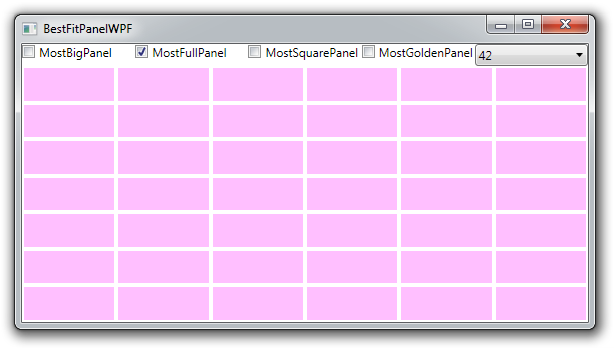
Sometimes it's nice to optimize for the "shape" of individual items - and for that there's the BestAnglePanel abstract base class which chooses the combination of M and N that yields items with a diagonal closest to some angle A determined by the GetIdealAngle override.
MostSquarePanel is a BestAnglePanel subclass that uses a value of 45° for A and therefore prefers arrangements where items are closest to being square.
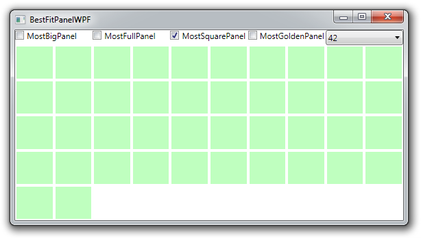
MostGoldenPanel, on the other hand, is a BestAnglePanel subclass that uses a value for A that matches that of a horizontally-oriented golden rectangle. Golden rectangles are said to be among the most aesthetically pleasing shapes, and this class makes it easy to create layouts based around them.
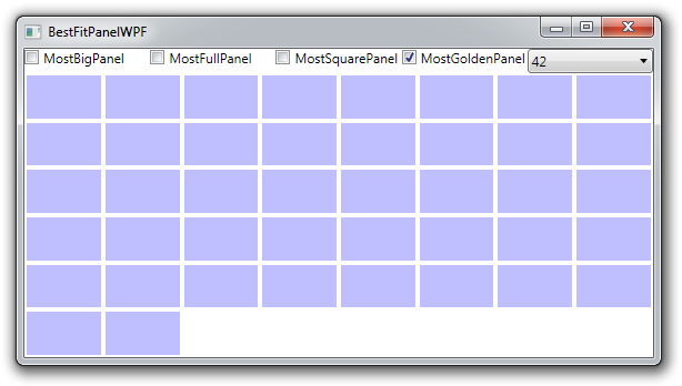
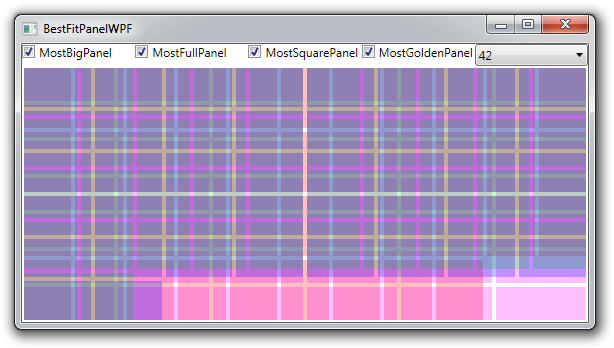
Of course, there are very few values of M and N to choose from, so it's not uncommon that all the implementations above choose the same values. The interesting differences tend to show up at various "special" sizes where each BestFitPanel selects a different layout. This is why the sample application allows you to enable all the panels at once: the sample content is translucent, so you can see where things differ and how each implementation is handling a particular configuration. I made sure all the arrangements above were unique - here's how it looks when they're all shown at once:
For a real-world example of BestFitPanel in action, I've adapted the "ImageLoading" sample from my Windows Phone 7 PhonePerformance project to use MostBigPanel (which is what I would have used if I'd written this post beforehand!). If you're not familiar with that sample, it finds all the followers of an arbitrary Twitter account and shows their images. Because it's impossible to know in advance how many followers an account has, trying to use one of the "in-box" Panel implementations is likely to be tricky or require writing code to configure things at run-time. But BestFitPanel makes this scenario easy by automatically showing all the items and optimizing for the most important attribute ("bigness" in this case). Here's the same code/XAML with different numbers of followers (400, 200, and 100) to show how things "just work":


The concept of a reusable, container-agnostic Panel for layout is tremendously powerful. The "stock" implementations for Silverlight, WPF, and Windows Phone are all quite useful, but sometimes you'll find that writing a custom Panel is the only way to get exactly the layout you're looking for. Fortunately, layout code is pretty straightforward - and classes like BestFitPanel and BestAnglePanel make it even easier. So the next time you're looking for a flexible container that works sensibly without requiring a bunch of prior knowledge or hand-holding, I hope you'll remember this post and consider using a BestFitPanel - or a custom subclass!