The blog of dlaa.me

LB-SV-WHY [Three wacky uses for Silverlight 2's ListBox and ScrollViewer!]

In my Silverlight 2 ListBox/ScrollViewer FAQ I described some common scenarios and demonstrated how to implement them with sample XAML/code. In this post I demonstrate three UNcommon ListBox/ScrollViewer scenarios - again showing the XAML/code that makes them possible.

Because sometimes the power of a thing only becomes clear when it's being abused. :)


ListBox: Planets

When I saw Beatriz Costa's "PlanetsListBox" WPF demo of a fully functioning ListBox that looked like the solar system, I was stunned and knew I had to port it to Silverlight.

Planets shown smaller than actual size

So I downloaded the WPF project, created a new Silverlight application, copied over the implementations of the classes SolarSystem, SolarSystemObject, and ConvertOrbit, and went to work migrating the XAML. With one small exception, the code had no changes for Silverlight. As you'd expect, the XAML got a variety of minor tweaks because Silverlight is a subset of WPF and I was moving in the "wrong" direction. In particular, I made the following changes to the original implementation:

  • Switched to inline styles because Silverlight does not support implicit styles
  • Switched from a Trigger-based selection indicator (the yellow circle) to one based on the Silverlight parts model
  • Manually created Canvas bindings in PrepareContainerForItemOverride because Silverlight wasn't creating the attached property bindings in XAML
  • Manually created ToolTip contents/bindings in a custom IValueConverter because bindings in the ToolTip XAML were unexpectedly seeing a null DataContext
  • Changed the type of SolarSystemObject.Image from Uri to string and changed the image resource paths so that binding to Silverlight's Image.Source worked
  • Switched to Canvas.Top because Silverlight does not support Canvas.Bottom
  • Converted all images to JPEG format because GIF is not supported by Silverlight


ListBox: Slideshow

One day I was working on a perfectly sensible ListBox sample with images when my teammate Ted suggested making a simple Slideshow with ListBox. It's not the craziest idea he's ever had, so I decided to humor him.

It's not much of a list anymore...

The basic idea is simple: Populate the ListBox with images and then size it so only one of them shows at a time. You can use the dedicated Previous/Next Buttons to change slides - or click on the ListBox and press the usual keys (arrow Up/Down, Home/End, Page Up/Down). Because the Button states are updated in the SelectionChanged handler, they're kept in sync. Here's the complete implementation:

<UserControl x:Class="ListBoxSlideShow.Page"
    xmlns="http://schemas.microsoft.com/client/2007"
    xmlns:x="http://schemas.microsoft.com/winfx/2006/xaml"
    xmlns:controls="clr-namespace:System.Windows.Controls;assembly=System.Windows.Controls">
    <Grid HorizontalAlignment="Center" VerticalAlignment="Center">

        <!-- Column/row definitions -->
        <Grid.ColumnDefinitions>
            <ColumnDefinition Width="Auto"/>
            <ColumnDefinition Width="Auto"/>
        </Grid.ColumnDefinitions>
        <Grid.RowDefinitions>
            <RowDefinition Height="*"/>
            <RowDefinition Height="Auto"/>
        </Grid.RowDefinitions>

        <!-- ListBox slide display -->
        <ListBox
            x:Name="Display" Grid.ColumnSpan="2" Width="484" Height="364"
            controls:ScrollViewer.HorizontalScrollBarVisibility="Hidden"
            controls:ScrollViewer.VerticalScrollBarVisibility="Hidden">

            <!-- Style to size all images to desired size -->
            <ListBox.ItemContainerStyle>
                <Style TargetType="ListBoxItem">
                    <Setter Property="Width" Value="480"/>
                    <Setter Property="Height" Value="360"/>
                </Style>
            </ListBox.ItemContainerStyle>

            <!-- Slide images -->
            <!-- Note: Sample images are from C:\Windows\Web\Wallpaper\*
                       Update that path if necessary for your machine -->
            <Image Source="img10.jpg"/>
            <Image Source="img7.jpg"/>
            <Image Source="img8.jpg"/>
            <Image Source="img9.jpg"/>
        </ListBox>

        <!-- Previous/Next buttons -->
        <Button x:Name="Previous" Grid.Column="0" Grid.Row="1" Content="Previous"/>
        <Button x:Name="Next" Grid.Column="1" Grid.Row="1" Content="Next"/>
    </Grid>
</UserControl>
using System;
using System.Windows.Controls;

namespace ListBoxSlideShow
{
    public partial class Page : UserControl
    {
        public Page()
        {
            InitializeComponent();

            // Hook button event handlers to change slides
            Previous.Click += delegate { ChangeSlide(Display.SelectedIndex - 1); };
            Next.Click += delegate { ChangeSlide(Display.SelectedIndex + 1); };

            // Update button states if necessary
            Display.SelectionChanged += delegate
            {
                Previous.IsEnabled = (0 < Display.SelectedIndex);
                Next.IsEnabled = (Display.SelectedIndex < Display.Items.Count - 1);
            };

            // Change to first slide
            ChangeSlide(0);
        }

        private void ChangeSlide(int index)
        {
            // Select specified slide and bring it into view
            Display.SelectedIndex = Math.Max(0, Math.Min(Display.Items.Count - 1, index));
            Display.ScrollIntoView(Display.SelectedItem);
        }
    }
}


ScrollViewer: Marquee

On a discussion list one day, someone innocently asked for a way to scroll text. I immediately thought: <MARQUEE>!

Welcome back to Web 1.0!

Again, the idea is simple: Put arbitrary content inside a ScrollViewer, hide its ScrollBars, and adjust its HorizontalOffset on a timer. I chose to have the content bounce at each end, but you could just as easily snap it back to the beginning. Here's the complete implementation:

<UserControl x:Class="ScrollViewerMarquee.Page"
    xmlns="http://schemas.microsoft.com/client/2007"
    xmlns:x="http://schemas.microsoft.com/winfx/2006/xaml">
    <Grid>

        <!-- Marquee-like ScrollViewer -->
        <ScrollViewer x:Name="Marquee" Width="200"
                      VerticalAlignment="Center"
                      HorizontalScrollBarVisibility="Hidden"
                      VerticalScrollBarVisibility="Disabled">

            <!-- Arbitrary nested content -->
            <TextBlock Text=" This message bounces! "
                       FontFamily="Arial Black" FontSize="40"/>
        </ScrollViewer>
    </Grid>
</UserControl>
using System;
using System.Windows.Controls;
using System.Windows.Threading;

namespace ScrollViewerMarquee
{
    public partial class Page : UserControl
    {
        // Timer and direction variables
        private DispatcherTimer _timer;
        private int _delta = 1;

        public Page()
        {
            InitializeComponent();

            // Create timer to tick every 10ms
            _timer = new DispatcherTimer
            {
                Interval = TimeSpan.FromMilliseconds(10)
            };

            // Attach a Tick handler to do the scrolling
            _timer.Tick += delegate
            {
                // Adjust the horizontal offset
                Marquee.ScrollToHorizontalOffset(Marquee.HorizontalOffset + _delta);

                // Flip direction if necessary
                if ((0 < Marquee.ViewportWidth) &&  // (NOOP if not visible yet)
                    ((Marquee.ScrollableWidth <= Marquee.HorizontalOffset) ||
                     (Marquee.HorizontalOffset <= 0)))
                {
                    _delta = -_delta;
                }
            };

            // Start the timer
            _timer.Start();
        }
    }
}


I've made the complete source code I used to build these samples available as an attachment to this post for anyone to play around with. If you come up with your own wacky use for ListBox or ScrollViewer, please let me know. It's always interesting to see the clever, creative ways people end up using stuff like this!

[LB-SV-WHY.zip]

LB-SV-WPF [Silverlight 2's ListBox and ScrollViewer controls running on WPF!]

In the Silverlight 2 ListBox/ScrollViewer FAQ, I mentioned that I'd done a lot of Silverlight control development on WPF. I spoke with a number of people at MIX08 last week and many of you wanted to know more. So I've created a Visual Studio solution with one project to compile these Silverlight controls on WPF and another project to run the corresponding unit tests. I've also implemented a simple demonstration of the WPF ListBox/ScrollViewer running side-by-side with the Silverlight ListBox/ScrollViewer (all on WPF):

Silverlight 2's ListBox and ScrollViewer running on WPF

While there are some obvious style differences between the default look and feel of the two platforms, the control functionality is very similar. To prove it, I've attached a ZIP of the solution to this blog post so you can run the demo application on your own machine. [Aside: I did not say the behavior was identical, just very similar. :) ]

And though I didn't enable code coverage by default, those of you with the Visual Studio Code Coverage feature installed can easily turn it on by editing the LocalTestRun.testrunconfig settings. When compiled for WPF, ListBox and ScrollViewer live in the WPF namespace to avoid colliding with WPF's classes in System.Windows.Controls. So we can see below that the overall coverage for these controls is a smidge under 80% (the uncovered code is mostly involved with user interface manipulation (ex: mouse and key input) which I wasn't able to flush out because I ran out of time):

Code coverage for the ListBox and ScrollViewer unit tests

So if you were wondering whether it was possible to easily share code, XAML, and unit tests across both Silverlight and WPF, the answer is a definite YES! :)


Notes:

  • In this case, the code for ListBox, ListBoxItem, ScrollViewer, and ScrollContentPresenter is taken from Silverlight, but the underlying implementations of ItemsControl, ContentPresenter, and ScrollBar are provided by WPF. (So some behavior differences in the dependent controls are reflected by ListBox/ScrollViewer.)
  • I wanted to make as few changes as possible when creating this sample - here's a summary of what I did:
    • Created a new WPF project.
    • Copied all code files directly from the public Silverlight 2 Beta 1 controls source code download.
    • Copied default styles from the associated generic.xaml file to the new project's Window1.xaml as implicit styles for the Silverlight control implementations.
    • Removed TemplateBindings from ContentPresenter/ScrollContentPresenter because they're not necessary on WPF (the ContentControl-ContentPresenter hook-up is done automatically) and removed Setters for related properties.
    • Added Animations to ListBoxItem's "Normal State" because the "restore default settings" behavior that's core to Silverlight's parts model specification is not present on WPF.
    • Added a few calls to Math.Round to ListBox's IsOnCurrentPage method. (I deliberately avoided duplicating WPF's MS.Internal.Double.Util.* helper methods for the Silverlight ListBox and have seen no problems because of that. However, when running the sample on WPF, I found a few situations where the double rounding issues were causing problems, so I patched the relevant location with a simple workaround.)
    • Added SnapsToDevicePixels=True to applicable elements in the copied style definitions. (Silverlight doesn't support SnapsToDevicePixels in Beta 1, so this property isn't used by the default Beta 1 control templates.)
    • Updated the assembly name for some XAML used by the unit tests.
    • More details: Search the solution for comments with the text "LB-SV-WPF:"
  • Because they're relevant, here are a few details from the previous post:

    What's the meaning of the WPF/WPFIMPLEMENTATION defines in the controls source code? The development of ListBox (+ListBoxItem) and ScrollViewer (+ScrollContentPresenter) was done in parallel with the development of their base types (e.g., ItemsControl, ContentControl) and also in parallel with the development of the Silverlight 2 platform itself. To minimize the risk/impact of developing on a changing foundation, I did much of my development and unit testing on WPF by deriving from the corresponding base classes, using only the subset of WPF that Silverlight exposes, and avoiding features specific to either platform as much as possible.

    When compiling and running on WPF, I would add "WPF" to the list of conditional compilation symbols for the project. Therefore, code inside an #if WPF block applies only when running on WPF. In many cases, the pattern is #if WPF ... #else ... #endif and this corresponds to instances where some bit of code needed to be different between the two platforms (typically because it used features that weren't identical across both). In some cases, the relevant code only applies to one platform and the #else is missing or #if !WPF is used instead.

    The meaning of "WPFIMPLEMENTATION" is similar and is used by the unit tests for code that applies only when testing the WPF implementations of ListBox or ScrollViewer. I used unit tests in three different scenarios to help ensure the code was as correct and compatible as possible: testing the Silverlight implementation on Silverlight, testing the Silverlight implementation on WPF (#if WPF), and testing the WPF implementation on WPF (#if WPF, #if WPFIMPLEMENTATION). Though it may seem silly at first, the point of testing the WPF implementation on WPF was to make sure the unit tests were validating the correct behavior.

[LB-SV-WPF.zip]

LB-SV-FAQ [Examples, Notes, Tips, and More for Silverlight 2 Beta 1's ListBox and ScrollViewer controls!]

Silverlight 2 Beta 1 is available today, yay!! I'm celebrating by publishing an FAQ of sorts for the controls I worked on. While not all of the topics below are "frequently asked questions" (it's a little too soon for that...), they're all intended to help developers get started by covering the basics of these controls.

If you're already familiar with WPF, then Silverlight should come pretty easily to you - but I'd still recommend skimming the topics below because some of the details are unique to Silverlight. If you're new to WPF and Silverlight, then I hope the topics below help jump-start the development process. In either case, I welcome your feedback, so please leave a comment below or contact me with any questions/problems/ideas you have!

Enjoy!!


General Questions

What does this FAQ cover? The Silverlight 2 Beta 1 controls I worked on: ListBox, ListBoxItem, ScrollViewer, and ScrollContentPresenter.

Why do all the hyperlinks point to WPF documentation? For one, that's all that was publically available when I started writing this post. For another, the WPF documentation is a superset of the Silverlight documentation and the additional detail there can help clarify issues. And finally, because one of the big goals for the Silverlight controls was complete (subset) compatibility with their WPF counterparts, the WPF documentation has been MY primary reference as well! But sometimes there's no substitute for the real thing; the Silverlight 2 Beta 1 documentation is a great reference, too. :)

What's the meaning of the WPF/WPFIMPLEMENTATION defines in the controls source code? The development of ListBox (+ListBoxItem) and ScrollViewer (+ScrollContentPresenter) was done in parallel with the development of their base types (e.g., ItemsControl, ContentControl) and also in parallel with the development of the Silverlight 2 platform itself. To minimize the risk/impact of developing on a changing foundation, I did much of my development and unit testing on WPF by deriving from the corresponding base classes, using only the subset of WPF that Silverlight exposes, and avoiding features specific to either platform as much as possible.

When compiling and running on WPF, I would add "WPF" to the list of conditional compilation symbols for the project. Therefore, code inside an #if WPF block applies only when running on WPF. In many cases, the pattern is #if WPF ... #else ... #endif and this corresponds to instances where some bit of code needed to be different between the two platforms (typically because it used features that weren't identical across both). In some cases, the relevant code only applies to one platform and the #else is missing or #if !WPF is used instead.

The meaning of "WPFIMPLEMENTATION" is similar and is used by the unit tests for code that applies only when testing the WPF implementations of ListBox or ScrollViewer. I used unit tests in three different scenarios to help ensure the code was as correct and compatible as possible: testing the Silverlight implementation on Silverlight, testing the Silverlight implementation on WPF (#if WPF), and testing the WPF implementation on WPF (#if WPF, #if WPFIMPLEMENTATION). Though it may seem silly at first, the point of testing the WPF implementation on WPF was to make sure the unit tests were validating the correct behavior.

What's a good strategy for investigating possible bugs? If you're trying to do something new and running into behavior that seems wrong, it's often helpful to identify exactly what/where the problem is. My first step is often to try the same scenario on WPF - if the behavior is the same there, then it's probably not a bug (and at least Silverlight is consistent!). But let's say the scenario works fine on WPF - my next step for ListBox problems is to try the same scenario using ItemsControl. This isn't always possible because ItemsControl offers only a subset of ListBox's functionality, but if I'm able to reproduce the problem using just ItemsControl, then ListBox is off the hook and that's a big chunk of code that's no longer in question. If ItemsControl isn't responsible, the next step I'll take is to switch to a debug version of System.Windows.Controls.dll so I can set breakpoints, tweak the control internals, etc.. For bugs in ListBox or ScrollViewer, this should be enough to identify most problems; for bugs in Silverlight, this helps to narrow things down.

And now that you've identified a bug, please let us know so we can fix it! :)


Common ListBox Scenarios

Here is the XAML code for a handful of the most common ListBox scenarios along with a picture of what it looks like on Silverlight.

ListBoxItems specified in XAML:

ListBoxItems specified in XAML
<ListBox>
    <ListBoxItem Content="ListBoxItem 0"/>
    <ListBoxItem Content="ListBoxItem 1"/>
    <ListBoxItem Content="ListBoxItem 2"/>
</ListBox>

FrameworkElements specified in XAML:

FrameworkElements specified in XAML
<ListBox>
    <Ellipse Width="20" Height="20"
             Fill="Red" Stroke="Black"/>
    <Rectangle Width="20" Height="20"
               Fill="Blue" Stroke="White"/>
    <Rectangle Width="20" Height="20"
               Fill="Yellow" Stroke="Black"
               RadiusX="5" RadiusY="5"/>
</ListBox>

Objects specified with ItemsSource and StaticResource Binding:
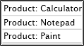
Objects specified with ItemsSource and StaticResource Binding
<ListBox
    ItemsSource="{StaticResource Products}"/>

Horizontal layout with ItemsPanel and ItemsPanelTemplate:

Horizontal layout with ItemsPanel and ItemsPanelTemplate
<ListBox>
    <ListBox.ItemsPanel>
        <ItemsPanelTemplate>
            <StackPanel Orientation="Horizontal"/>
        </ItemsPanelTemplate>
    </ListBox.ItemsPanel>
    <ListBoxItem Content="Item 0"/>
    <ListBoxItem Content="Item 1"/>
    <ListBoxItem Content="Item 2"/>
</ListBox>

Simple data visualization with DisplayMemberPath:

Simple data visualization with DisplayMemberPath
<ListBox
    ItemsSource="{StaticResource Products}"
    DisplayMemberPath="Name"/>

Complex data visualization with ItemTemplate and DataTemplate:

Complex data visualization with ItemTemplate and DataTemplate
<ListBox ItemsSource="{StaticResource Products}">
    <ListBox.ItemTemplate>
        <DataTemplate>
            <StackPanel Orientation="Horizontal">
                <Image Source="{Binding Image}"/>
                <TextBlock Text="{Binding Name}"
                           VerticalAlignment="Center"/>
            </StackPanel>
        </DataTemplate>
    </ListBox.ItemTemplate>
</ListBox>

Customized ListBoxItem appearance with ItemContainerStyle and Style:

Customized ListBoxItem appearance with ItemContainerStyle and Style
<ListBox ItemsSource="{StaticResource Products}"
         DisplayMemberPath="Name">
    <ListBox.ItemContainerStyle>
        <Style TargetType="ListBoxItem">
            <Setter Property="Background" Value="Gray"/>
            <Setter Property="Foreground" Value="White"/>
        </Style>
    </ListBox.ItemContainerStyle>
</ListBox>

Minimally templated ListBox and ListBoxItem with Template and ControlTemplate:

Minimally templated ListBox and ListBoxItem with Template and ControlTemplate
<ListBox ItemsSource="{StaticResource Products}"
         DisplayMemberPath="Name">
    <ListBox.Template>
        <ControlTemplate TargetType="ListBox">
            <Border BorderBrush="Blue"
                    BorderThickness="2"
                    CornerRadius="5">
                <ItemsPresenter/>
            </Border>
        </ControlTemplate>
    </ListBox.Template>
    <ListBox.ItemContainerStyle>
        <Style TargetType="ListBoxItem">
            <Setter Property="Template">
                <Setter.Value>
                    <ControlTemplate TargetType="ListBoxItem">
                        <Border BorderBrush="HotPink"
                                BorderThickness="2"
                                CornerRadius="3">
                            <ContentPresenter
                                Content="{TemplateBinding Content}"
                                ContentTemplate="{TemplateBinding ContentTemplate}"
                                FontWeight="Bold"/>
                        </Border>
                    </ControlTemplate>
                </Setter.Value>
            </Setter>
        </Style>
    </ListBox.ItemContainerStyle>
</ListBox>

Note: For the samples that refer to {StaticResource Products}, the following code/XAML is assumed to be present:

namespace LB_SV_FAQ
{
    public class Products : List<Product>
    {
        public Products()
        {
            Add(new Product { Name = "Calculator" });
            Add(new Product { Name = "Notepad" });
            Add(new Product { Name = "Paint" });
        }
    }
    public class Product
    {
        public string Name { get; set; }
        public string Image { get { return Name + ".png"; } }
        public override string ToString() { return "Product: " + Name; }
    }
}
<UserControl x:Class="LB_SV_FAQ.Page"
    xmlns="http://schemas.microsoft.com/client/2007"
    xmlns:x="http://schemas.microsoft.com/winfx/2006/xaml"
    xmlns:local="clr-namespace:LB_SV_FAQ">
    <Grid>
        <Grid.Resources>
            <local:Products x:Key="Products"/>
        </Grid.Resources>
    ...
    </Grid>
</UserControl>


ListBox Implementation Notes

Why is SelectionMode.Single the only supported SelectionMode? The Silverlight controls are subsets of their WPF counterparts in order to keep complexity and download size as low as possible. In cases where it seemed that specific functionality was not widely used, we opted to exclude it for Beta 1 and use customer feedback to identify which missing features are the most important. SelectionMode.Multiple and SelectionMode.Extended both fall into the category of "very nice to have, but seemingly not critical for most scenarios" - if you need multiple selection support, please let us know!

Why doesn't ListBox derive from Selector? On WPF, ListBox derives from the Selector class which derives from ItemsControl; on Silverlight, ListBox derives directly from ItemsControl. To simplify matters and keep development/testing/download costs down, the Selector class was thought to be unnecessary for Silverlight 2 Beta 1. With ListBox being the only Selector-derived class in the Beta 1 controls offering, the Selector functionality was merged into ListBox for compactness. (If a Selector class is introduced to the Silverlight controls in the future, it should have little/no effect on existing ListBox code.)

Why does the ListBoxItem.ChangeVisualState method overlap playing the old/new Storyboards? The pattern of changing visual states by calling Begin for the new Storyboard and then calling Stop for the old one is a key part of the Silverlight state model. Starting the new Storyboard begins applying the values of whatever animations it represents (as you'd expect). Stopping the old one then automatically resets any animations it represents that aren't also being changed by the new Storyboard. Manipulating the two Storyboards in this particular manner is necessary for the correct visual behavior under Silverlight.


ListBox Curiosities

Why is the scrolling behavior slightly different than with WPF? If you have a ListBox with enough items that a vertical ScrollBar is displayed, using the Page Up/Down or arrow keys to scroll through the list behaves just a little bit differently on Silverlight than on WPF. In particular, WPF's default behavior is to keep the top-most item fully visible and flush against the top of the ListBox at all times. Therefore, scrolling doesn't affect the items' vertical placement until the very beginning/end of the list. Silverlight does not have the same behavior with respect to the top-most item, so the item placement tends to change slightly while scrolling through the list. This behavior difference is due to the fact that the WPF ListBox's default Style overrides the default ScrollViewer.CanContentScroll value of False and sets it to True, changing the ScrollViewer's scrolling mode from physical scrolling (pixel-based) to logical scrolling (item-based). Silverlight's ScrollViewer supports only physical scrolling, so this override is not present on Silverlight. To see the same Silverlight scrolling behavior on WPF, set ScrollViewer.CanContentScroll="False" on any ListBox with ScrollBars.

Why is selection behavior incorrect when I have the same object in a ListBox multiple times? For compatibility with WPF, of course! :) Due to the way ItemsControl is implemented, it is necessary for it to maintain a mapping from the objects it contains to the corresponding wrappers (i.e., ListBoxItems) that get created for them. This is handled by the ItemContainerGenerator.ContainerFromItem method on WPF and by ListBox.GetListBoxItemForObject on Silverlight - but the idea is the same. When the same object reference is added to the ListBox multiple times, this mapping breaks down because it isn't prepared for a single object to map to multiple containers. As it happens, the WPF and Silverlight behaviors differ slightly here. Both seem wrong, but I'll suggest that the Silverlight behavior is slightly less wrong. The following XAML/code demonstrates the problem on WPF and Silverlight (click on the third item, then the second item to see the behavior difference):

<ListBox x:Name="lb"/>
object obj = new object();
lb.Items.Add(obj);
lb.Items.Add(obj);
lb.Items.Add(obj);

Note: The problematic object-to-ListBoxItem mapping is unnecessary when the items added to the ListBox are of type ListBoxItem. Therefore, if you need to store the same object multiple times, consider wrapping your items in unique ListBoxItem instances (setting the Content property to the wrapped item) before adding them to the ListBox.


ListBox Bugs

Why doesn't setting ListBox's SelectedIndex in XAML or the Page constructor seem to work? The internal ListBox state is actually correct in the code scenario (and unit tests verify this), but the visual representation is wrong. The following XAML/code demonstrates the problem:

<ListBox x:Name="lb">
    <TextBlock Text="one"/>
    <TextBlock Text="two"/>
    <TextBlock Text="three"/>
</ListBox>
public Page()
{
    InitializeComponent();
    lb.SelectedIndex = 1;
}

The problem is that when the SelectedIndex property gets set in the Page constructor, ItemsControl has not yet called PrepareContainerForItemOverride and so ListBox has not yet set up its mapping from object to ListBoxItem (see the "ListBox Curiosities" section above for more about this mapping). So when ListBox tries to toggle IsSelected on the corresponding ListBoxItem, no such ListBoxItem exists and ListBox gives up instead of making a note to come back and finish this task after the mapping has been established. (Unfortunately, the situation is even worse if SelectedIndex is set in XAML (vs. code) because at that time it is typically the case that ItemsControl's Items collection is still empty.)

The workaround is to call something like the SelectedIndexWorkaround extension method (defined below) after setting SelectedIndex. SelectedIndexWorkaround defers setting SelectedIndex until it will have the desired effect - and thereby works around the bug. The change to the above code is:

lb.SelectedIndex = 1;
lb.SelectedIndexWorkaround();  // Added workaround

Why doesn't setting IsSelected True before adding a ListBoxItem to the ListBox look right? Again the internal ListBox state is correct, but the visual representation is wrong. In this case, the visuals fix themselves if you move the mouse over the selected item and then off it because the ListBoxItem transitions from its hover appearance to its selected appearance and the visuals update correctly. The problem here is that when IsSelected is toggled, ListBoxItem plays its state transition Storyboard immediately - but the ListBoxItem is not in the visual tree yet so Silverlight doesn't actually apply the associated state changes. (To behave correctly in this scenario, ListBoxItem should be calling its ChangeVisualState method at the end of OnApplyTemplate and also in a handler for the Loaded event.) The following code demonstrates the problem:

ListBoxItem lbi;
lbi = new ListBoxItem();
lbi.Content = "Unselected";
lb.Items.Add(lbi);
lbi = new ListBoxItem();
lbi.Content = "Selected";
lbi.IsSelected = true;
lb.Items.Add(lbi);

The workaround is to call something like the IsSelectedWorkaround extension method (defined below) after setting IsSelected. This method causes the appropriate Storyboard to play again once it will have the desired effect - and thereby works around the bug. The change to the above code:

lbi.IsSelected = true;
lbi.IsSelectedWorkaround();  // Added workaround

Why can't I arrow up/down past a ListBox item with Visibility Collapsed? Because ListBox doesn't expect there to be "invisible" ListBoxItems. If you try the obvious workaround of leaving the ListBoxItem Visible and marking its Content Collapsed, arrow navigation no longer gets "stuck" - but the scenario is still confusing to the user because the ListBox lets focus get set to the "invisible" item. Rather than playing with Visibility, consider the more direct approach of removing items from the collection if you don't want them to be visible. An elegant approach is to use an ObservableCollection for storing items and then assign that collection to the ItemsSource property of the ListBox. Because ObservableCollection implements INotifyCollectionChanged, changes to it (e.g., via Add/Remove) are automatically communicated to ListBox's ItemsControl base class which automatically updates the ListBox display. All you need to do is keep the collection up to date - everything else is handled for you.


ListBox Workaround Code

The following C# static class implementation can be added to a project to introduce extension methods to help work around the bugs described above. Simply call the corresponding extension method after setting one of the associated properties and the proper behavior should occur. Please note that calling these methods is not typically necessary and should be done only if a scenario is affected by one of the above bugs.

Sorry for the trouble!

/// <summary>
/// This class contains extensions to help work around two ListBox bugs in
/// the Silverlight 2 Beta 1 controls release. Simply add it to your project
/// and call the extension methods just after the properties they match.
/// </summary>
public static class ListBoxExtensions
{
    /// <summary>
    /// Augments ListBox.SelectedIndex to work around a bug where setting
    /// SelectedIndex before the ListBox is visible does not update the UI.
    /// </summary>
    /// <remarks>
    /// Instead of:
    ///     listBox.SelectedIndex = 1;
    /// Use:
    ///     listBox.SelectedIndex = 1;
    ///     listBox.SelectedIndexWorkaround();
    /// </remarks>
    /// <param name="listBox">Extension method class.</param>
    public static void SelectedIndexWorkaround(this ListBox listBox)
    {
        int selectedIndex = listBox.SelectedIndex;
        bool set = false;
        listBox.LayoutUpdated += delegate
        {
            if (!set)
            {
                // Toggle value to force the change
                listBox.SelectedIndex = -1;
                listBox.SelectedIndex = selectedIndex;
                set = true;
            }
        };
    }
    /// <summary>
    /// Augments ListBoxItem.IsSelected to work around a bug where setting
    /// IsSelected before the ListBoxItem is visible does not update the UI.
    /// </summary>
    /// <remarks>
    /// Instead of:
    ///     listBoxItem.IsSelected = true;
    /// Use:
    ///     listBoxItem.IsSelected = true;
    ///     listBoxItem.IsSelectedWorkaround();
    /// </remarks>
    /// <param name="listBoxItem">Extension method class.</param>
    public static void IsSelectedWorkaround(this ListBoxItem listBoxItem)
    {
        bool isSelected = listBoxItem.IsSelected;
        bool set = false;
        listBoxItem.LayoutUpdated += delegate
        {
            if (!set)
            {
                // Toggle value to force the change
                listBoxItem.IsSelected = !isSelected;
                listBoxItem.IsSelected = isSelected;
                set = true;
            }
        };
    }
}


Common ScrollViewer Scenarios

Using ScrollViewer to scroll content that is too large:

Using ScrollViewer to scroll content that is too large
<!-- Grid used to limit ScrollViewer size -->
<Grid Width="150" Height="70">
    <ScrollViewer HorizontalScrollBarVisibility="Auto"
                  VerticalScrollBarVisibility="Auto">
        <TextBlock Text="ScrollViewer"
                   FontFamily="Arial Black"
                   FontSize="50"/>
    </ScrollViewer>
</Grid>

Using ScrollViewer to add ScrollBars to an application when the browser is resized:

<UserControl x:Class="ResizableApplication.Page"
    xmlns="http://schemas.microsoft.com/client/2007"
    xmlns:x="http://schemas.microsoft.com/winfx/2006/xaml">
    <Grid>
        <ScrollViewer HorizontalScrollBarVisibility="Auto"
                      VerticalScrollBarVisibility="Auto">
            <Grid>
                <!-- Page content goes here instead of the outer Grid -->
            </Grid>
        </ScrollViewer>
    </Grid>
</UserControl>


ScrollViewer Implementation Notes

Why am I having a hard time specifying ScrollViewer's attached properties in XAML? Silverlight 2 Beta 1's XAML parser throws a XamlParseException (ex: "Unknown attribute ScrollViewer.VerticalScrollBarVisibility on element ListBox.") when trying to specify any control's attached properties on a different control in XAML. This problem should be fixed in a future release; for now there's an easy workaround: add an explicit xmlns definition for System.Windows.Controls and use that xmlns when setting the attached properties:

<UserControl x:Class="LB_SV_FAQ.Page"
    xmlns="http://schemas.microsoft.com/client/2007"
    xmlns:x="http://schemas.microsoft.com/winfx/2006/xaml"
    xmlns:controls="clr-namespace:System.Windows.Controls;assembly=System.Windows.Controls">
    <Grid>
        <ListBox controls:ScrollViewer.VerticalScrollBarVisibility="Hidden"/>
    </Grid>
</UserControl>

Why doesn't ScrollViewer support the ScrollViewer.CanContentScroll property? See the "ListBox Implementation Notes" section above for an explanation of how Silverlight controls try to be a minimal subset of core functionality and the "ListBox Curiosities" section for an explanation of how the lack of ScrollViewer.CanContentScroll affects ListBox.

Why is there no ScrollChanged event or IScrollInfo interface? As with ScrollViewer.CanContentScroll, these were deliberate omissions intended to keep things simple and compact.


ScrollViewer Curiosities

Why does the ScrollViewer default to HorizontalScrollBarVisibility Disabled and VerticalScrollBarVisibility Visible? For compatibility with the WPF defaults, of course. :) Regarding the obvious next question about why those values are the WPF defaults, I don't know. Auto/Auto would seem more generally useful to me and, in fact, the WPF ListBox (and Silverlight ListBox) overrides the ScrollViewer defaults to set Auto/Auto! But maintaining compatibility wins, so the Silverlight ScrollViewer defaults to the same values used by WPF.


Brought to you by community contributions [AJAX Control Toolkit release!]

We've just published the 20229 release of the AJAX Control Toolkit! This release was one of our most community-driven and features 10 contributor code patches with improvements across the set of Toolkit controls. We really appreciate community involvement and specifically recognize our contributors in a Toolkit Patch Hall of Fame.

This release addresses over 200 users votes in areas including:

  • Tab support for Visible=false
  • ValidatorCallout support for server-side validation
  • ValidatorCallout support for CSS styling
  • Calendar improvements for Safari
  • Tab support for starting out blank

As always, it's easy to sample any of the controls (no install required). You can also browse the project web site, download the latest Toolkit, and start creating your own controls and/or contributing to the project!

If you have any feedback, please share it on the support forum!

A better web is coming [Silverlight 2 is on the way!]

On Friday, Scott Guthrie posted a "first look" at Silverlight 2. My boss, Shawn Burke, followed with a post about his team's involvement. I've already demonstrated my fondness for Silverlight, so now you know what I've been up to recently. :)

ListBox/ScrollViewer Intro 
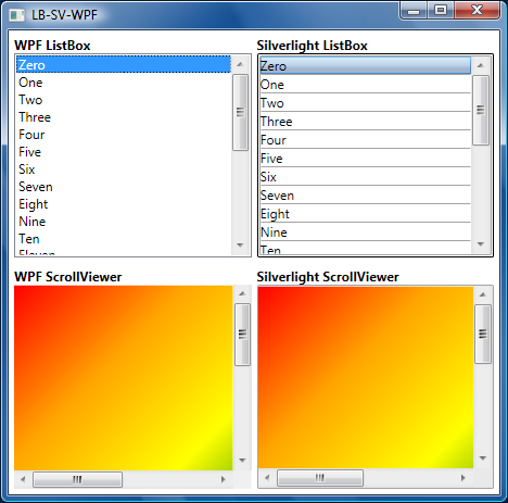
My contribution to the Silverlight 2 effort was to write the ListBox control along with its ever-present sidekick, ListBoxItem. Because I needed to support bi-directional scrolling in ListBox, I figured it would be good to add ScrollViewer and its buddy ScrollContentPresenter for consistency with WPF. For people who don't live and breathe API definitions, MSDN offers a ListBox Overview and ScrollViewer Overview that summarize the key points of both controls. (Note: These links are all to the documentation for the WPF controls. Because the Silverlight implementations are subset-compatible, they give a great idea how the Silverlight controls will work, too.) For folks who want a taste of actual Silverlight 2 hotness, I've included an image of these controls being used in very simple scenarios to the right of this text. For images of the Silverlight 2 ListBox (and therefore ScrollViewer) being used in a real-world scenario, have a look at Scott's Silverlight tutorial - particularly part 5 where he introduces the ListBox and shows off some of its coolness.

I've had a lot of fun working on these controls and am planning to blog more about them once the Silverlight 2 beta is publically available. I'm thinking of starting with an FAQ-like document that touches on some of the more interesting implementation details and gives example code for some common scenarios. After that, I'm going to post a few simple applications to demonstrate more complex scenarios. And after that... we'll see how things play out!

Silverlight 2 looks like it will really improve the web experience for everyone - it'll be great to see what customers think once they get their hands on it!

PS - I'll be attending MIX08 next week and would be happy to chat about any of this in person. So if you're going to be in the Las Vegas area and want to get together, send me a note and we'll try to set something up!

Getting the Toolkit working with the VS 2008 web site designer [AJAX Control Toolkit 11119 release update!]

Since last week's release of the 11119 version of the AJAX Control Toolkit, some people have reported problems using the .NET 3.5 flavor of the Toolkit with the Visual Studio 2008 web designer. Our team has just updated the 3.5 ZIPs (AjaxControlToolkit-Framework3.5.zip and AjaxControlToolkit-Framework3.5-NoSource.zip) available from the 11119 release page to address the issue. Whereas the old assembly had version number 3.5.11119.*, the new assembly has version number 3.0.11119.*. This is the only change to the Toolkit and only the 3.5 version has been updated.

If you have already downloaded the 3.5 flavor of the Toolkit, please remove the Toolkit from your Toolbox (if present), download the new 3.5 ZIPs, extract the new files over top of the existing ones, and designer support should work as expected. We apologize for any inconvenience this may have caused.

A big day for development tools [AJAX Control Toolkit release!]

A short while ago we published the 11119 release of the AJAX Control Toolkit to coincide with today's release of .NET 3.5 and Visual Studio 2008! As usual, we have published "source" and "no-source" versions for .NET 2.0/Visual Studio 2005 and .NET 3.5/Visual Studio 2008.

The content of the 11119 release is largely the same as our previous 10920 release, with most changes being minor tweaks to the .NET 3.5 flavor of the Toolkit:

  • All web.config files were updated to match the shipping configuration of ASP.NET/AJAX 3.5.
  • The AssemblyVersion/AssemblyFileVersion of the .NET 3.5 version of AjaxControlToolkit.dll was changed from 1.0.x.y to 3.5.x.y to more clearly identify its association with .NET 3.5 (the .NET 1.0 version of the assembly remains as 1.0.x.y).
  • All of the new code analysis warnings resulting from improvements to the VS 2008 code analysis feature were addressed.
  • The "Add Page Method" design-time feature was re-enabled because the blocking issue in VS 2008 Beta 2 was been fixed.
  • A design-time workaround for XML namespace alterations to a control's inner property content was removed because the problematic VS 2008 Beta 2 behavior was addressed.
The following changes were common to both the .NET 1.0 and .NET 3.5 flavors of the Toolkit:
  • A minor documentation correction was made to the ModalPopup sample page's descriptions of the OkCancel* properties.
  • A fix was made to AutoComplete to better support the use of purely numeric values.

As always, it's easy to sample any of the controls (no install required). You can also browse the project web site, download the latest Toolkit, and start creating your own controls and/or contributing to the project!

If you have any feedback, please share it with us on the support forum!

Bigger isn't always better [How to: Resize images without reloading them with WPF]

I've been doing some work with Windows Presentation Foundation lately and came across a scenario where an application needed to load a user-specified image and display it at a fairly small size for the entire life of the application. Now, WPF makes working with images easy and I could have simply used the Image class's automatic image scaling and moved on. But it seemed wasteful for the application to keep the entire (arbitrarily large!) image in memory forever when it was only ever going to be displayed at a significantly reduced size...

What I really wanted was a way to shrink the source image down to the intended display size so the application wouldn't consume a lot of memory storing pixels that would never be seen. The WPF documentation notes that the most efficient way to load an image at reduced size is to set Image's DecodePixelWidth/DecodePixelHeight properties prior to loading it so WPF can decode the original image to the desired dimensions as part of the load process. However, the comments in one of the overview's samples explain why this isn't suitable for the aforementioned scenario:

// To save significant application memory, set the DecodePixelWidth or
// DecodePixelHeight of the BitmapImage value of the image source to the desired
// height or width of the rendered image. If you don't do this, the application will
// cache the image as though it were rendered as its normal size rather then just
// the size that is displayed.
// Note: In order to preserve aspect ratio, set DecodePixelWidth or
// DecodePixelHeight but not both.

Basically, the problem with this approach occurs when an application doesn't know the aspect ratio of the image before loading it: the application doesn't know whether to set DecodePixelWidth or DecodePixelHeight to constrain the larger dimension. If the application picks the right one (width vs. height), then the image will be properly resized to fit within the bounds of the application - but if it picks the wrong one, then the image will be resized some but will still be unnecessarily large (though less unnecessarily large than before!). While the application could arbitrarily pick one dimension to constrain, load the image, check if it guessed correctly, and reload the image with the other constraint when necessary, I was looking for something a little more deterministic. After all, sometimes you get only one chance to load an image - or someone else loads it for you - or the cost of loading it a second time is prohibitive, so it's nice to have a way to dynamically resize an already-loaded image.

After a search of the documentation didn't turn up anything promising, I wrote a small helper function using the handy RenderTargetBitmap class to generate a new, properly sized image based on the original. The code for that method ended up being fairly simple:

/// <summary>
///
Creates a new ImageSource with the specified width/height
/// </summary>
///
<param name="source">Source image to resize</param>
///
<param name="width">Width of resized image</param>
///
<param name="height">Height of resized image</param>
///
<returns>Resized image</returns>
ImageSource CreateResizedImage(ImageSource source, int width, int height)
{
  
// Target Rect for the resize operation
  Rect rect = new Rect(0, 0, width, height);

  
// Create a DrawingVisual/Context to render with
  DrawingVisual drawingVisual = new DrawingVisual();
  
using (DrawingContext drawingContext = drawingVisual.RenderOpen())
  {
    drawingContext.DrawImage(source, rect);
  }

  
// Use RenderTargetBitmap to resize the original image
  RenderTargetBitmap resizedImage = new RenderTargetBitmap(
      (
int)rect.Width, (int)rect.Height,  // Resized dimensions
      96, 96,                             // Default DPI values
      PixelFormats.Default);              // Default pixel format
  resizedImage.Render(drawingVisual);

  
// Return the resized image
  return resizedImage;
}

[Note: If you want to see this code in action, you can download the complete source code for a sample application (including Visual Studio 2008 solution/project files) that's attached to this post (click the WpfResizeImageSample.zip link below).]

Basically, the CreateResizedImage method works by creating a new image of exactly the size specified and then drawing the original image onto the new, blank "canvas". WPF automatically scales the original image during the drawing operation, so the resulting image ends up being exactly the right (smaller) size. All that remains is for the calling application to do a bit of math on the original image's dimensions to determine how to scale it, pass that information along to CreateResizedImage to get back a properly sized image, and then discard the large original image. It's that easy.

WPF and XAML make it easy to author compelling user interfaces. But sometimes it's worth a little extra effort to optimize some aspect of the user experience. So if you're looking to trim the fat from some of your in-memory images, consider something like CreateResizedImage to help you out!

[WpfResizeImageSample.zip]

Tags: WPF

Something fun for the little ones [SilverlightKidsDoodler develops mouse skills!]

When I'm working on the computer and my toddler is around, she usually wants to "type" - which consists mostly of hitting all the keys to see the letters appear on the screen. A maximized Notepad window works pretty well for this purpose, though the occasional modal dialog (ex: open file, change font) gets in the way and requires parental assistance. I've tried using Paint to let her "draw" and develop basic mouse skills, but the Paint user interface is not great for young children. Paint's input elements are small and hard for a beginning mouser to click and there are lots more of them than a beginner really needs.

So I decided to use Silverlight to write a very simple Paint-like program for kids. SilverlightKidsDoodler looks like this (the artwork is mine; yes, I'm keeping my day job):

SilverlightKidsDoodler Demonstration Page

You can click here (or on the image above) to try SilverlightKidsDoodler in your own browser. As usual, I've made the complete source code available, so click here to download the source code and play around with it yourself! (To build the project, you'll want to use Visual Studio 2008 Beta 2 and the latest Silverlight Tools.)

Notes:

  • The user interface elements (the color palette and action buttons at the left of the frame) are flush with the edges of the screen (when zoomed) to make them easy for young hands to target. (Bruce Tognazzini has more on Fitts's Law here.)
  • The "Zoom" button switches to Silverlight's full-screen mode. Unlike the other input elements which respond to a single-click, the zoom button requires a double-click to avoid accidental triggering by children. I figure the parent will start SilverlightKidsDoodler, zoom it, and then let the child play around without needing to worry about clicks on the close button, start menu, etc..
  • If you're serious about keeping children from inadvertently messing up your computer, you probably want to consider something like Windows SteadyState which makes it easy to lock-down your computer and avoid questions like, "Sweetie, where did all of daddy's documents go?". :)
  • As my daughter grows older and becomes more proficient, I'm thinking of moving her to something like Edubuntu which comes with a variety of educational applications already installed.

SilverlightKidsDoodler is an extremely simple drawing program that's intended to help young children learn basic mousing skills while having fun doing something they already enjoy. Silverlight made the implementation easy, and hosting the application on the web means "installation" is trivial!

Bringing more HTML to Silverlight [HtmlTextBlock improvements]

I blogged about my HtmlTextBlock implementation for Silverlight a few days ago. In that post I described HtmlTextBlock as a "plug-compatible" replacement for TextBlock that knows how to take simple HTML (technically XHTML) and display it in a manner that fairly closely approximates how a web browser does. The responses I've gotten suggest HtmlTextBlock is somewhat popular, so I've spent a bit of time improving upon the original implementation. The HtmlTextBlock demonstration and source code linked to by my earlier post have been updated, so feel free to play along as you read the notes:

HtmlTextBlock Demonstration Page

Notes:

  • I loved the simplicity of using an XmlReader to parse the input to HtmlTextBlock, but I worried that the prevalence of non-XHTML would limit the usefulness of HtmlTextBlock. For example, the following invalid XHTML would fail to parse correctly: foo<b>bar</i>baz. During an informal discussion, Ted Glaza suggested using the browser's Document Object Modelto do the parsing of invalid XHTML - great idea! :)
    • So now when its Text property is set, HtmlTextBlock first treats the input as valid XHTML and tries to parse it with XmlReader. This is the most efficient code path and should be successful for any valid XHTML input.
    • However, if the input can't be parsed in that manner, HtmlTextBlock uses the objects in Silverlight's System.Windows.Browser namespace to dynamically insert the provided text into the host browser's DOM, run some JavaScript code to transform the input into valid XHTML, then extract and parse the transformed text with XmlReader as before.
    • Two techniques are tried:
      • The first method works in browsers that return XHTML for an element's innerHTML property even if the contents of the element are not valid XHTML (ex: Firefox) and simply inserts and retrieves XHTML from the innerHTML property.
      • The second method works in browsers that return the contents of an element as-is (ex: Internet Explorer (though it works fine in Firefox, too)) by walking the node's .firstChild/.nextSibling/.nodeName tree and manually building up the corresponding XHTML as the nodes of the tree are visited. The results of this method appear ideal in most scenarios, though it's possible to come up with edge cases where its output is slightly different from that of the browser itself (Internet Explorer): foo<b><i>bar</b>baz.
    • Strangely, BOTH browsers prefer <br> to <br/>, going as far as transforming the latter into the former despite the fact that doing so creates invalid XHTML!
    • If all parsing attempts fail, the supplied text is used as-is with no formatting applied.
    Unfortunately, there's a catch... Depending on the content of the text, adding it to the DOM could insert untrusted HTML into the host browser's page. A malicious user with control of the text could use the following approach to run their own JavaScript code in the context of the user's browser (Firefox only): </div><script>alert('Script code running!');</script>. As such, the new DOM parsing behavior is disabled by default and can be enabled by setting the UseDomAsParser property of HtmlTextBlock for scenarios when the input text is known to be safe.
  • A kind reader informed me that an HtmlTextBlock created in code (vs. in XAML as my sample demonstrated) did not seem to do text wrapping properly. The problem was caused by the difference in when the Control.Loaded event fires in the two scenarios. The fix is a simple change to HandleLoaded that skips sizing the contained TextBlock if the HtmlTextBlock hasn't been sized itself. Additionally, the sample code now demonstrates how to create a HtmlTextBlock in code - just #define CREATE_IN_CODE to see how.
  • Because HtmlTextBlock used bool variables to track the bold/italic/underline states, nesting a style caused that style to be prematurely removed. Specifically, the following scenario would not display properly: normal <b>bold <b>also bold</b> still bold</b> normal. HtmlTextBlock now handles nesting properly by using int variables.
  • I mentioned last time that making HtmlTextBlock adhere to all the individual browser quirks would be a daunting task. For fun, here's a simple input to demonstrate the point: <p>hello world</p>. Firefox (and HtmlTextBlock) leaves some space above the text because of the <p> element; Internet Explorer does not. :)

In its introductory post, I said that HtmlTextBlock is obviously nothing like a complete HTML rendering engine - and that statement remains true today. However, by taking advantage of the host browser's DOM to transform invalid XHTML input, HtmlTextBlock is much more flexible than it used to be. That - and a few fixes - makes it an even more compelling option for rich text display in Silverlight!