Chart tweaking made easy [How to: Make four simple color/ToolTip changes with Silverlight/WPF Charting]
While answering a support forum question I'd seen a couple of times before, I figured it would be helpful to write a post showing how to make simple styling changes to charts created by the Charting controls that come with the Silverlight Toolkit. Note that I said simple changes - if you want to make more dramatic changes, you should go read some of the excellent tutorials Pete Brown has written on the topic. Links to Pete's posts (and other interesting posts) can be found on my latest Charting links post.
The sample application we'll be working with here shows off four scenarios and looks like this:
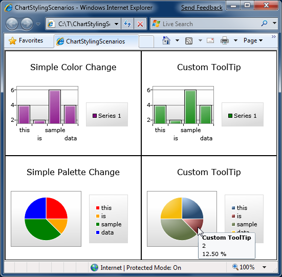
Simple Color Change
In this scenario we have a basic Chart with a ColumnSeries and want to change the color to purple. As you'd expect, this is quite easy to do: we provide a custom Style that sets the Background color to purple and we're done!
It's worth pointing out that we could add more Setters to this Style to customize things further - but I promised I'd keep this simple, so we won't do that right now. :)
<charting:Chart
    Title="Simple Color Change">
    <charting:ColumnSeries
        ItemsSource="{Binding}"
        DependentValueBinding="{Binding Length}"
        IndependentValueBinding="{Binding}">
        <charting:ColumnSeries.DataPointStyle>
            <Style TargetType="charting:ColumnDataPoint">
                <Setter Property="Background" Value="Purple"/>
            </Style>
        </charting:ColumnSeries.DataPointStyle>
    </charting:ColumnSeries>
</charting:Chart>
Custom ToolTip (Column)
For this example, the setup is the same as last time except that now we want to change the default ToolTip that appears when the user hovers over any of the columns. As with just about every other visual default, the standard ToolTip is part of the ColumnDataPoint's default Template. So in order to customize it we start with a copy of that Template and modify it to suit our needs. Blend makes this easy, but I'm most comfortable in Visual Studio, so what we'll do here is go to the source code for ColumnDataPoint.xaml and copy the Style there to the Application.Resources section of our App.xaml.
Aside: You can also use my handy-dandy SilverlightDefaultStyleBrowser for this. What's more, SilverlightDefaultStyleBrowser works even when you don't have access to source code for the control you're styling, so it's something to keep in mind for those occasions when Blend isn't readily available. :)
Copying done, we can tweak the ToolTip to include a custom message as follows:
<ToolTipService.ToolTip>
    <StackPanel>
        <ContentControl
            Content="Custom ToolTip"
            FontWeight="Bold"/>
        <ContentControl
            Content="{TemplateBinding FormattedDependentValue}"/>
    </StackPanel>
</ToolTipService.ToolTip>
After that, and it's simply a matter of assigning our customized Style/Template to the DataPointStyle property of the ColumnSeries:
<charting:Chart
    Title="Custom ToolTip">
    <charting:ColumnSeries
        ItemsSource="{Binding}"
        DependentValueBinding="{Binding Length}"
        IndependentValueBinding="{Binding}"
        DataPointStyle="{StaticResource MyColumnDataPointStyle}"/>
</charting:Chart>
Simple Palette Change
What we've done so far will work for all of the current series except for PieSeries which is special because each of its PieDataPoints gets a unique Style. In other words, there's no DataPointStyle property on PieSeries because one value just isn't enough! Therefore, PieSeries exposes a StylePalette property just like Chart does and we can use that to provide a collection of Styles for the pie slices. (Note that we can provide as many or as few as we want; PieSeries will start at the beginning and automatically loop through the collection as necessary.)
In this case, we know our data has exactly four items, so we'll provide exactly four custom Styles to set the colors we want. Other than using a list this time around, it's just like the first example we saw:
<charting:Chart
    Title="Simple Palette Change">
    <charting:PieSeries
        ItemsSource="{Binding}"
        DependentValueBinding="{Binding Length}"
        IndependentValueBinding="{Binding}">
        <charting:PieSeries.StylePalette>
            <datavis:StylePalette>
                <Style TargetType="charting:PieDataPoint">
                    <Setter Property="Background" Value="Red"/>
                </Style>
                <Style TargetType="charting:PieDataPoint">
                    <Setter Property="Background" Value="Orange"/>
                </Style>
                <Style TargetType="charting:PieDataPoint">
                    <Setter Property="Background" Value="Green"/>
                </Style>
                <Style TargetType="charting:PieDataPoint">
                    <Setter Property="Background" Value="Blue"/>
                </Style>
            </datavis:StylePalette>
        </charting:PieSeries.StylePalette>
    </charting:PieSeries>
</charting:Chart>
Custom ToolTip (Pie)
Finally, let's customize the ToolTip for the slices of a PieSeries. Like before, we'll start by copying the default Style/Template from the source code for PieDataPoint.xaml and then customize the ToolTip found within:
<ToolTipService.ToolTip>
    <StackPanel>
        <ContentControl
            Content="Custom ToolTip"
            FontWeight="Bold"/>
        <ContentControl
            Content="{TemplateBinding FormattedDependentValue}"/>
        <ContentControl
            Content="{TemplateBinding FormattedRatio}"/>
    </StackPanel>
</ToolTipService.ToolTip>
Because we want our PieSeries to use all the same colors as the default, the next step is to copy the default StylePalette from the code for Chart.xaml and add a single Setter for the Template property of each of the Styles within. All of which point to the one Template we just customized, so if we make any changes in the future there's exactly one place we need to touch and our changes automatically shows up everywhere they should:
<datavis:StylePalette
    x:Key="MyStylePalette">
    <!--Blue-->
    <Style TargetType="Control">
        <Setter Property="Template"
                Value="{StaticResource MyPieDataPointTemplate}"/>
        <Setter Property="Background">
            <Setter.Value>
                ...
            </Setter.Value>
        </Setter>
    </Style>
    <!--Red-->
    <Style TargetType="Control">
        <Setter Property="Template"
                Value="{StaticResource MyPieDataPointTemplate}"/>
        <Setter Property="Background">
            <Setter.Value>
                ...
            </Setter.Value>
        </Setter>
    </Style>
    ...
With that out of the way, all that remains is to use our customized StylePalette by assigning it to the StylePalette property of PieSeries:
<charting:Chart
    Title="Custom ToolTip">
    <charting:PieSeries
        ItemsSource="{Binding}"
        DependentValueBinding="{Binding Length}"
        IndependentValueBinding="{Binding}"
        StylePalette="{StaticResource MyStylePalette}">
    </charting:PieSeries>
</charting:Chart>
Done!
If you've gotten this far, I hope that you've gained at least a somewhat better understanding of how to perform some basic style changes to the Toolkit's Charting controls. We've really only scratched the surface, though, so I encourage interested readers to have a look at some of the other charting links for more details, ideas, and inspiration!
[Please click here to download the source code for the sample application.]