The blog of dlaa.me

Posts from October 2008

Click your way to great Silverlight charts [Live ChartBuilder sample and source code!]

Yesterday in my Introduction to Charting with the Silverlight Toolkit post, I included a teaser for my ChartBuilder application. The tease ends today, because I've just posted a live ChartBuilder for everyone to play with and am also making the source code available for download.

What is ChartBuilder?

In addition to driving the Silverlight Charting effort and being one of the primary developers, I was also the entire test team for Charting. (I told you we were resource constrained.) I decided pretty quickly that I needed to do what I could to make it easy for anyone to exercise the Charting implementation, find bugs, and report them. Additionally, I wanted an easy way for the developers to exercise what they'd written in strange and unusual ways. My task was somewhat complicated by the fact that Charting supports fully dynamic data sources - static XAML Charts simply aren't enough to cover all the scenarios we care about.

I tried to capture a hint of this dynamic behavior in the samples project (I wrote all the samples, too - except for the two fantastic Scenarios which were contributed by Ted Glaza (Custom Series) and Ruurd Boeke (Series Zoom)). But the sample project isn't the most debugging-friendly environment because of all the different Chart instances it loads. Last - but certainly not least - I knew there would be a lot of customers looking at Charting with very little idea how our API and object model work.

I had a vision for an interactive chart-building application that would expose the most common Charting concepts with some simple UI, show how those settings combined to create a chart, AND show the corresponding XAML code to build that chart. What's more, I wanted changes to the chart's settings to be made in real-time to the running instance of the chart so that users could see how the dynamic data support actually works. (And so developers could fix it when it didn't!) And because it was so easy, I enabled a live XAML editing experience (think XAMLPad) for folks who demand absolute control over their charts. :)

What does it look like? How do I play with it?

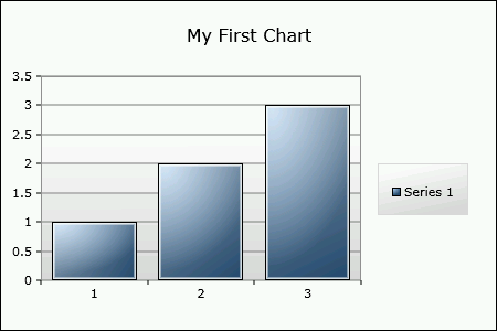
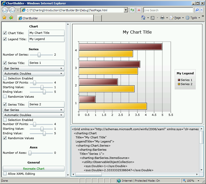
Below is a static image of ChartBuilder as it existed yesterday to give an idea of what I'm talking about.

Better yet, you can click this text or the image below to run the latest ChartBuilder in your browser!

ChartBuilder

[Click here to download the complete ChartBuilder source code.]

The left side of the application is where you go to customize your chart, the upper-right side of the application shows the current chart, and the lower-right side shows the complete XAML for that chart (wrapped in a Grid to keep the XAML clean).

Changes you make to the settings are automatically applied to the running instance of the chart as well as the XAML for that chart - so if you're curious how the API and object model look, just set things up how you want them and look at the XAML! As a convenience, the XAML area supports copying to the clipboard (use Ctrl+C or whatever your platform's standard "copy" keystroke is). That means you can build a chart you like and then paste the XAML right into your own source code to help get started.

If you ever do something that's not allowed - or hit a bug - and an exception is thrown, the complete exception details will appear in a red text box over the chart - which can also be copied to the clipboard. ChartBuilder will let you continue to change the settings and keep going after an exception, but please bear in mind that some exceptions may leave the chart with inconsistent internal state. At any time you can hit the green "Recreate Chart" button to completely recreate the chart instance from the current settings and get everything back in sync.

Anything else I should know?

  • ChartBuilder is a dual-edged sword: the same power that lets you explore strange and creative new scenarios also lets you do things that are not supported. We've tried to throw informative exceptions whenever we detect something unusual, so please read the exception message for details about what went wrong.
  • Of course, if an exception message makes no sense, or a broken scenario seems like it should be supported, or things just seem to be flat-out wrong, please post a question in the Silverlight Controls forum or report a bug with the Silverlight Toolkit Issue Tracker. When reporting issues, please include as much detail as possible; ChartBuilder makes that easy by letting you copy the entire exception text. What's more, if you can reproduce the problem reliably, then you can report it by giving us a simple list of steps to follow in ChartBuilder! Problems that are demonstrated by ChartBuilder scenarios are usually a pleasure to debug because it's so easy to tell what's going on and so easy to isolate the problematic behavior. [Well, most of the time! :) ]
  • One thing I did not do with ChartBuilder is spend a lot of time designing or implementing a comprehensive architecture for the application. More often than not, the little bits of time I found for adding features were spent in a frenzy of coding with me trying to enable new testing scenario as quickly as possible. When forced to choose between refactoring and getting a new feature implemented, the new feature always won. I've made a quick pass over the code since PDC and it's not as bad as I feared - but I guarantee it won't be winning any beauty contests. :)
  • Because ChartBuilder was written to validate the functionality of Charting, it would be ideal if ChartBuilder itself were bug-free. While I've done what I can to try to make that so, I'm sure a few things have slipped by here and there - in no small part because of the hurried conditions under which I added features to ChartBuilder. If you see a strange behavior and don't think it's a bug in Charting, please let me know because it may be ChartBuilder that's at fault!

Are there any good usability tricks worth sharing?

  • Not all series types support all axis combinations. Specifically, it's not possible to put a column series and a bar series in the same chart because they put their independent/dependent axes in different places. Similarly, column and line don't go together because column only supports a category-based independent axis while line only supports a value-based (numeric or date) independent axis. Here's a quick cheat-sheet:
    Series Independent axis Works with
    Column Category Column, Pie
    Bar Vertical Category Bar, Pie
    Pie N/A Everything
    Line Number/Date Line, Scatter, Pie
    Scatter Number/Date Line, Scatter, Pie
  • The text input boxes validate their contents and update the chart state after every key press. This can make it tricky to make certain changes because the intermediate states are invalid. If you run into this situation, there are two tricks to try. First, see if you can select part of the text field and then type over it (ex: "10/28/2008" can be change to "10/29/2008" in one step by selecting the '8' and typing a '9'). If that doesn't help, another option is to open a Notepad window, type what you want there, copy it to the clipboard, select the entire text box in ChartBuilder and paste over it with the intended value.
  • The "Number of Axes" slider is disabled whenever there are one or more series present. This is because as soon as a series is rendered, it automatically creates whatever axes it needs to display itself - so if the user tried to add another axis, there would be multiple horizontal/vertical axes. At this time, Charting supports only a single horizontal and a single vertical axis - though please note that this restriction will be removed in an upcoming release to support multiple horizontal and vertical axes on the same chart. So if you want to customize the axes for your chart, first remove all the series, then add the axes you want, then add the series back - assuming the axis configuration that's set is supported by the series that are added, they will automatically use the provided axes and you will be able to customize them dynamically.
  • When "Allow XAML Editing" is checked, the XAML is completely re-parsed and the chart re-created after every keystroke. Similarly, when unchecking that option, the state stored in the input controls on the left is re-applied and the text in the XAML editing box is lost. Basically, once the option to edit XAML is enabled, ChartBuilder has no idea what the user has done and no way of mapping that back to the subset of changes it supports. So feel free to experiment with XAML mode (it's great for stuff like adding a colored background or extra data), but know that you're completely on your own when you do so.
  • ChartBuilder makes use of two classes it exposes via the "utility" XML namespace: ObservableObjectCollection and Pair. ObservableObjectCollection is simply an ObservableCollection<object> and Pair is just an object that exposes two properties "First" and "Second" of type object. These are purely convenience classes that make the XAML easy to deal with; you're welcome to make use of them in your own application if you care to.
  • ChartBuilder does its best to capture all exceptions that occur and display them in its user interface. This is quite handy when running outside of Visual Studio, but in order for it to have a chance to work when running under a debugger, be sure to configure the debugger to ignore handled exceptions (or just hit F5 when one occurs to allow ChartBuilder to catch and handle the exception).

What are examples of some issues I might encounter?

  • Removing and re-adding a series over and over gives that series a different color each time. This is an artifact of how the Chart.StylePalette collection works: each time a new style is needed, it is fetched from the palette and the "next style" index incremented. So as long as the same chart instance is being used, recreating a series over and over gradually cycles through all the different colors of the default style palette. As soon as a new chart instance is created, the style palette is reset and the colors start from the beginning. In other words, the "random" behavior is completely deterministic and will always be the same for a particular application. If you want to guarantee that a particular series will always have the same color no matter what, there is a DataPointStyle property on Column/Bar/Line/ScatterSeries and a dedicated StylePalette property on PieSeries that can be set in code (but is not exposed by ChartBuilder at this time).
  • Removing the Chart (or Legend) Title does not automatically recover the space used by the text of that control (until something like a resize causes another layout pass). This is actually a Silverlight bug with ContentControl (which is what Title is) and can be reproduced outside Charting by placing a ContentControl in a StackPanel between two other elements and setting its Content property to null. This bug has been reported to the Silverlight team and should be fixed in a future release.
  • The default appearance of the line and scatter charts in "Automatic Doubles" mode is always a straight line (with a slope of 1) and the points just slide along it. "Manual Pairs" mode is the only mode that really makes sense for line and scatter because they need numeric independent values - but just so that "Automatic Doubles" and "Manual Doubles" modes show something, ChartBuilder automatically sets their IndependentValueBinding to "{Binding}". This provides an independent value, but it's always the same as the dependent value and so the points always lie on the same line. To really exercise line and scatter, switch to "Manual Pairs" mode, click the "All Doubles" button for both columns, enable a couple of points, and then have fun changing values.
  • Adding a point to the middle of the collection for line, bar, and pie charts adds that point to the end of the visual series. ChartBuilder's "Manual Doubles" and "Manual Pairs" modes allow you to individually enable and disable points - and specifically to "insert" points at the beginning, middle, or end of the collection. This is what ChartBuilder does internally (verify by looking at the XAML or clicking "Recreate Chart"), but the aforementioned series add that point to the end of their internal collections, so the new point always shows up after the existing points. This is a known issue to be addressed in a future release of Charting; it can be worked around for now by clicking "Recreate Chart".
  • Multiple occurrences of the same data point instance in the collection can get their visual representations mixed up. This can be seen by starting from the default ChartBuilder configuration, then increasing the "Starting Value" twice (from 1 to 3) - the columns of the resulting chart should increase in height from left to right, but do not. What happens is that the collection goes from [2, 3, ...] to [3, 3.6, ...] when the starting value goes from 2 to 3. As soon as the first value of the collection changes from 2 to 3, there are two instances of the value 3 in the collection: [3, 3, ...]. When the second value changes from 3 to 3.6, the chart incorrectly updates the column corresponding to the first point. This is unfortunate behavior, but is actually also present in the WPF and Silverlight ListBox implementations (though it manifests itself differently there). The basic problem is that the chart tracks things by object identity and the presence of the same object multiple times creates ambiguity for the tracking code. The good news is that this problem is only really an issue when the data set contains raw doubles or integers - the far more common scenario (in practice) of using unique business objects is unaffected by this because each business object is a unique instance. To verify this, switch to "Manual Pairs" mode for the column series, enable three points, set all their values to 1, then change any of them to a different value and observe that the correct column is always updated.
  • Changing the independent value of a pie series data point (in "Manual Pairs" mode) does not automatically update the label for that data point in the legend. This is a known issue to be addressed in a future release of Charting; it can be worked around for now by clicking "Recreate Chart".
  • There are certain circumstances under which toggling "Show GridLines" and "Should Include Zero" for a custom axis cause the axis to disappear (and the chart not to render). This is a known issue to be addressed in a future release of Charting; it can be worked around for now by clicking "Recreate Chart".

Any last words?

I wrote ChartBuilder to help you learn about Charting as much as to help us develop Charting. If it provides everyone with a common language that helps make it easy to talk about Charting features, suggestions, and issues, I'll be delighted!

And now... Enjoy! :)

Announcing a free, open source Charting solution for Silverlight [Silverlight Toolkit released today at PDC!]

Today at the Microsoft Professional Developers Conference, we announced the immediate availability of the Silverlight Toolkit. The Silverlight Toolkit is a collection of controls for Silverlight that add new functionality and enable new scenarios. There are some great controls in the Toolkit: WPF favorites (ex: DockPanel, WrapPanel, TreeView), cool new things (ex: AutoCompleteBox, NumericUpDown), and some that are a little of both (ex: ImplicitStyleManager). All of these controls are worth looking at and blogging about - but that's not what I'm going to do. :)

Instead, I'd like to direct your attention to the Microsoft.Windows.Controls.DataVisualization.dll assembly which contains a set of completely new classes that enable Silverlight developers to easily create professional-looking column, bar, pie, line, and scatter charts that follow the same XAML developer/designer metaphor as the rest of the Silverlight platform. We've tried to make Silverlight Charting as easy as possible to use - while also enabling some very powerful scenarios like automatic support for dynamic changes to a bound data collection as well as a powerful extensibility model that allows people to write their own custom chart types with minimal difficulty.

Here's all it takes to create a simple column chart in XAML (note that there's no code required):

<charting:Chart Title="My First Chart">
    <charting:Chart.Series>
        <charting:ColumnSeries>
            <charting:ColumnSeries.ItemsSource>
                <controls:ObjectCollection>
                    <sys:Double>1</sys:Double>
                    <sys:Double>2</sys:Double>
                    <sys:Double>3</sys:Double>
                </controls:ObjectCollection>
            </charting:ColumnSeries.ItemsSource>
        </charting:ColumnSeries>
    </charting:Chart.Series>
</charting:Chart>
Sample Chart

Looking at the structure of that XAML, we start with a Chart control and set its Title. Then we add an instance of the ColumnSeries class to the Chart's Series collection and provide a simple collection of doubles as the ItemsSource of the series (think ItemsControl.ItemsSource). Silverlight Charting does all the rest and renders the chart you see above.

Being able to display static XAML-only data like this is great for learning and experimenting, but more advanced scenarios will usually be working with pre-existing business objects. So let's create a pie chart to display some fictitious statistics about a project's source code. Here's the business object we'll be working with:

public class CodeElement : INotifyPropertyChanged
{
    public string Name { get; set; }

    public int Lines
    {
        get { return _lines; }
        set
        {
            _lines = value;
            var handler = PropertyChanged;
            if (null != handler)
            {
                handler.Invoke(this, new PropertyChangedEventArgs("Lines"));
            }
        }
    }
    private int _lines;

    public event PropertyChangedEventHandler PropertyChanged;
}

And here's a collection of them that we'll use as the source of the data for the chart:

public class CodeElementCollection : ObservableCollection<CodeElement>
{
    public CodeElementCollection()
    {
        Add(new CodeElement { Name = "Code", Lines = 400 });
        Add(new CodeElement { Name = "Comments", Lines = 200 });
        Add(new CodeElement { Name = "Whitespace", Lines = 100 });
    }
}

All we need to do is create a CodeElementCollection (I'll put it in the Resources section for ease of access) and use it with our chart:

<charting:Chart Title="Source Code Statistics">
    <charting:Chart.Series>
        <charting:PieSeries
            ItemsSource="{StaticResource CodeElementCollection}"
            DependentValueBinding="{Binding Lines}"
            IndependentValueBinding="{Binding Name}"/>
    </charting:Chart.Series>
</charting:Chart>
Sample Chart

This time the ItemsSource property is being set to a collection of objects. (Note: We could have set the ItemsSource property in code instead.) Because these business objects have multiple properties, the series needs to know which of those properties correspond to the independent and dependent values. So we set the DependentValueBinding and IndependentValueBinding properties of PieSeries to Bindings that identify the relevant business object properties. The chart automatically extracts the data values, creates the properly-named legend items, and renders a pie chart. It's as easy as, uh, pie! :)

Now let's say someone adds a new XAML file to our imaginary project - we want our chart to automatically update itself to show the new code type. And because we've used an ObservableCollection for our collection, it will! In the sample project for this post (you can download it from the attachment link at the bottom of the post), there's a button to add a new CodeElement to the collection; the implementation looks like this:

private void AddXamlStatistics_Click(object sender, RoutedEventArgs e)
{
    _codeElementCollection.Add(new CodeElement { Name = "XAML", Lines = 100 });
}

Pressing that button gives us the following chart:

Sample Chart

You can't tell from the still images here, but the new pie slice displays with a very smooth animation that's typical of Charting's support for dynamic data.

My code for the click handler doesn't stop the user from hitting that button a bunch of times; doing so just for fun gives us the following chart which demonstrates how Charting's Legend control automatically scrolls to accommodate large lists and also demonstrates the complete palette of colors that Charting supports by default:

Sample Chart

Naturally, folks might want to customize the default palette - and it's easy to do so with the StylePalette property on Chart. Here, I've switched the palette to simple, monochromatic red, green, and blue:

<charting:Chart Title="Statistics (Custom Palette)">
    <charting:Chart.StylePalette>
        <datavis:StylePalette>
            <Style TargetType="Control">
                <Setter Property="Background" Value="Blue"/>
            </Style>
            <Style TargetType="Control">
                <Setter Property="Background" Value="Green"/>
            </Style>
            <Style TargetType="Control">
                <Setter Property="Background" Value="Red"/>
            </Style>
        </datavis:StylePalette>
    </charting:Chart.StylePalette>
    <charting:Chart.Series>
        <charting:PieSeries
            ItemsSource="{StaticResource CodeElementCollection}"
            DependentValueBinding="{Binding Lines}"
            IndependentValueBinding="{Binding Name}"/>
    </charting:Chart.Series>
</charting:Chart>
Sample Chart

A designer could, of course, make the custom Background brushes much nicer by adding a gradient, an overlay, etc.. The StylePalette is simply the place the Chart goes to get the next Style it needs when it's creating a new DataPoint instance (DataPoint = the visual representation of a column or pie slice) for a Series. The custom palette above uses TargetType="Control" to indicate that each Style is applicable to all the different data point types (ColumnDataPoint, PieDataPoint, etc.), but it's also possible to provide a specific TargetType to customize the data point types individually.

Getting back to the topic of dynamic data, suppose that instead of a new CodeElement instance being added to the collection, the value of one of the existing CodeElements changes as a result of an edit to an existing file of our imaginary project's source code. Again, we want our chart to automatically update - and because our CodeElement business object implements the INotifyPropertyChanged interface, it will! The sample project has a button to increase the number of comment lines by 50 each time it's clicked:

private void ChangeCommentStatistics_Click(object sender, RoutedEventArgs e)
{
    CodeElement commentCodeElement = _codeElementCollection.Where(element => element.Name == "Comments").First();
    commentCodeElement.Lines += 50;
}

After clicking this button a few times, the chart has smoothly animated itself to the following state (there's no XAML entry because I reloaded the sample before doing this):

Sample Chart

Note that in both of the dynamic data scenarios so far, the code that updates the business data doesn't ever need to know that a chart is actively presenting that data. All the code needs to concern itself with is changing the business objects - and the chart automatically handles the rest. It doesn't get much easier than that! :)

Of course, there's lots more to Charting than I've shown off here: drill-down support, reveal/hide animations, customizability, and more. And much of this can only be fully appreciated in a live demonstration - so please have a look at the live sample page for Charting for lots more examples. And remember that the complete source code to Charting, the samples page, and the automated tests is all freely available under the Microsoft Public License (Ms-PL). Believe me when I say we've tried to make it as easy as possible to get started with Charting!

And to make things even easier, I'll be posting the following application (with full source code) to my blog in a day or so. It's called ChartBuilder and is an interactive Charting sample/learning tool/test bed all rolled up in one happy bundle of joy. I hope you'll find it useful:

ChartBuilder

And that's Charting in a nutshell! I expect there will be lots more written about Charting in the coming weeks. Those of us on the Charting team have done our best to come up with an API and an implementation that everyone will love, but a big part of that process is YOU. We're eager to hear your feedback as you start playing around with Charting in your own projects. This release of Silverlight Charting is what's known as a "preview release", so nothing is set in stone and we're completely open to improvements anywhere. We'll do our best to minimize breaking changes, but if there are places where things are just plain broken, we'll do what we can to fix them! If you have any questions about Charting, you can ask them in the Silverlight Controls forum. If you think you've found a bug, please report it with the Issue Tracker in the Toolkit's CodePlex site.

Thank you for taking the time to learn about Silverlight Charting - it's my sincere hope that Charting helps Silverlight application developers deliver even more compelling applications with simplicity and ease!


Aside: The development of Silverlight Charting has been a very interesting experience to be a part of. Throughout the entire process, we've been *extremely* resource-constrained (you wouldn't believe me if I told you), but when all is said and done, I'm really pleased with what we've accomplished!

Further aside: I began leading the Charting effort a few months ago when my manager asked me to "think about developing a Charting story for Silverlight". I soon partnered with a few people on the SQL Data Visualization team and began working on the foundations of what you see today. We spent a lot of time trying to design a good, easy to use API for Charting that also made sense in the Silverlight world of templates, styling, etc.. (There are a lot of challenges here and I may blog more about these challenges in the future.) Near the end of August, Jafar Husain joined our team and the Charting effort. He's been responsible for large parts of the internal Charting infrastructure and there are examples of his influence throughout our final object model. He's going to be blogging about some of the internal details and decision-making process, so please subscribe to his blog if you want the gory details of how this stuff actually fits together.

[ChartingIntroduction.zip]

Roadblock in the way of migrating the proof-of-concept Silverlight XPS reader [SimpleSilverlightXpsViewer sample does not work on Silverlight 2 RTW]

Since the public release of Microsoft Silverlight 2, I've gotten a few internal and external requests to migrate my SimpleSilverlightXpsViewer sample application to the final Silverlight bits. (Background reading: Introductory Post for the Alpha, Beta 1 Update, Beta 2 Update, Interesting Scenario.) Unfortunately, there is a pretty significant roadblock preventing this and I'm afraid I don't have a good solution. :(

Specifically, the "BreakingChangesBetweenBeta2andRelease" document contains the following item:

Font URI is Restricted to Assembly Resource

Who Is Affected:
Silverlight 2 Beta1 or Beta 2 applications (not Silverlight 1.0 applications) that reference fonts (or zip of fonts) via the URI syntax in the Control.FontFamily, TextBlock.FontFamily or Glyphs.FontUri attributes and where the fonts are not embedded within the assembly (dll) of the control or application.
Fix Required:
You can specify a font (or in some cases a zip of fonts) in URI format via the Control.FontFamily, TextBlock.FontFamily and the Glyphs.FontUri attributes. If you are, you will need to ensure your font is marked as a "resource" in the project system.

This is problematic for SimpleSilverlightXpsViewer because it uses Glyphs.FontUri to associate the font for the on-screen text with the corresponding ODTTF font file in the XPS document - and it's impossible for a general-purpose document viewer to have all the fonts in the world compiled into its own assembly. Making matters worse, fonts in an XPS document are identified by GUID, so it doesn't even seem possible to embed the N most common fonts and try to cover the 90% scenario by looking at font names and using the best available match. The seemingly obvious alternative is to use the FontSource property instead - but that's not exposed by the Glyphs class. The only workable option I see is to embed a single font in the viewer's resources and use that ONE font for ALL fonts in every XPS file. Obviously, this puts a pretty big damper on the idea of displaying an arbitrary XPS document how it was meant to be displayed because all the font fidelity of the original document is lost.

In controlled scenarios, it should still be possible to bundle an XPS document and its fonts in a compiled assembly and point some suitably modified version of SimpleSilverlightXpsViewer at that - but by then it's no longer as much of a client-side XPS viewer as it is a client+server document viewing solution (that could use straight XAML when you get down to it!). Unfortunately, my original vision of a Silverlight-based XPS viewer that lets users open any arbitrary XPS file on their computer or on the web is going to have to wait a little while longer to be realized. :(

In case folks are wondering, I did ask why this restriction is present. As I understand things (caveat: I am not a lawyer or a spokesperson for Microsoft), some fonts have copyrights and/or licensing restrictions placed on them by their creator and some of those fonts should not be made available via HTTP (where everybody can access them freely). I may not be happy about the consequences of this for SimpleSilverlightXpsViewer, but I understand why this restriction makes sense.

So to make a long story short: I have not yet come up with a good way to migrate SimpleSilverlightXpsViewer to Silverlight 2 and I apologize to all the folks who have expressed interest in this sample. For what it's worth, if I ever come up with a solution I like, I'll immediately update SimpleSilverlightXpsViewer and post the details! :)

Silverlight 2 has released! [Congratulations to everyone involved!]

I'd like to congratulate the entire Silverlight team for achieving this significant milestone and for building such a remarkable offering for users, developers, and designers. I'm a big believer in the power of the WPF/Silverlight XAML+code programming model and think that bringing the power of that model to the web is very much the right thing for advancing the state of the art of interactive web applications.

I try not to post without contributing anything new, so I'll mention that I - along with a couple of other people - have been working feverishly for the past couple of months on something that will be unveiled at PDC later this month. We're still very much in a race to get as much done as possible, and I'm looking forward to the opportunity to share something exciting with the Silverlight community in a couple of weeks.

Again, my congratulations to the Silverlight team - thanks for all that you've done!

Just a little too eager with the clicking... [Updated binaries and source for MouseButtonClicker]

I described the idea behind my MouseButtonClicker utility in the introductory post for MouseButtonClicker. As you might expect, I've been using this tool ever since I released it a few weeks ago.

All was well - except that every so often I'd get an automatic click that shouldn't have happened. Not frequently enough to stop me from using MouseButtonClicker, but enough to be annoying. I assumed this was simply "jitter" (see the original post for background) beyond what the jitter-prevention code was already filtering out, but I didn't think so because I'd watched the input events and the 2-unit threshold really seemed like it should be large enough.

So one evening when I had a bit of time, I compiled an instrumented version of MouseButtonClicker, started it up, and went about my work. Sure enough, after a half-hour or so, I got an unexpected click! So I had a look at the debug output and found that the bogus click had occurred after a 1-unit jitter movement. But that was below the 2 unit threshold, so the jitter filter should have suppressed the click. To my dismay, it seemed my code had a bug...

And sure enough, once I knew what to look for, I spotted it right off. :) The jitter filter was working fine for the general case - but there was a special case that wasn't handled properly. Specifically, the jitter threshold is always reset when MouseButtonClicker clicks the mouse - because the mouse has stopped moving is likely to stay at rest for a while. However, if the user moved the mouse and clicked the mouse button manually, MouseButtonClicker would suppress its own click (correct behavior) but was neglecting to reset the jitter filter! This problem wasn't immediately obvious to the user because the observable behavior so far was 100% correct - it was only if the mouse was left alone for about 10 minutes and jittered again that the jitter threshold wouldn't do its job and a bogus click would be made.

So I fixed the bug, compiled version 1.01 of MouseButtonClicker, ran with the new bits for a few days to verify the problem was solved (it was!), and updated the public download:

Click here to download the MouseButtonClicker executables (32- and 64-bit) and the complete Visual Studio 2008 source code.

I'm sorry for any trouble this may have caused - I hope the new bits prove even more helpful than the last! :)