Announcing a free, open source Charting solution for Silverlight [Silverlight Toolkit released today at PDC!]
Today at the Microsoft Professional Developers Conference, we announced the immediate availability of the Silverlight Toolkit. The Silverlight Toolkit is a collection of controls for Silverlight that add new functionality and enable new scenarios. There are some great controls in the Toolkit: WPF favorites (ex: DockPanel, WrapPanel, TreeView), cool new things (ex: AutoCompleteBox, NumericUpDown), and some that are a little of both (ex: ImplicitStyleManager). All of these controls are worth looking at and blogging about - but that's not what I'm going to do. :)
Instead, I'd like to direct your attention to the Microsoft.Windows.Controls.DataVisualization.dll assembly which contains a set of completely new classes that enable Silverlight developers to easily create professional-looking column, bar, pie, line, and scatter charts that follow the same XAML developer/designer metaphor as the rest of the Silverlight platform. We've tried to make Silverlight Charting as easy as possible to use - while also enabling some very powerful scenarios like automatic support for dynamic changes to a bound data collection as well as a powerful extensibility model that allows people to write their own custom chart types with minimal difficulty.
Here's all it takes to create a simple column chart in XAML (note that there's no code required):
<charting:Chart Title="My First Chart">
    <charting:Chart.Series>
        <charting:ColumnSeries>
            <charting:ColumnSeries.ItemsSource>
                <controls:ObjectCollection>
                    <sys:Double>1</sys:Double>
                    <sys:Double>2</sys:Double>
                    <sys:Double>3</sys:Double>
                </controls:ObjectCollection>
            </charting:ColumnSeries.ItemsSource>
        </charting:ColumnSeries>
    </charting:Chart.Series>
</charting:Chart>
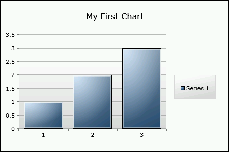
Looking at the structure of that XAML, we start with a Chart control and set its Title. Then we add an instance of the ColumnSeries class to the Chart's Series collection and provide a simple collection of doubles as the ItemsSource of the series (think ItemsControl.ItemsSource). Silverlight Charting does all the rest and renders the chart you see above.
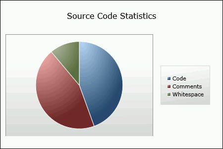
Being able to display static XAML-only data like this is great for learning and experimenting, but more advanced scenarios will usually be working with pre-existing business objects. So let's create a pie chart to display some fictitious statistics about a project's source code. Here's the business object we'll be working with:
public class CodeElement : INotifyPropertyChanged
{
    public string Name { get; set; }

    public int Lines
    {
        get { return _lines; }
        set
        {
            _lines = value;
            var handler = PropertyChanged;
            if (null != handler)
            {
                handler.Invoke(this, new PropertyChangedEventArgs("Lines"));
            }
        }
    }
    private int _lines;

    public event PropertyChangedEventHandler PropertyChanged;
}
And here's a collection of them that we'll use as the source of the data for the chart:
public class CodeElementCollection : ObservableCollection<CodeElement>
{
    public CodeElementCollection()
    {
        Add(new CodeElement { Name = "Code", Lines = 400 });
        Add(new CodeElement { Name = "Comments", Lines = 200 });
        Add(new CodeElement { Name = "Whitespace", Lines = 100 });
    }
}
All we need to do is create a CodeElementCollection (I'll put it in the Resources section for ease of access) and use it with our chart:
<charting:Chart Title="Source Code Statistics">
    <charting:Chart.Series>
        <charting:PieSeries
            ItemsSource="{StaticResource CodeElementCollection}"
            DependentValueBinding="{Binding Lines}"
            IndependentValueBinding="{Binding Name}"/>
    </charting:Chart.Series>
</charting:Chart>
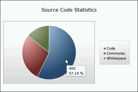
This time the ItemsSource property is being set to a collection of objects. (Note: We could have set the ItemsSource property in code instead.) Because these business objects have multiple properties, the series needs to know which of those properties correspond to the independent and dependent values. So we set the DependentValueBinding and IndependentValueBinding properties of PieSeries to Bindings that identify the relevant business object properties. The chart automatically extracts the data values, creates the properly-named legend items, and renders a pie chart. It's as easy as, uh, pie! :)
Now let's say someone adds a new XAML file to our imaginary project - we want our chart to automatically update itself to show the new code type. And because we've used an ObservableCollection for our collection, it will! In the sample project for this post (you can download it from the attachment link at the bottom of the post), there's a button to add a new CodeElement to the collection; the implementation looks like this:
private void AddXamlStatistics_Click(object sender, RoutedEventArgs e)
{
    _codeElementCollection.Add(new CodeElement { Name = "XAML", Lines = 100 });
}
Pressing that button gives us the following chart:
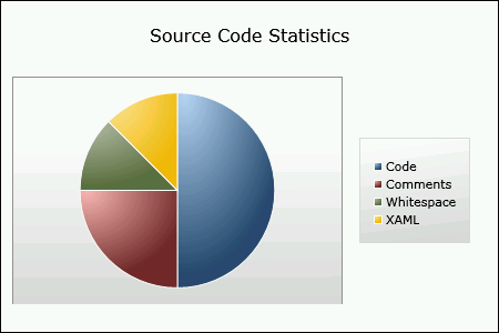
You can't tell from the still images here, but the new pie slice displays with a very smooth animation that's typical of Charting's support for dynamic data.
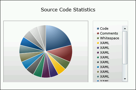
My code for the click handler doesn't stop the user from hitting that button a bunch of times; doing so just for fun gives us the following chart which demonstrates how Charting's Legend control automatically scrolls to accommodate large lists and also demonstrates the complete palette of colors that Charting supports by default:
Naturally, folks might want to customize the default palette - and it's easy to do so with the StylePalette property on Chart. Here, I've switched the palette to simple, monochromatic red, green, and blue:
<charting:Chart Title="Statistics (Custom Palette)">
    <charting:Chart.StylePalette>
        <datavis:StylePalette>
            <Style TargetType="Control">
                <Setter Property="Background" Value="Blue"/>
            </Style>
            <Style TargetType="Control">
                <Setter Property="Background" Value="Green"/>
            </Style>
            <Style TargetType="Control">
                <Setter Property="Background" Value="Red"/>
            </Style>
        </datavis:StylePalette>
    </charting:Chart.StylePalette>
    <charting:Chart.Series>
        <charting:PieSeries
            ItemsSource="{StaticResource CodeElementCollection}"
            DependentValueBinding="{Binding Lines}"
            IndependentValueBinding="{Binding Name}"/>
    </charting:Chart.Series>
</charting:Chart>
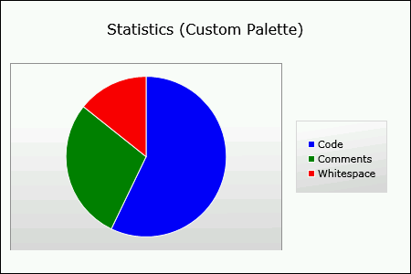
A designer could, of course, make the custom Background brushes much nicer by adding a gradient, an overlay, etc.. The StylePalette is simply the place the Chart goes to get the next Style it needs when it's creating a new DataPoint instance (DataPoint = the visual representation of a column or pie slice) for a Series. The custom palette above uses TargetType="Control" to indicate that each Style is applicable to all the different data point types (ColumnDataPoint, PieDataPoint, etc.), but it's also possible to provide a specific TargetType to customize the data point types individually.
Getting back to the topic of dynamic data, suppose that instead of a new CodeElement instance being added to the collection, the value of one of the existing CodeElements changes as a result of an edit to an existing file of our imaginary project's source code. Again, we want our chart to automatically update - and because our CodeElement business object implements the INotifyPropertyChanged interface, it will! The sample project has a button to increase the number of comment lines by 50 each time it's clicked:
private void ChangeCommentStatistics_Click(object sender, RoutedEventArgs e)
{
    CodeElement commentCodeElement = _codeElementCollection.Where(element => element.Name == "Comments").First();
    commentCodeElement.Lines += 50;
}
After clicking this button a few times, the chart has smoothly animated itself to the following state (there's no XAML entry because I reloaded the sample before doing this):
Note that in both of the dynamic data scenarios so far, the code that updates the business data doesn't ever need to know that a chart is actively presenting that data. All the code needs to concern itself with is changing the business objects - and the chart automatically handles the rest. It doesn't get much easier than that! :)
Of course, there's lots more to Charting than I've shown off here: drill-down support, reveal/hide animations, customizability, and more. And much of this can only be fully appreciated in a live demonstration - so please have a look at the live sample page for Charting for lots more examples. And remember that the complete source code to Charting, the samples page, and the automated tests is all freely available under the Microsoft Public License (Ms-PL). Believe me when I say we've tried to make it as easy as possible to get started with Charting!
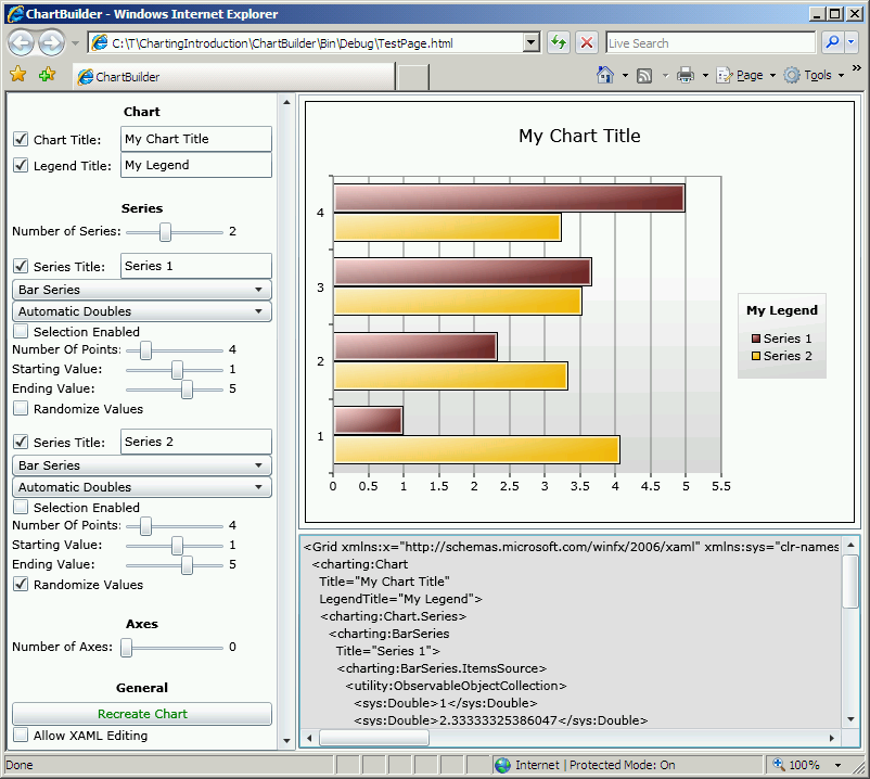
And to make things even easier, I'll be posting the following application (with full source code) to my blog in a day or so. It's called ChartBuilder and is an interactive Charting sample/learning tool/test bed all rolled up in one happy bundle of joy. I hope you'll find it useful:
And that's Charting in a nutshell! I expect there will be lots more written about Charting in the coming weeks. Those of us on the Charting team have done our best to come up with an API and an implementation that everyone will love, but a big part of that process is YOU. We're eager to hear your feedback as you start playing around with Charting in your own projects. This release of Silverlight Charting is what's known as a "preview release", so nothing is set in stone and we're completely open to improvements anywhere. We'll do our best to minimize breaking changes, but if there are places where things are just plain broken, we'll do what we can to fix them! If you have any questions about Charting, you can ask them in the Silverlight Controls forum. If you think you've found a bug, please report it with the Issue Tracker in the Toolkit's CodePlex site.
Thank you for taking the time to learn about Silverlight Charting - it's my sincere hope that Charting helps Silverlight application developers deliver even more compelling applications with simplicity and ease!
Aside: The development of Silverlight Charting has been a very interesting experience to be a part of. Throughout the entire process, we've been *extremely* resource-constrained (you wouldn't believe me if I told you), but when all is said and done, I'm really pleased with what we've accomplished!
Further aside: I began leading the Charting effort a few months ago when my manager asked me to "think about developing a Charting story for Silverlight". I soon partnered with a few people on the SQL Data Visualization team and began working on the foundations of what you see today. We spent a lot of time trying to design a good, easy to use API for Charting that also made sense in the Silverlight world of templates, styling, etc.. (There are a lot of challenges here and I may blog more about these challenges in the future.) Near the end of August, Jafar Husain joined our team and the Charting effort. He's been responsible for large parts of the internal Charting infrastructure and there are examples of his influence throughout our final object model. He's going to be blogging about some of the internal details and decision-making process, so please subscribe to his blog if you want the gory details of how this stuff actually fits together.