The blog of dlaa.me

Posts from September 2009

If it walks like a duck and talks like a duck, it must be a ... TreeGrid! [A simple, XAML-only TreeGrid UI for WPF]

If you've done much work with WPF or Silverlight, chances are you already know what a TreeView is and what a DataGrid is. You know that a TreeView is good for showing hierarchical data and a DataGrid is good for showing tabular data. But you may not know about their hybrid love child, the TreeGrid - and that's what this post is about.

Sometimes you've got data that's basically tabular in nature, yet also has a hierarchical aspect, and you'd like to leverage that to give people control over the level of detail they're seeing. Most commonly, you'll see a TreeGrid used when the tabular data can be nicely summarized (or "rolled up") into hierarchical groupings. For example, a list of people's name and address would not make a good TreeGrid, because there's no natural grouping that makes sense (you can't combine addresses). However, a list of people's company and salary might make a good TreeGrid because it's natural to group by job and the aggregated salary information could be informative (either as an average or as a sum).

Aside: You might wonder if DataGrid's native support for grouping would be useful here. In my experience, DataGrids don't tend to summarize the grouped data like we want - but if you have examples to the contrary, I'd love to see them.

So with all this talk about TreeGrid, you might expect to find one in the Silverlight or WPF framework, or perhaps as part of the Silverlight Toolkit or WPF Toolkit. But you won't - it's just not used frequently enough to have made it to the big leagues yet. The good news is that a bit of web searching will turn up some third-party TreeGrid options that definitely seem worth evaluating. But because I'm cheap and a show-off - and occasionally fall victim to a little NIH - I decided to craft a TreeGrid-like experience using only the WPF TreeView control, a couple of Grids, and some XAML.

That's right - no code, just XAML! :)


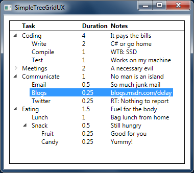
Here's how my SimpleTreeGridUX sample looks with some data I made up about the schedule of a fictional developer:

SimpleTreeGridUX sample

And here's the complete XAML:

<!-- TreeGrid "Control" -->
<Border BorderBrush="Black" BorderThickness="1">

    <!-- Resources -->
    <Border.Resources>
        <Style x:Key="TextBlockStyle" TargetType="{x:Type TextBlock}">
            <Setter Property="Margin" Value="3 0 3 0"/>
        </Style>
        <Style x:Key="TextBlockBoldStyle" TargetType="{x:Type TextBlock}" BasedOn="{StaticResource TextBlockStyle}">
            <Setter Property="FontWeight" Value="Bold"/>
        </Style>
    </Border.Resources>

    <!-- Content -->
    <Grid Grid.IsSharedSizeScope="True">
        <Grid.RowDefinitions>
            <RowDefinition Height="Auto"/>
            <RowDefinition/>
        </Grid.RowDefinitions>

        <!-- Column headers -->
        <TreeViewItem Grid.Row="0" BorderThickness="1">
            <TreeViewItem.Header>
                <Grid>
                    <Grid.ColumnDefinitions>
                        <ColumnDefinition SharedSizeGroup="Task"/>
                        <!-- Placeholders for two columns of ToggleButton -->
                        <ColumnDefinition SharedSizeGroup="Toggle"/>
                        <ColumnDefinition SharedSizeGroup="Toggle"/>
                        <ColumnDefinition SharedSizeGroup="Duration"/>
                        <ColumnDefinition SharedSizeGroup="Notes"/>
                    </Grid.ColumnDefinitions>
                    <TextBlock Grid.Column="0" Text="Task" Style="{StaticResource TextBlockBoldStyle}"/>
                    <!-- Empty TreeViewItem to measure the size of its ToggleButton into the "Toggle" group-->
                    <TreeViewItem Grid.Column="1" Padding="0"/>
                    <TextBlock Grid.Column="3" Text="Duration" Style="{StaticResource TextBlockBoldStyle}"/>
                    <TextBlock Grid.Column="4" Text="Notes" Style="{StaticResource TextBlockBoldStyle}"/>
                </Grid>
            </TreeViewItem.Header>
        </TreeViewItem>

        <!-- Data rows -->
        <TreeView Grid.Row="1" ItemsSource="{Binding SubItems}" BorderBrush="Gray" BorderThickness="0 1 0 0">
            <TreeView.ItemTemplate>

                <!-- Level 0 template leaves space for 2 child "Toggle" levels -->
                <HierarchicalDataTemplate ItemsSource="{Binding SubItems}">
                    <Grid>
                        <Grid.ColumnDefinitions>
                            <ColumnDefinition SharedSizeGroup="Task"/>
                            <ColumnDefinition SharedSizeGroup="Toggle"/>
                            <ColumnDefinition SharedSizeGroup="Toggle"/>
                            <ColumnDefinition SharedSizeGroup="Duration"/>
                            <ColumnDefinition SharedSizeGroup="Notes"/>
                        </Grid.ColumnDefinitions>
                        <TextBlock Grid.Column="0" Text="{Binding Task}" Style="{StaticResource TextBlockStyle}"/>
                        <TextBlock Grid.Column="3" Text="{Binding Duration}" Style="{StaticResource TextBlockStyle}"/>
                        <TextBlock Grid.Column="4" Text="{Binding Notes}" Style="{StaticResource TextBlockStyle}"/>
                    </Grid>

                    <!-- Level 1 template leaves space for 1 child "Toggle" level -->
                    <HierarchicalDataTemplate.ItemTemplate>
                        <HierarchicalDataTemplate ItemsSource="{Binding SubItems}">
                            <Grid>
                                <Grid.ColumnDefinitions>
                                    <ColumnDefinition SharedSizeGroup="Task"/>
                                    <ColumnDefinition/>
                                    <ColumnDefinition SharedSizeGroup="Toggle"/>
                                    <ColumnDefinition SharedSizeGroup="Duration"/>
                                    <ColumnDefinition SharedSizeGroup="Notes"/>
                                </Grid.ColumnDefinitions>
                                <TextBlock Grid.Column="0" Text="{Binding Task}" Style="{StaticResource TextBlockStyle}"/>
                                <TextBlock Grid.Column="3" Text="{Binding Duration}" Style="{StaticResource TextBlockStyle}"/>
                                <TextBlock Grid.Column="4" Text="{Binding Notes}" Style="{StaticResource TextBlockStyle}"/>
                            </Grid>

                            <!-- Level 2 template has no children -->
                            <HierarchicalDataTemplate.ItemTemplate>
                                <HierarchicalDataTemplate ItemsSource="{Binding SubItems}">
                                    <Grid>
                                        <Grid.ColumnDefinitions>
                                            <ColumnDefinition SharedSizeGroup="Task"/>
                                            <ColumnDefinition/>
                                            <ColumnDefinition/>
                                            <ColumnDefinition SharedSizeGroup="Duration"/>
                                            <ColumnDefinition SharedSizeGroup="Notes"/>
                                        </Grid.ColumnDefinitions>
                                        <TextBlock Grid.Column="0" Text="{Binding Task}" Style="{StaticResource TextBlockStyle}"/>
                                        <TextBlock Grid.Column="3" Text="{Binding Duration}" Style="{StaticResource TextBlockStyle}"/>
                                        <TextBlock Grid.Column="4" Text="{Binding Notes}" Style="{StaticResource TextBlockStyle}"/>
                                    </Grid>
                                </HierarchicalDataTemplate>
                            </HierarchicalDataTemplate.ItemTemplate>
                        </HierarchicalDataTemplate>
                    </HierarchicalDataTemplate.ItemTemplate>
                </HierarchicalDataTemplate>
            </TreeView.ItemTemplate>
        </TreeView>
    </Grid>
</Border>


Notes:

  • There are two "tricks" I use to get DataGrid-like behavior from a TreeView. The first is the Grid.IsSharedSizeScope attached DependencyProperty and its partner-in-crime DefinitionBase.SharedSizeGroup. (Both available only on WPF for now.) By setting IsSharedSizeScope on a parent element and SharedSizeGroup on some of the column/row definitions of Grids within it, it's possible to "link" the sizes of cells across different Grids. In the scenario above, that sharing takes place across the separate Grids of the column headers and each TreeViewItem row of data. In this manner, same-width columns are created for the "Task", "Duration", and "Notes" fields so they all line up properly. Except that they wouldn't actually line up if it weren't for...
  • The "Toggle" shared size group which is used to offset TreeViewItem children to take into account the indent that TreeViewItem parents automatically impose on them. The following diagram of the default TreeViewItem layout should help explain what I mean:
    Header
    Children
    You see, each collection of children is offset to the right by exactly the width of the TreeViewItem's toggle element. So if all we did was make each column's cells the same width, things wouldn't actually line up because of this offset showing up in different amounts everywhere:
    Header
    Header
    Children
    So what I've done is add a special shared size group with exactly the same width as the toggle (this is what the empty TreeViewItem in the header section of the XAML is for). Having done that, the "Toggle" size group can be used to simulate the width of the actual toggle anywhere it's needed. Therefore, I'm able to insert the appropriate counter-offset for each level of the tree - and everything lines up beautifully!
  • You've probably noticed that there's an unfortunate amount of XAML duplication above - each of the three HierarchicalDataTemplates are very nearly identical. In fact, the only difference among them is whether the second and third ColumnDefinition have the SharedSizeGroup property or not. Now, I strive to stay as DRY as the next guy, and I tried to come up with a way to collapse the three templates into one. But while I could do so quite easily using a bit of code, I couldn't come up with a nice way that was pure XAML.
    Aside: Converting the template contents to a UserControl gets close, but there's still the problem of toggling that property based on external input. And while it would definitely be possible to decorate the (view) model with information about each element's level, I considered that to be "cheating" for the purposes of this exercise. :)


[Click here to download the complete source code for the SimpleTreeGridUX sample.]


Just in case it's not really obvious by now, what I describe here is not a true TreeGrid control! While I'll suggest that it looks like a real TreeGrid, behaves mostly like one, and is probably good enough for many scenarios, I'm also the first to acknowledge it's not a true TreeGrid. A true TreeGrid would probably have an extensive API for managing columns and rows, allow sorting and arbitrary nesting, and end up with an object model pretty similar to DataGrid's. So if you came here looking for a proper TreeGrid control, I'm sorry to disappoint you - but if you came here hoping to learn more about solving real-world problems with WPF, I hope this has been educational! :)

I get by with a little help from my friends [PieSeries annotations trilogy complete!]

Friend and fellow Charting fan Bea Stollnitz has just completed a 3-post series describing how to add annotations to pie charts created by the Data Visualization package that's part of the Silverlight Toolkit and WPF Toolkit. Because annotations are a feature that we'd love to implement ourselves (but haven't had time for yet), I'm delighted that someone in the community has taken this task on - and shared the experience for the benefit of others!

Here are direct links to Bea's posts:

  1. How can I add labels to a WPF pie chart?
  2. How can I add labels to a WPF pie chart? – Implementation details
  3. How can I port the WPF labeled pie chart to Silverlight?

My thanks go out to Bea for sharing her time and expertise here - I hope others find this as cool as I do! :)


PS - Please note that while a number of WPF-to-Silverlight incompatibilities are identified in the third post, none of them come from the Data Visualization assembly. We've specifically spent a good bit of effort to make the Silverlight and WPF code/XAML experience identical for Data Visualization; it's the success of projects like this one that are the reason and reward!

PPS - In the next release of the Data Visualization assembly (which you can preview now!), the core Charting classes will no longer be sealed and some of the inconvenience mentioned in the second post should go away.

PPPS - Here's my own take on a quick-and-easy way to add simple annotations to ColumnSeries.

PPPPS - If you're looking for more information about the Silverlight/WPF Data Visualization assembly, I've collected a bunch of links from across the web - including all of my own introductions and notes.

A preview of upcoming Charting changes [Silverlight/WPF Data Visualization Development Release 1]

It was about two months ago that I posted about Silverlight/WPF Data Visualization Development Release 0. At the time, I explained how I was hoping to do occasional, out-of-band releases of the Data Visualization assembly that's part of the Silverlight Toolkit and WPF Toolkit in order to give people an early glimpse of upcoming changes and maybe get a bit of feedback along the way.

It's that time again...


Announcing Silverlight/WPF Data Visualization Development Release 1!


As usual, there have been plenty of distractions these past weeks to keep us, um..., distracted - but we've still managed to make some significant architectural tweaks that I think people are going to appreciate. Maybe a little less so in the short term because there are a couple of breaking changes, but definitely in the long term because these changes enable some very interesting scenarios and should do a lot to make it easier to develop with the Data Visualization framework.

Please bear in mind that this is just a development release, so it hasn't gone through the same level of scrutiny that our official releases get. Therefore, there may be some behavioral anomalies - and if there are, I apologize in advance. So if you do find an issue, please contact me (by leaving a comment below or by clicking the Email link on my blog) as I'd love to fix whatever I can before the next official release!

Because I'm trying to keep the cost of doing Development Releases down, I'm not doing my usual long-winded write up of new features. Instead, I'm going to include the notable changeset descriptions from our source control system along with a few brief notes. If that isn't enough detail to get you excited, then you're probably not the target audience for these Development Releases. ;)


Notable Changes (from the check-in comments)

Unseal (i.e., remove the "sealed" modifier) from all Data Visualization classes that were previously sealed. Although we aren't yet completely settled on the public-facing API for Data Visualization and reserve the right to make breaking changes in the future, these classes are being unsealed now to help simplify a wide variety of user scenarios that are being actively developed and that are cumbersome without the ability to subclass (without needing to create a private build of the assembly solely for the purpose of unsealing these classes). Other changes were kept to a minimum, but a couple of methods have been changed to protected virtual for consistency and/or convenience as well as some tweaks that resulted due to new code analysis warnings due to explicit interface implementations in an unsealed class.

While this is the most controversial change, I think it's the right thing for us to do now. The concern is that people will take our unsealing as encouragement to go off and subclass everything - and then be disappointed/frustrated when they need to change their code after we make some subsequent breaking change to the API. And I sympathize with this concern - so if you're worried about this happening to you, just pretend everything's still sealed for now. The official indication that the API has stabilized will be when the classes in the Data Visualization assembly change quality bands from Preview (their current band) to Stable. That's not happening yet, so please be aware that there's a certain amount of risk when making the decision to build on the current API.

That said, I'm of the opinion that we have little to lose with this because the decision is entirely in the customers' hands. If you don't want the risk, don't take it. But if you're doing something cool with Charting and wish you could subclass to avoid a bunch of additional effort, then this change is for you. :) For instance, Bea Stollnitz is doing some cool stuff with adding annotations to PieSeries - and she's basically called us out in that post for making her task harder because our classes are sealed. Well, discouraging folks from using the Data Visualization assembly is the last thing I'm trying to do - so we're unsealing now to help make the platform as friendly as possible.

And while you're busy taking advantage of the new ability to subclass, I fully expect there will be places we haven't exposed all the extensibility points people want. When that happens, please let me know, and we'll look into addressing that oversight in a future release. Think of it as the "You scratch our backs, we'll scratch yours" model of software development... :)


Introduce ISeries interface to Charting as "base interface" for all Series. This will allow users to write ItemsControl-based Series which will automatically leverage all of the ItemsControl infrastructure for creating points, tracking data changes, etc. and also gives us a safe root for a future 3D series hierarchy. As part of this change, some interfaces have been cleaned up a bit (IStyleDispenser, ISeriesHost) and others have been created (IStyleDispenser.StylesChanged event). Also, some public methods with little justification have been removed/made private/moved lower (Chart.Refresh, Chart.ResetStyles, StyleDispenser.ResetStyles) and some vestigial code has been removed (ISeriesHost.GlobalSeriesIndexesInvalidated). Aside from adjusting for renamed/deleted functionality, all tests continue to pass as-is.

There are two pretty big wins from this change - so go back and re-read that paragraph if you weren't paying attention. We've prototyped both an ItemsControl-based PieSeries and a (WPF-only) Viewport3D-based PieSeries and the results are very promising! Simply by changing our base Series contract from a class to an interface, we give people with simple needs the ability to leverage the existing ItemsControl framework and significantly decrease the amount of code they need to understand and interact with. (Aside: There have even been suggestions to change our existing series over to use this model!) And the benefits for 3D are also compelling - though further off in the future due to a variety of open issues and unanswered questions. I'm not going to dwell on the implications of this change more right now, but there are obviously some cool possibilities that I'd love to see folks start to explore. (Hint, hint, friends of Charting...)


Rename Charting's StylePalette to Palette (for clarity) AND change its type to IEnumerable<ResourceDictionary> (from IEnumerable<Style>) for a significant flexibility boost. Perform related renamings (many internal/private): IStyleDispenser->IResourceDictionaryDispenser, StylePalette->ResourceDictionaryCollection, StyleDispensedEventArgs->ResourceDictionaryDispensedEventArgs, StyleDispenser->ResourceDictionaryDispenser, StyleEnumerator->ResourceDictionaryEnumerator. Modify all code, comments, tests, samples, themes, etc. accordingly.

Most notably, this change gives us the ability to associate MULTIPLE things with a palette entry and enables designers to easily and flexibly customize things like LineSeries PolyLineStyle in the Palette. Additionally it enables the use of DynamicResource (currently only supported by the WPF platform) to let users customize their DataPointStyle *without* inadvertently losing the default/custom Palette colors. Due to merged ResourceDictionaries, this also enables the addition of arbitrary resources at the Palette level (like Brushes) which can be referenced by DataPoints, etc..

Also: Simplify default Background Brushes by removing ScaleTransform and TranslateTransform and replacing with RadialBrush properties, and more...

This is going to be the most painful change for existing users of Data Visualization - sorry! If you've ever customized a StylePalette, your XAML is going to need to change. However, the opportunities this change opens up seem sufficiently compelling that we've decided to make it now (while we still have the freedom to do so). The good news is that the migration is really quite simple - and once you've seen it done once, you can mindlessly apply the change everywhere it's needed.

To prove it, here's a sample of the "old" way from my original Charting Introduction post:

<chartingToolkit:Chart Title="Statistics (Custom Palette)">
    <chartingToolkit:Chart.StylePalette>
        <visualizationToolkit:StylePalette>
            <Style TargetType="Control">
                <Setter Property="Background" Value="Blue"/>
            </Style>
            <Style TargetType="Control">
                <Setter Property="Background" Value="Green"/>
            </Style>
            <Style TargetType="Control">
                <Setter Property="Background" Value="Red"/>
            </Style>
        </visualizationToolkit:StylePalette>
    </chartingToolkit:Chart.StylePalette>
    ...
</chartingToolkit:Chart>

And here's that same XAML converted to the "new" way of doing things (I've highlighted the changes):

<chartingToolkit:Chart Title="Statistics (Custom Palette)">
    <chartingToolkit:Chart.Palette>
        <visualizationToolkit:ResourceDictionaryCollection>
            <ResourceDictionary>
                <Style x:Key="DataPointStyle" TargetType="Control">
                    <Setter Property="Background" Value="Blue"/>
                </Style>
            </ResourceDictionary>
            <ResourceDictionary>
                <Style x:Key="DataPointStyle" TargetType="Control">
                    <Setter Property="Background" Value="Green"/>
                </Style>
            </ResourceDictionary>
            <ResourceDictionary>
                <Style x:Key="DataPointStyle" TargetType="Control">
                    <Setter Property="Background" Value="Red"/>
                </Style>
            </ResourceDictionary>
        </visualizationToolkit:ResourceDictionaryCollection>
    </chartingToolkit:Chart.Palette>
    ...
</chartingToolkit:Chart>

Yes, the new syntax is a little bit longer, no doubt about that - but the ability to associate multiple resources with a single palette entry addresses some very tricky problems we've been avoiding till now. And the DynamicResource benefits for WPF address the single biggest complaint people have had with StylePalette: Why should I have to redefine the entire color palette when all I want to do is provide a new template? This is a really powerful shift, and something I'll probably spend more time showing off in a future blog post.


Update Series to look for "LegendItemStyle" in their ResourceDictionary for increased customizability. Add Owner property to LegendItem pointing to owning series to simplify LegendItem-based user scenarios. Add ActualDataPointStyle and ActualLegendItemStyle properties and use Bindings to automatically propagate changes to the right places. (Aside: This fixes a bug that was reported against the WPF Toolkit *as I was making this change*!) Move code so that PieSeries now has the DataPointStyle property like the other Series. Update LegendItem default Template to include standard TemplateBindings for Background/BorderBrush/BorderThickness for more friendly designer experience.

Hey, look, we're already making use of the new ResourceDictionaryCollection! :) The other two big improvements here are the comprehensive use of bindings for the DataPointStyle property that fixes an issue a few customers have bumped into (it's confusing unless you know exactly what's going on) and the addition of DataPointStyle to PieSeries which is like the DynamicResource change in that it should do a lot to simplify things on the WPF platform.


Move unnecessarily duplicated DependencyProperties IRangeAxis DependentRangeAxis and IAxis IndependentAxis from ColumnSeries and BarSeries into common base class ColumnBarBaseSeries. Move unnecessarily duplicated DependencyProperties IRangeAxis DependentRangeAxis and IAxis IndependentAxis from AreaSeries and LineSeries into common base class LineAreaBaseSeries. Same for methods OnApplyTemplate and UpdateDataPoint and half of UpdateShape. Also remove an unnecessary override from CategoryAxis. No functional impact.

Less code, same features, no functional impact - 'nuff said.


[Please click here to download the complete SilverlightWpfDataVisualization solution (includes all source code and pre-compiled binaries for both platforms).]


Release Notes

  • When you add a project reference to the Data Visualization assembly on WPF, you also need to add a reference to WPFToolkit.dll or you'll get weird runtime errors because the Visual State Manager (VSM) isn't available.
  • The file structure of the ZIP archive remains the same (see my previous post for details).
  • Design-time assemblies are not part of the Development Releases because I don't expect the target audience to need them and because they add additional complexity.
  • I haven't updated my DataVisualizationDemos application for this unofficial release.


So there you have it: the second Silverlight/WPF Data Visualization Development Release in a nutshell. Though, in many ways, this is really the first release because the previous release didn't showcase upcoming changes like this one does (it mainly set the stage for future releases). I said before that these Development Releases are an experiment - so please let me know if you find them useful or if you'd all rather just wait for an official release and find out what's changed then. I'm hopeful that early access to the new code will be helpful to our early adopters and that we'll be able to incorporate their feedback to deliver an even more compelling, more reliable official release.

So this is me trying to do my part; the ball is in your court now, Charting fans. So, what's it going to be then, eh?

When framework designers outsmart themselves [How to: Perform streaming HTTP uploads with .NET]

As part of a personal project, I had a scenario where I expected to be doing large HTTP uploads (ex: PUT) over a slow network connection. The typical user experience here is to show a progress bar, and that's exactly what I wanted to do. So I wrote some code to start the upload and then write to the resulting NetworkStream in small chunks, updating the progress bar UI after each chunk was sent. In theory (and my test harness), this approach worked perfectly; in practice, it did not...

What I saw instead was that the progress bar would quickly go from 0% to 100% - then the application would stall for a long time before completing the upload. Which is not a good user experience, I'm afraid. I'll show what I did wrong in a bit, but first let's take a step back to look at the sample application I've written for this post.


The core of the sample app is a simple HttpListener that logs a message whenever it begins an operation, reads an uploaded byte, and finishes reading a request:

// Create a simple HTTP listener
using (var listener = new HttpListener())
{
    listener.Prefixes.Add(_uri);
    listener.Start();

    // ...

    // Trivially handle each action's incoming request
    for (int i = 0; i < actions.Length; i++)
    {
        var context = listener.GetContext();
        var request = context.Request;
        Log('S', "Got " + request.HttpMethod + " request");
        using (var stream = request.InputStream)
        {
            while (-1 != stream.ReadByte())
            {
                Log('S', "Read request byte");
            }
            Log('S', "Request complete");
        }
        context.Response.Close();
    }
}
Aside: The code is straightforward, but it's important to note that HttpListener is only able to start listening when run with Administrator privileges (otherwise it throws "HttpListenerException: Access is denied"). So if you're going to try the sample yourself, please remember to run it from an elevated Visual Studio or Command Prompt instance.


With our test harness in place, let's start with the simplest possible code to upload some data:

/// <summary>
/// Test action that uses WebClient's UploadData to do the PUT.
/// </summary>
private static void PutWithWebClient()
{
    using (var client = new WebClient())
    {
        Log('C', "Start WebClient.UploadData");
        client.UploadData(_uri, "PUT", _data);
        Log('C', "End WebClient.UploadData");
    }
}

Here's the resulting output from the Client and Server pieces):

09:27:07.72 <C> Start WebClient.UploadData
09:27:07.76 <S> Got PUT request
09:27:07.76 <S> Read request byte
09:27:07.76 <S> Request complete
09:27:07.76 <C> End WebClient.UploadData

The WebClient's UploadData method offers a super-simple way of performing an upload that's a great choice when it works for your scenario. However, all the upload data must be passed as a parameter to the method call, and that's not always desirable (especially for large amounts of data like I was dealing with). Furthermore, it's all sent to the server in arbitrarily large chunks, so our attempt at frequent progress updates isn't likely to work out very well. And while there's the OnUploadProgressChanged event for getting status information about an upload, WebClient doesn't offer the granular level of control that's often nice to have.


So WebClient is a great entry-level API for uploading - but if you're looking for more control, you probably want to upgrade to HttpWebRequest:

/// <summary>
/// Test action that uses a normal HttpWebRequest to do the PUT.
/// </summary>
private static void PutWithNormalHttpWebRequest()
{
    var request = (HttpWebRequest)(WebRequest.Create(_uri));
    request.Method = "PUT";
    Log('C', "Start normal HttpWebRequest");
    using (var stream = request.GetRequestStream())
    {
        foreach (var b in _data)
        {
            Thread.Sleep(1000);
            Log('C', "Writing byte");
            stream.WriteByte(b);
        }
    }
    Log('C', "End normal HttpWebRequest");
    ((IDisposable)(request.GetResponse())).Dispose();
}

Aside from the Sleep call I've added to simulate client-side processing delays, this is quite similar to the code I wrote for my original scenario. Here's the output:

09:27:08.78 <C> Start normal HttpWebRequest
09:27:09.79 <C> Writing byte
09:27:10.81 <C> Writing byte
09:27:11.82 <C> Writing byte
09:27:12.83 <C> Writing byte
09:27:13.85 <C> Writing byte
09:27:13.85 <C> End normal HttpWebRequest
09:27:13.85 <S> Got PUT request
09:27:13.85 <S> Read request byte
09:27:13.85 <S> Request complete

Although I've foreshadowed this unsatisfactory result, maybe you can try to act a little surprised that it didn't work the way we wanted... :) The data bytes got written at 1 second intervals over the span of 5 seconds to simulate a gradual upload from the client - but on the server side it all arrived at the same time after the client was completely finished making its request. This is exactly the behavior I was seeing in my application, so it's nice that we've managed to reproduce the problem.

But what in the world is going on here? Why is that data sitting around on the client for so long?


The answer lies in the documentation for the AllowWriteStreamBuffering property (default value: True):

Remarks
When AllowWriteStreamBuffering is true, the data is buffered in memory so it is ready to be resent in the event of redirections or authentication requests.

Notes to Implementers:
Setting AllowWriteStreamBuffering to true might cause performance problems when uploading large datasets because the data buffer could use all available memory.

In trying to save me from the hassle of redirects and authentication requests, HttpWebRequest has broken my cool streaming scenario. :( Fortunately, it's easy to fix - just set the property to False, right?

Wrong; that'll get you one of these:

ProtocolViolationException: When performing a write operation with AllowWriteStreamBuffering set to false, you must either set ContentLength to a non-negative number or set SendChunked to true.

Okay, so we need to set one more property before we're done. Fortunately, the choice was easy for me - my target server didn't support chunked transfer encoding, so choosing to set ContentLength was a no-brainer. The only catch is that you need to know how much data you're going to upload before you start - but that's probably true most of the time anyway! And I think ContentLength is a better choice in general, because the average web server is more likely to support it than chunked encoding.


Making the highlighted changes below gives the streaming upload behavior we've been working toward:

/// <summary>
/// Test action that uses an unbuffered HttpWebRequest to do the PUT.
/// </summary>
private static void PutWithUnbufferedHttpWebRequest()
{
    var request = (HttpWebRequest)(WebRequest.Create(_uri));
    request.Method = "PUT";
    // Disable AllowWriteStreamBuffering allows the request bytes to send immediately
    request.AllowWriteStreamBuffering = false;
    // Doing nothing else will result in "ProtocolViolationException: When performing
    // a write operation with AllowWriteStreamBuffering set to false, you must either
    // set ContentLength to a non-negative number or set SendChunked to true.
    // The most widely supported approach is to set the ContentLength property
    request.ContentLength = _data.Length;
    Log('C', "Start unbuffered HttpWebRequest");
    using (var stream = request.GetRequestStream())
    {
        foreach (var b in _data)
        {
            Thread.Sleep(1000);
            Log('C', "Writing byte");
            stream.WriteByte(b);
        }
    }
    Log('C', "End unbuffered HttpWebRequest");
    ((IDisposable)(request.GetResponse())).Dispose();
}

Here's the proof - note how each byte gets uploaded to the server as soon as it's written:

09:27:14.86 <C> Start unbuffered HttpWebRequest
09:27:14.86 <S> Got PUT request
09:27:15.88 <C> Writing byte
09:27:15.88 <S> Read request byte
09:27:16.89 <C> Writing byte
09:27:16.89 <S> Read request byte
09:27:17.90 <C> Writing byte
09:27:17.90 <S> Read request byte
09:27:18.92 <C> Writing byte
09:27:18.92 <S> Read request byte
09:27:19.93 <C> Writing byte
09:27:19.93 <C> End unbuffered HttpWebRequest
09:27:19.93 <S> Read request byte
09:27:19.93 <S> Request complete


Like many things in life, it's easy once you know the answer! :) So if you find yourself wondering why your streaming uploads aren't so streaming, have a look at the AllowWriteStreamBuffering property and see if maybe that's the cause of your problems.


[Please click here to download a sample application demonstrating everything shown here.]

Tags: Technical

Get out of the way with the tray ["Minimize to tray" sample implementation for WPF]

"Minimize to tray" is a feature in some applications where minimizing the application removes its taskbar button and replaces it with a (much smaller) notification area icon. Clicking that notification icon restores the application's window - just like clicking its taskbar button would have done.

Well, I was considering using this functionality in a project I'm working on, so I looked to see what my options were. This feature didn't seem to be directly supported by WPF, so I searched the web a bit. What I found after a minute or two of searching was plenty of questions about how to implement this, a few suggestions, and not a lot else. So I figured I'd put something together myself and post it to my blog...


Here's the sample application I'm about to minimize - note the (boring) green square of an application icon:

About to minimize

And here's what things look like just after the application is minimized to the tray:

Notify balloon

Aside from just looking cool, that notification bubble serves an important purpose: it helps to draw the user's attention to the new icon in the notification area and calls out the application's custom minimize behavior. (To avoid being annoying, the bubble is only shown the first time the application is minimized each time it's run.) This is a nice convenience on most versions of Windows, but is pretty much necessary due to the new Windows 7 behavior of hiding notification area icons as quickly as possible. Without a helpful indication like this bubble, users might "lose" the application when it minimizes to the tray.

Aside: I understand why the Windows 7 team introduced this new behavior and I think it's perfectly reasonable. However, it has implications for this scenario, so it's good to think twice (or thrice!) about choosing to use "minimize to tray" in your application. The document I link to above has lots more guidance on the proper use of notification icons - interested parties are encouraged to review it!

After Windows 7 hides the notification icon for the application, it can be accessed via the "Show hidden icons" popup. Clicking on the hidden notification icon restores the application just like you'd expect:

Hidden by Windows 7
Aside: If you really dislike the new hiding behavior, it's easy to disable - just click the "Customize..." link (shown in the image above) and you'll be presented with a window that lets you disable this behavior for specific applications - or disable it for all of them with a single checkbox.


Notes:

  • I've implemented this functionality in a static MinimizeToTray class with a single Enable method that's super-easy to use. Just add a call to it in your Window's constructor and you're done:
    // Enable "minimize to tray" behavior for this Window
    MinimizeToTray.Enable(this);
    
  • WPF doesn't natively offer notify icon support, but there's nothing stopping us from using the NotifyIcon implementation that's part of WinForms! That's what MinimizeToTray does, so it's important to note that you'll need to change your project to add references to the System.Drawing and System.Windows.Forms .NET assemblies. (FYI, they're both part of the .NET Framework and are already present in the GAC (and NGEN-ed), so you don't need to worry about distributing them with your application.)
  • But it's also important to note that I've written my code such that MinimizeToTray doesn't cause either of these assemblies get loaded until the user first minimizes the application. This means neither assembly will impact the startup time of your application! (You can verify this by running the sample application, attaching the debugger, checking the module list to see that neither assembly is present, minimizing the application, and then noting that both assemblies just got loaded.)
  • I only use the most basic notify icon functionality in this sample, so the WinForms implementation is more than adequate for my needs. However, if you're looking for true WPF-style notification icon support, this implementation by Philipp Sumi looks quite promising (though I haven't tried it myself).


As a final favor, I'll ask that people please use "minimize to tray" wisely - just because you can minimize your application to the tray doesn't mean you should. :) Minimizing to the tray is something that's only meaningful for a limited set of scenarios - but if you find yourself in one of them, I hope MinimizeToTray is helpful!


[Click here to download the sample application and complete source code for MinimizeToTray.]


The code is quite straightforward - here it is in its entirety:

/// <summary>
/// Class implementing support for "minimize to tray" functionality.
/// </summary>
public static class MinimizeToTray
{
    /// <summary>
    /// Enables "minimize to tray" behavior for the specified Window.
    /// </summary>
    /// <param name="window">Window to enable the behavior for.</param>
    public static void Enable(Window window)
    {
        // No need to track this instance; its event handlers will keep it alive
        new MinimizeToTrayInstance(window);
    }

    /// <summary>
    /// Class implementing "minimize to tray" functionality for a Window instance.
    /// </summary>
    private class MinimizeToTrayInstance
    {
        private Window _window;
        private NotifyIcon _notifyIcon;
        private bool _balloonShown;

        /// <summary>
        /// Initializes a new instance of the MinimizeToTrayInstance class.
        /// </summary>
        /// <param name="window">Window instance to attach to.</param>
        public MinimizeToTrayInstance(Window window)
        {
            Debug.Assert(window != null, "window parameter is null.");
            _window = window;
            _window.StateChanged += new EventHandler(HandleStateChanged);
        }

        /// <summary>
        /// Handles the Window's StateChanged event.
        /// </summary>
        /// <param name="sender">Event source.</param>
        /// <param name="e">Event arguments.</param>
        private void HandleStateChanged(object sender, EventArgs e)
        {
            if (_notifyIcon == null)
            {
                // Initialize NotifyIcon instance "on demand"
                _notifyIcon = new NotifyIcon();
                _notifyIcon.Icon = Icon.ExtractAssociatedIcon(Assembly.GetEntryAssembly().Location);
                _notifyIcon.MouseClick += new MouseEventHandler(HandleNotifyIconOrBalloonClicked);
                _notifyIcon.BalloonTipClicked += new EventHandler(HandleNotifyIconOrBalloonClicked);
            }
            // Update copy of Window Title in case it has changed
            _notifyIcon.Text = _window.Title;

            // Show/hide Window and NotifyIcon
            var minimized = (_window.WindowState == WindowState.Minimized);
            _window.ShowInTaskbar = !minimized;
            _notifyIcon.Visible = minimized;
            if (minimized && !_balloonShown)
            {
                // If this is the first time minimizing to the tray, show the user what happened
                _notifyIcon.ShowBalloonTip(1000, null, _window.Title, ToolTipIcon.None);
                _balloonShown = true;
            }
        }

        /// <summary>
        /// Handles a click on the notify icon or its balloon.
        /// </summary>
        /// <param name="sender">Event source.</param>
        /// <param name="e">Event arguments.</param>
        private void HandleNotifyIconOrBalloonClicked(object sender, EventArgs e)
        {
            // Restore the Window
            _window.WindowState = WindowState.Normal;
        }
    }
}
Tags: WPF