Silverlight 4 Beta is out - and the Toolkit has it covered! [Silverlight Toolkit November 2009 release now available for Silverlight 3 and 4!]
We've just published the November 09 release of the Silverlight Toolkit in conjunction with today's unveiling of the Silverlight 4 Beta! The Silverlight 4 Beta offers a bunch of neat new features which enable even more compelling online (and offline!) applications. Stuff like bi-directional text, web cam and microphone support, a RichTextArea control, clipboard access, ICommand, an elevated-trust model, printing, notifications, right-click, and more!
Of course, the big news for this post is a new version of the Silverlight Toolkit that's perfectly suited for developing great applications on Silverlight 4. And though it seems like just yesterday that we finished off the October 09 release, there are some neat, new things in today's release for Silverlight 3, as well. You can be confident that the Silverlight Toolkit has your back whichever platform you choose!
My announcements are usually all about the Toolkit's Data Visualization assembly - and there are some improvements in that area - but it wasn't my primary focus this time around. If you have a look at the official release notes, you'll see there are all kinds of new things across the board. I'm not going to repeat everything here, but I do want to highlight a few things:
Partial Release Notes
- SL3/SL4: We've added a new control, BusyIndicator, based on the
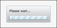
ActivityControlfound in the RIA Services project template and samples.BusyIndicatormakes it easy to add a "Please wait..." progress indicator to applications and does so in a way that's easy to customize. It's a simple control, but a handy one. I have a few examples below; please see David Poll's blog for more. - SL3/SL4: Minor tweaks to Data Visualization: Support more flexible subclassing scenarios of core classes, provide more helpful exception messages in some scenarios, tweak default Chart template to respect Padding, change type of Chart.LegendItems collection items to
objectfor flexibility, convertLegendto aHeaderedItemsControlfor consistency. - SL3/SL4: It's now possible to collect code coverage statistics when running unit tests with the Silverlight Unit Test Framework! Jeff spent some time this release productizing some clever hackery Ted Glaza originally did about a year ago, and this new capability fills a pretty big hole in the unit testing story for Silverlight. We're also including a couple of the custom build actions that we use internally - now you'll be able to use them in your projects! And we're including the XML files to make it easy for customers to enable Application Library Caching for their projects. For more information on these topics, please have a look at Jeff Wilcox's blog.
- SL4: We've modified all the Toolkit/SDK control visuals and input handlers to behave correctly for right-to-left cultures and added mouse wheel support in some of the obvious places.
- SL4: We've removed ImplicitStyleManager because Silverlight 4 supports implicit styles natively. Correspondingly, we've modified the
Theme-based wrapper classes (TwilightBlue,ShinyRed, etc.) to use implicit styles. - SL4: Viewbox has moved into the Silverlight 4 core (i.e., it's available in the
System.Windows.dllassembly that every Silverlight 4 install includes), so it has been removed from the Silverlight 4 Toolkit. - SL4: Along with the new MEF (Managed Extensibility Framework) features in the Silverlight 4 SDK, there's an experimental System.ComponentModel.Composition.Packaging.Toolkit assembly in the Toolkit that adds support for downloading secondary XAP’s and loading them into a MEF catalog. For more information, please have a look at Wes Haggard's blog.
BusyIndicator is in the house...
At its core, BusyIndicator is a simple wrapper control into which you put whatever makes up the UI of your application. (You can think of it as a special kind of Border with special abilities.) BusyIndicator exposes an IsBusy property which should be set to true (possibly via data binding) whenever the relevant portion of the application is busy and won't respond to user input. When this happens, BusyIndicator automatically disables its content and shows a simple UI to let the user know what's going on. It's really quite simple!
Here's the most basic scenario:
<controlsToolkit:BusyIndicator
    IsBusy="{Binding MyBusyProperty}">

    <!-- Content goes here... -->

</controlsToolkit:BusyIndicator>
And this is how it looks when IsBusy is set:
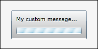
The most common change is to customize the message, and of course that's simple to do:
<controlsToolkit:BusyIndicator
    IsBusy="{Binding MyBusyProperty}"
    BusyContent="My custom message...">

    <!-- Content goes here... -->

</controlsToolkit:BusyIndicator>
Yielding:
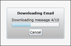
Note that the BusyContent property is of type object, so we could have used other UI elements (like Grid, Image, and Button) for a message with more than just text. Of course, sometimes you want things to be totally custom - so there are some straightforward ways to do that which don't require you to completely re-Template:
<controlsToolkit:BusyIndicator
    IsBusy="{Binding MyBusyProperty}"
    BusyContent="{Binding}">

    <!-- Provide custom UI for busy display -->
    <controlsToolkit:BusyIndicator.BusyContentTemplate>
        <DataTemplate>
            <StackPanel>
                <TextBlock Text="Downloading Email" FontWeight="Bold" HorizontalAlignment="Center"/>
                <StackPanel Margin="6">
                    <TextBlock Text="{Binding MyStatus}"/>
                    <ProgressBar Value="{Binding MyProgress}" Height="15"/>
                </StackPanel>
                <Button Content="Cancel" HorizontalAlignment="Center"/>
            </StackPanel>
        </DataTemplate>
    </controlsToolkit:BusyIndicator.BusyContentTemplate>

    <!-- Remove unnecessary default ProgressBar -->
    <controlsToolkit:BusyIndicator.ProgressBarStyle>
        <Style TargetType="ProgressBar">
            <Setter Property="Visibility" Value="Collapsed"/>
        </Style>
    </controlsToolkit:BusyIndicator.ProgressBarStyle>

    <!-- Content goes here... -->

</controlsToolkit:BusyIndicator>
Which looks like:
Another property to be aware of is the DisplayAfter property which lets you configure the initial delay before the busy indicator is shown - to avoid the annoying "on/off" flicker that would otherwise result from a lot of quick operations in succession. The BusyIndicator page of the public sample project has an interactive section where you can experiment with various delays and durations to see how this looks in action.
ImplicitStyleManager has left the building...
I wanted to show how to convert an existing application using ImplicitStyleManager over to using Silverlight 4's new implicit styling support. Because I made this change for the 11 Toolkit themes, I can tell you it is quite easy. ImplicitStyleManager attached property/properties and - where relevant - moving the ResourceDictionary of Styles into the Resources section of the parent element (or all the way up to App.xaml). Also, be sure to go through and remove any explicit assignments to the Style property or it's friends (e.g., ItemContanerStyle). (This probably isn't common in most applications, but the Toolkit Themes did it all over the place.)
To make that a little more concrete, here's a simplified "before" example that makes Buttons have blue text and ListBoxItems purple:
<StackPanel controlsThemingToolkit:ImplicitStyleManager.ApplyMode="OneTime">

    <!-- Styles for controls -->
    <StackPanel.Resources>
        <Style TargetType="Button">
            <Setter Property="Foreground" Value="Blue"/>
        </Style>
        <Style TargetType="ListBoxItem">
            <Setter Property="Foreground" Value="Purple"/>
        </Style>
    </StackPanel.Resources>

    <!-- Styled controls -->
    <Button Content="Button"/>
    <ListBox>
        <ListBoxItem Content="Item 1"/>
        <ListBoxItem Content="Item 2"/>
    </ListBox>

</StackPanel>
To convert this XAML over to Silverlight 4's implicit style support, just remove the highlighted portion above. The visuals will look exactly the same, but everything is more efficient because the platform is handling it internally. And what's more, various scenarios that were tricky to get working with ImplicitStyleManager (like styling the contents of a TabControl) now "just work" thanks to the new framework support for implicit styles!
Silverlight 4 has a lot of great improvements that really raise the bar for rich, interactive web applications. I encourage everyone to check it out today and start thinking about how to take advantage of all the new stuff!