Nobody likes a show-off [Today's DataVisualizationDemos release includes new demos showing off stacked series behavior]
My DataVisualizationDemos application is a collection of nearly all the Data Visualization samples I've posted to my blog. And just like the Data Visualization assembly (get Silverlight/WPF Data Visualization Development Release 4 here!), the demo application runs on Silverlight 3, Silverlight 4, WPF 3.5, and WPF 4 and shares the same code and XAML across all platforms. It's a handy way to look at bunch of sample code running on any of the supported platforms. What's more, each demo page has hyperlinks to relevant blog post(s) for more detail about each scenario, so it's a good learning tool as well!
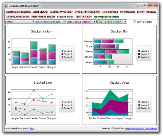
Of the two completely new demos, the prettiest is definitely the "Stacked Series" sample shown above. Its interface is simple - you choose one to three sets of stacked data for examples of all four stacking types and can control the nature of that data: positive/mixed/negative small/large ints/doubles. As you might guess, the corresponding value changes are fully animated, so it's pleasing to watch the charts flow from one configuration to another.
There's also a check-box for switching the examples from "normal" stacked mode into "100%" stacked mode. This transition is not animated because what goes on behind the scenes is a swap of the series types in use. Similarly, choosing a different kind of independent value from the combo-box (string, consecutive numbers, random numbers, or dates) re-creates the data and is not animated.
Disclaimer: As soon as you start playing around with negative values, you'll think you've found a bad rendering bug. But before you fire off an email telling me what a bone-head I am for getting things wrong, please finish reading this post...:)
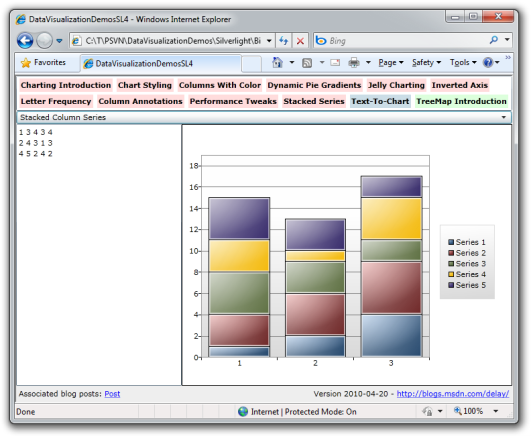
The less attractive - but arguably more interesting - of the two new demos is the "Text-To-Chart" sample shown above. What it lacks in sophisticated UI polish, it makes up for in flexibility. The idea is that you (or me when I'm testing things!) can paste simple tabular data directly from Excel and see how it looks in any of the eight new stacked series types. The dependent values of a single series go down and different series go across (using tab, space, or ';' as a delimiter). It's flexible, so you can have any number of dependent values or series! Independent values are generated automatically according to row number; the only requirement is that every row needs to have the same number of values (i.e., no missing data). If everything checks out, you get a pretty chart of the data - if not, the text turns red to indicate a problem that needs to be corrected.
After a little while playing around with negative numbers, you might end up with the chart shown below;
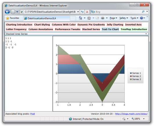
Clearly, this is a rendering bug - that can't possibly be correct! Let's try it in Excel to see how it's supposed to look so we can tell the developer what a complete bone-head he is:
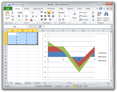
Oh, snap, it's not a bug after all!
Of course, that's not to say there aren't still bugs in the stacked series implementation - there are bound to be because everything has bugs. But the good news is that I may not be a total bone-head after all. That said, if you run into a scenario where the output from the stacked series code differs from that of Excel, I'd love to hear about it - and "Text-To-Chart" provides a really easy way of sending a bug report!
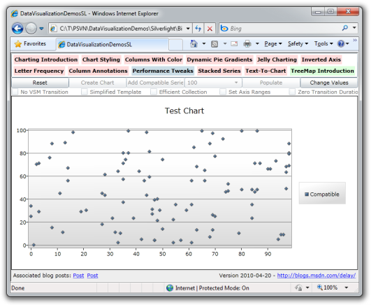
The last thing I wanted to call out is that I've updated the "Performance Tweaks" sample (above) to allow the creation of a "Compatible" ScatterSeries (shown above) in addition to the normal kind. You can read more about what I mean in my detailed discussion of the new stacked series support. What's important to know is that holding down the Ctrl key switches the "Add Series" button to an "Add Compatible Series" button - and the resulting series name in the legend will be "Standard" or "Compatible" accordingly.
This makes it easy to see some of the performance improvements I discuss in that blog post for yourself. One good example is the following: Reset, Create Chart, Add Series, Populate, [watch as the points fade in], Change Values, [watch as they move], Change Values, etc.. Now repeat those same steps with a Compatible series and note how everything runs faster!
Aside: If you're on WPF, you may need to increase the number of points before you start seeing a difference.
And there you have it: cool new samples to go with the new Data Visualization features. The DataVisualizationDemos application is one of my favorite test cases because it implements a bunch of different scenarios with a variety of different techniques and it runs everywhere the Data Visualization assembly does. (Or at least it did until Windows Phone 7 showed up... Hum, maybe I'll port to that platform next time...)
DataVisualizationDemos has been a